Kinetica by Face
Opinion by Richard Baird Posted 2 July 2012

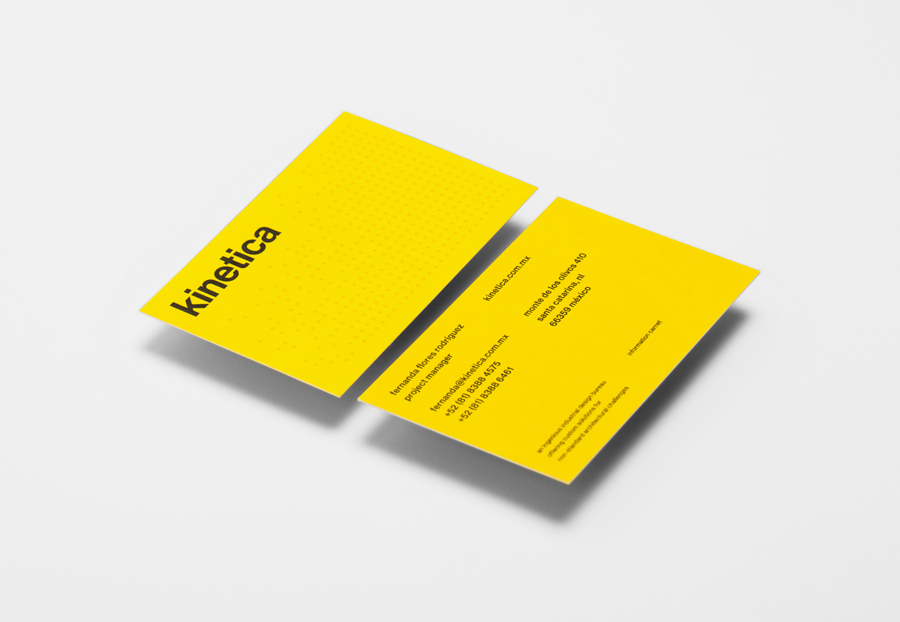
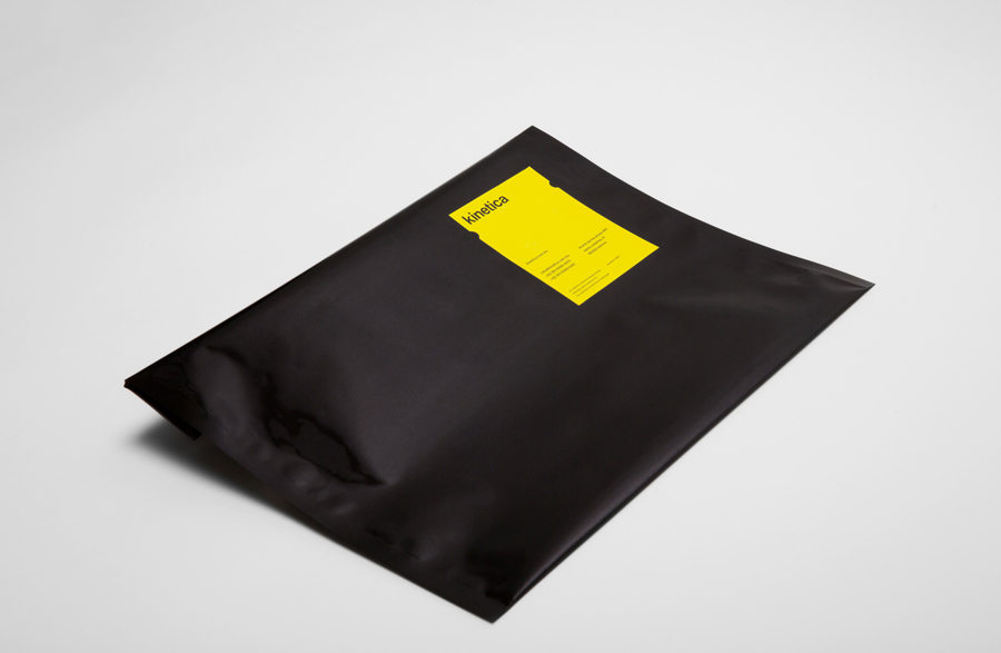
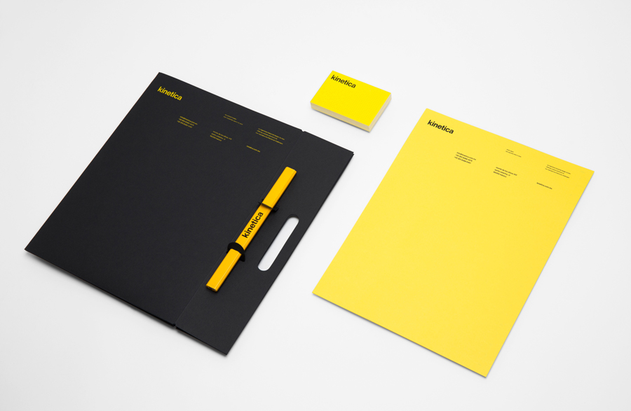
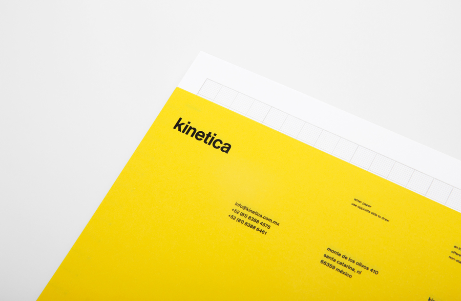
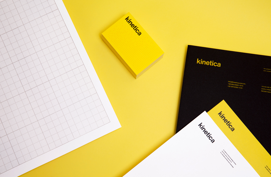
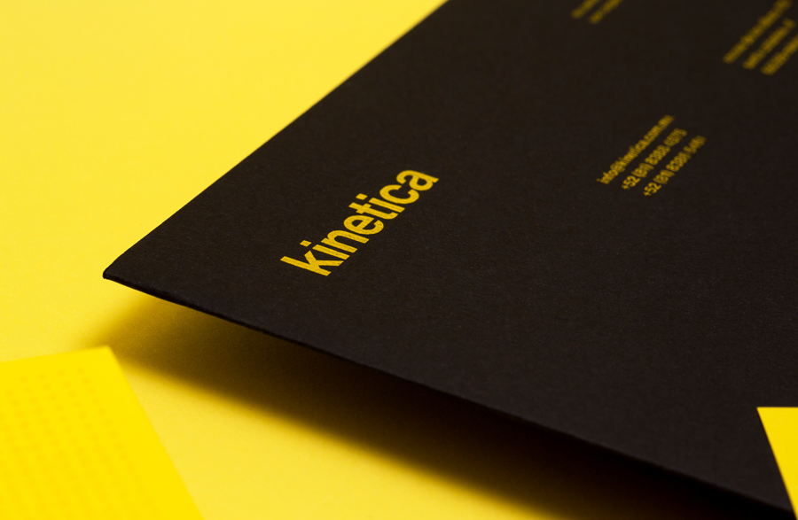
Kinetica is an international industrial design studio located in Santa Catarina, Mexico, that specialises in non-standard architectural projects. Their new visual identity, created by ‘supermodernist’ design agency Face, utilises a bold black and yellow colour palette, a straightforward sans-serif logo-type, plenty of space and a grid based collateral layout to establish a restrained and contemporary interpretation of heavy industry infused with subtle architectural cues.
“Kinetica is an ingenious industrial design bureau offering custom solutions for non-standard architectural challenges. They work with top-level international, national and local architectural firms to develop the most obsessive and mind blowing industrial firms. Face redesigned the brand from head to toe, from their manifesto, their DNA and their way to communicate through words and images.”
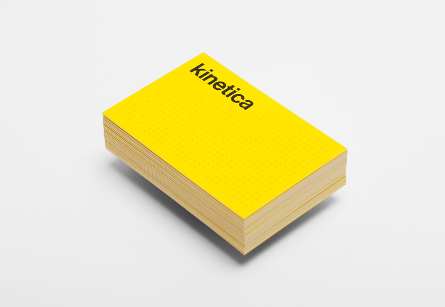
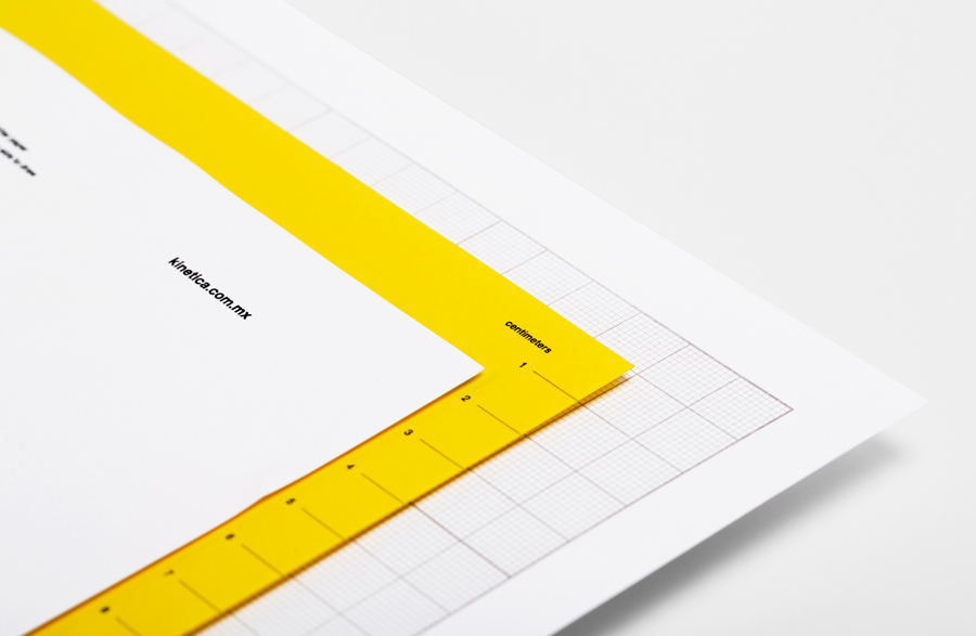
“Kinetica’s identity is based in the simple concept of modular grids with movement. The only generic and geometric shape that we use is a circle. Modern design, bright colour, Swiss typography and grids create an industrial yet classy atmosphere.” – Face
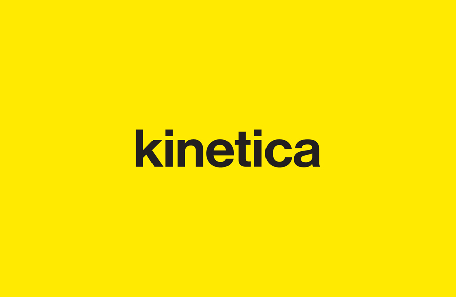
I have never had a problem with Helvetica logo-types when utilised alongside other communicative brand assets (as it was originally designed to be neutral) or where the practical philosophy of the typeface resonates well with the brand. In this case, while minimal, I think Face has managed to deliver a solution that appropriately reflects the company’s industrial nature, architectural relationships and manages to build on Max Miedinger’s Bauhaus influences with a neat combination of grids, simple typesetting, the economy and restraint of a two-tone colour palette and geometric pattern.
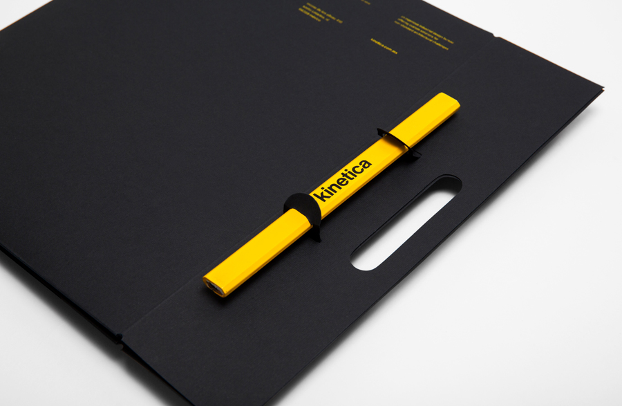
The logo-type has been well executed with a good eye for pairs and letter-space, it avoids any superfluous character adjustments and has a lowercase egalitarianism but robust weight that makes it appear solid, practical and democratic (perhaps a reference to equality and collaboration across all design disciplines). Plenty of space, geometry and basic material choices across the collaterals build on Kinetica’s architectural specialisation while the pattern across the business cards introduces a subtle sense of movement, from randomness to uniformity (implying pragmatism and process), as well as a modular technical quality.
