Nuts.com by Pentagram
Opinion by Richard Baird Posted 6 July 2012
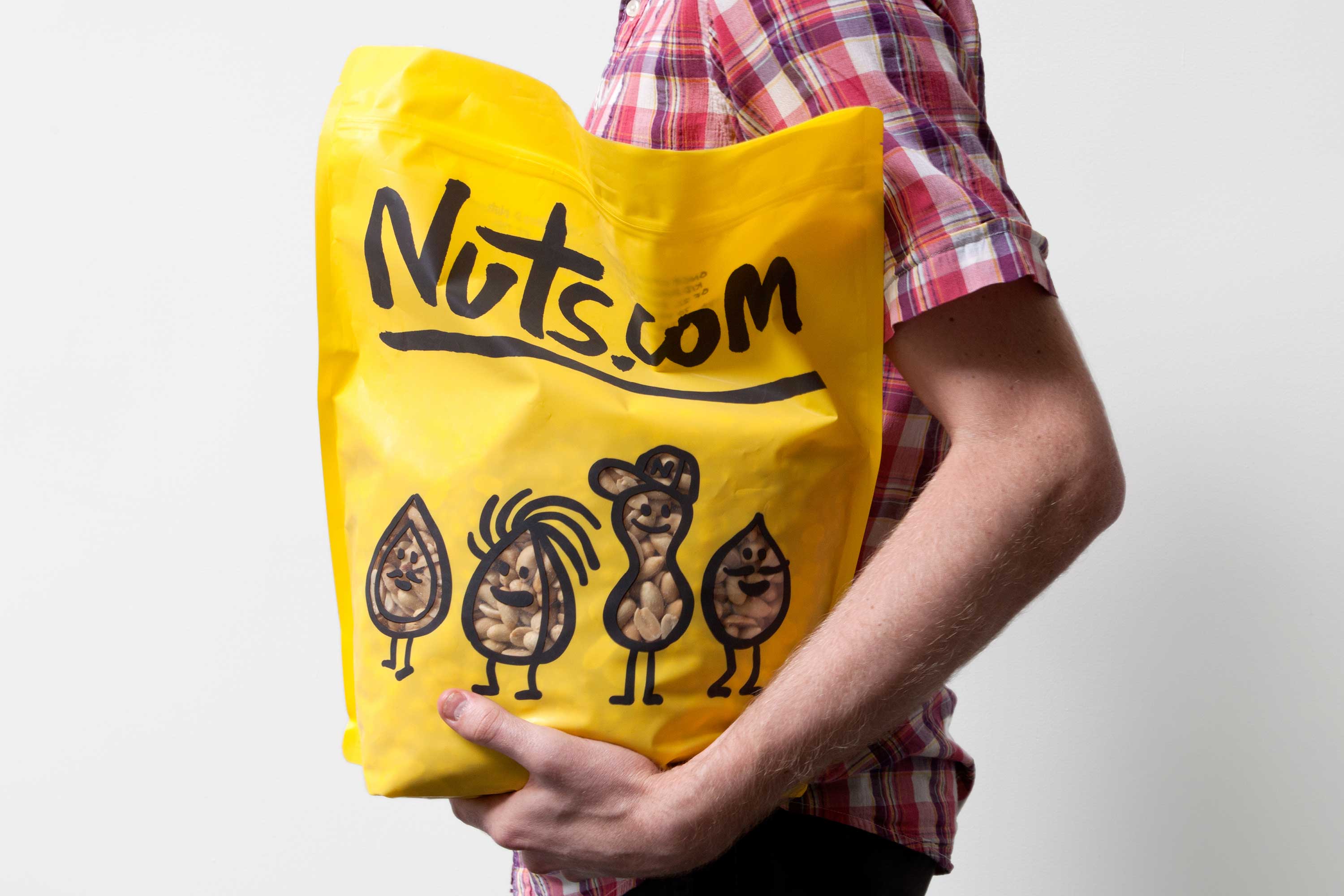
Originally established in 1929 as the Newark Nut Company, Nuts.com is a family owned on-line retailer of nuts, dried fruit, snacks, chocolate, tea and coffee. Following a recent url change, international design agency Pentagram, lead by partner Michael Bierut, created a new visual identity and packaging solution ‘that would help establish Nuts.com as a distinctive brand’.
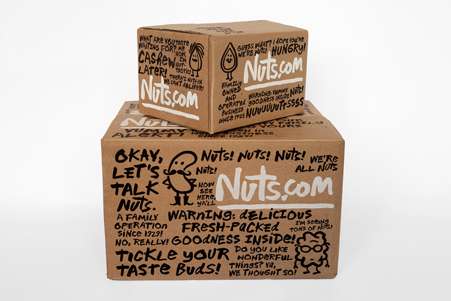
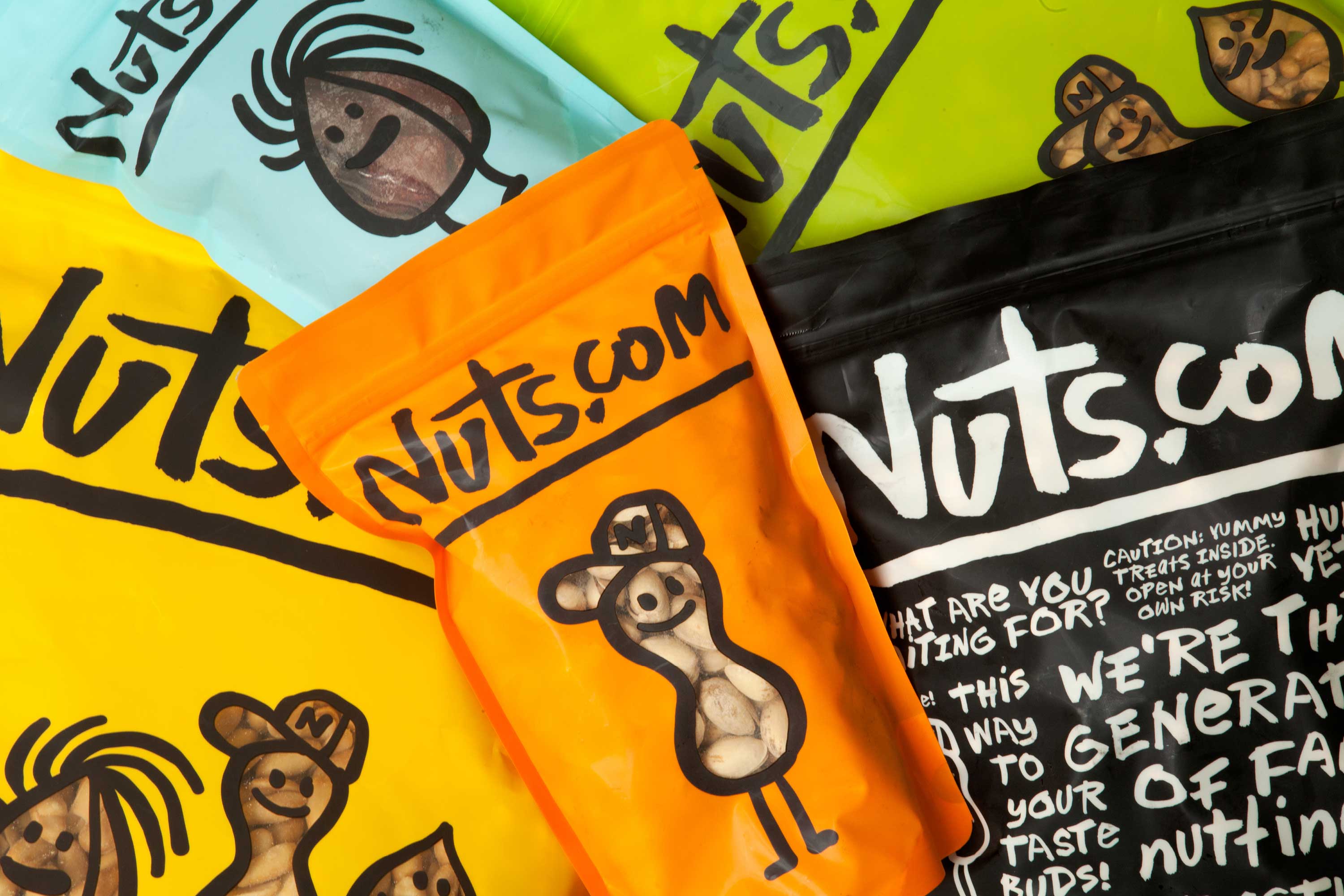
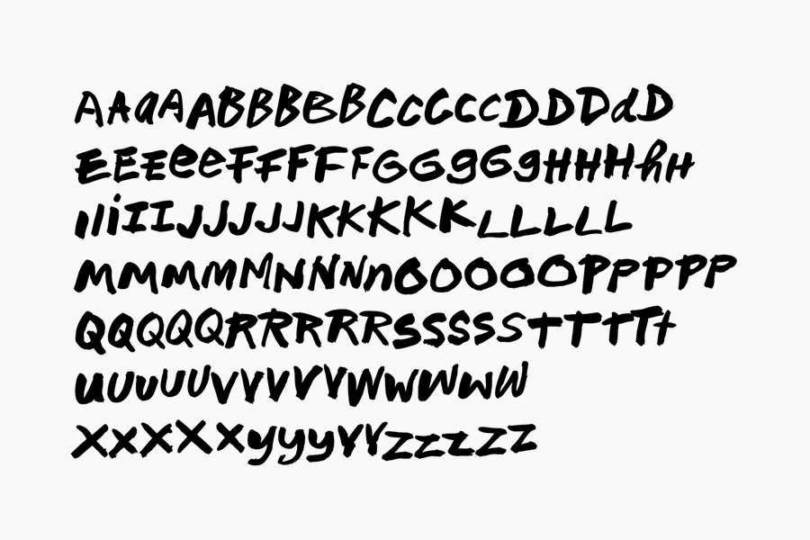
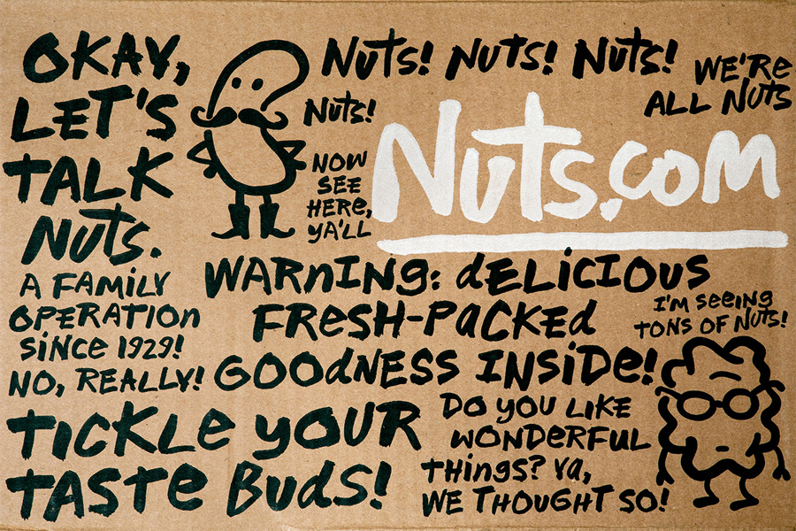
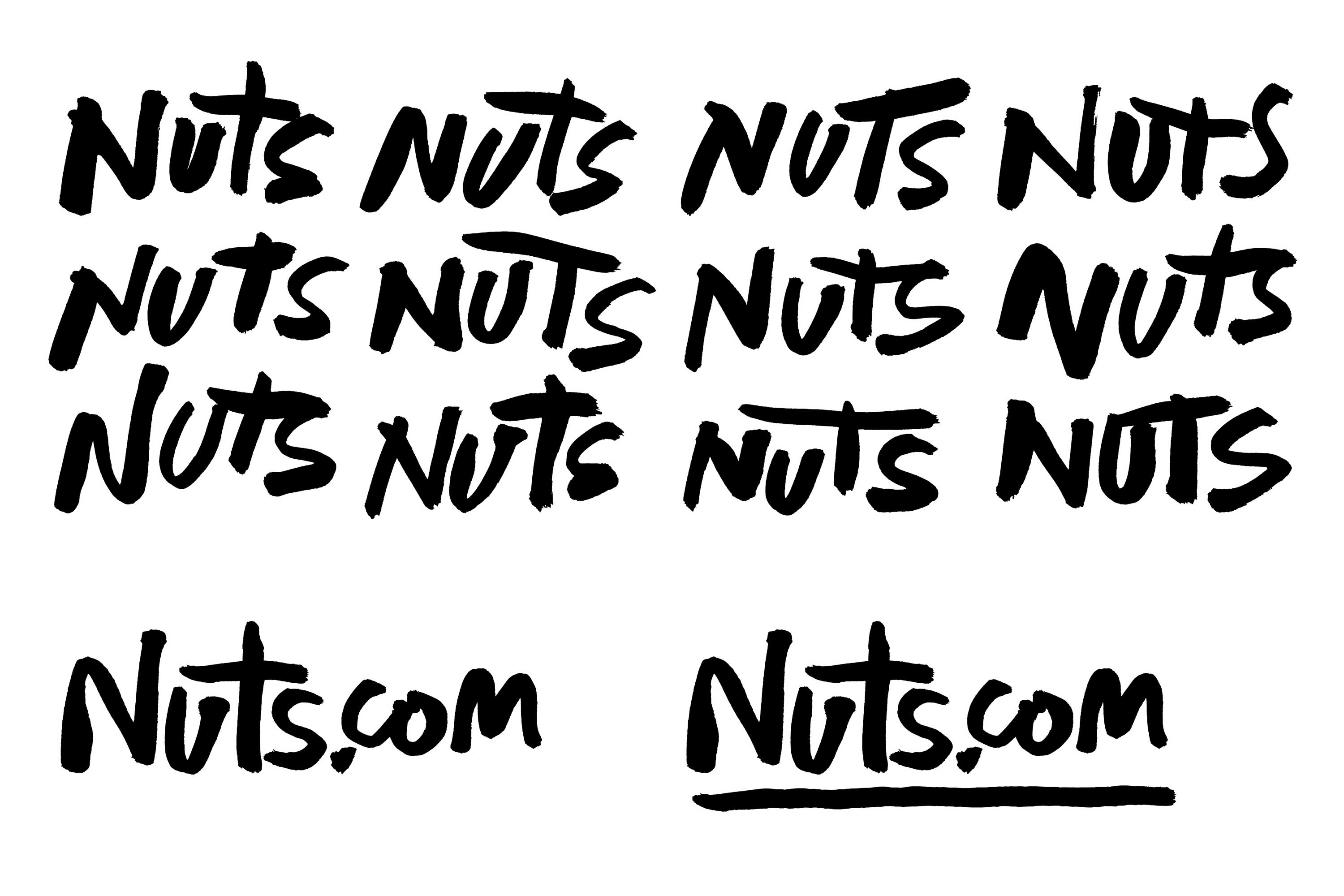
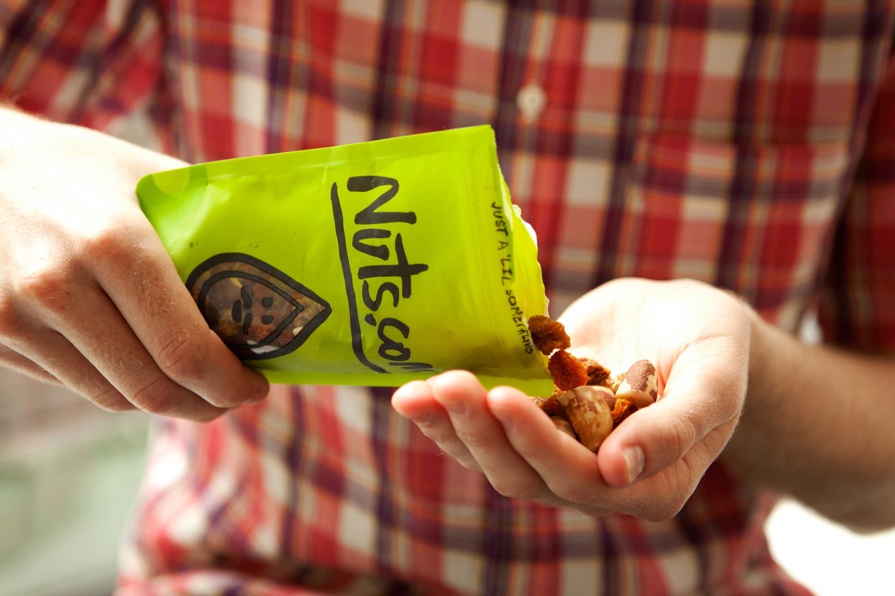
Based around a bright and distinctive colour palette, organic, heavy line-weight character illustrations (their hidden arms giving them a childlike cheek but innocent personality), a loose, ‘hand rendered’ proprietary typeface alongside an uncoated unbleached material choice, the design solution successfully mixes the playful, conversational and tactile to capture the brand’s youthful, personal and wholesome sensibility.
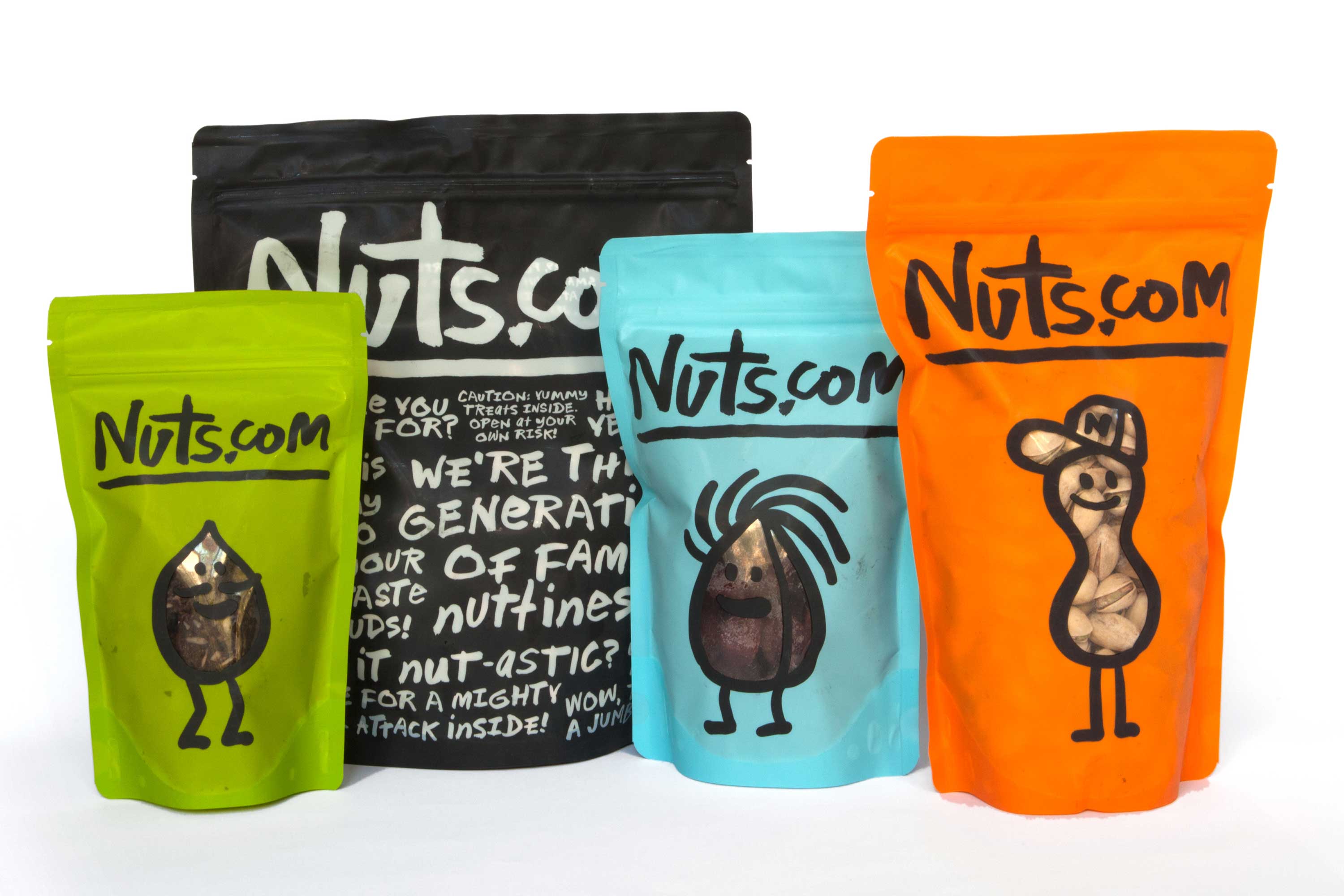
“The company first launched its site in 1999 with the slightly confusing name/URL NutsOnline.com––a second choice after it found the URL Nuts.com was already taken. This year the company finally secured the Nuts.com address and made the move to the new name. With the change, the company asked Pentagram’s Michael Bierut to create a new identity and packaging that would help establish Nuts.com as a distinctive brand. The new graphics create an unmistakable look and feel that is fun, personal, and well, a little nutty.”
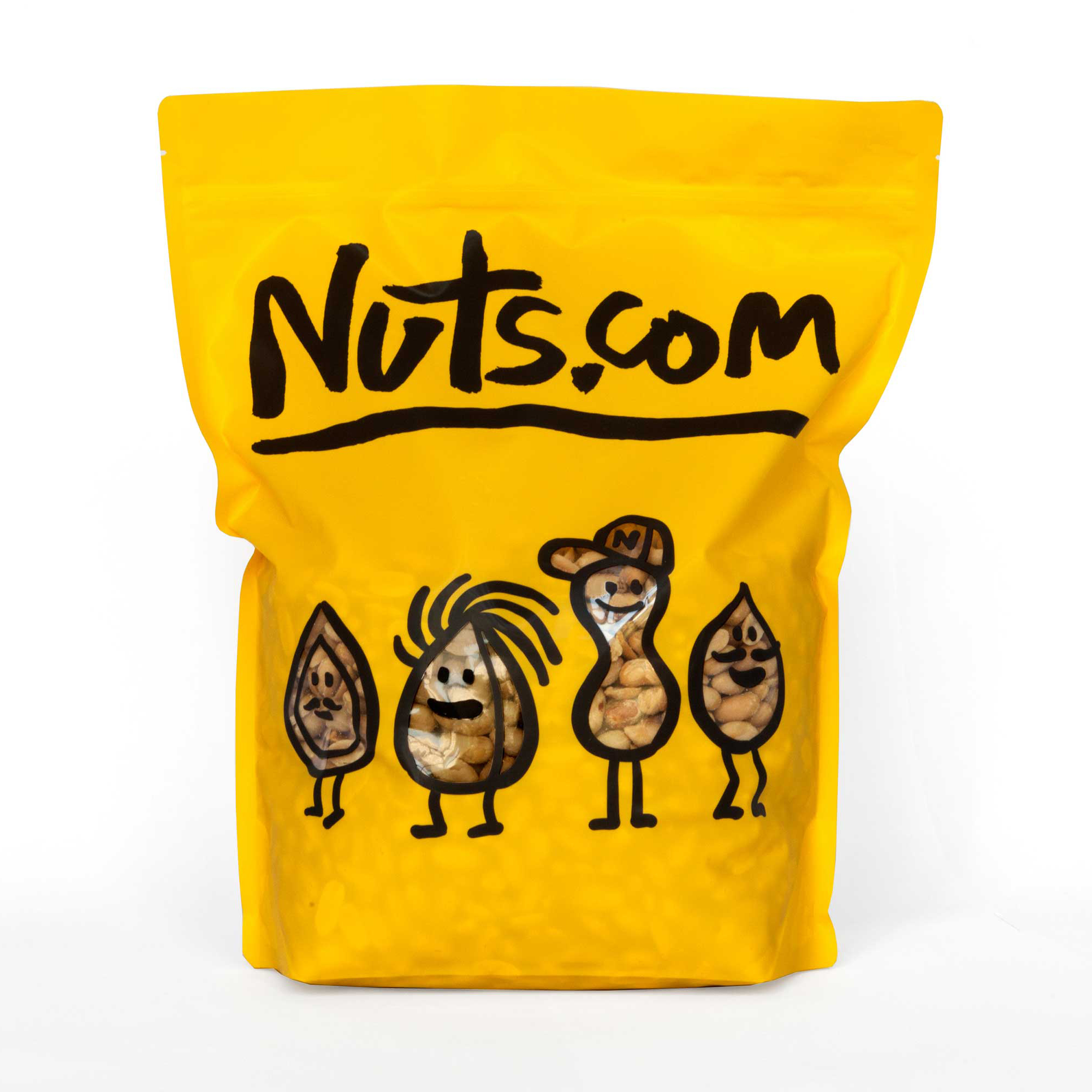
“Bierut’s redesign incorporates this irreverent and chatty tone of voice into the packaging with friendly hand-drawn typography and illustrations. Bags and shipping boxes are covered in commentary: “This way to your taste buds!,” “Isn’t it nut-astic?,” etc. The typeface was hand-drawn by Bierut and converted into a font by Jeremy Mickel, who provided a lot of alternate characters. The illustrator Christoph Niemann redrew the cartoon nuts to complement the typeface; the mascots appear on the bags of nuts, where they are reversed out to show the product inside. A bright, appealing color palette completes the cheerful look.” – Pentagram
