Bermellón by Anagrama
Opinion by Richard Baird Posted 18 July 2012

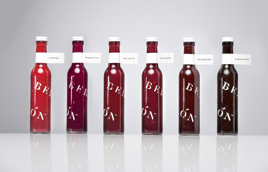
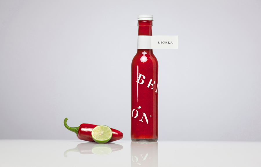
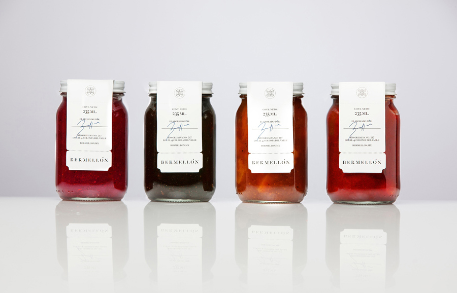
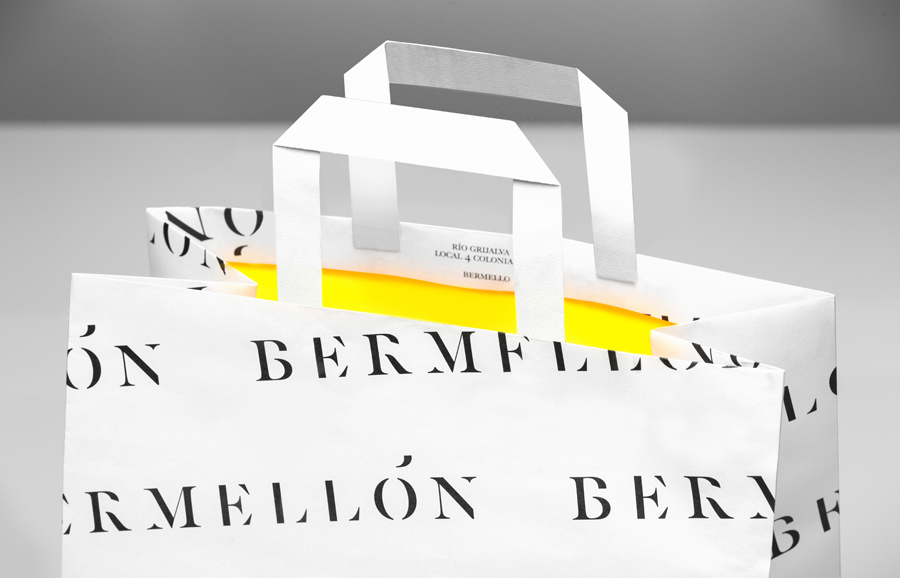
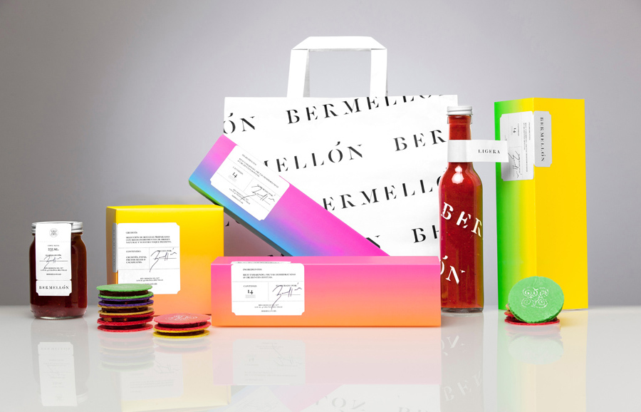
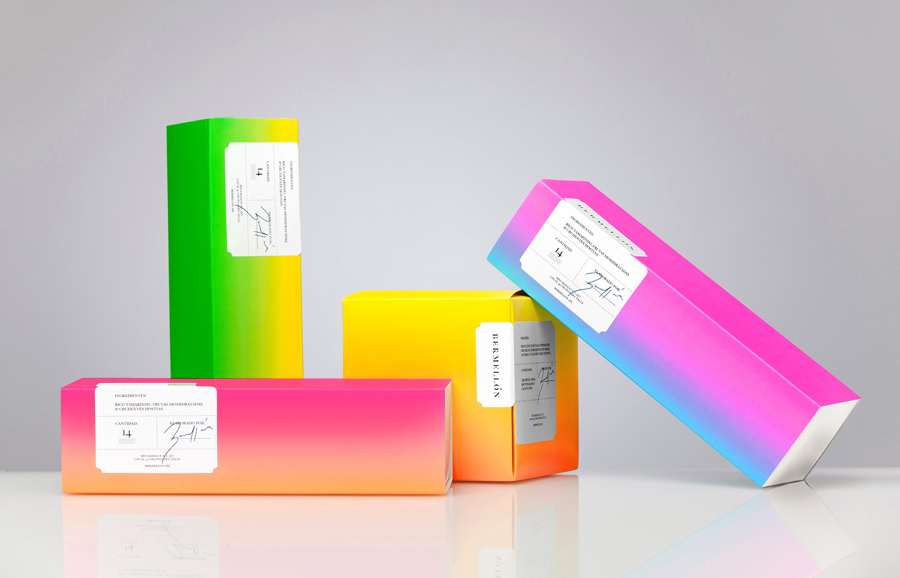
Bermellón is a Mexican confectionery shop that specialises in the premiumisation of traditional spicy treats typically sold on street markets. The shop’s identity and packaging, designed by Anagrama, fuses a bold and intense fluorescent colour palette with the fine detail and craft qualities of an adhesive label.
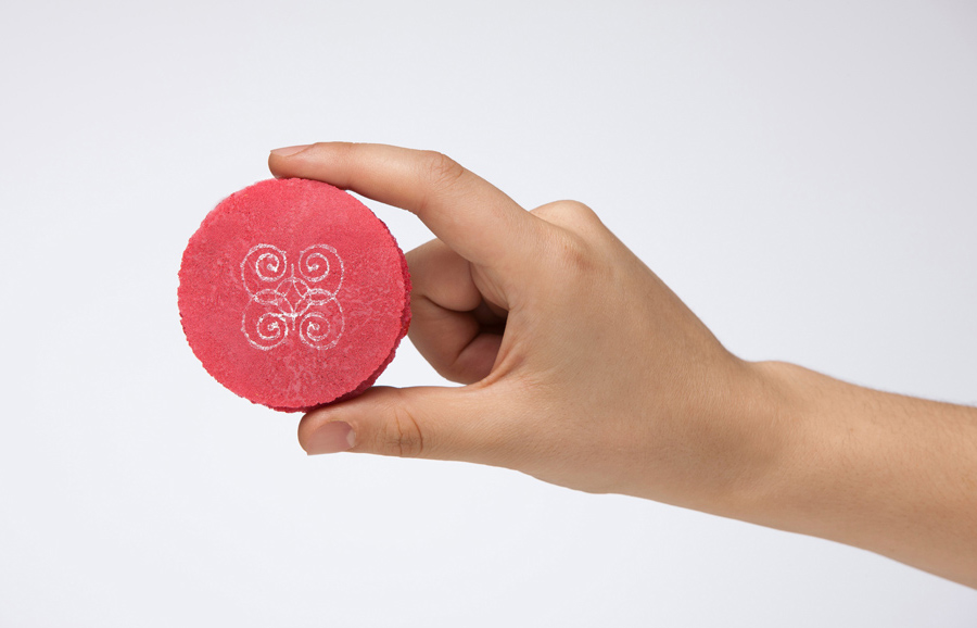
“The brand’s greatest success consists in taking these traditional flavored products to a premium buying experience through their packaging, excellent raw materials usage and hand-crafted cooking techniques.”
“Our proposal reflects sophistication values that the brand promotes using an elegant typographic palette and a logotype with allusion to a family’s monogram. The selected vivid colors constantly remind us about the product’s extreme acid and spicy flavours.” – Anagrama
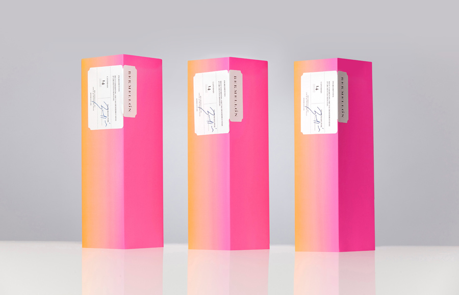
This is a really confident piece of design work from Anagrama that neatly manages to appropriate a colour palette previously lost to the world of cheap imports and pound shops. Considering the intensity and contrast of the gradients it appears incredibly restrained, appropriately tempered and significantly contrasted against the simplicity and craft aesthetic of the label. The use of seals, signatures and die cut detail, heritage cues borrowed from the wine and spirits category, delivers a clear sense of high and a batch-like quality expected from today’s premium products. The utilitarian stencil cut and serif detail of the logo-type is perhaps a little on-trend but, alongside the colour palette, add a contemporary contrast to the classic components. Like the products the packaging is melee of old and new and while there is not necessarily a connection between the label and colour palette the stark contrast makes this appear unique and communicative.
