Askeroths Trappor Och Räcken by Bedow
Opinion by Richard Baird Posted 7 September 2012

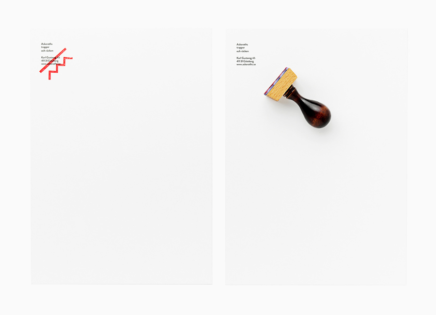
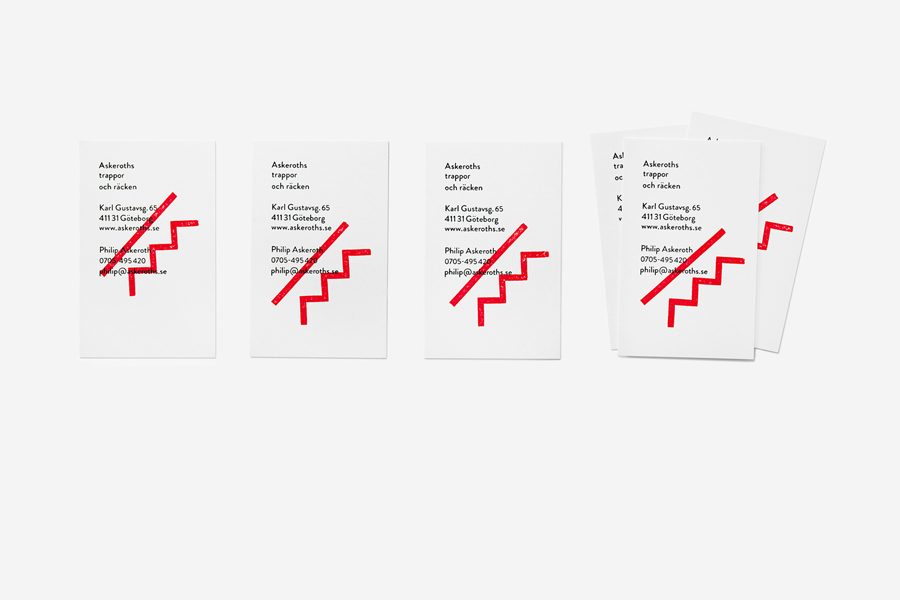
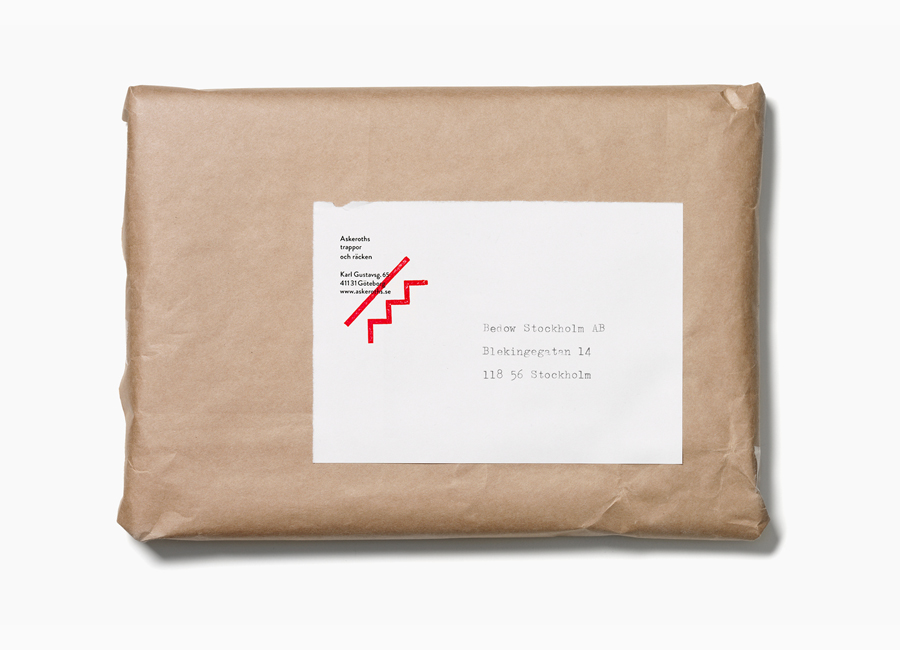
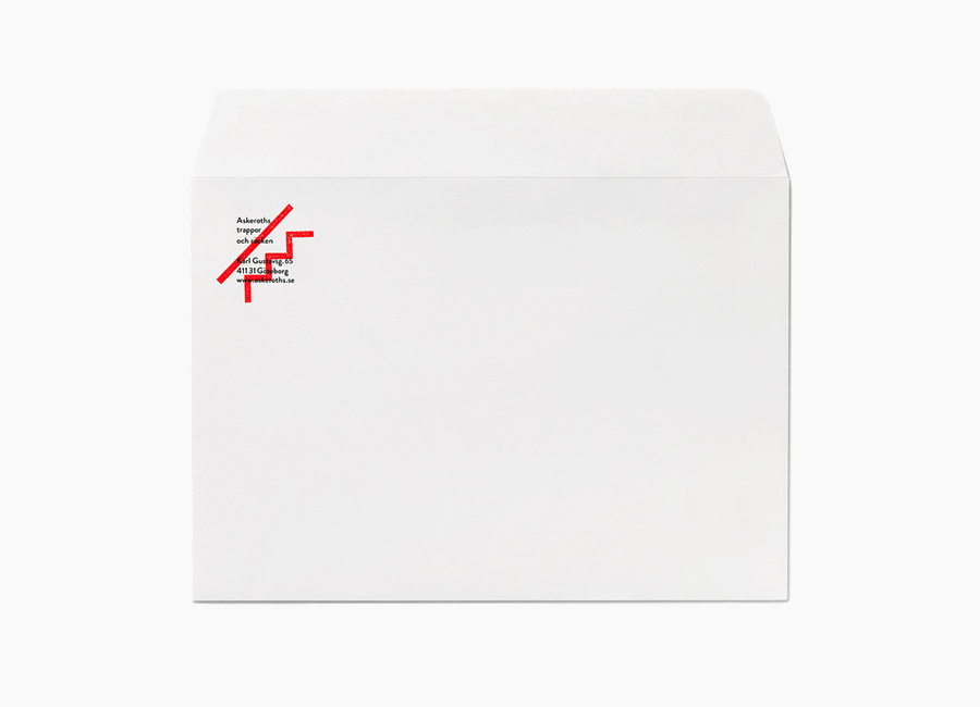
Stockholm based graphic and product design studio Bedow recently developed a new visual identity and stationery solution for Askeroths Trappor och Räcken, a small Swedish manufacturer of specialist staircases.
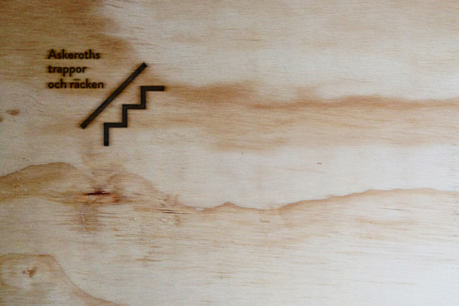
Based around a simple but identifiable abstraction, the logo-mark captures the elemental, functionality and practicality of staircases and the solid technical abilities of the craftsmen through the combination of a single, consistent line weight, basic geometry and nice balance of positive and negative space.
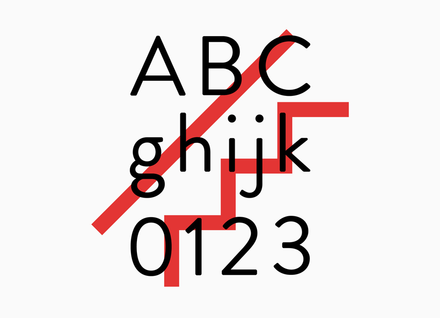
The hand-stamped and bright red overprint treatment across a typographic choice that features small curves added to square terminals, ample letter-spacing and a low lowercase X height introduces more of a personal, creative and crafted sensibility. The diagonal build and large proportions of the mark alongside the small detail and horizontal layout of the type delivers an interesting and communicative contrast of statement style and fine detail, weighty reliability and a sense of movement.
