Bernard Boutique by Bunch
Opinion by Richard Baird Posted 25 September 2012

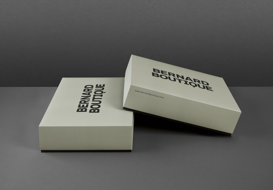
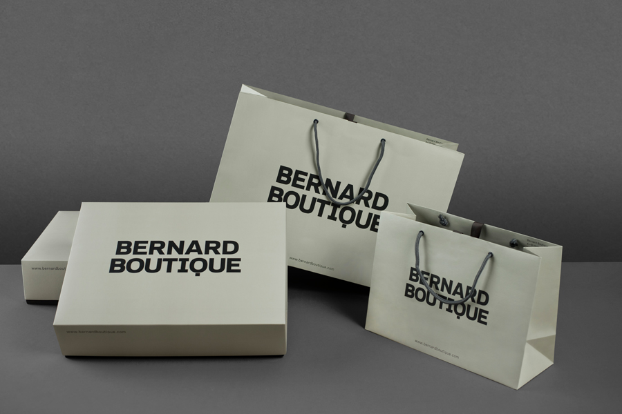
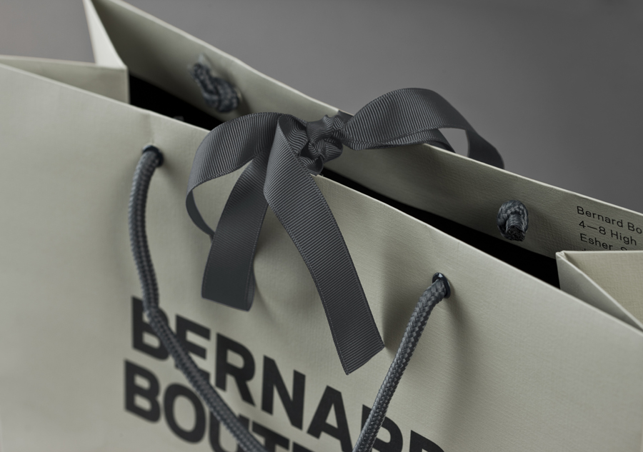
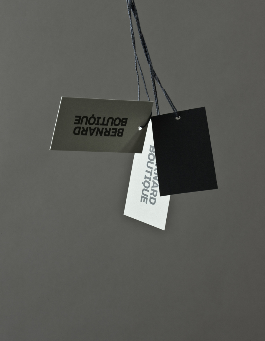
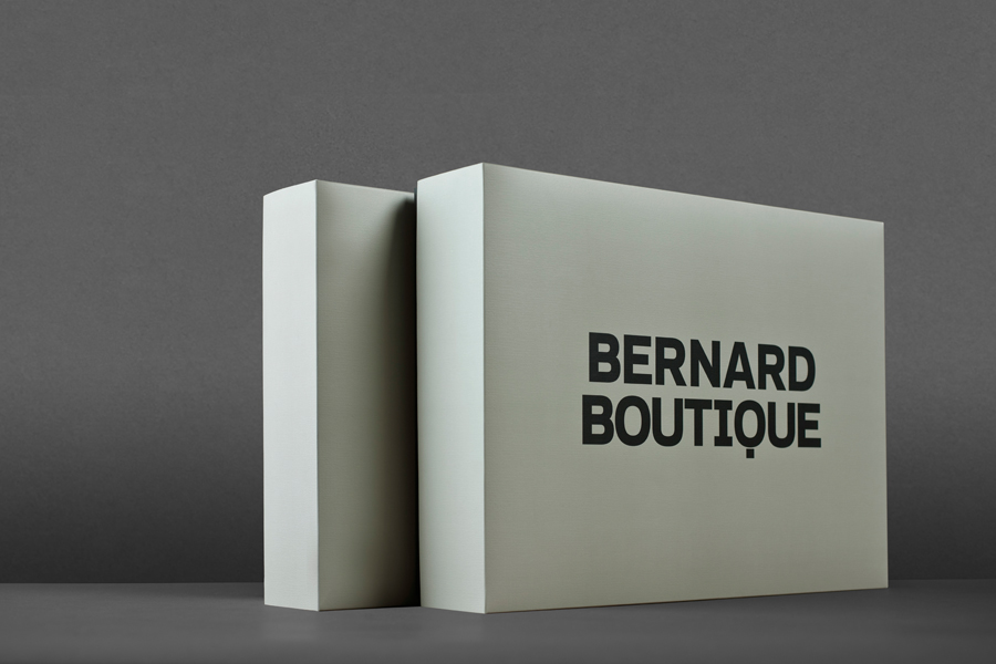
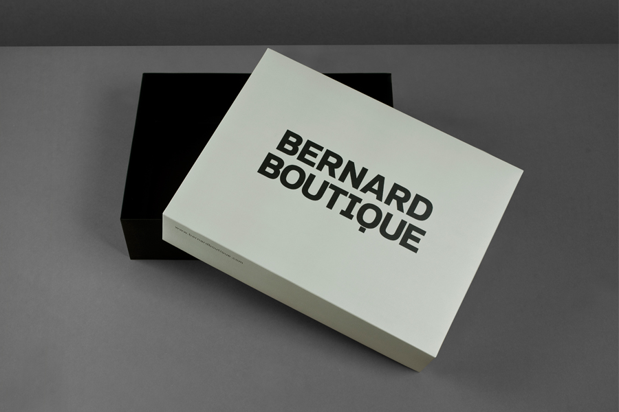
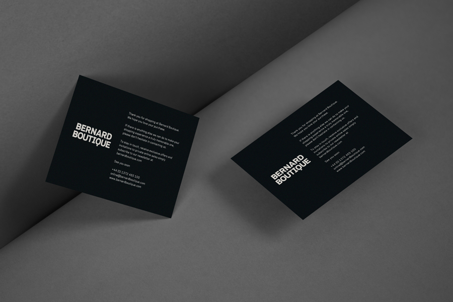
Bernard Boutique is an award-winning fashion store with a thirty year history that mixes the latest collections from established brands such as Givenchy, Alexander McQueen and Stella McCartney with the work of new upcoming designers. The boutique’s new visual identity, recently developed by creative design agency Bunch and extended across signage, bags, boxes, tags and other in-store collateral, contrasts a bold and masculine logotype solution with the tactile and feminine detail of the collaterals.
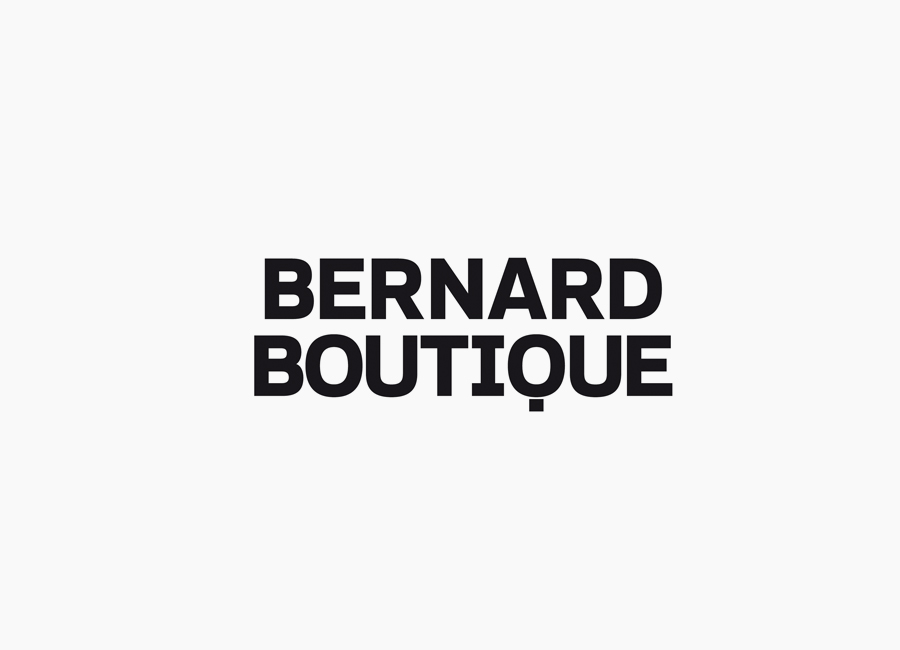
The logotype’s combination of reductionist and stencil cut Q, slabs across the I, heavy weight, geometry and tight spacing of uppercase characters, alongside a deep, sea green colour palette delivers a distinctly masculine and slight military sensibility that resonates quite well with the store’s unusual name. It clearly breaks a few industry conventions but confidently maximises this by placing the logo-type alongside more conventional high fashion detail such as ribbons and finer substrate textures, achieving significant contrast and unique character. It is this juxtaposition that appropriately resolves the duality and diversity of an urban collection made up of new and established designers.
