Breakwater by Lundgren+Lindqvist
Opinion by Richard Baird Posted 4 October 2012

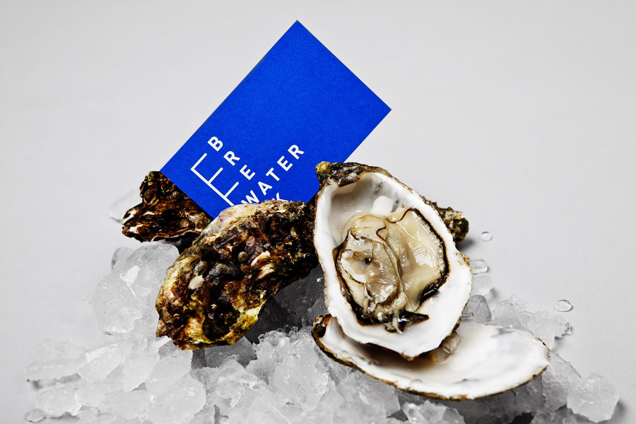
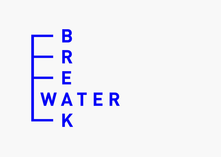
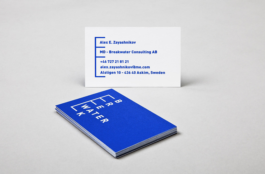
Breakwater is a Swedish logistics company that services the marine cargo sector. Their visual identity and stationery, created by Gothemburg-based studio Lundgren+Lindqvist, brings together the themes of open sea, systems and cargo through the vertical and horizontal intersection of a geometric sans serif, simple grid-based layout, plenty of space and a vivid blue and icy white colour palette.

I love the design work that comes out of the Nordic countries, there is often a great sense of coolness and restraint frequently underpinned by a solid but very simple idea. Lundgren + Lindqvist’s identity work for Breakwater is no different. At its most basic the logo-type manages to to achieve a utilitarian functionality and a structural sensibility – through the tall grid-based layout, consistent character width, line weight, square terminals and broad spacing of a geometric sans serif – that neatly reflects the stacked and practical format of container ships. The typographical intersection and line work cleverly mixes vertical depth and horizontal measurement to subtly convey the changing waterline of a ship as it loads and unloads cargo while a spot blue and white colour combination across an uncoated substrate achieves both a practical and distinctive quality that suggests individuality and ties it to the elemental and expansive nature of the open sea.


