Naturepaint by B&B Studio
Opinion by Richard Baird Posted 8 October 2012
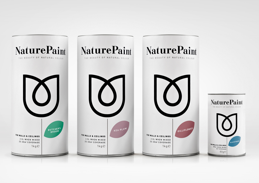
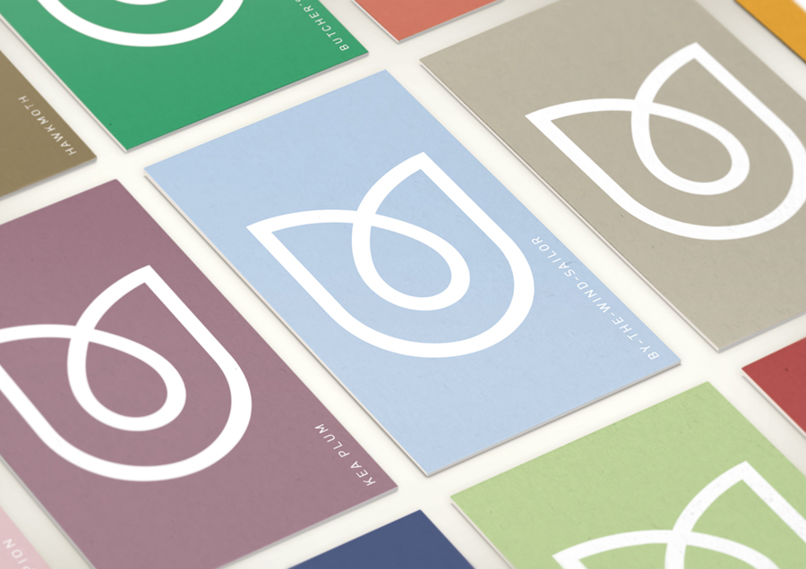
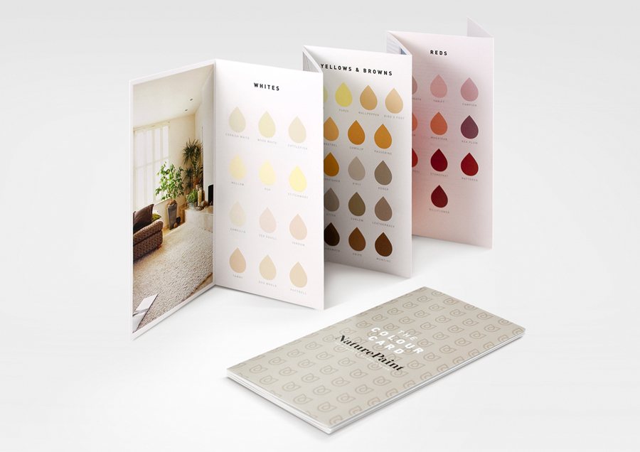
Naturepaint is a British brand of ‘earth-friendly’ powdered wall paint formulated from biodegradable, non-toxic, sustainable and locally sourced ingredients. London based studio B&B recently created a new visual identity and packaging solution for the brand which replaces the saturated visual cues of the original with a distinctive duality and contrast of contemporary form and classic type that better reflects the high quality and hardwearing qualities of the paint.

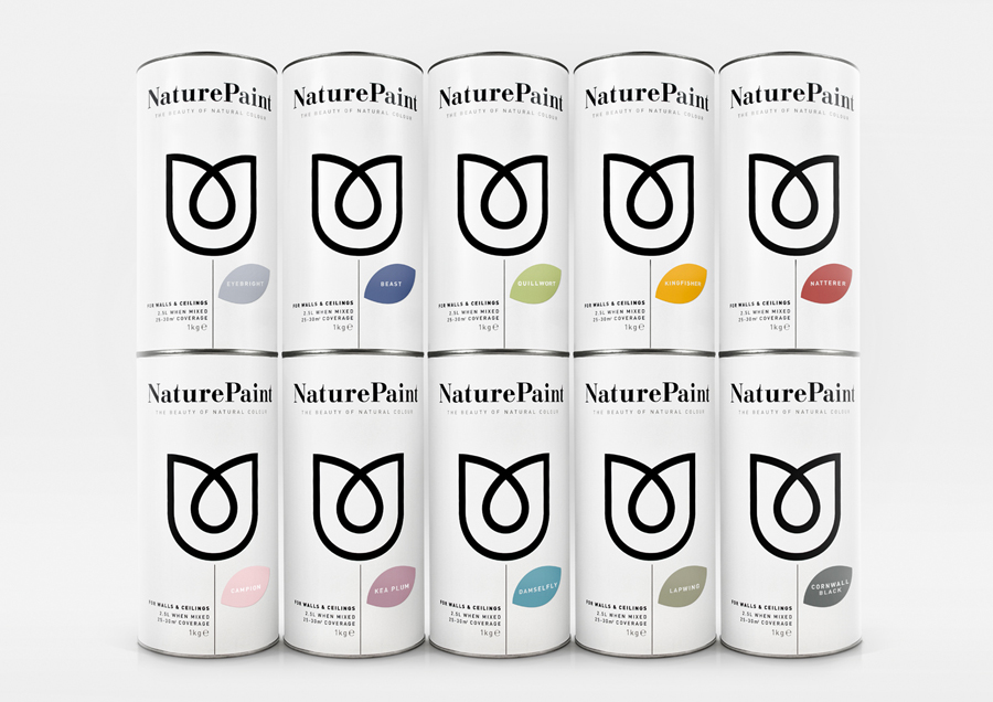
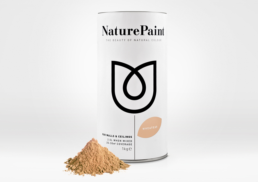
Based around a simple geometric and single line weight union of what looks like an abstract tulip and paint drop, the logo-mark manages to communicate organic values through inorganic form—infusing a sense of durability and consistency into what is an intentionally degradable product. Its clear two-part communicative value is appropriately leveraged, through its dominant proportion, across a light and spacious packaging solution that utilises plenty of white space to deliver a blank canvas-like sense of creative opportunity while also functioning well as a backdrop to the paint colour.
A well spaced classic serif and contemporary sans serif combination continues to deliver duality – uniting traditional high quality ingredients and the practicality and utility of paint – while the juxtaposition of weight and point size resolves the bold statement nature and fine detail associated with interior design.
It is a significant and impressive change that appropriately replaces the tired and generic with the iconic and proprietary achieved through visual and conceptual contrast, simplicity and restraint.
