Surname & Surname by NB Studio
Opinion by Richard Baird Posted 15 October 2012
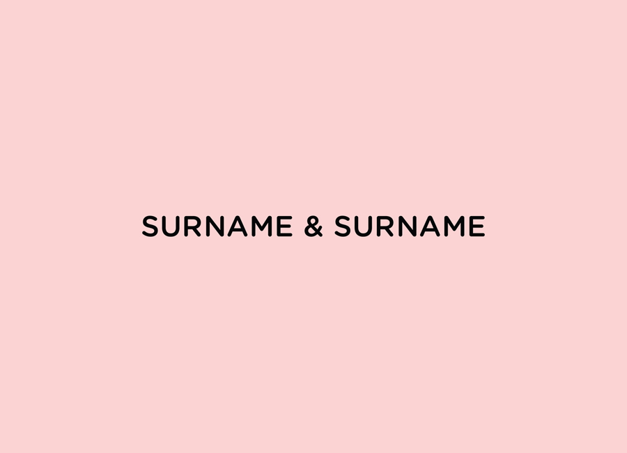
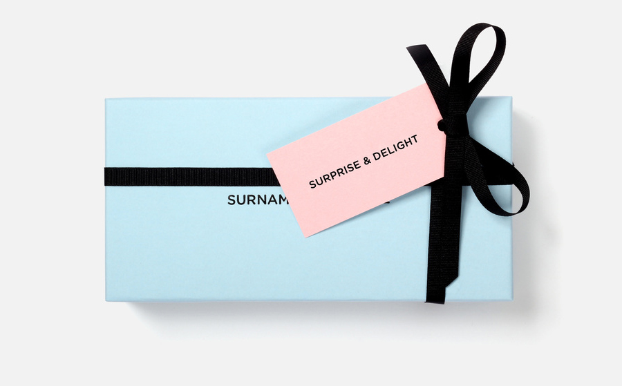
Surname & Surname is a new consumer focused brand communications agency formed by London-based PR specialist Blue Rubicon. Their visual identity, recently created by NB Studio, utilises a simple but well executed typographical solution to deliver an alternating union of language which conveys professionalism, communicative creativity at its most elemental, and a thoughtful, evolving brand personality.
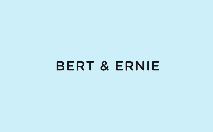
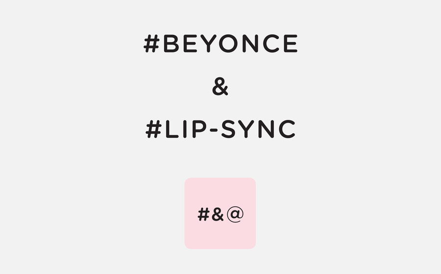
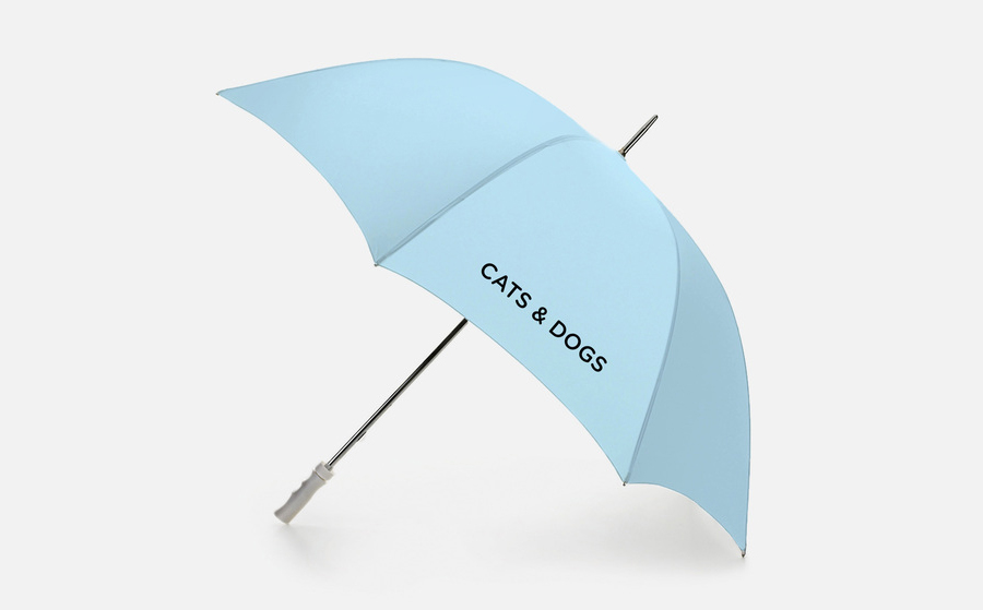
“The identity is built around the name, a tongue in cheek response to the traditional agency format; a comment on ego and authorship. We wanted to use the ampersand as a constant element in both the visual and verbal messaging. The Surname & Surname visual toolkit has a friendly sophistication that gives them stand-out in a very competitive sector. The end result is an identity that is frank yet expressive, that can flex between play and rigour.” – NB Studio
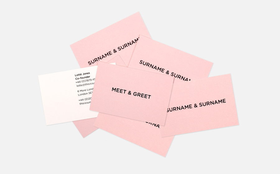
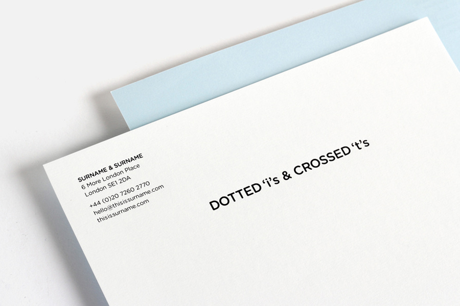
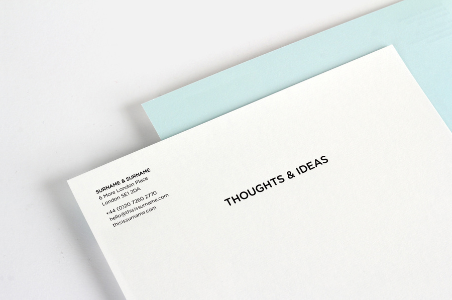
Based around what looks like uppercase Gotham, the logotype has a fairly straightforward authoritative formality, bare efficiency and contemporary professionalism. This is tempered by the use of rounded terminals and some generous spacing that adds a lighter and more accessible duality that resonates well with the tone-in-cheek nature of the name.
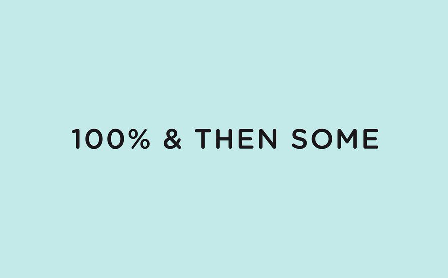
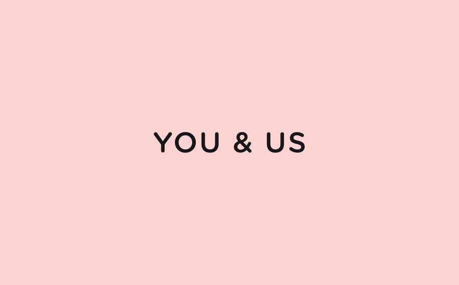
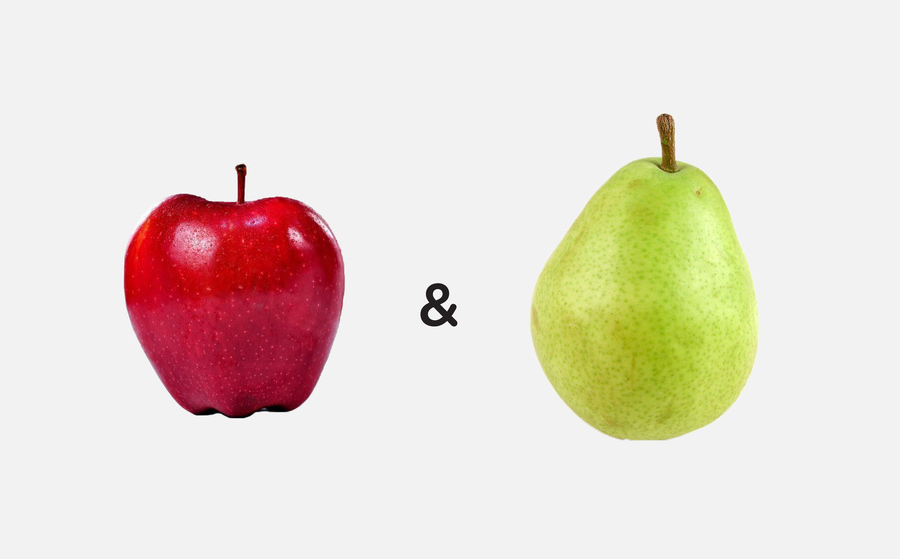
The functionality and simplicity of the typography is met by a richness in vocabulary and expression. A variety of contrasting, collaborative and emotive language choices, bound by a consistent ampersand but replacing the name, establishes an expandable and multi-dimensional personality that resolves around the theme of natural and unusual unions. The stationery’s combination of pastel and white colour palette compliment the softness of the typography and introduce a subtle craft sensibility while the images offer a visual variation on the juxtaposition of themes, a brightness and a layer of visual texture.
The result is a smart and broad resolution of brand traits expressed through linguistic creativity, simile and metaphor, bound by a simple, economical typographical solution that works well to communicate consistent and creative ideas over superfluous visual detail.
