Whisky Ambassador by O Street
Opinion by Richard Baird Posted 29 October 2012

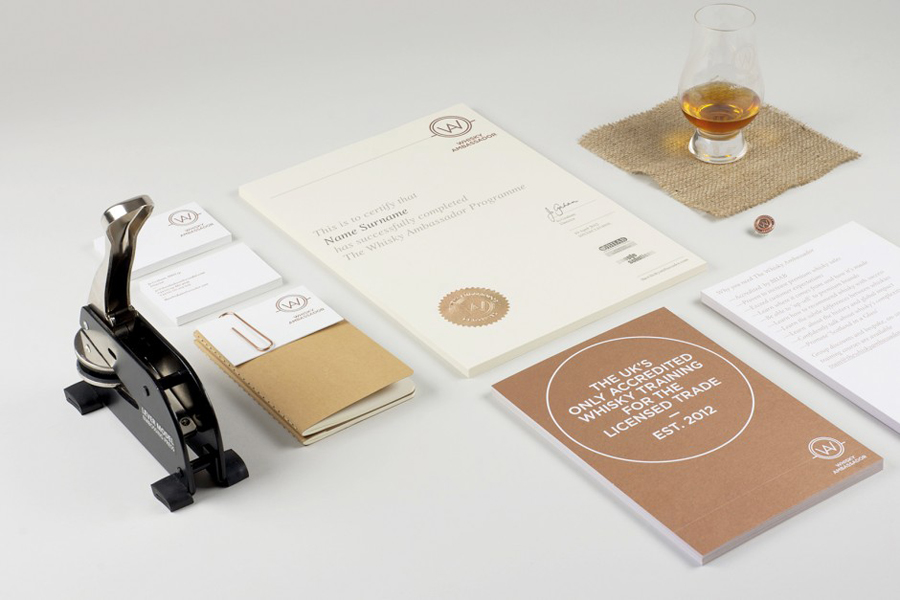
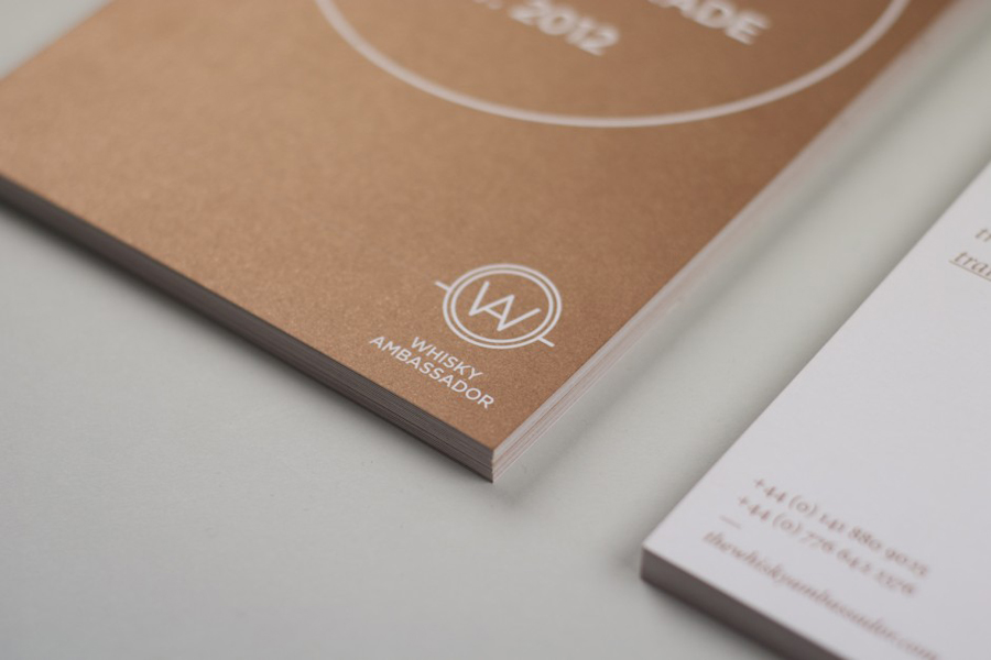
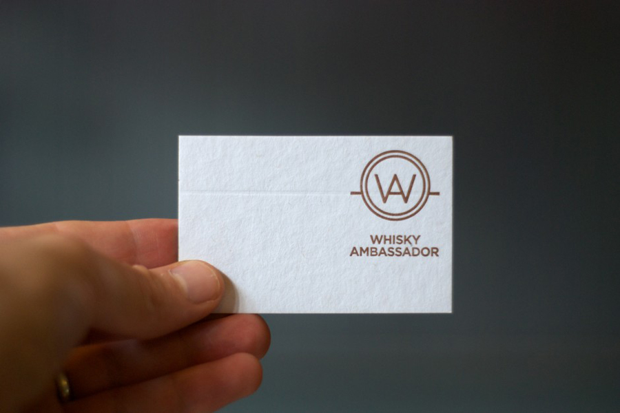
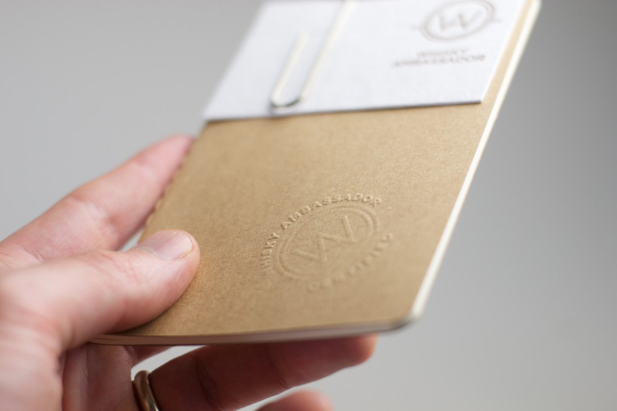
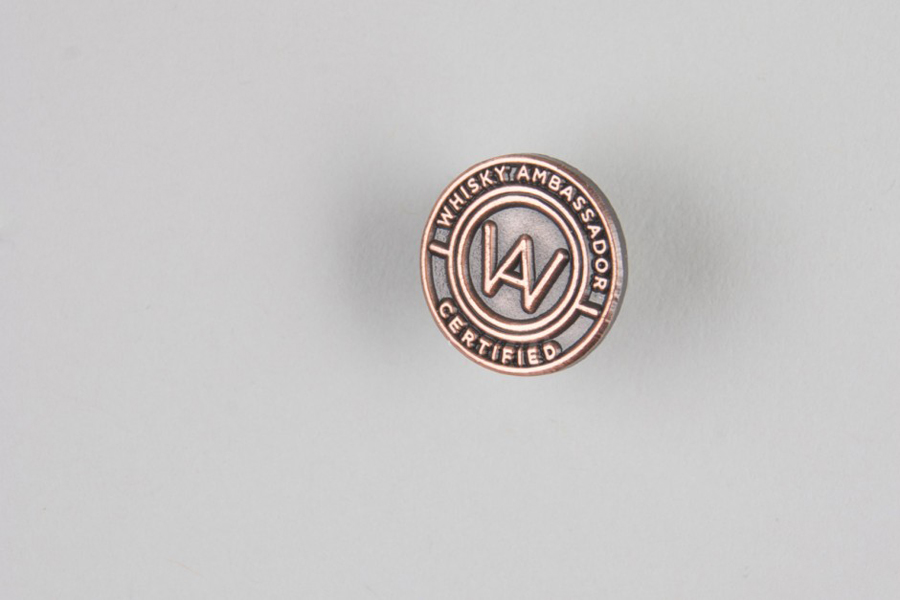
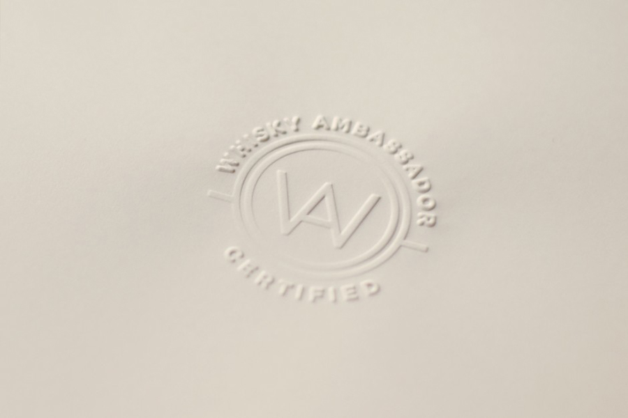
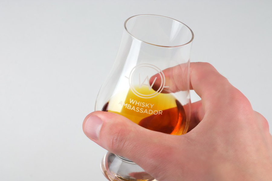
Whisky Ambassador is an Accredited, UK-based one-day training course that introduces bar staff and license holders to the techniques of effective Scotch whisky selling. Based around a simple monogram and sans serif logo-type combination delivered as an emboss and metallic spot colour treatment across tactile and uncoated material choices, design studio O Street’s visual identity for Whisky Ambassador – a recent start-up – aims to appear authoritative to the international luxury hospitality sector.
It is a simple but communicative solution that confidently draws on the aesthetics of the whiskey industry – neatly bringing together the regional craft qualities of an earthy unbleached and hand-embossed booklet, the richness, warmth and luxury of a bronze metallic spot and hot-foil detail alongside a classic cream substrate. The single line weight, square terminals and barrel-like concentric circles of a straightforward WA monogram works well to capture traditional and personal service practices in a contemporary manner while also resonating well with the pride associated with high quality whiskey. This is paired with a neutral but well spaced uppercase sans serif logo-type that delivers a professionalism and formality suitably representative of useful information and education.
It is a visual identity that through material choice and print finish delivers dimensionality and industry relevance to the simplicity, authority and practicality of the graphic design.
