The Tokenhouse by Designers Anonymous
Opinion by Richard Baird Posted 6 February 2013
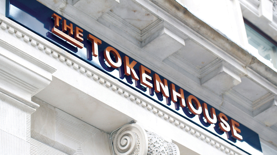
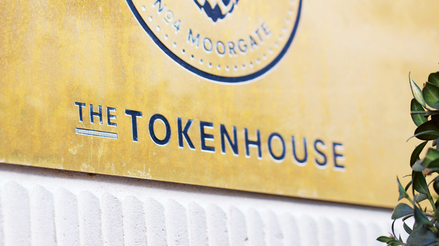
The Tokenhouse is a gastropub – run by hospitality brand Fuller’s – located on London’s Moorgate road. Designers Anonymous – the agency behind the branding of Fuller’s King’s Cross pub venture The Parcel Yard and fair-trade coffee range Brewer St. – developed a visual identity for the venue that appropriates 17th century history, gives it a contemporary vector treatment, a creative but cohesive diversity throughout the print work and a high quality finish across the exterior signage.
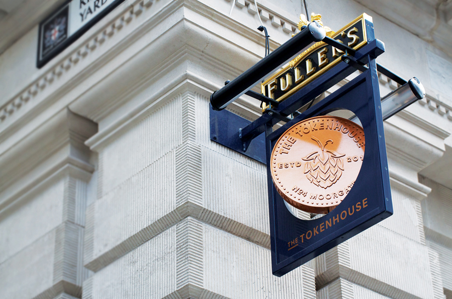
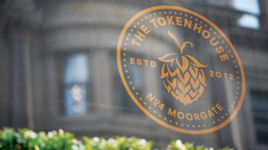
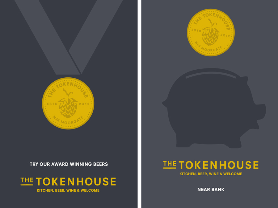
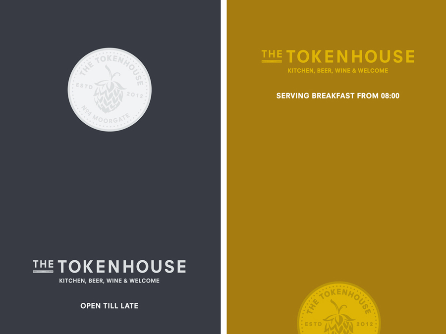
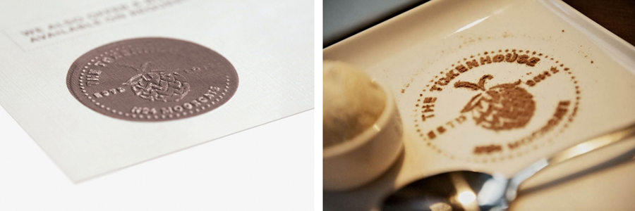
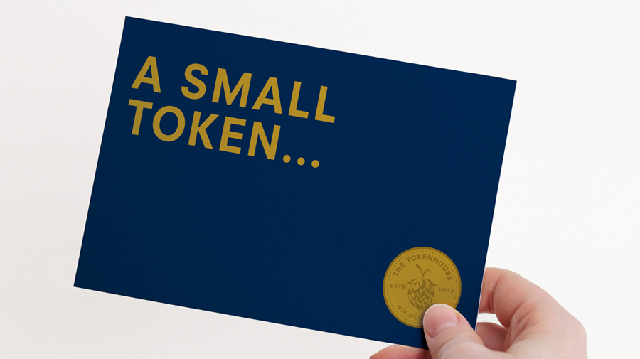
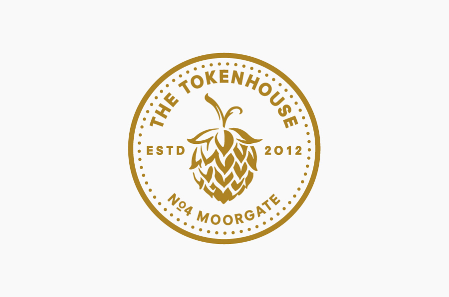
“The Tokenhouse gastropub takes its name from an old city building that distributed farthing pieces, or tokens, during the 17th century. Based on this heritage, we devised a logo featuring a coin bearing the inscription The Tokenhouse – Estd 2012 – No 4 Moorgate. The addition of a beer hop reinforced the brewing connection. Our pub sign featured a spinning coin and we created a stamped coin that could be hand-embossed onto menus, drinks lists and cards. Adapting the coin device to other uses, we also created a set of cards to communicate specific messages. ‘Open till late’ featured a coin representing a full moon, while ‘Serving breakfast from 08.00’ used a coin to represent the rising sun.” – Designers Anonymous
The token, set at the heart of the visual identity, has been well rendered with a good eye for internal space, a smart contrast of fine and heavy, geometric and organic detail, light and shade around the hop and some solid sans-serif letter work along the curved baselines. Traditional elements such as the raised and underlined O, established date and minted format have a period quality which is balanced by a contemporary vector crispness that works incredibly well across the illustrative simplicity of the posters. This contrast of old and new continues with a classic blue and gold colour palette – which has been given a more recent sensibility through the solid, flat colour and the uncluttered space of the collaterals – and the worn, rustic qualities of a partial (perhaps sculpted) emboss across the linen texture of the menu.
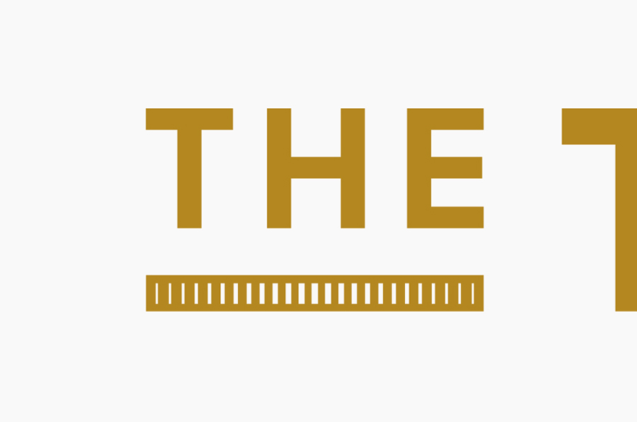
The logotype remains largely very simple but again well executed and provides a more conventional flexibility to the identity. The underline – a coin on its side with etched-style shading – is a really clever and creative feature that ties it to the mark but also to the appropriated history and theme of the pub.
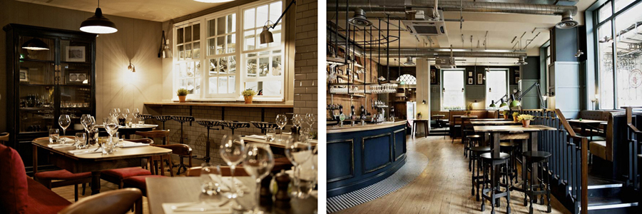
The solution achieves a nice sense of diversity from a simple, cohesive set of assets which fuse past and present values and design finishes to appropriately complement contemporary service and high quality food delivered within a venue filled with the traditional detailing of classic wooden furniture, tiled surfaces and exposed utilities.
