NB Flowers by Karoshi
Opinion by Richard Baird Posted 7 February 2013
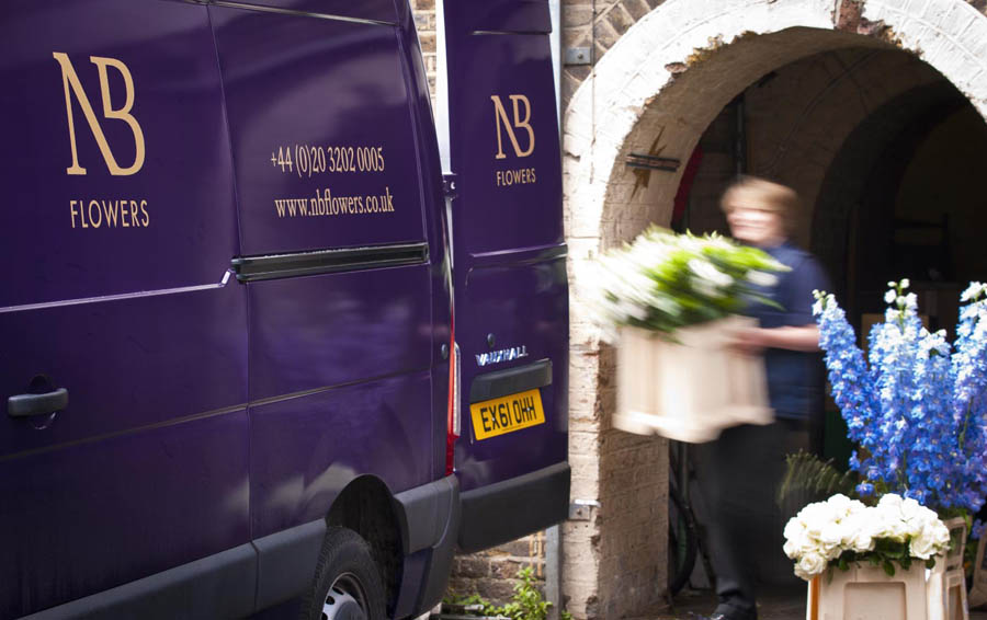
NB Flowers is a florist – founded by Neil Birks and located at London’s New Covent Garden Market – that specialises in corporate and private events, delivering value through a combination of ‘beautiful flowers, creativity, and a personable service’.
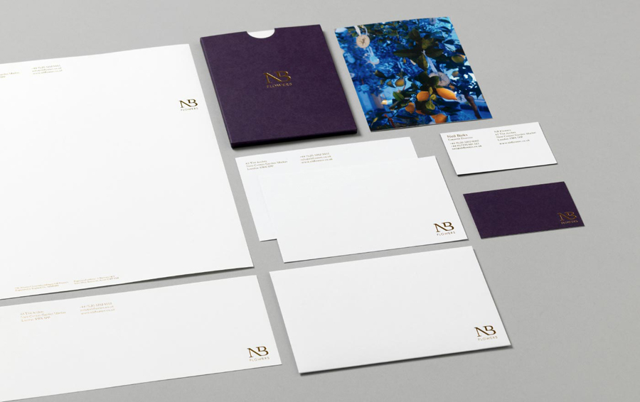
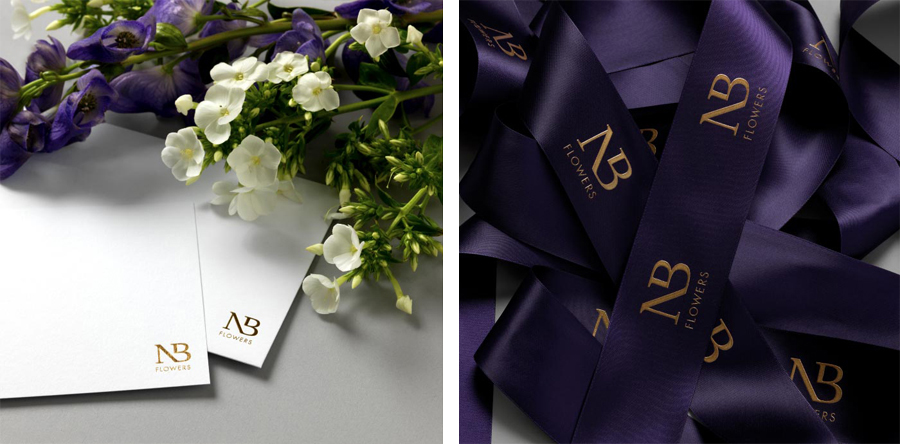
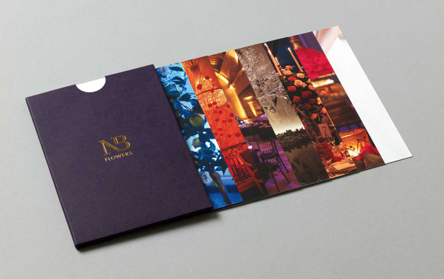
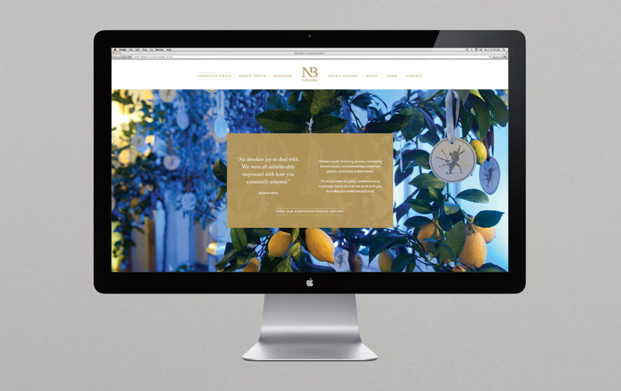
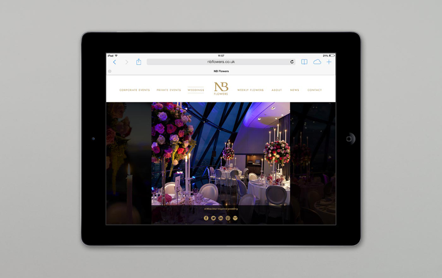
Multi-disciplinary design agency Karoshi were commissioned to ‘rebrand and reposition NB Flowers as one of London’s leading luxury event florists and capture the essence of the brand – classic with a contemporary twist’. In response the agency created a visual identity solution that, through a serif monogram, sans-serif by-line, purple and white substrates and a block foil print finish, delivers a simple and consistent communicative contrast that successfully draws out the organic detail of the photography utilised across NB’s collateral and website.
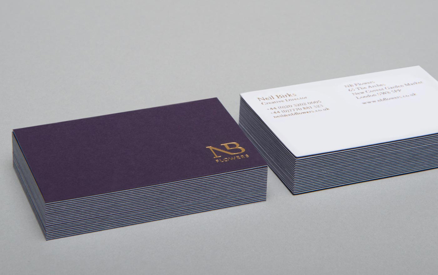
While perhaps not the most natural compounding of two letters, the monogram’s unusual ligature and cut certainly lend the flourishes and classic serif detail of Kings Caslon and the traditional, personal perception of monograms, a more unique, creative and contemporary character. This is juxtaposed alongside the modernistic practicality and professional formality of the well spaced, uppercase, geometric, slim and broad sans-serif characters and even stroke weight of Futura Book. A typeface with the functionality and legibility I tend to associate with wayfinding systems of the past and which feels appropriate for a reliable and time dependant service. The identity’s execution across the collateral – a landscape of dyed purple and bleached uncoated substrates and a gold block foil print finish – united in a weighty duplex business card – establishes a clear union of craft and luxury but with a simple consistency that really enhances the rich, creative and diverse natural qualities of the photography.
