Massproductions by Britton Britton
Opinion by Richard Baird Posted 13 February 2013
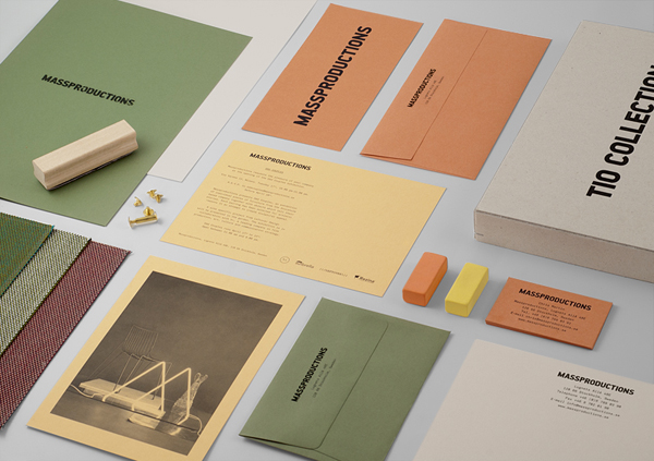
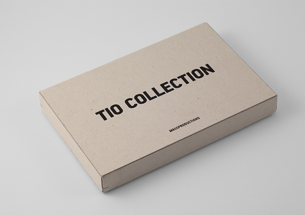
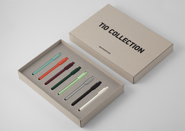
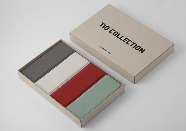
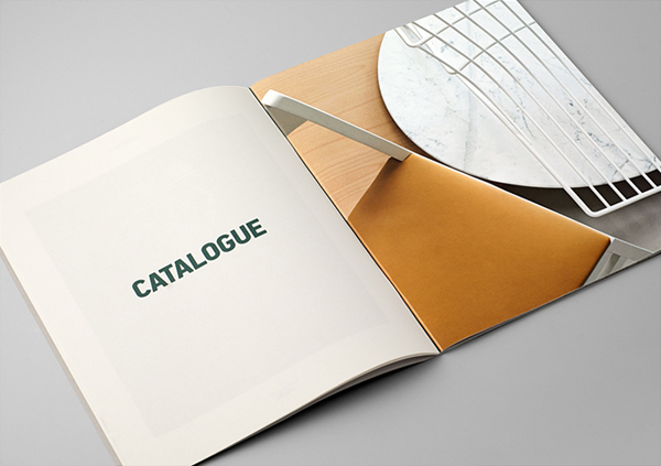
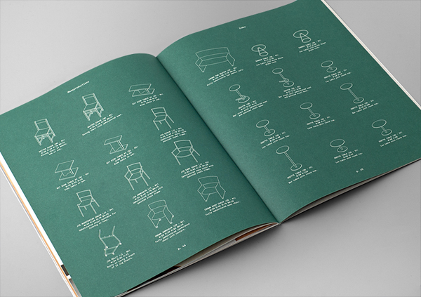
Massproductions is a Stockholm-based furniture company – established in 2009 by designers Chris Martin and Magnus Elebäck – that develops ”high quality, tactile furniture in a modernist spirit’. The firm’s visual identity, developed by creative branding and communication agency Britton Britton, neatly mixes a structural, typographical authority with craft textures and confidently appropriates an upholstered colour palette of the past.
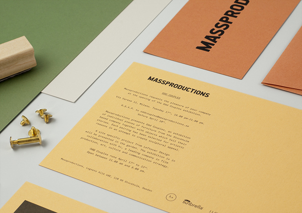
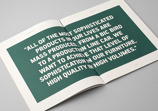
“Our knowledge and passion is in mass production, hence the name. Our goal is to use industrial processes to create furniture which people can get excited about, something that gives them pride of ownership. You can do that with a hand-crafted piece, but for us the satisfaction comes from achieving it with an industrially produced article”, say Chris Martin. The philosophy behind Massproductions is to harness the benefits, values and quality of volume production. We believe that responsible and rational mass production benefits the consumer, the factory worker and everyone in between. With a dignified simplicity we aim to create products that are tactile, considered and modernist in spirit.” – Massproduction
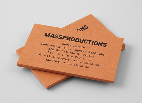
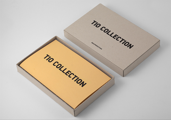
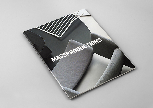
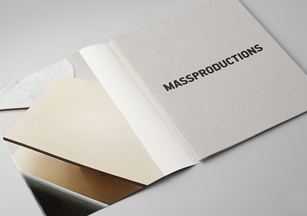
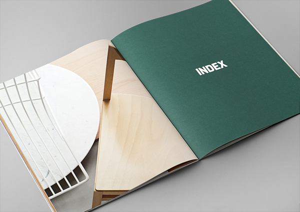
Although very simple, the logo-type, set at the heart of this identity solution, feels largely appropriate for mass-furniture production. Its tightly spaced, tall, uppercase, sans-serif characters, built from recurring shapes and a single stroke weight, have a repetitive consistency – softened slightly by radius of the corners – that convey both an industrial authority and a subtle sense of soft furnishings. The awkward length is well leveraged by an over-sized application across the collaterals and suitably tempered by the generous spacing and small size of a secondary typeface. A choice that adds a practicality and everyday utility that along with the weight of the logo-type (and the expanded typeface) reflect both the functional and statement qualities of modernistic furniture.
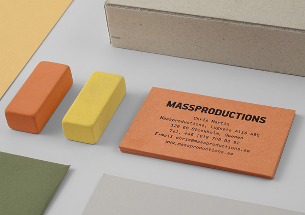
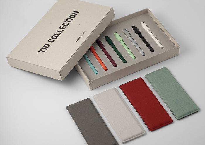
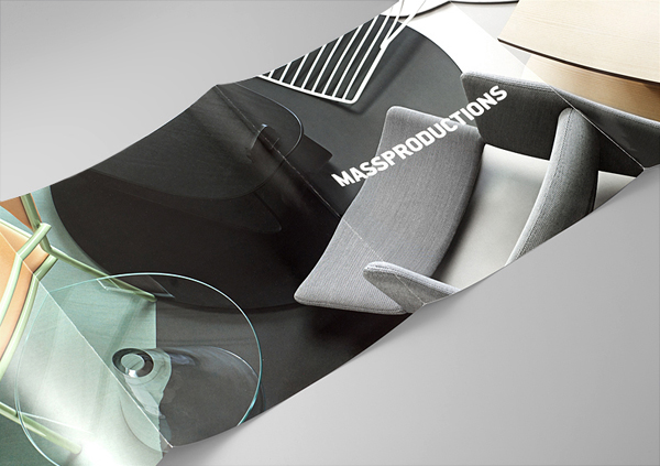
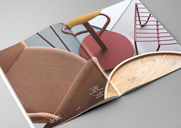
This typographic utility is given a tactile and craft dimensionality through a combination of dyed and unbleached material choices. These appropriate the classic tones of 50’s and 60’s furniture, giving the identity a contemporary and retrospective communicative impact and distinctiveness that suggests an appreciation of design history, its cyclical and aspirational nature. All of these elements are resolved through a contrast of flat colour and heavy type, set alongside rich, full-page photography of the brochure. A direction that works really well to pull out and highlight the finer details of Massproduction’s work.
