One Planet Living by Demian Conrad
Opinion by Richard Baird Posted 18 February 2013

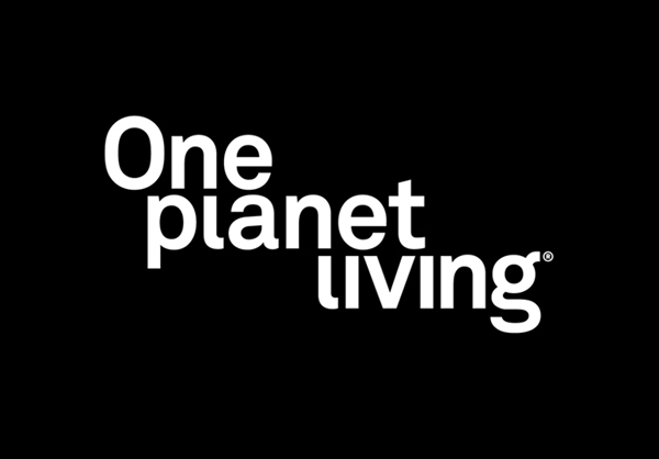
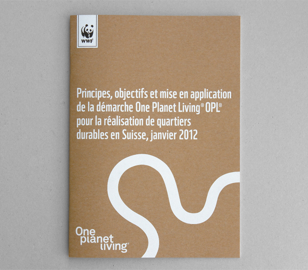
One Planet Living is an initiative to promote sustainable practices and help influence global environmental policies. The initiative’s new identity, developed by Swiss agency Demian Conrad Design, replaces a tired, blue earth, green heart logo-mark and dull typography with a more distinctive and professional logo-type solution, an earthy, unbleached substrate and a contemporary, single white, print treatment.
“One Planet Living is a vision of a sustainable world, in which people everywhere can enjoy a high quality of life within the productive capacity of the planet, with space left for wildlife and wilderness. Organisations around the world are using the one planet living approach to take measurable steps towards genuine sustainability. From zero carbon buildings to procurement policies that support the green economy, one planet living solutions are cost-effective, creative, inspirational and replicable.” – One Planet Living
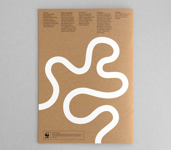
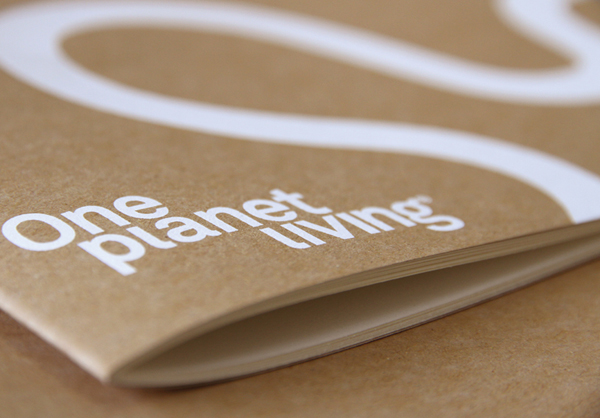
This is a fantastic visual repositioning of an organisation that appeared more like a consumer-facing eco-fashion brand rather than a professional and influential global initiative. Compared to the original identity the slightly elevated x height, corporate neutrality and weight of the new logo-type achieves a bolder and more authoritative character while the all lowercase typesetting tempers this with an accessible, friendlier dimensionality. The sweeping curves of the G are neatly drawn out by the river-like qualities of the illustrative work, adding subtle proprietary detail which perhaps reflect the similarities between meandering water and societal change. The location, cropped stems and missing tittles of the L’s – enhanced by the staggered structure of the logo-type – provide a strong link and flow through each line of type with a reductionist approach that works well to resolve the themes of integration, cohesiveness and a logical, step-by-step approach to policy change without the need for superfluous detail.
A monochromatic colour palette alongside the natural, unbleached qualities of the collateral and white print treatment confidently avoids the blues and greens typically associated with small foundations and appropriates the restraint and honesty of the larger, more influential organisations such as the WWF. Neatly balancing formality and effectiveness with the initiative’s ecological credentials.
