Guy Bauer by Anagrama
Opinion by Richard Baird Posted 20 February 2013

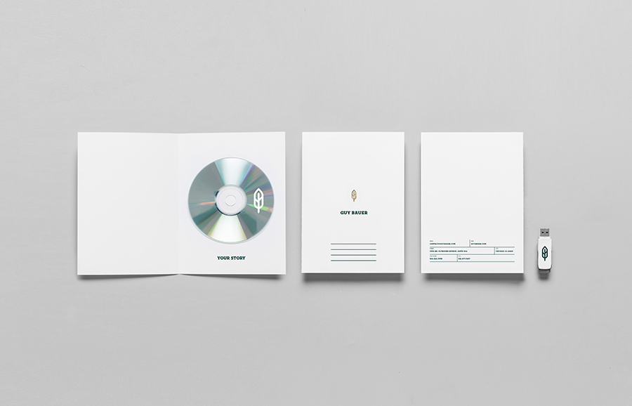
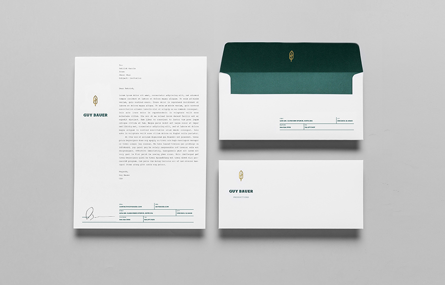
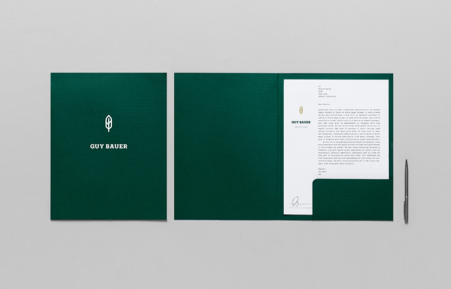
Guy Bauer is a Chicago-based video production company ‘committed to creating stories that elicit feelings’. The company’s new visual identity, based around a quill logo – conveying their story-telling philosophy – a stationery solution that references the film industry in its layout and a deep green color palette, designed to convey depth and reliability, was recently developed by independent design agency Anagrama.
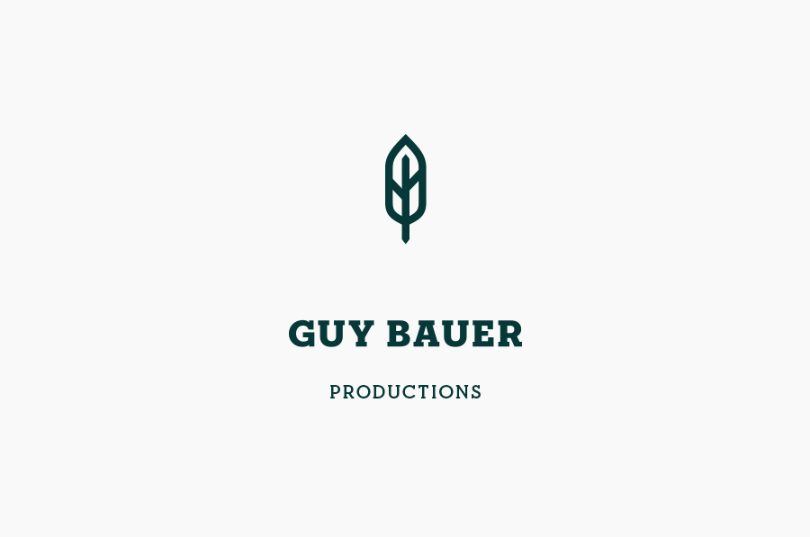
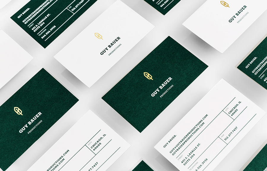
Although the logo-mark sits at the head of Anagrama’s project page, it is the layout and logo-type that really resonate with me. The typographical weight, uppercase characters and slab serif detail – neatly referencing public communication of the early 19th century – executed with the contemporary twist of a single, consistent stroke width, some solid character and line spacing, has a weighty authority and a subtle conceptual depth.
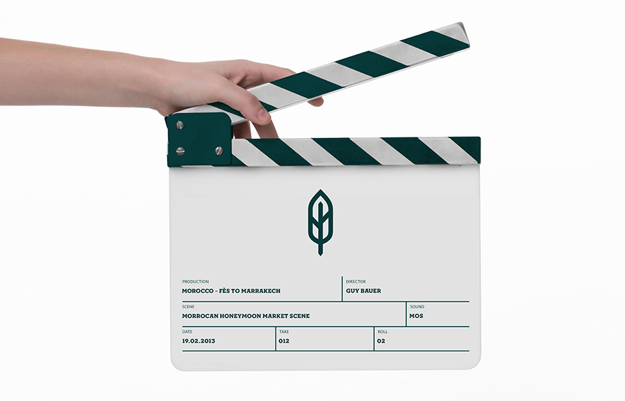
The logo-mark shares similar qualities in its more recent, reductionist resolution of a historic reference (a quill) and adds a personal and story-telling relevance. It however feels a little superfluous and perhaps a touch abstract compared to the more compelling, communicative and distinctive elements of the business card’s clapperboard layout and the screenplay-like sensibilities of the letterhead.
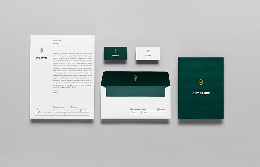
The colour palette is a smart mix of a single spot green, uncoated, embossed material texture, what looks like a gold block foil and ample white space. Again a smart juxtaposition of past and present that comfortably unites a sense of knowledge, experience and the perception of high quality with a modernistic restraint.
