February’s Top 5 Projects 2013
Opinion by Richard Baird Posted 1 March 2013

Longton is a Melbourne-based multidisciplinary design studio, established in 2012 by Michael Longton, that offers its clients holistic design solutions built on Michael’s past experience – under his previous agency And – with large, international businesses such Sony Music, Billabong, Stussy and Warner Music. The studio’s visual identity – an unusual, modernistic arrangement of neutral sans-serif characters, recurring circular forms and a single consistent line weight – has a reductionist quality with the underlying qualities of a logic game or mind map. Its expanded letter-forms – isolated by generous spacing but collectively united by the container – establish a simple, proprietary value that perhaps reflects the arrangement or coming together of external sources – be that information or experience – into a single and cohesive resolution.
Read the review here.

Level Improvements is a small-scale builder that possesses, in the words of Hi Ho – the studio responsible for their new identity – a characteristic often lacking in others in their field — a high level of craft and attention to detail. To reflect these values, Hi Ho developed a ‘easily managed and straight talking’ visual identity solution that leverages the similarities between an uppercase L and a carpenter’s square – a measure of straightness and a steady hand – and isolates it with a typographical quirk to convey both continued consistency and a sense of individuality that distances it from other unreliable services.
Read the review here.


Minke is a Spanish print production studio that favours ’analogue splendour’ over mass manufacture, providing its clients with a variety of small-scale, mechanical and handcrafted processes.
Their visual identity, developed by multidisciplinary design studio Atipo, reflects their services and philosophy through a union of traditional and contemporary material textures, print finishes and die cut detail across the collateral. A sharp juxtaposition of an abstract, geometric mark layered with subtle, slightly reaching brand expressions, the editorial flourish and friendly informality of an all lowercase, italic logo-type, the technological sensibilities of the iconography and the creative detail of the pattern work. Elements united by the restraint and timelessness of a monochromatic colour palette and the more recent energy of bright, spot colour highlights.
Read the review here.

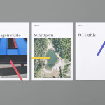
Tegn_03 is a Norwegian, multidisciplinary, architectural design studio that, through inclusive methods, process-oriented and competent project management, deliver holistic solutions that encompass the fields of architecture, planning and landscape, to large clients across Scandinavia. Their visual identity, developed by Neue, draws together the themes of technical knowledge, structure, connections, collaboration and creativity through neutral typography, a modular and expanding geometric pattern, tactile and reflective print finishes, ample white space and the more unusual, playful addition of colour and the engagement of an interactive image generator.
Read the review here.

The Tokenhouse is a gastropub – run by hospitality brand Fuller’s – located on London’s Moorgate road. Designers Anonymous – the agency behind the branding of Fuller’s King’s Cross pub venture The Parcel Yard and fair-trade coffee range Brewer St. – developed a visual identity for the venue that appropriates 17th century history, gives it a contemporary vector treatment, a creative but cohesive diversity throughout the print work and a high quality finish across the exterior signage.
Read the review here.