Factor Negen by Red Thumb
Opinion by Richard Baird Posted 6 March 2013
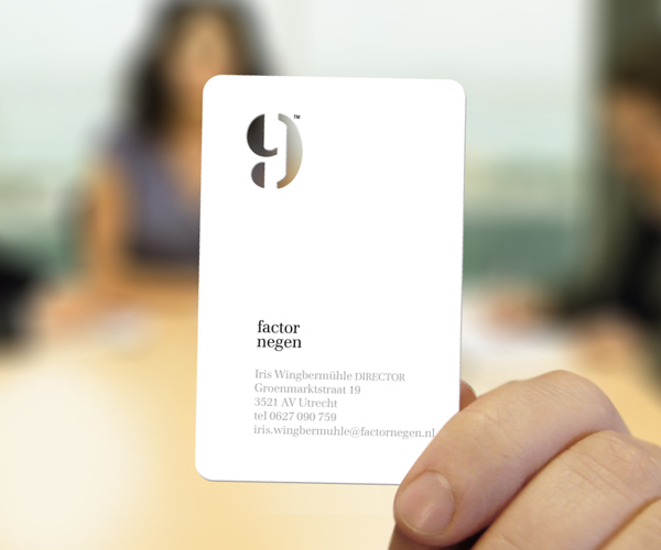
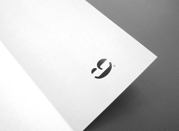
Factor Negen (Factor Nine) is a Dutch firm that assists in the connecting of people with employment opportunities and provides training services to business and individuals with a specific focus on personal and professional growth within the context of teamwork. The firm’s visual identity and stationery solution, based around a logo-mark that unites stencil cut detail with the accessible qualities of a face, was developed by multidisciplinary design studio Red Thumb.
As a nine the mark is well rendered, it has a nice sense of positive and negative space, an authoritative weight and vertical alignment. Its basic construction, stencil-cut utility and monochromatic colour palette has a elemental functionality that works well to convey a practical/pragmatic approach. This is countered by the friendlier and more humanistic aspect of the face – eyes and nose neatly picked out by shadow – cleverly drawn out of the mark through a change in orientation and die cut detail across the business card. The logo-type shares a similar two-sided nature, fusing the long-standing professionalism of a classic, well-spaced serif with the informality of all-lowercase typesetting.
Although ‘logo-centric’ the project manages to achieve a simple communicative dimensionality – through simple observation and the natural, unforced duality of the typography – that resolves the pragmatic approach to providing and training people for team-based businesses without appearing too playful or superfluous.
