The Cannonball by Lo Siento
Opinion by Richard Baird Posted 11 March 2013
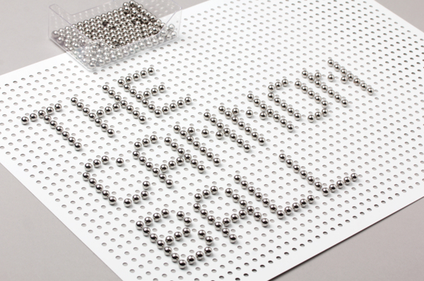
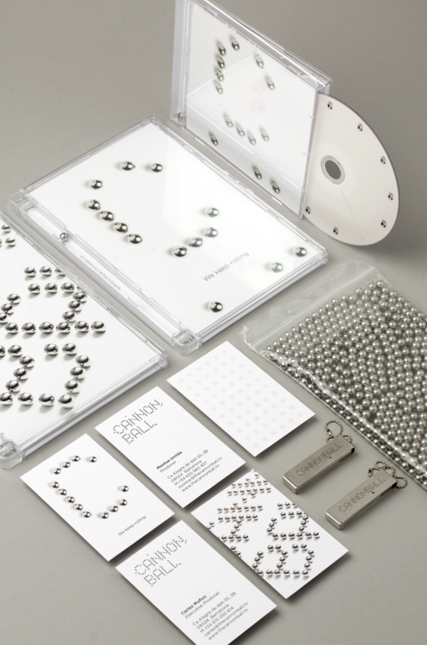
The Cannonball is a Spanish production studio that develops ‘creative and sophisticated audio-visual narratives’ within the fields of broadcast television, photography, social media, fashion films and motion graphics. Their visual identity, developed by Barcelona-based brand and graphic design agency Lo Siento working in collaboration with Dave Sedgwick, utilises a ball bearing, grid-based concept to give the associated force of the name a precision and a practical sense of creativity.
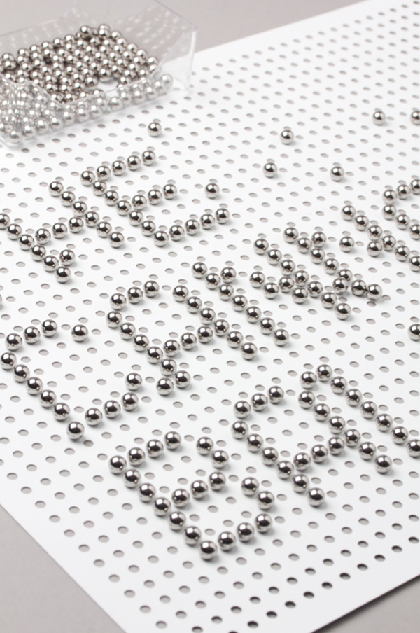
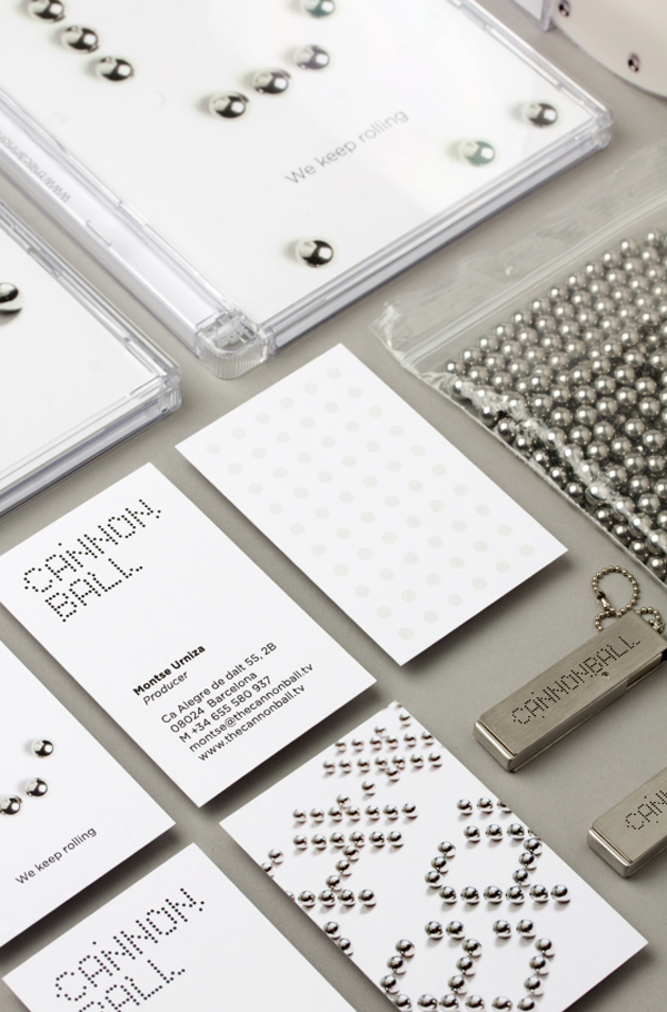
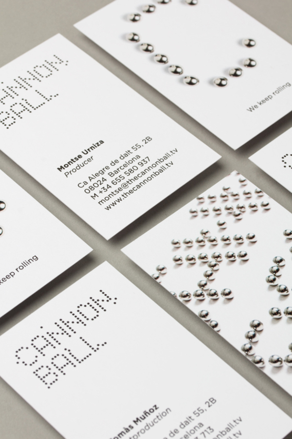
Like many good identity solution this draws distinction from a communicative contrast, juxtaposing the weight and impact of the name alongside the far lighter medium of ball bearings. And although I am not particularly keen on logotype – isolated it has the qualities of a faulty dot-matrix sign – it conveys, within the context of the collateral, a similar union of ideas through an uppercase confidence/authority and an amalgamated, modular construction.
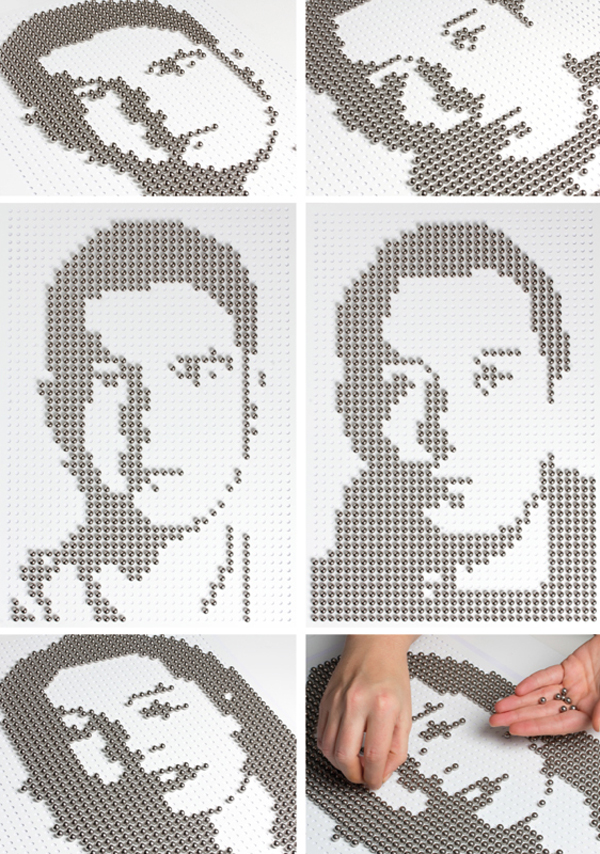
The photography provides an interesting real-world quality. Adding a sense of physical, playful activity and exploration – rather than a static behind the screen process. A dimensionality that reflects the nature of screen work and appropriately leverages the dexterity and patience required to work with such small elements to reinforce the theme of detail.
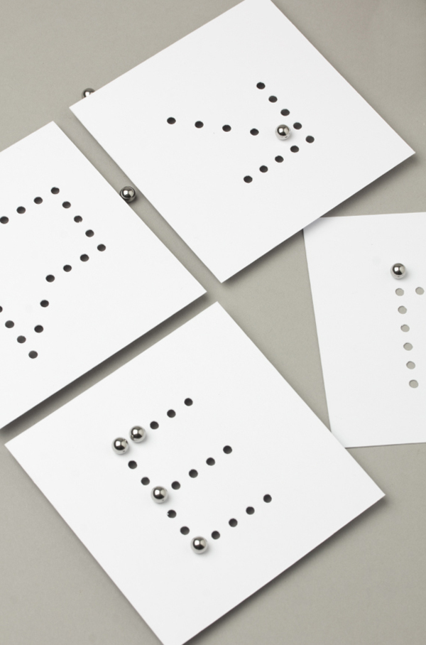
Even though the ball bearings are bound by the limitations of a die cut grid-based structure, the profile pictures show a degree of imagination and the extent to which the concept still has a flexibility. Essentially the ability to generate creative ideas within an established format.
