Newscope Films by Karoshi
Opinion by Richard Baird Posted 15 March 2013
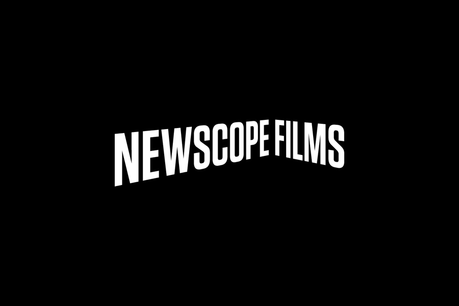
Newscope Films is an independent, UK-based producer of feature films, television programmes and micro-budget movies for an international market. United by their mission to develop innovative, highly conceptual and original genre films, multi-disciplinary design agency Karoshi created a ‘progressive new identity solution which would capture this brand spirit whilst remaining accessible to a broad audience’.
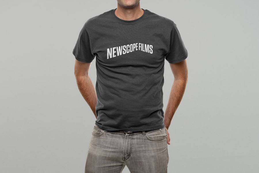
Taking inspiration from the company’s name and approach, we developed a visual play on the notion of a unique perspective. The dynamic identity solution evokes the movement of the animation with typographic inspiration being drawn from large-scale, three dimensional type heritage within film and cinema. The identity employs only black and white and each logotype is constrained to the maximum proportions of 2.4:1 – the current cinema widescreen standard.” – Karoshi
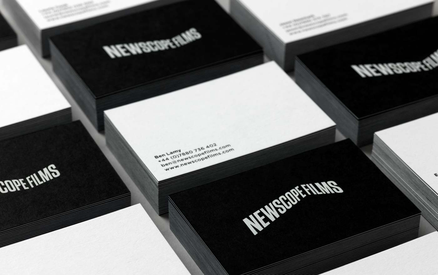
The logotype’s dimensional twist on an enduring typographical choice, set within a ‘widescreen’ frame, is a simple but smart concept that neatly draws together past and present, and perhaps hints at the increasing prevalence/recurrence of 3D in modern cinema.
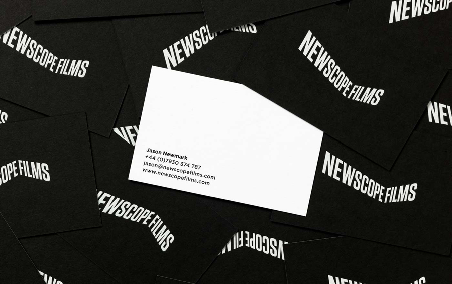
Although the ‘S’ has a subtle 60’s sci-fi sensibility the rest have a well-spaced near neutrality, and collectively, a tall, heavy and uppercase conviction — reminiscent of CinemaScope, Videcolour and Supermarionation — that avoids appearing genre specific. This is enhanced by the monochromatic and typographic restraint of a weighty, duplex business card.
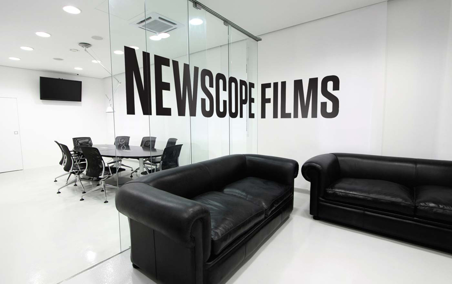
The application of the identity across the right angled surfaces of the office space, the use of a logo animation and a static multiplicity introduce a creative and engaging variation that works well to encompass changes in physical perspective, whether that be in an auditorium or on set, differing opinion, production techniques and approaches.
