Triticum by Lo Siento
Opinion by Richard Baird Posted 25 March 2013
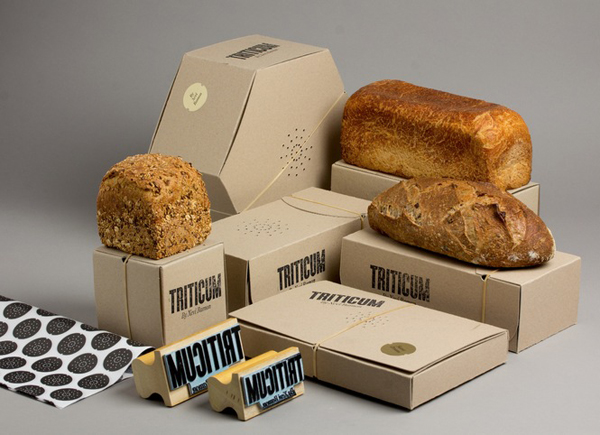
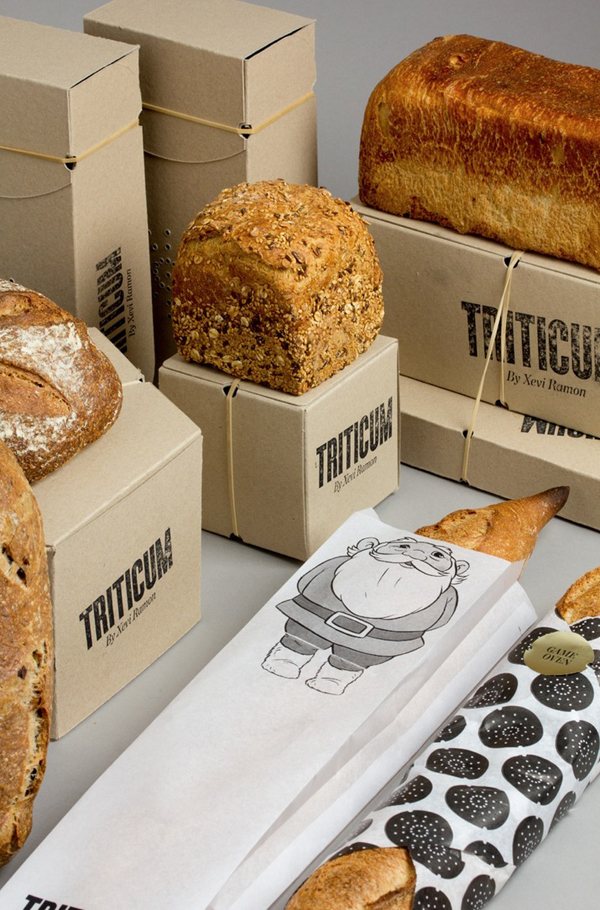
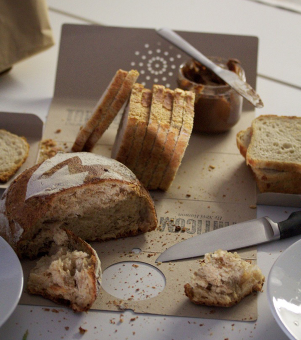
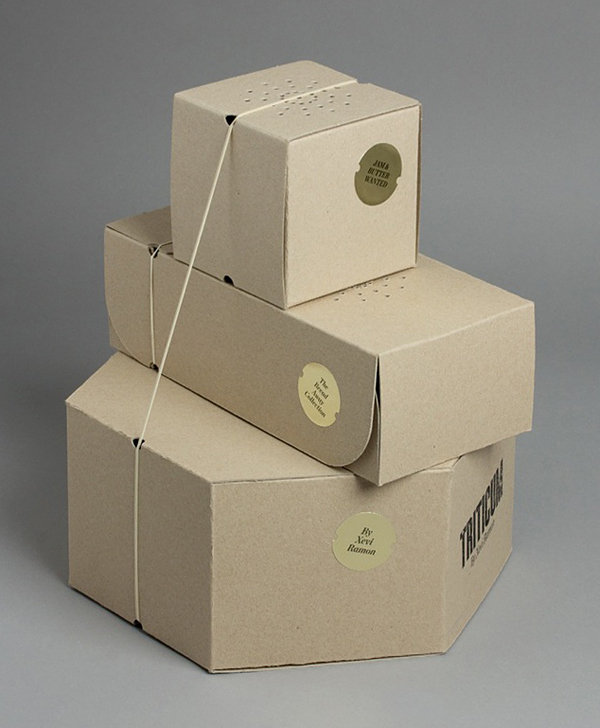
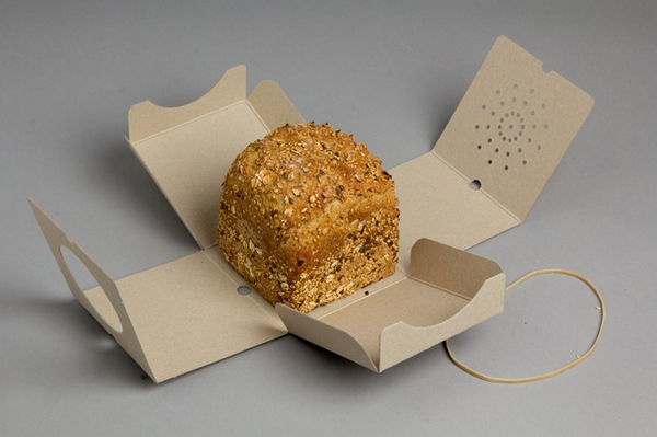
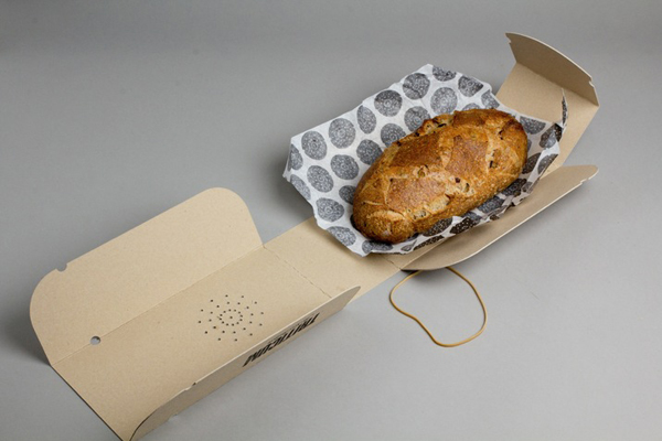
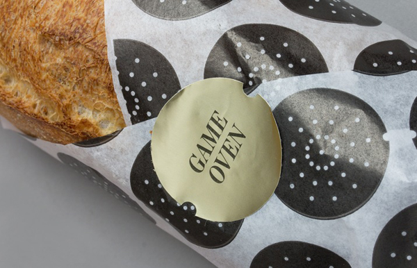
Lo Siento have recently completed branding and packaging work for Triticum, a Spainish bakery founded by Xevi Remón. Based around a combination of a weighty, uncoated, unbleached substrate, rubber band, sticker, stamp and greaseproof paper. The structural design solution delivers a familiar, earthy, traditional and practical sensibility alongside the more distinctive and proprietary qualities of a non-adhesive, product specific form that allows the boxes to completely foldout. A smart concept that unites commodity and craft, and treats bread making with the same reverence as cakes and pastry.
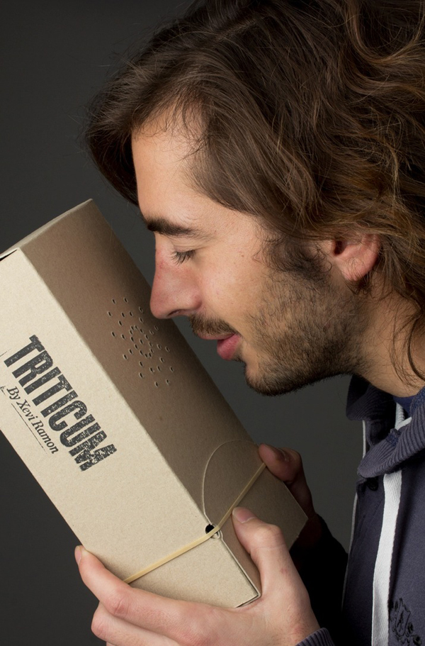
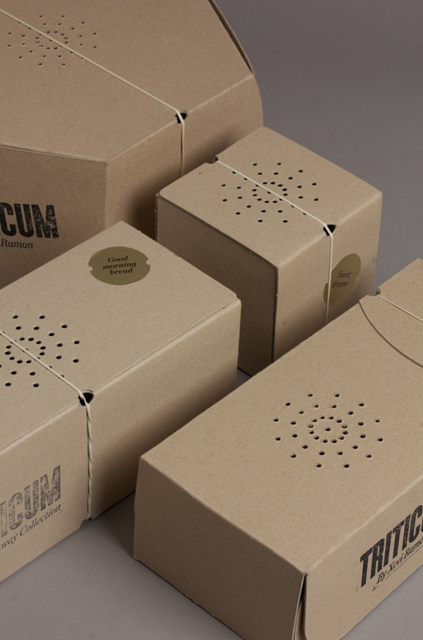
The radial die cut across the top – also utilised as a simple printed graphic element – is a neat idea that takes ownership of a functional and sensory detail that allows moisture and aroma to escape and establishes it as a brand-mark. Placing an everyday, freshly baked experience at the centre of the identity with the simplest of treatments. A more conventional logo-type built from bold, tall, uppercase, wood-block, stamp-based characters mixes authority, craft and local industry while the gold sticker adds a subtle sense of high quality.
