Addition by Thought Assembly
Opinion by Richard Baird Posted 26 March 2013

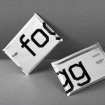
Addition is a new Australian digital development group who recently commissioned graphic design studio Thought Assembly—formally Studio Verse, the agency behind Addition director Zann St Pierre’s personal logo-mark reviewed on BP&O back in 2011—to develop a visual identity and business card solution.
Based around a generously spaced logo-type built from consistent, single line weight sans-serif characters with unusual cuts and omissions—an abstraction that leaves room for ‘addition’—the logotype delivers a proprietary twist to a familiar neutrality with a underlying sense of construction that, alongside the finer technicality of a grid detail, could form the basis of something a little more expansive in the future. A neat triplex business card made from a tactile, uncoated, navy blue material choice with a white centre and a blind emboss, tempers the ‘unfinished’ and conceptual nature of the logotype with a corporate professionalism and the technological subtlety of an electric blue print treatment on the reverse.