Saxa by Graphical House
Opinion by Richard Baird Posted 6 May 2013

Saxa is an independent on-line dealer, publisher and commissioner of original and editioned works from international artists with differing perspectives and cultures, taking a curatorial and collaborative approach to make these available to collectors, galleries, institutions and the general public.
Saxa’s visual identity, created by UK-based design agency Graphical House and inspired by crystalline structures, conveys the idea of buyer and artist networks through the coalescing and interconnected forms of an abstract logo-mark which has been applied to a wide range of stationery, packaging and marketing materials as well as a responsive website.
The logo-mark’s vortex of twisting geometric shapes, square boundary and balance of positive and negative space could be viewed as largely abstract but the connections that bind the four separate strings, each beginning with an arrow pointing either north, south, east and west, and the motion of an animated gif, could perhaps be perceived as neatly unifying the themes of collaboration, extended networks and the gathering and dissemination of ideas.


The generously spaced, lowercase and condensed sans-serif letterforms of the logo-type are given the height and authority you might typically associate with uppercase characters with a simple reflection of form between the S and the A that make it appear intentionally reductionist in its construction much like the mark. It is hard to divine any particular communicative value from the arrangement so far as being contemporary and distinctive but the response nature of the two components – expanding and contracting depending on the height of the canvas – add a slightly more dynamic nature to the uniformity and structure of the identity.

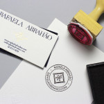
Fine texture across the surface of the business card and the hand finish of a blind deboss add a tactile and subtle craft dimensionality while a cool, icy blue colour and a typewriter slab-serif introduces a economical restraint and utility that, like any good gallery, neatly frames the diverse and organic nature of the artwork through stark contrast and a predominately aesthetic neutrality.