Podi by Bravo
Opinion by Richard Baird Posted 27 May 2013
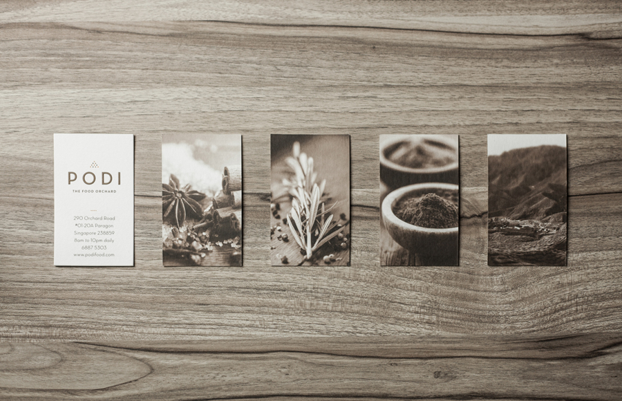
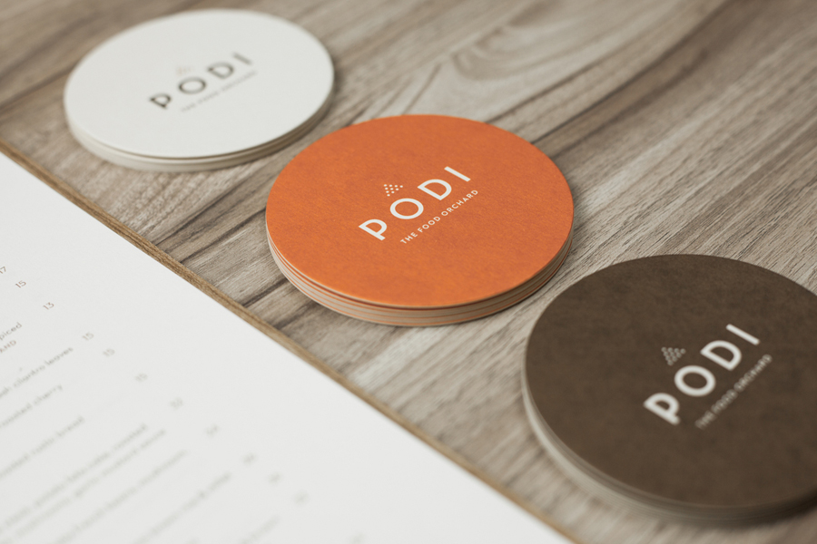
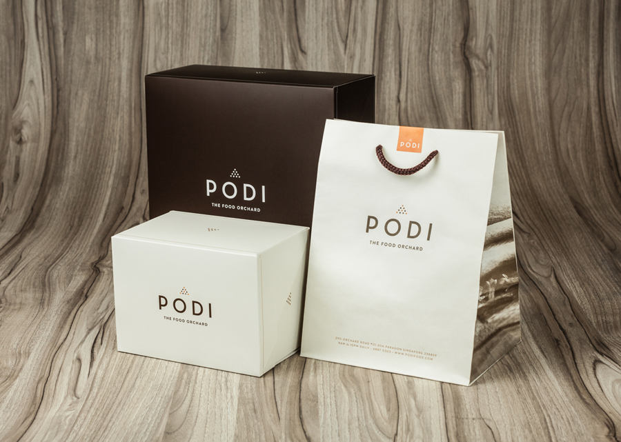
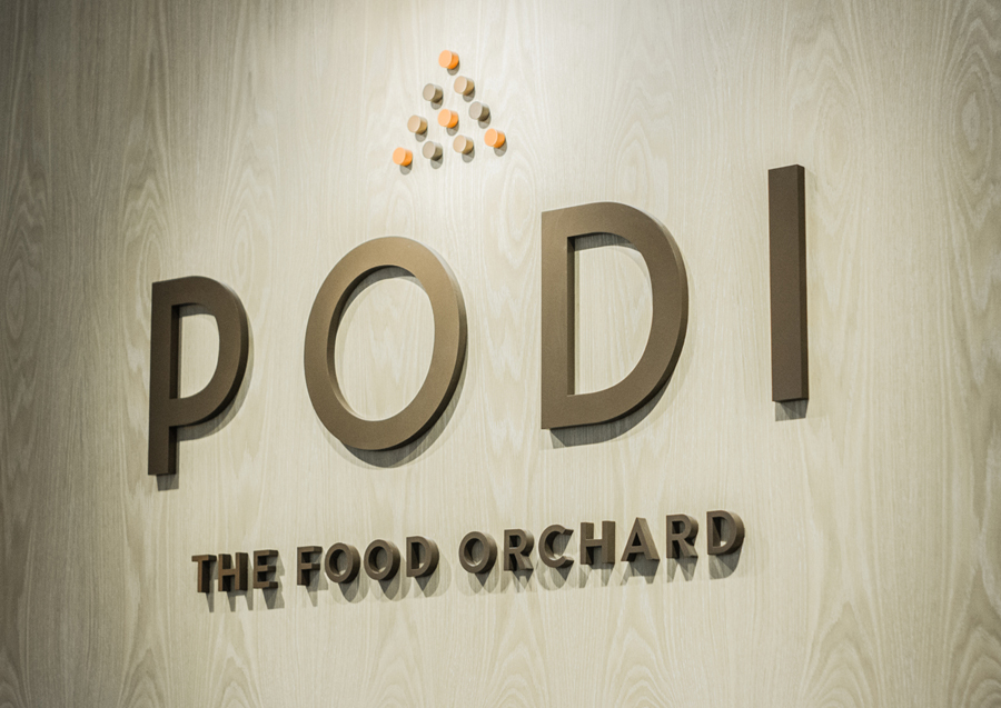
Podi is a Singapore-based organic restaurant that ‘celebrates bold, robust and unique flavours’ and the responsible sourcing and cooking of ingredients. Drawing inspiration from the restaurant’s name, a Hindi word to describe a mixture of ground dry spices and herbs, design agency Bravo developed a visual identity that pairs a small, abstract interpretation of heaped spices with a bold logo-type, earthy tones and tinted imagery to reflect Podi’s mission of making ‘good, natural and organic food’.

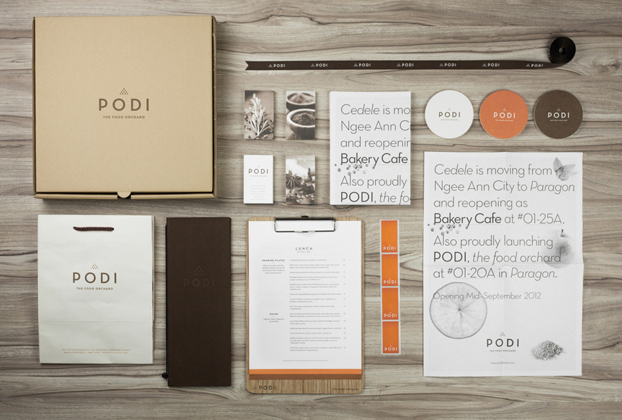
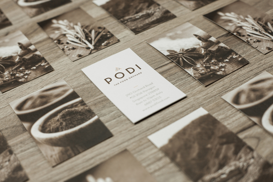
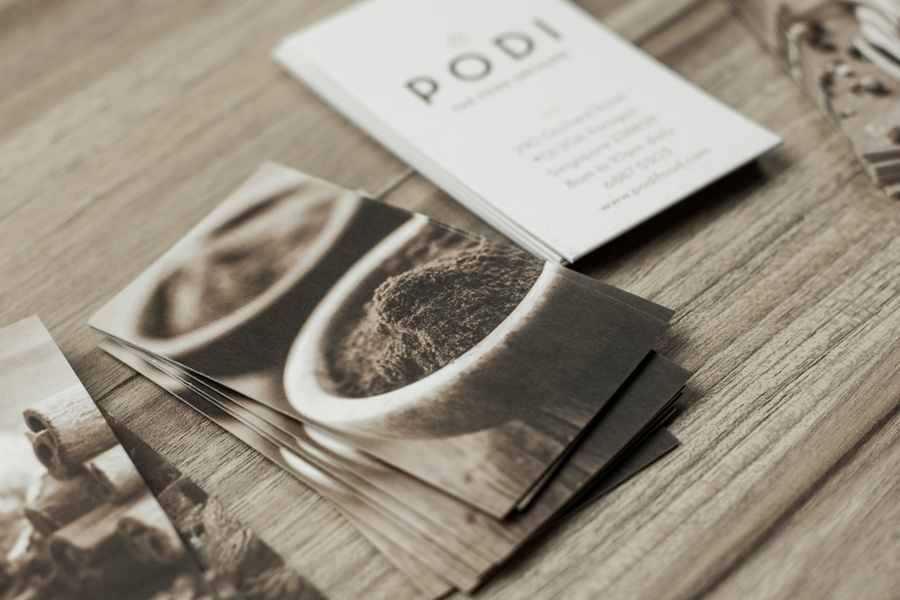
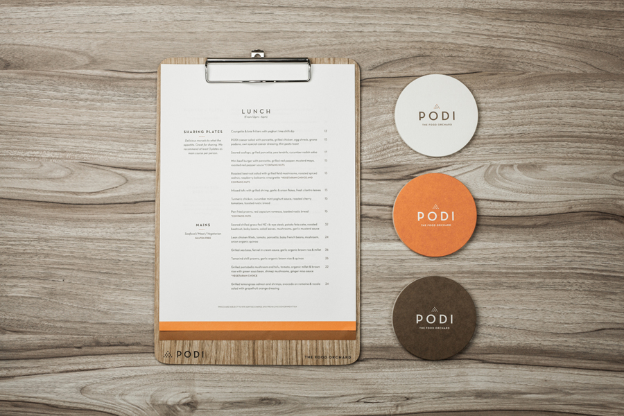
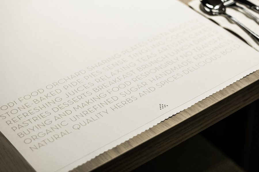
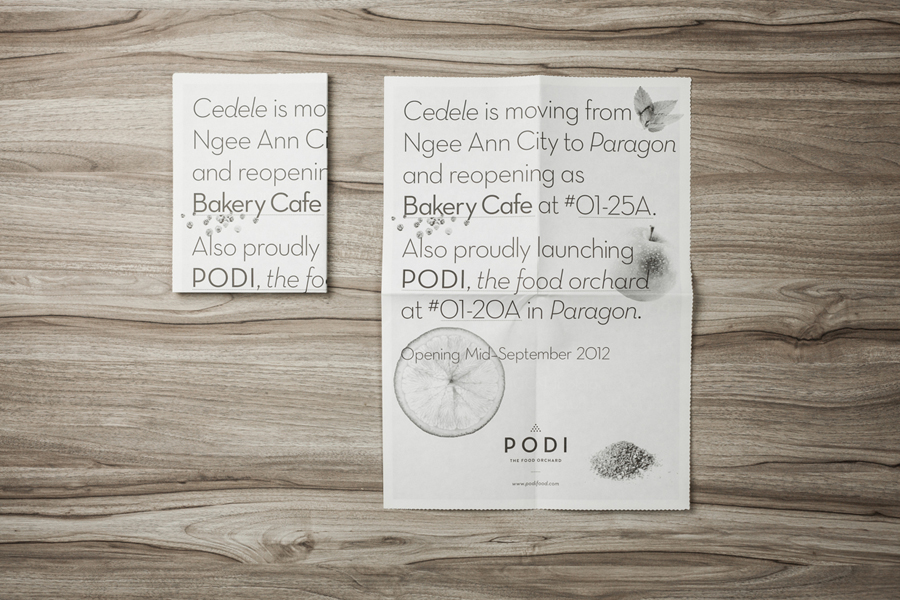
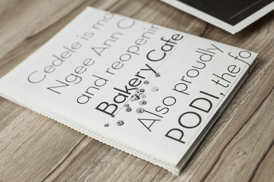
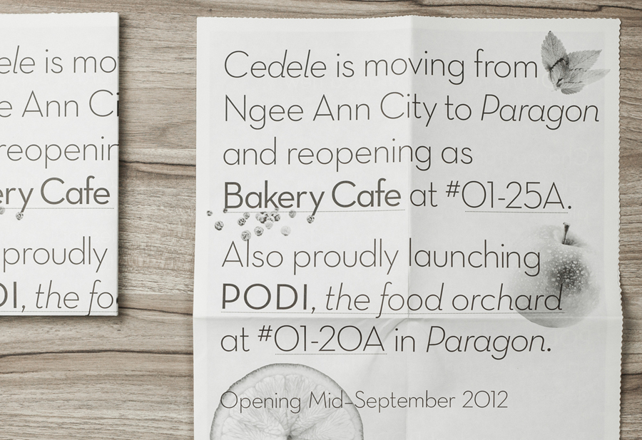
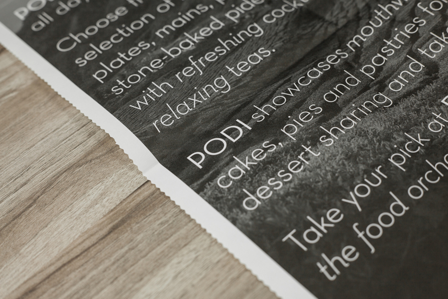
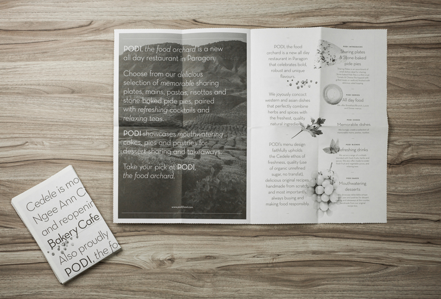
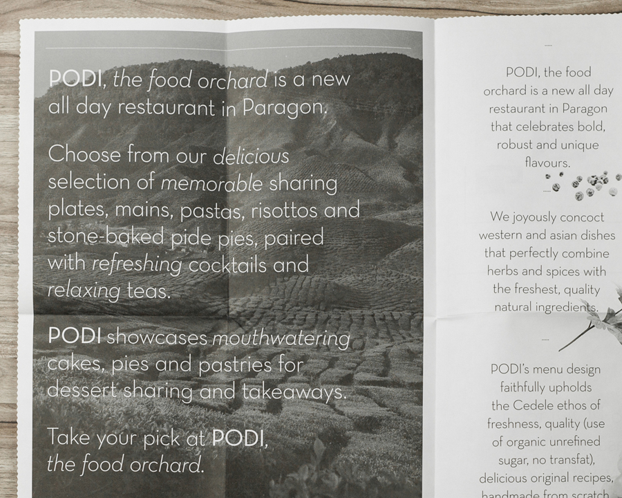
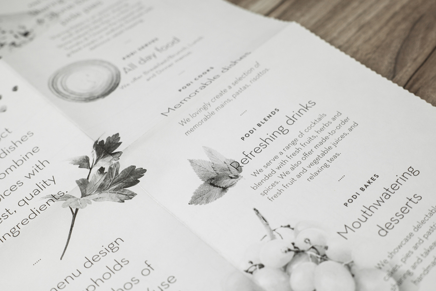
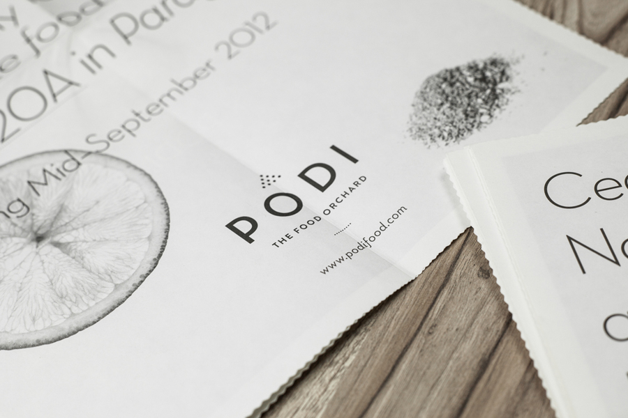
The simplicity of an uppercase logo-type built from an on-trend combination of single stroke width geometric sans-serif characters, laid out with plenty of line and character space, and the finer detail of the logo-mark above – a contrast that perhaps reflects bold flavour achieved through careful spicing – are juxtaposed alongside the richer detail of full bleed photography. These intelligently balance the theme of elemental base ingredients and a ‘from scratch’ philosophy, also reflected by the isolated fruits, herbs and spices of the marketing materials, with landscapes that depict their natural untouched provenance. These introduce a nice aesthetic and communicative depth to the straightforward professionalism, consistency and quality conveyed by the logo-type and a type-based print direction.
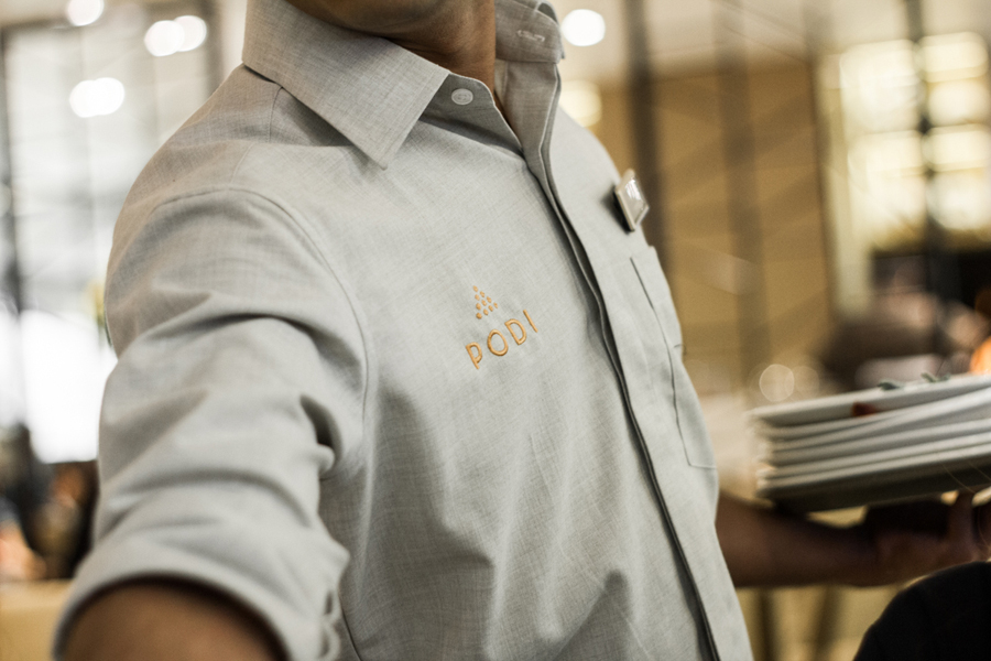
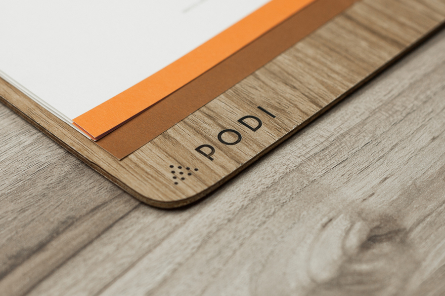
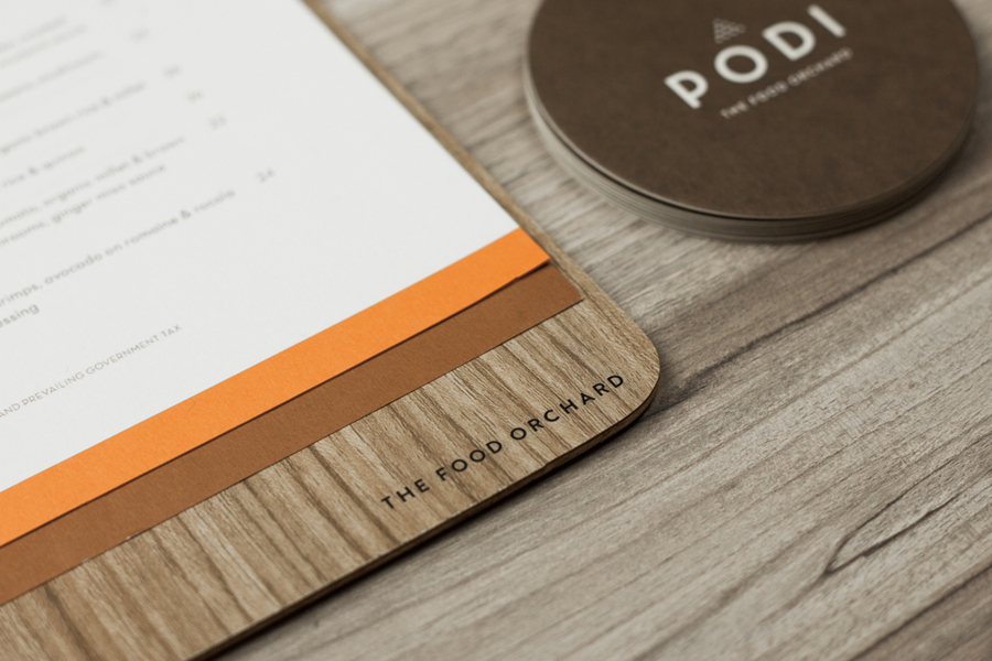
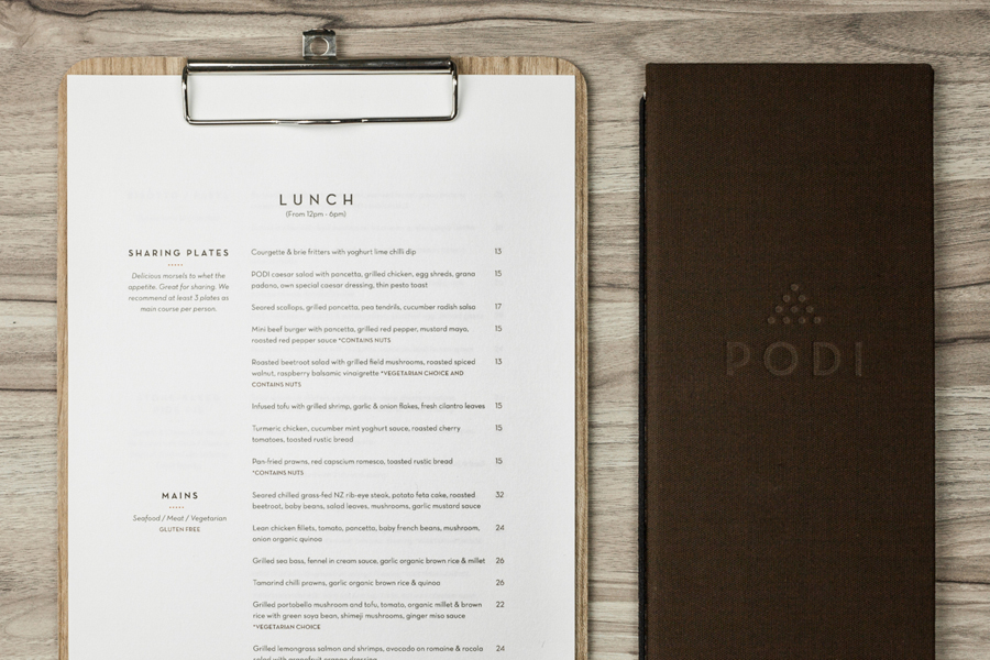
The photography, identity and typography are neatly bound by the economical but contemporary sensibilities of a limited colour palette of soil brown and spicy orange set across an uncoated kitchen white, and the material choices of wood, fabric and unbleached boxes that add an earthy and tactile experience.
