Nordic House by Anagrama
Opinion by Richard Baird Posted 12 June 2013

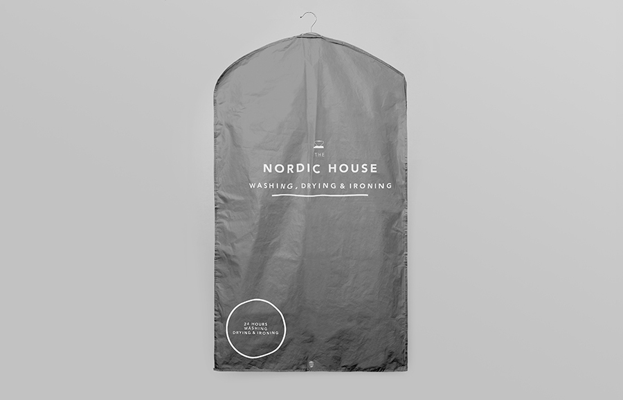
Multidisciplinary design agency Anagrama have recently completed the visual identity for yet-to-launch dry cleaning shop Nordic House, who alongside their cleaning service sell scented soaps and undershirts. Anagrama describe their approach as focusing on Scandinavian design by combining “simple geometric forms with a clean, sharp, well-distributed logotype and an icy, cold color palette” of snowy white, chilly grey, pine needle green and fresh salmon to “create a cool nordic landscape complete with its pure, immaculate and undisguised scents”. Alongside iconography “designed with a stark and reductionist style” the solution “captures the brand’s elemental emphasis on honesty, clarity and above all, quality.”

Barring the landscape photography above, this project is perhaps not as Nordic as Anagrama think, they have however managed to extract a distinctive and proprietary quality from the utility of salmon pink and deep military green substrates, a typewriter slab-serif, generously spaced, clear but largely neutral sans-serif typography and the authority of uppercase letterforms and heavy underlines.
It is stark and impersonal but with an efficiency, honesty—through a lack of superfluous detail—and what might be described as a contemporary design sophistication in its restraint that provides it with a sense of reliability and consistency. A predominantly white colour palette and spacious layouts give it an appropriately clean and pressed sensibility that along with the type choices set it apart from what could be seen as a visually haphazard industry.
I cannot help but see, in the combination of the iron at the top and centre-aligned, consistently weighted, uppercase sans-serif typography, a little of the now ubiquitous British public information posters of WWII as well as ration packs and official documents from a similar period. So although in my opinion it misses a modern Scandinavian aesthetic, I do not believe you can really distill such an approach/philosophy/reference down to a union of space and a broadly-spaced sans-serif, for an American audience a broader European quality may still provide the differentiation, through importation, and the perception of high quality Anagrama were aiming for.