Mark Cappellino by Perky Bros
Opinion by Richard Baird Posted 17 June 2013
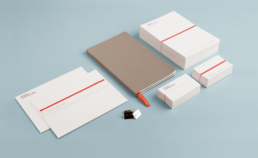
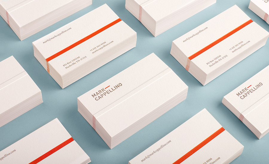
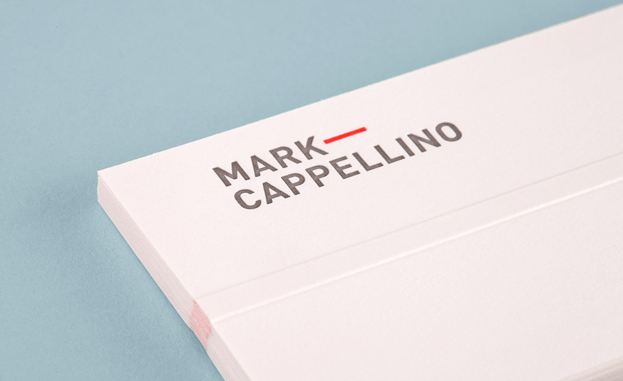
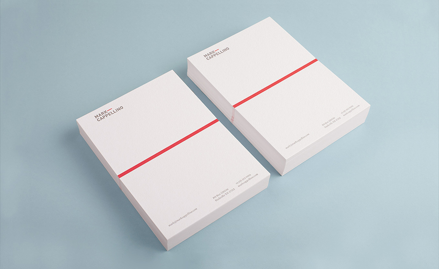
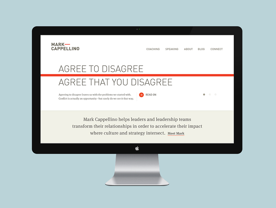
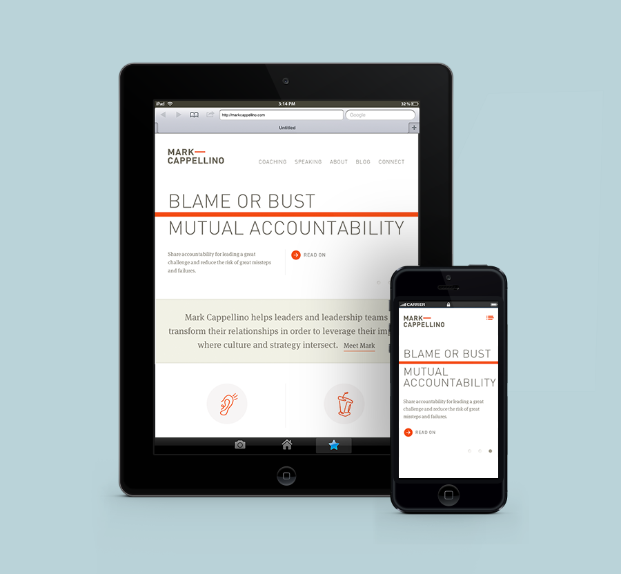
Mark Cappellino is described by Perky Bros, the Tennessee-based studio behind his new logo and stationery, as a leadership consultant who travels the worldwide helping individuals and teams better communicate through stronger relationships. Their design solution, “based on the behavioural beliefs that shape his practice”, “plays on the typographic device called the em dash, meaning an interruption of thought” and “comes to life as a red thread which according to Chinese legend connects all of us—tangling, stretching, but never breaking.”
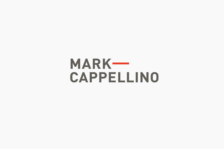
The em dash, while having a relevant but slightly abstract conceptual foundation, provides an interesting and proprietary interruption – one that neatly expands and contracts across the stationery and website – to a logo-type that conveys a conventional but professional corporate efficiency through its generously spaced, uppercase, sans-serif characters. This has been given communicative dimensionality through its execution across the tactile and high qualities of a bright white cotton, letterpressed business card with a striking red spot colour and the loose illustrative iconography on-line, a solid but restrained combination of details that introduce a personal, creative and crafted sensibility to the formalities of the type.
