Designers Anonymous by Designers Anonymous
Opinion by Richard Baird Posted 28 June 2013

Designers Anonymous is London-based multidisciplinary design agency with global clients from a variety of sectors. The agency has appeared on BP&O on a number of occasions, with highlights including their packaging work for Zest and Patchett’s, and their identity work for Fuller’s hospitality brands The Parcel Yard, The Tokenhouse and Brewer St.
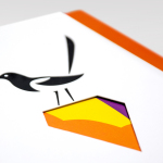
Following the launch of their new website this week, Designers Anonymous has published images of their new visual identity system. Based around large symbols and sans-serif type, plenty of space and a neat print finish, this new identity communicates, in an unusually efficient but also playful manner, the goals of the agency.


This is an incredibly smart idea that manages to extract relevant communicative value, subtle humour and distinctiveness from well rendered but largely ubiquitous forms. Their bold, oversized and monochromatic application across the stationery appears both confident and restrained, and is appropriately complemented by the typographic efficiency and professionalism typically associated with Helvetica Neue.


Where special print treatments and stickers have often been used as a superfluous side-show or vanity exercise within the context of self-initiated projects, Designers Anonymous have used peel-able adhesives and heat reactive inks to introduce a literal, layered quality and a big ‘reveal’ that take the simple redacted/anonymous concept from their earlier identity – and in conjunction with the new icons / logo set – adds a much-needed dimensionality, approachability and personality.
The solution feels wholly representative of Designers Anonymous’ work, everything has an individual value and is united by a cohesive aesthetic that makes great use of graphic design, print treatment, typography and layout to showcase their approach without appearing remotely self-indulgent.