Hoola Swimwear by Two Times Elliott
Opinion by Richard Baird Posted 16 July 2013

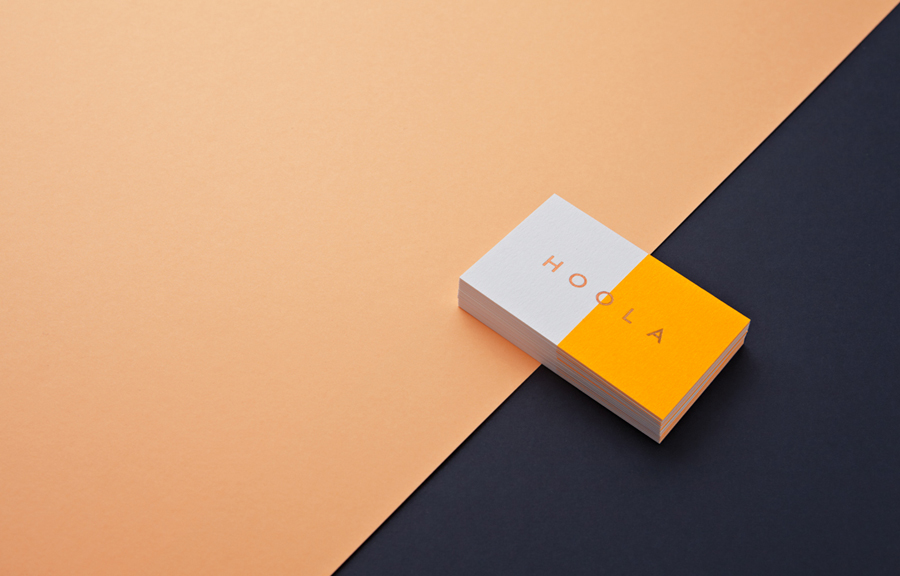
Hoola is a women’s specialist D plus swimwear brand launched in 2006 with the intention of creating “beautiful and supportive larger cup swimwear” as an antidote to “bras masquerading as swimwear”. Commissioned to refresh the brand’s visual identity, Two Times Elliott developed a design solution based around the theme of horizons that juxtaposes a bold single spot colour with a classic foil print finish across a white substrate.
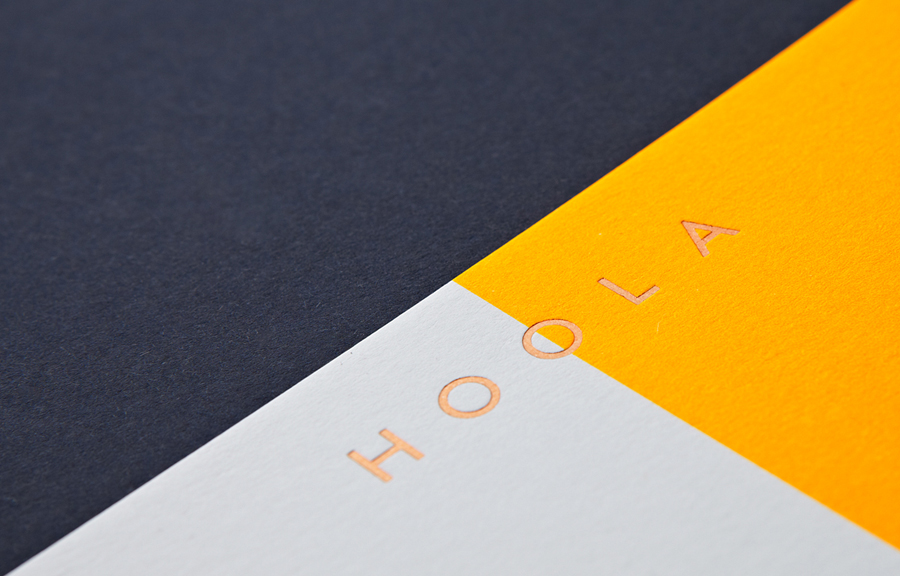
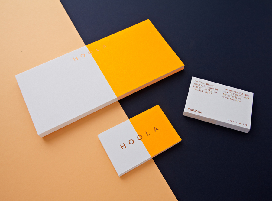
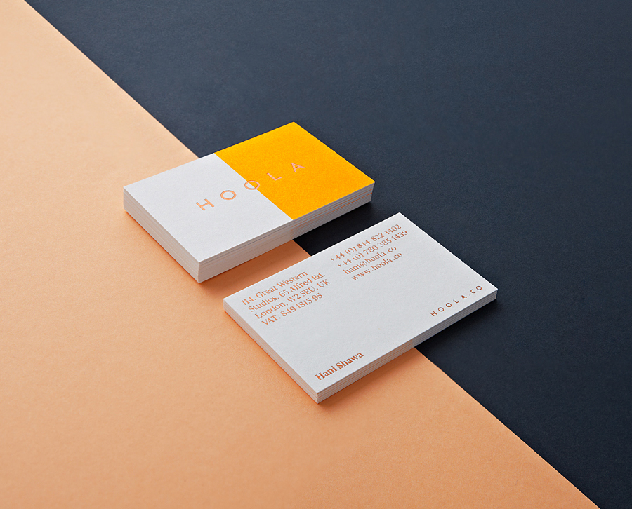
Although I am not entirely sure I understand the horizon concept – perhaps the meeting of colour is an abstraction of sunlit skies converging with open sea or sun bleached sand? – it is the print work for me that delivers the strongest communicative value. Its impressive and distinctive contrast of warm fluorescent yellow, enhanced by the bright white texture of an uncoated board, and a lovely bronze block foil detail delivers contemporary impact alongside what might be perceived as traditional, crafted quality, a value matched by a serif type choice on the reverse of the business cards.
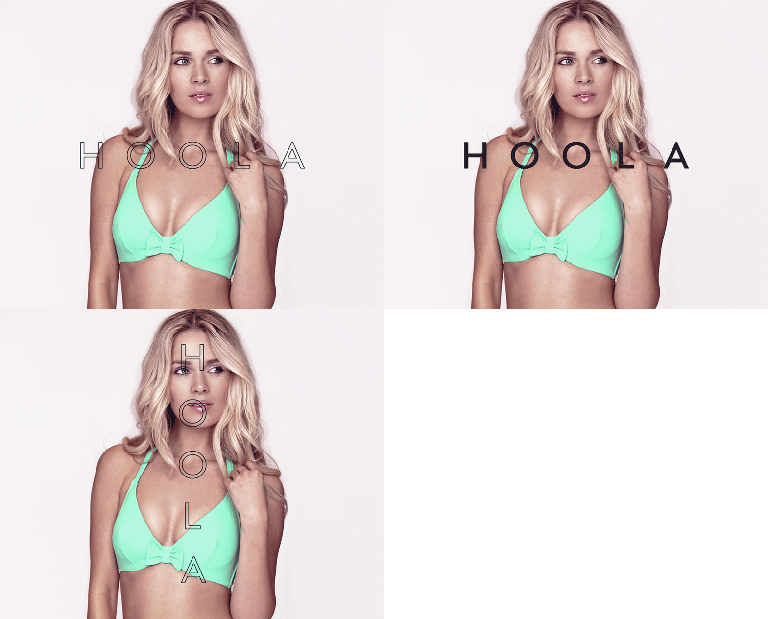
The strong geometric basis, uppercase and generous spacing, single line weight and the contrast of slim and broad characters of what looks like a logo-type built from Futura, introduces an efficiency that competently leverages the current, on-trend resurgence of early 20th century typography in the fashion industry to convey stylistic restraint, classic references and expertise whilst providing a functional and practical backbone to the fine, aesthetic detailing of the garments on-line. To get this much out of one ink, a foil, sans-serif type and bleached board is pretty neat.
