Olive Gold by Anagrama
Opinion by Richard Baird Posted 30 July 2013
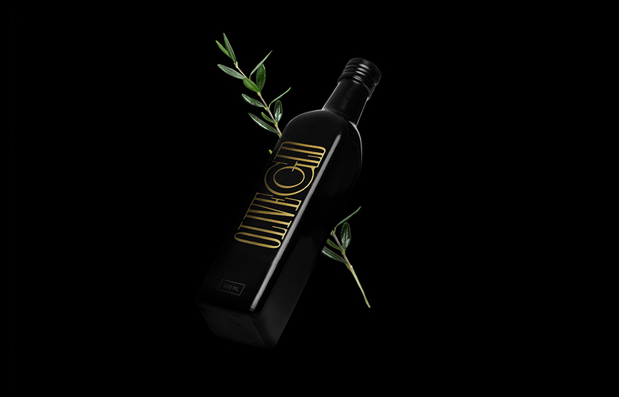
Olive Gold is described by Anagrama, the multidisciplinary design agency behind its new packaging and visual identity, as an ‘ultra premium’ cold-pressed, extra virgin olive oil from Olivarera Italo-Mexicana that “targets the global high-end section of its category, is marketed through word-of-mouth, luxury communication channels and is only available in a few upscale gourmet stores and luxury-chic hotels.”
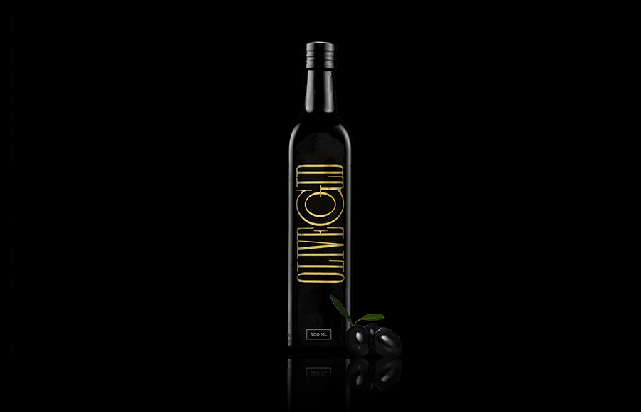
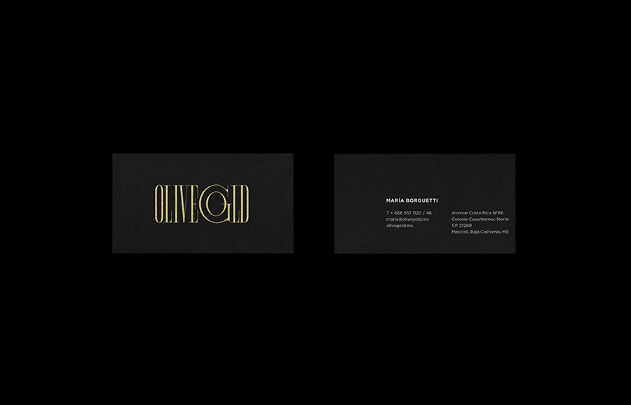
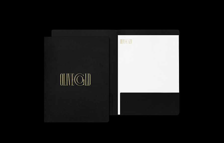
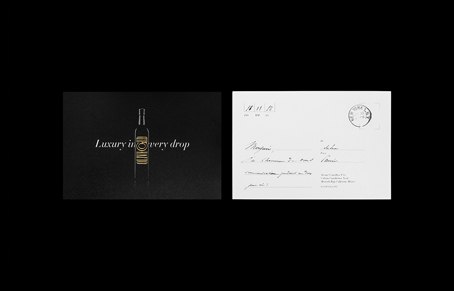
“Our brand proposal aims to not only elevate the brand’s values (elegance, exclusivity, purity and tradition) but to stand out in a medium where its competitors’ identities either border on boring antiquity or icy cold minimalism. The idea was to design a brand that was both simple and traditional without falling into either extreme.” “We played with the idea of the oil’s color and richness, and so came up with the products name: Olive Gold. The type is custom made to have an easy but tight fit on the bottle. The logo’s elegant, golden serif typeface is juxtaposed with the bottle’s black simplicity to convey a modern look that embraces its traditional character.” – Anagrama
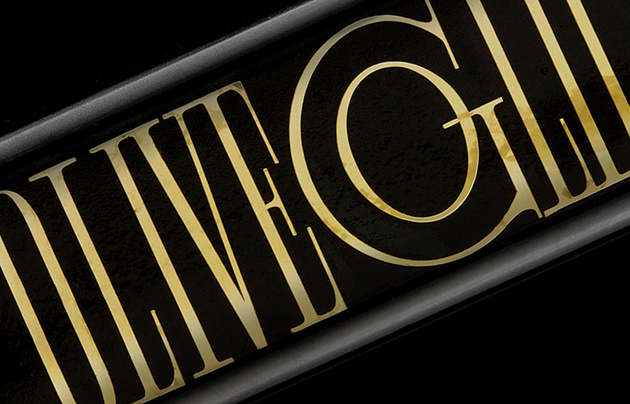
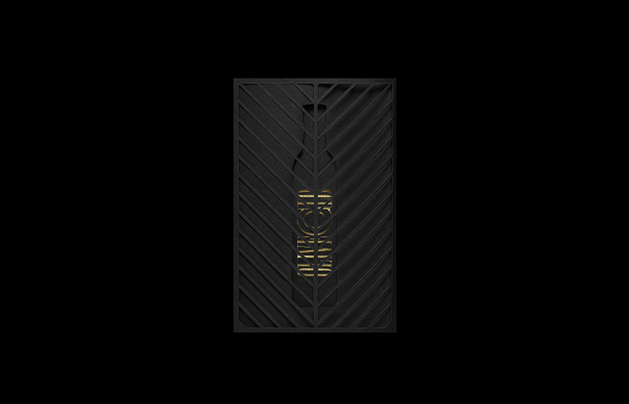
Anagrama’s solution appropriately leverages the established premium and crafted qualities of dark glass, uncoated paper and a gold foil print finish and infuses these with distinctive and individual typographic character. The contrast of light and heavy strokes, condensed and radial characters, tight spacing, serifs and an edge to edge print treatment that covers the width of the bottle’s front face, provides plenty of proprietary detail that neatly suggest a degree of heritage, bold and fine flavour executed with a contemporary restraint.
