Griab by Kollor
Opinion by Richard Baird Posted 5 August 2013
Griab is a Swedish engineering firm, founded in 1957 and located in Helsingborg, Sweden, that specialises in delivering a holistic design and build service that includes land planning, wastewater management, architecture and construction.
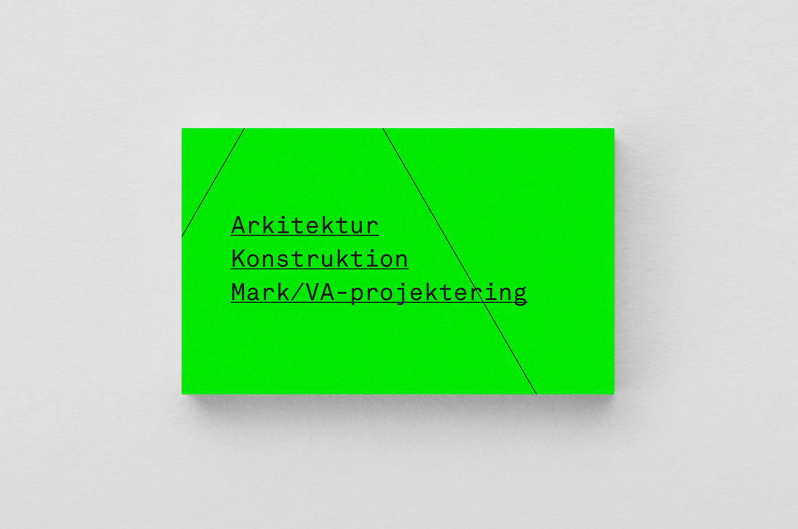
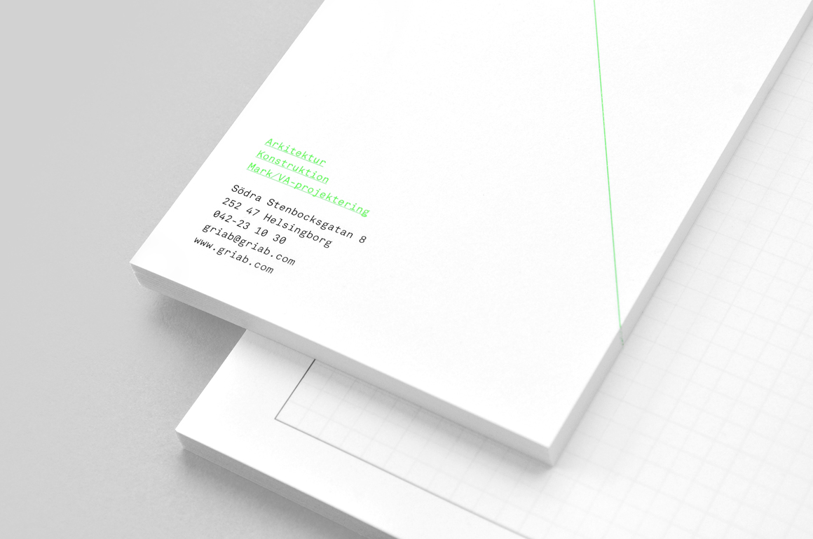
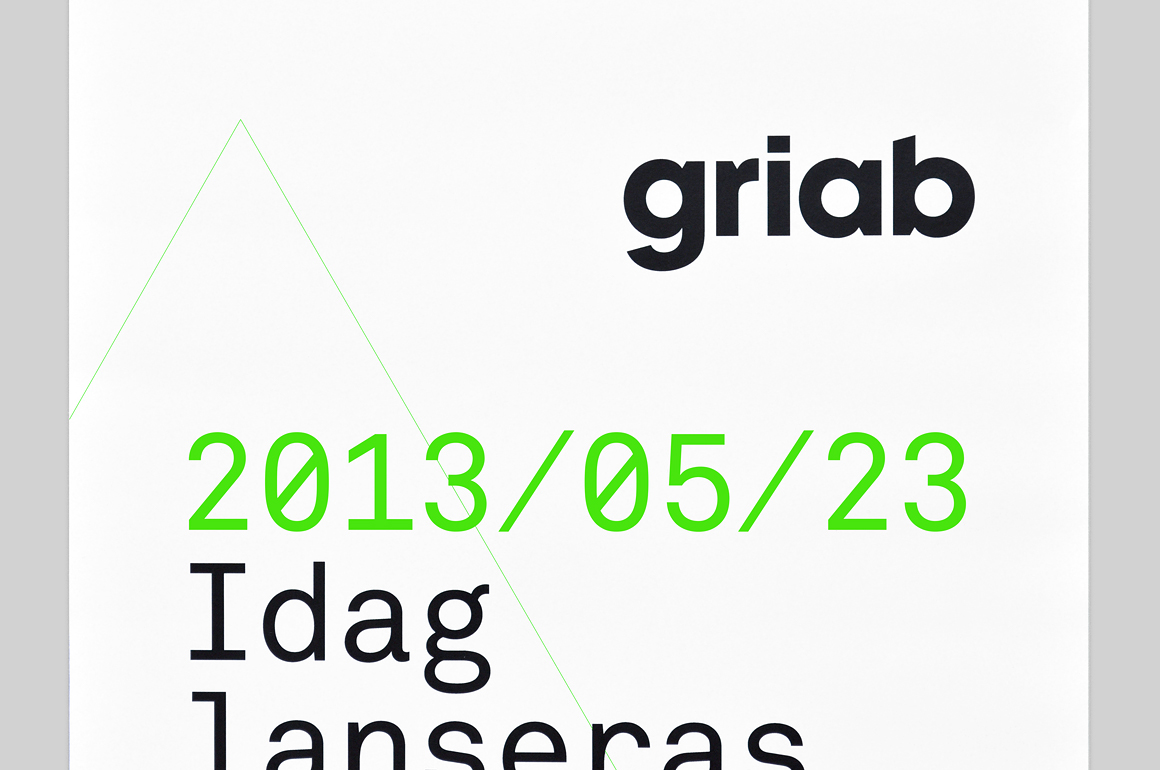
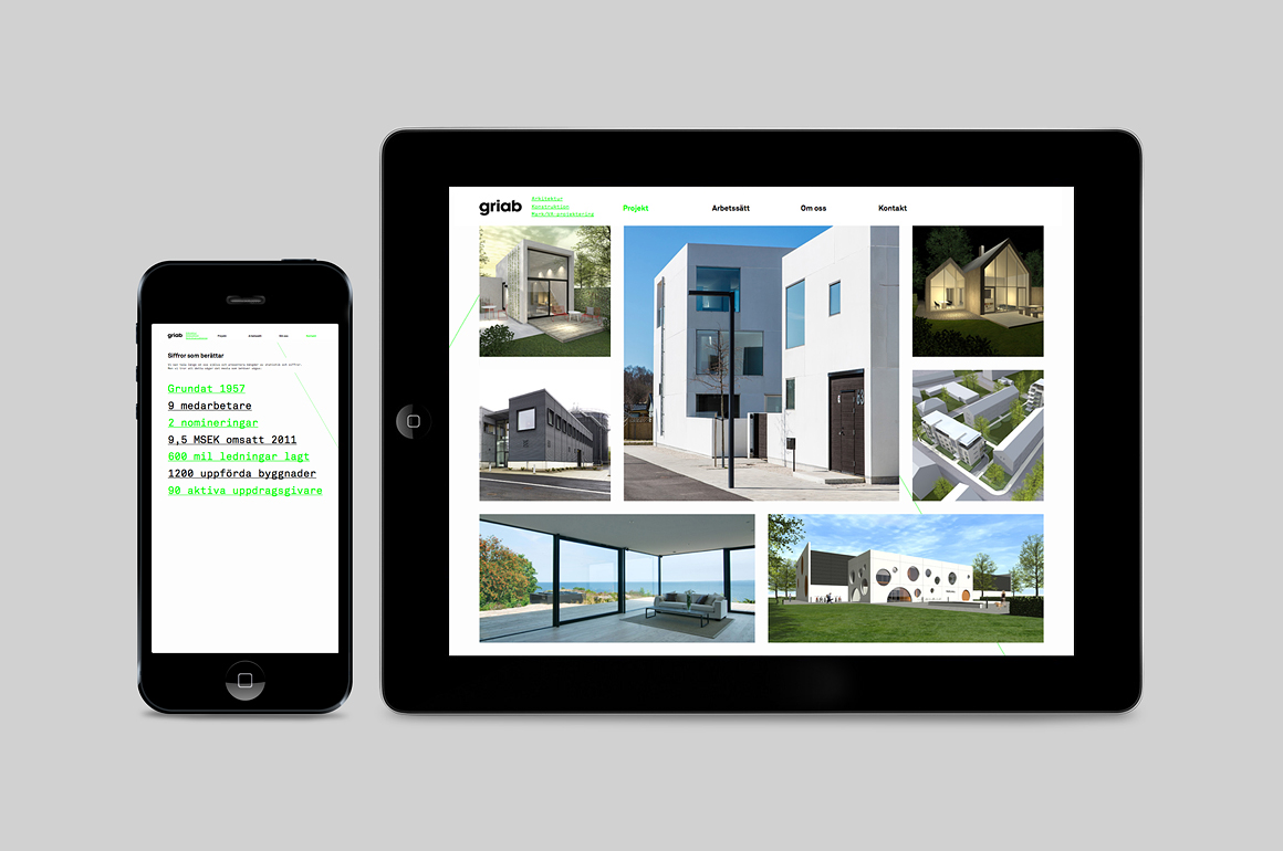
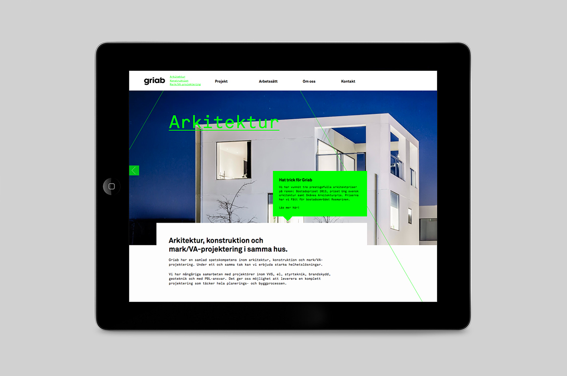
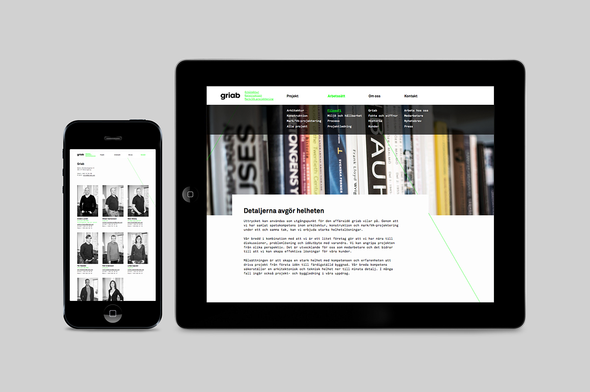
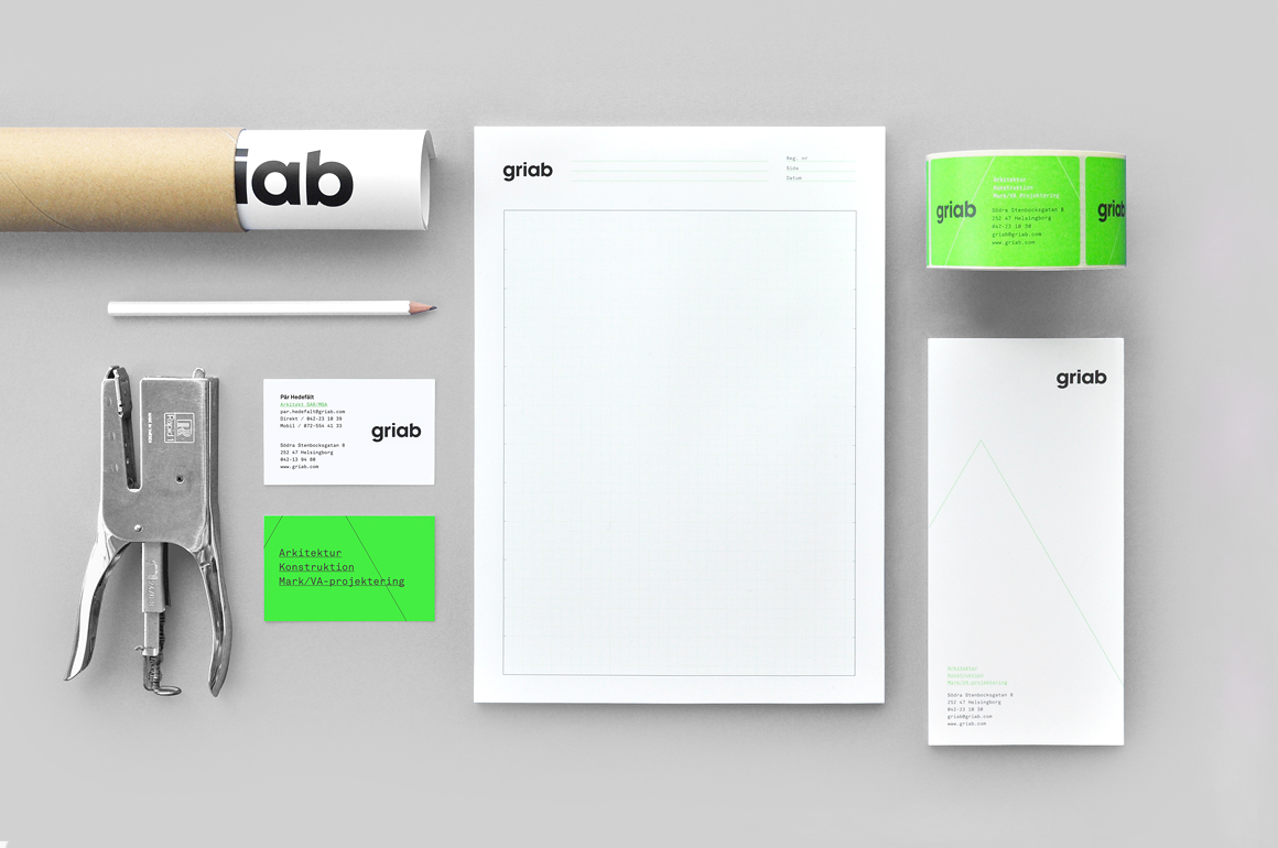
Developed by multidisciplinary design agency Kollor, Griab’s visual identity, “inspired by the the straight lines and shapes commonly seen in architecture” and created to help reinforce the firm’s environmental profile, includes a new logo-type, stationery and website based around a sans-serif logo-type, monospace typeface, grids, guides and a fluorescent green print treatment.
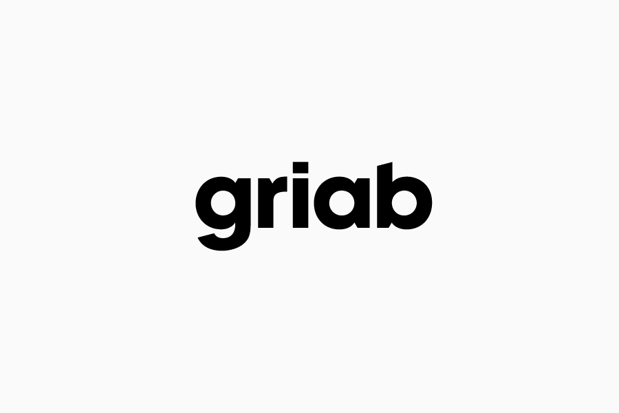
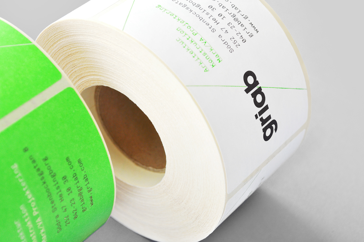
Griab’s new logo-type provides a solid foundation to a visual identity solution that neatly resolves architectural principles, technical understanding and environmental practices. It manages to balance an all lowercase accessibility with a confident authoritative weight and a familiar but understandable Swiss-inspired and well-spaced sans-serif efficiency. The subtle and proprietary flourish of diagonal cuts across the terminals and junctions tie in well with the theme of dimensionality, angles and architectural shapes whilst adding proprietary character and removing some of the corporate neutrality typically associated with similar typefaces.
While perhaps a touch synthetic to really nail the environmental and sustainable aspect of the business, the fluorescent green spot colour delivers distinctive, contemporary impact, a sense of creative energy and an economy in the use of a spot colour enhanced by bright white white substrate and contrasting black ink.
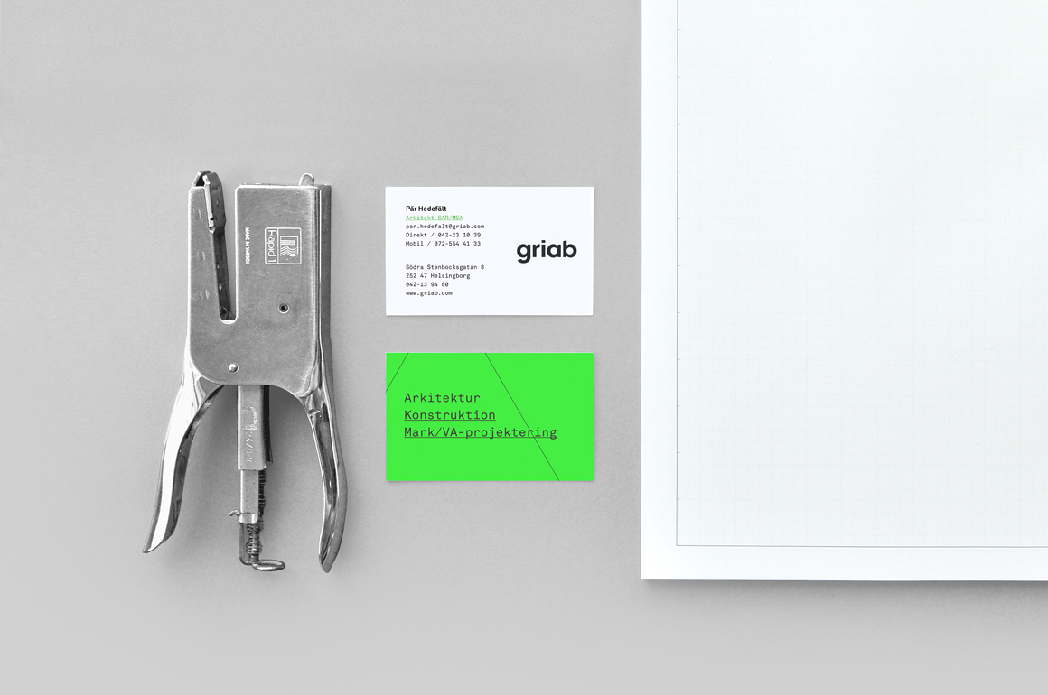
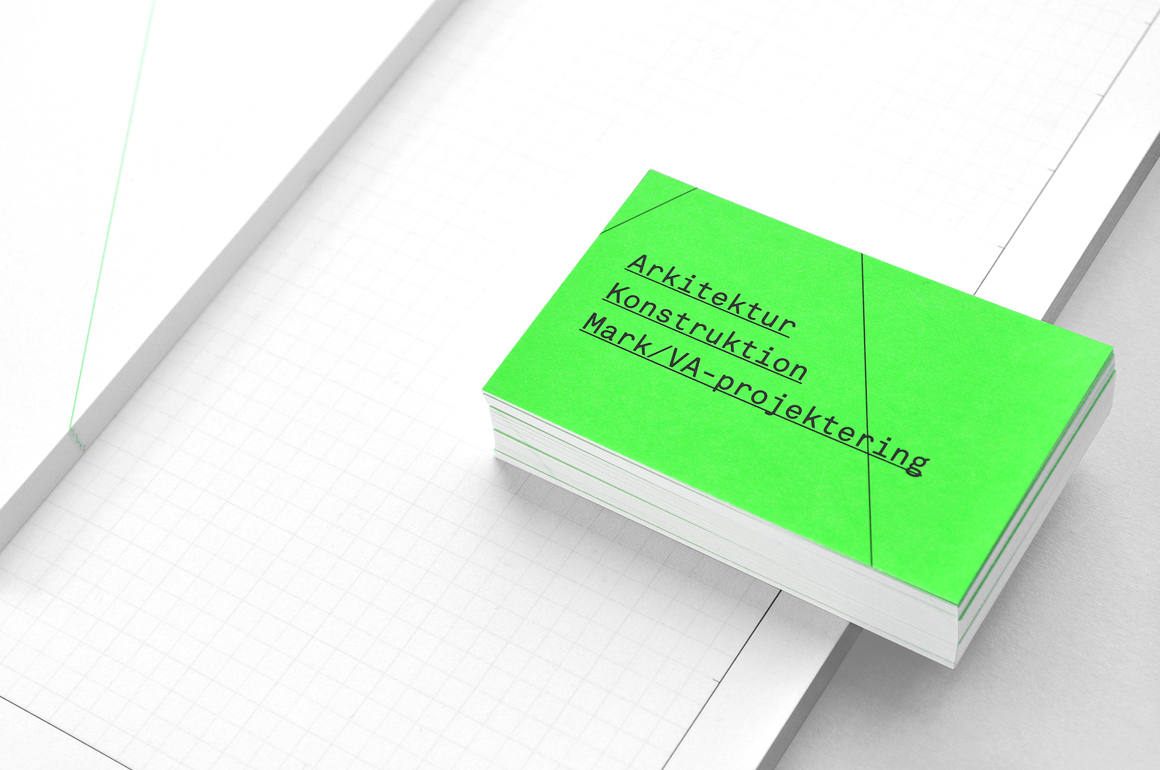
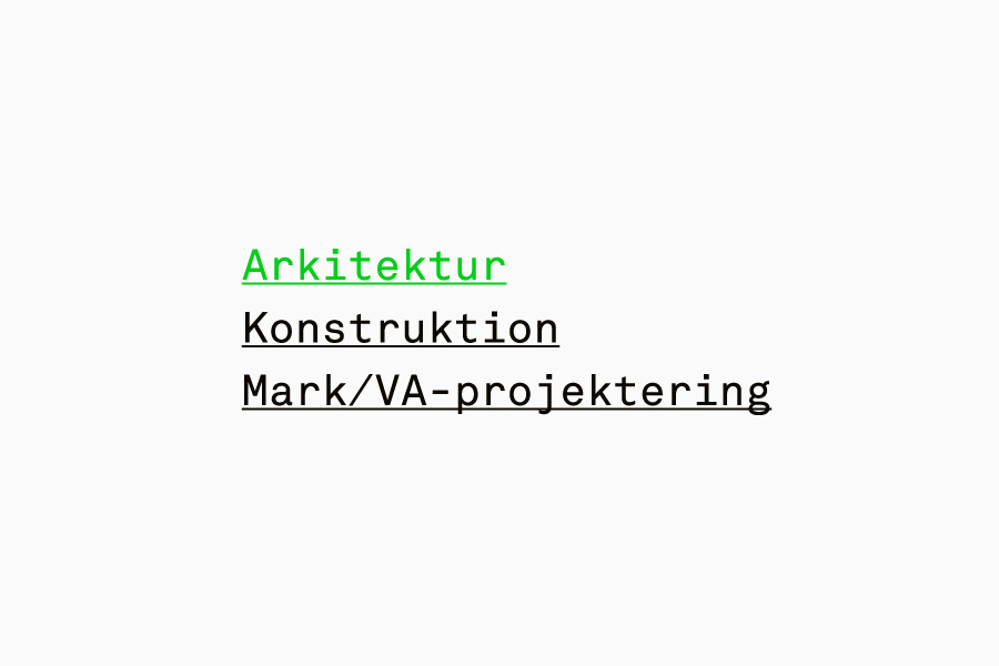
The broad monospacing, underlines and regular consistent stroke width of Akkurat Mono, alongside the use of engineering paper, guides and fine diagonal lines across the stationery and grid-based website add a technicality, communicative dimensionality and aesthetic contrast to the accessibility and weight of the logo-type.
Design: Kollor
Opinion: Richard Baird
Fonts Used: Akkurat Mono
