Maderista by Anagrama
Opinion by Richard Baird Posted 7 August 2013
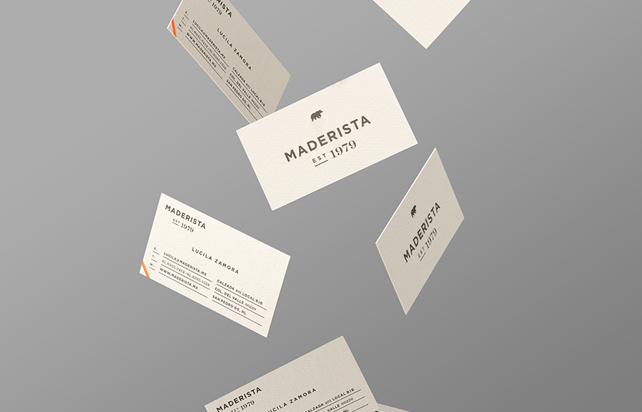
Maderista is a San Pedro-based carpentry studio with more than 30 years of experience designing and crafting custom wood furniture. Multidisciplinary design agency Anagrama were recently commissioned to develop a new visual identity for Maderista that would convey its “proficiency and expertise in a modern and all-embracing way”.
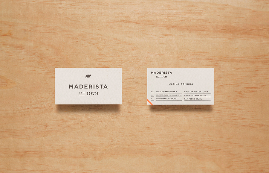
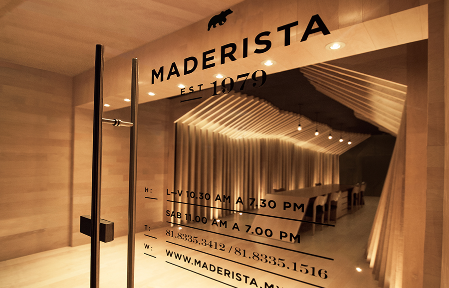
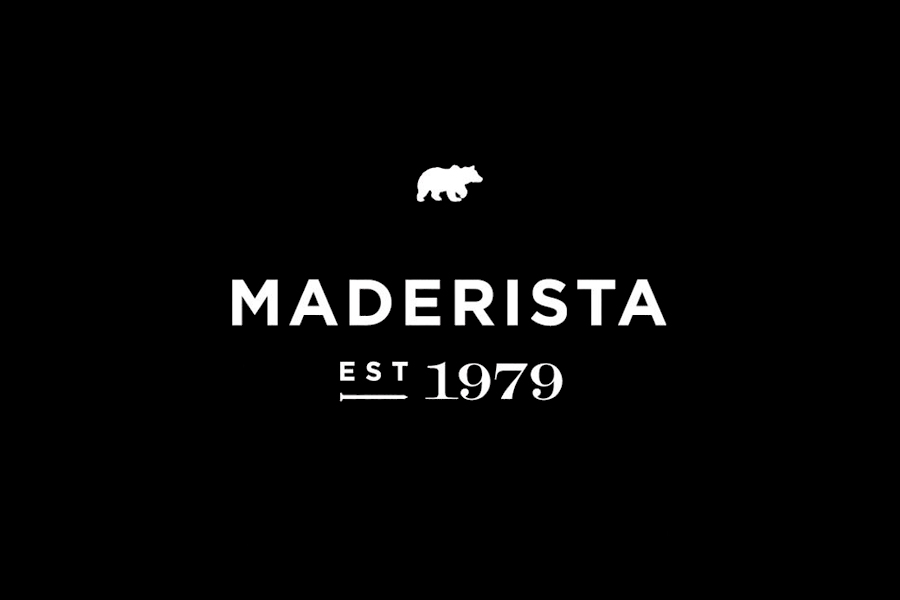
“Our proposal for the logo is complex, carrying a typographical palette meant to portray timelessness, a coalescence of modern and traditional, and two iconic symbols: a bear and a nail. The bear embodies the natural strength and robustness of wood, Maderista’s primary material, while the nail exemplifies the skilled craftsmanship and thoughtful attention put into each custom-made piece of furniture produced.”
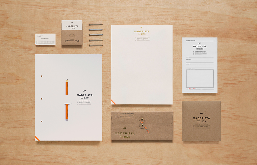
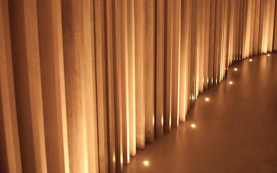
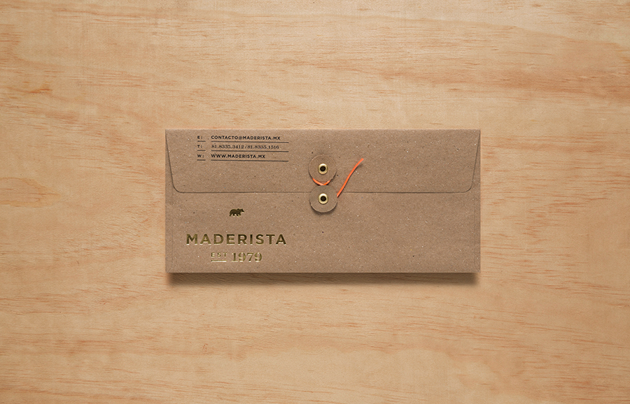
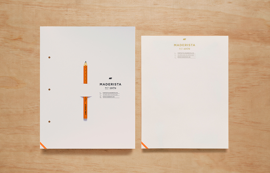
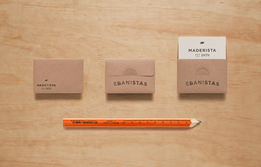
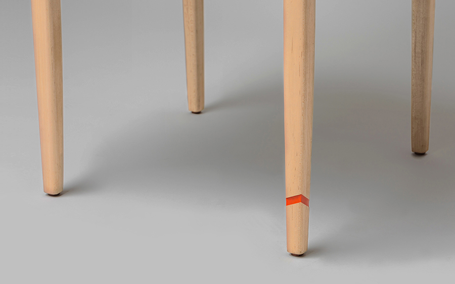
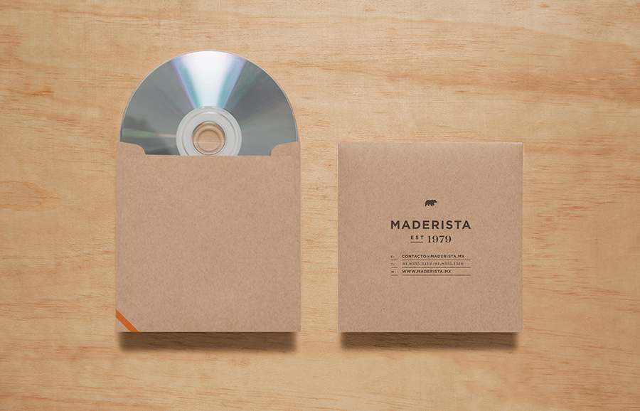
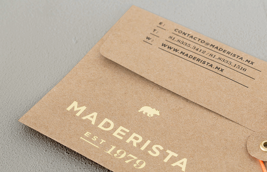
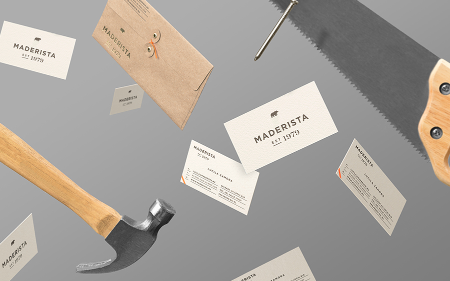
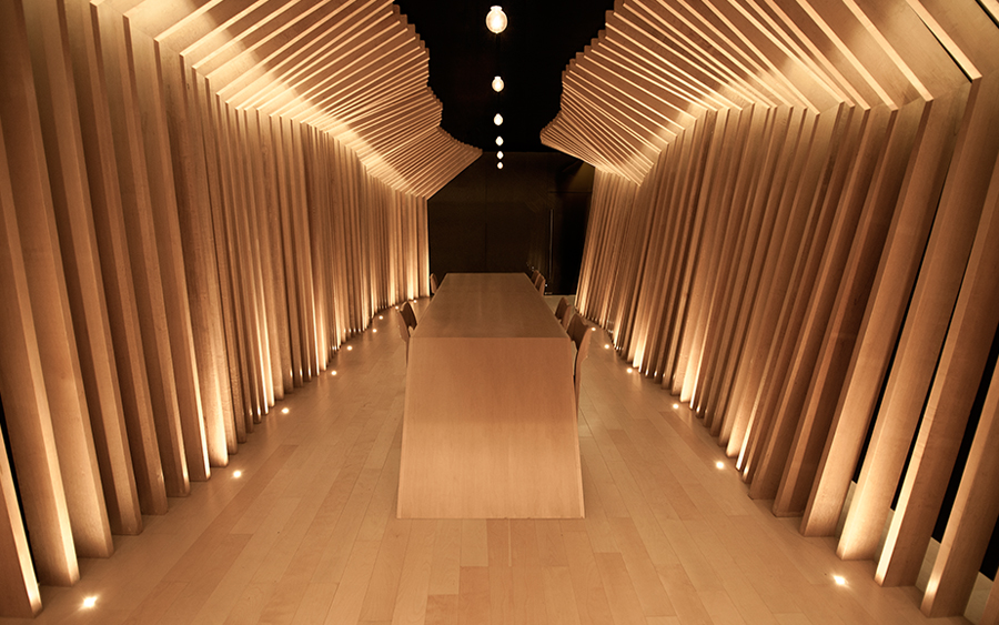
“The choice of paper for the stationery: porous, off-white, crafty but with touches of hot-stamped gold, conveys the crafty nature of the brand while embracing its guaranteed high-end quality and class. The showroom is aspirational and inviting, designed to inspire and encourage the imagination on the endless possibilities that can be attained from wood. In addition, we designed a small gesture: a small, engraved, orange diagonal line in the left-hand corner, that would set apart every piece of furniture made by Maderista.” – Anagrama
While I would not describe this project as complex, it is certainly multifaceted and makes great use of graphic design, print and material techniques to touch upon the various aspects of the business. Each element appears relevant and communicatively obvious but avoids appearing too literal or unsophisticated, intelligently leveraging the sharp contrast of natural and man-made forms (the bear and nail – a smart visual union of natural strength and construction), the flourish of a serif juxtaposed alongside the efficiency of a sans-serif (heritage, fine detail and functionality), and a gold foil set over uncoated, unbleached paper (high quality finish drawn out of raw materials) to deliver distinction alongside communication.
