Motion Music by Face
Opinion by Richard Baird Posted 16 August 2013

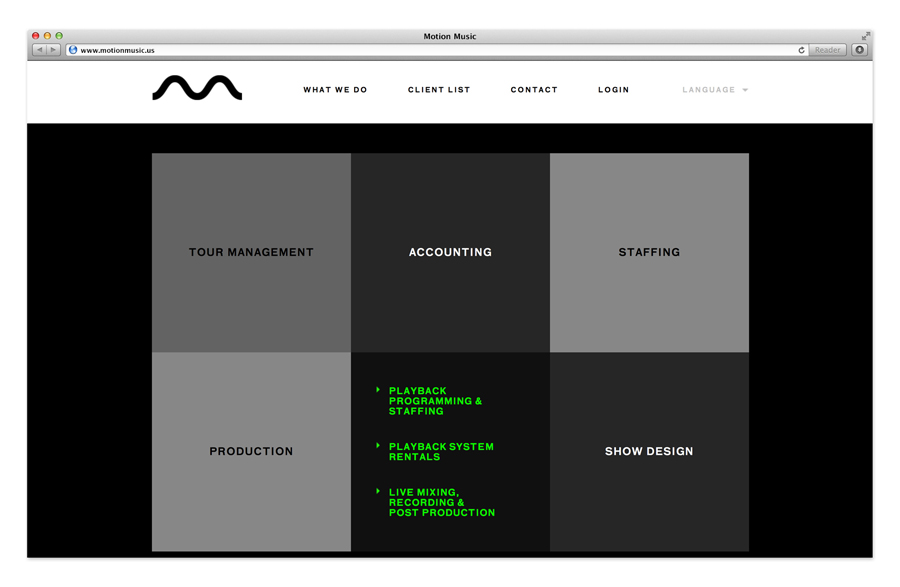
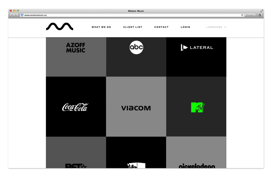
Motion Music is a Los Angeles based business that works with managers, agents, labels, and artists to produce professional tours, concerts and appearances worldwide. Inspired by the forms created by noise frequencies, modernism, and technology, design agency Face, a regular on BP&O, created a “bold, dynamic, and versatile” visual identity for Motion Music that would reflect their intentions of setting a high standard of service and innovation for the touring industry and appeal to both the younger and more business-minded individuals of the industry.

Although there a very few details that make up this identity, each appears incredibly precise in its presentation of Motion Music’s brand values with a simple, modular flexibility.

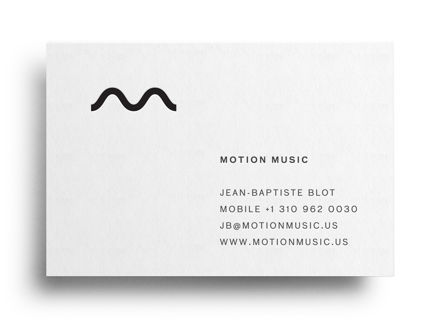
The typographical neutrality once associated with broadly spaced uppercase san-serif characters built from a single line weight, executed as one consistent point size and with black ink, now gives way to the perceptions of contemporary efficiency and practicality. The logo-mark does rely on context to derive its communicative value but once understood neatly conveys a sense of technology much like Sony’s Vaio identity and works well to balance the dual aesthetic of monogram and waveform.
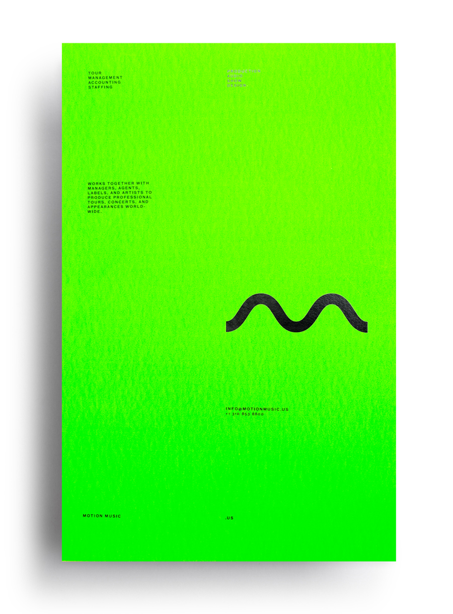
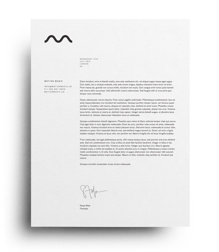
The subtlety of a black block foil and blind deboss across the stationery add a sense of quality without contradicting the practical values established by the type while a bright fluorescent green introduces distinctive contrast, energy and character fitting for the music industry.
