Diverza by Face
Opinion by Richard Baird Posted 20 August 2013
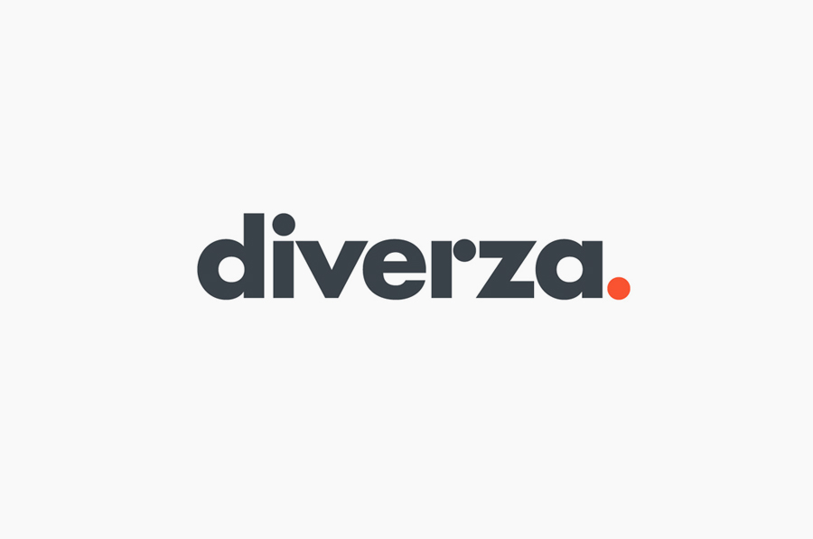
Diverza is a Mexican, on-line, electronic, invoicing service provider aimed at both low and high volume companies. Diverza’s visual identity, a combination of logotype, illustrative and iconographic detail, website and simple print work with high quality material and print finish, created by multidisciplinary design agency Face, mixes an everyday accessibility with corporate reliability and technological efficiency without appearing contradictory, in a way that should appeal to Diverza’s broad and inclusive demographic.
“Renovating the world of invoices services in Mexico is no small feat, but Diverza somehow managed it, and they did it with an enthusiasm for innovation, people, and technology that can be clearly felt in the personality of their new identity. Choosing a universally friendly typeface, and an easy, straightforward blueprint for the layouts, the design became a reflection of Diverza’s work process: practical, simple, and approachable. To top it off, each dot in the logo stands for a key aspect of their philosophy: movement, evolution, and entrepreneurship. With modern design, we created a basic canvas for their expertise and innovation to flow the right way. – Face
Although it is the website, as primary touch point, that delivers the clearest and most effective communicative value, the logo-type does a solid job of distilling quite a lot into a simple typographical expression. While perhaps a little tight in places, the logo-type’s bold weight, sans-serif characters and full stop, lowercase formatting, and subtle proprietary detail in the recurring circle, manages to balance the theme of individualised service plans with a sense of reliability, efficiency, finality – in that the service is complete and unmatched – and accessibility in a way that avoids appearing corporate or over-styled/informal.
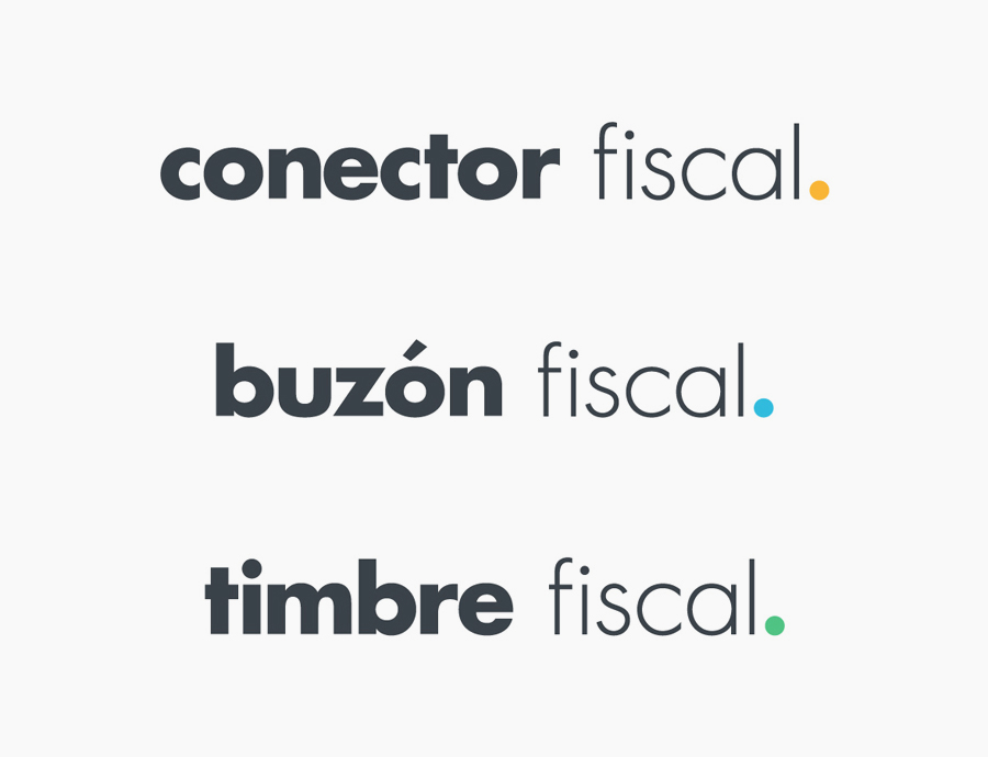
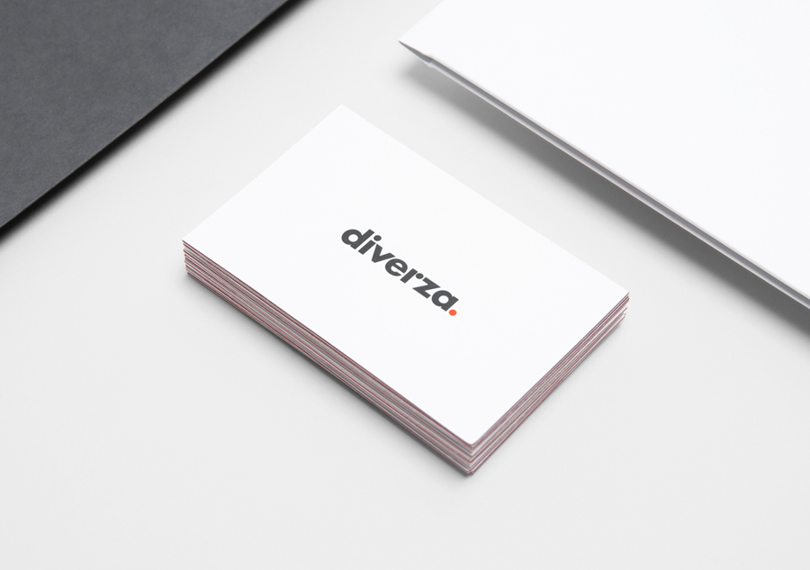
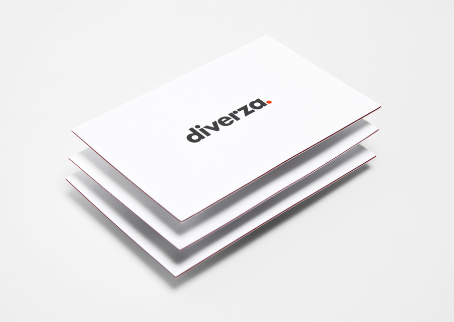
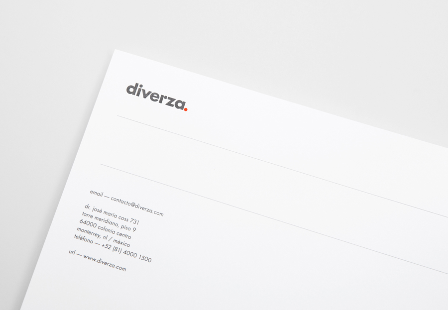
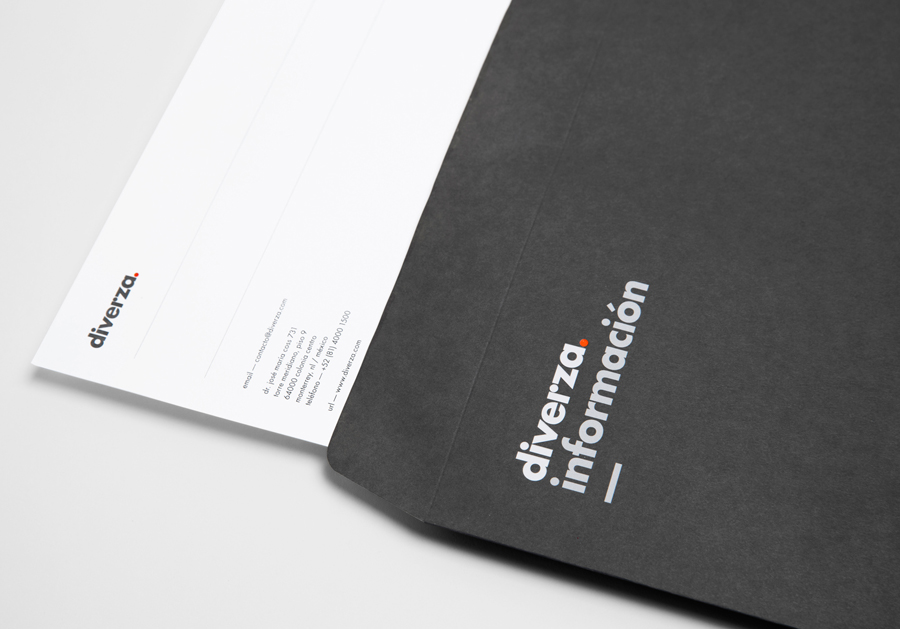
In print the identity is predominantly logo-centric but well executed, utilising white space to enhance the weight of the logo-type and the colour of the full stop. This is complemented by the high quality and professionalism associated with a heavy triplex business card with a red seam that ties it to the logo-type and a white ink detail across a dark, dyed substrate.
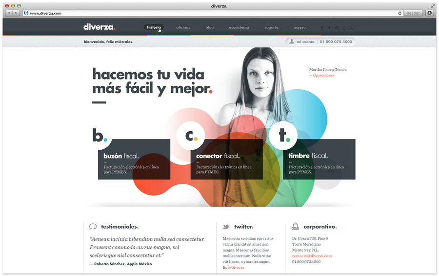
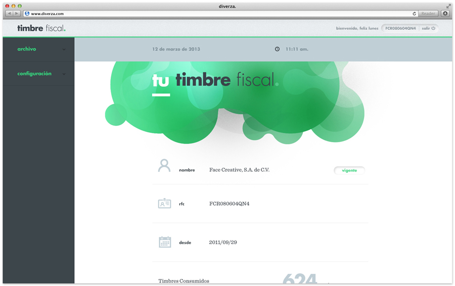
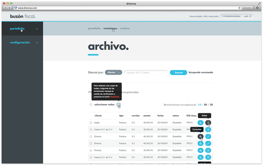
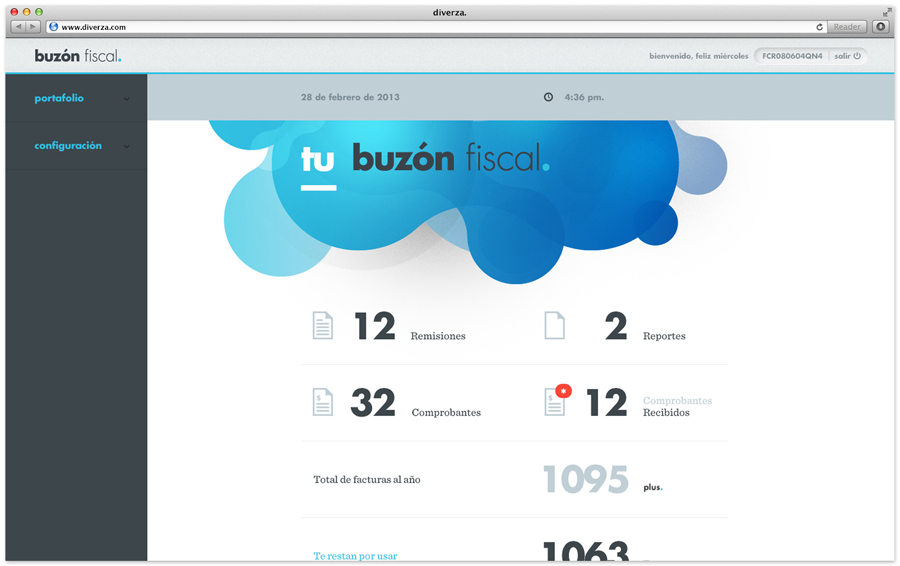
The website, as an entry point to the brand, fleshes out Diverza’s proposition through the use of organic cloud-like forms (check out Bunch’s work for Fogg for another similar approach), colourful gradients, illustrative detail with a contemporary single line weight and rounded terminals (soon to be added), an ‘a. b. c.’ step by step simplicity in the structure of the content that builds on the coloured full-stop device of the logo-type.
These design cues work well to really draw out the accessibility aspect of emerging cloud-based services and soften their technological aspect while the corporate subtitles help to establish a sense of reliability and trustworthiness.
