Harridge Group by Igloo
Opinion by Richard Baird Posted 8 October 2013

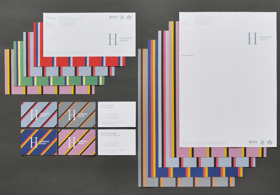
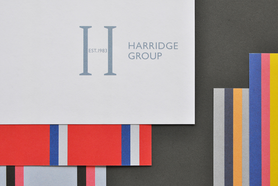
Harridge, formerly Ealing Travel Services, is a corporate travel group made up of Harridge Business Travel, Harridge Luxury and Harridge Events. London-based design studio Igloo were recently commissioned to design the group’s visual identity and brand architecture which would reference its “significant history and experience”. Their design solution, a combination of serif detail, sans-serif characters and a modern colour palette and pattern set, drawing on what Igloo describe as upper-class English culture, mixes a sense of heritage with corporate quality in a clear and concise way.
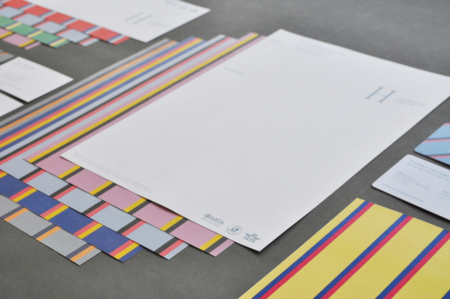
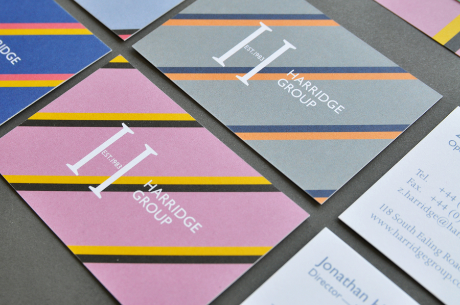
“The new identity employs typefaces Gill Sans and Joanna, hoping to quickly and directly suggest a sense of Englishness, which is a key part of how the company sees itself. A set of eight striped patterns support this idea, recalling aspects of English heritage and culture, particularly the aesthetic of upper-class college ties and cricket/rowing blazers in ‘club colours’.”
“In an industry that suffers from a poverty of unique, effective design, the work done for Harridge —in its approach to visuals and typography, UI design and code— aims to position the company as a major player in the corporate travel industry.” – Igloo
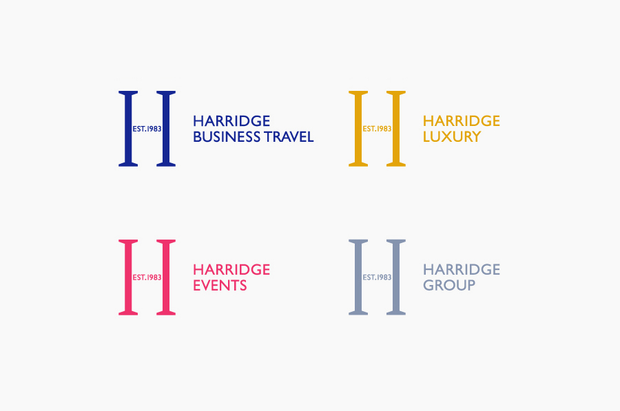
Although I am not keen on the aesthetic of the mark and type it is difficult to really question their communicative effectiveness. The tall H character, its traditional serifs, the modern spin of replacing its bar with the company’s EST date and the practical sensibilities of a well-spaced, uppercase, humanist sans-serif (a choice that has significant heritage of its own and a close association with the way finding efficiency of rail infrastructure of the early 20th century), achieves a solid balance between experience and contemporary reliability. The pattern and colour palette, executed in print as an edge to edge detail across the stationery, also manages to draw from the past but manages to work it in with a more recent sense of energy and style.
