Hardhaus by Heydays
Opinion by Richard Baird Posted 19 December 2013
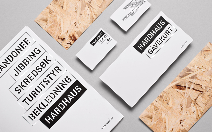
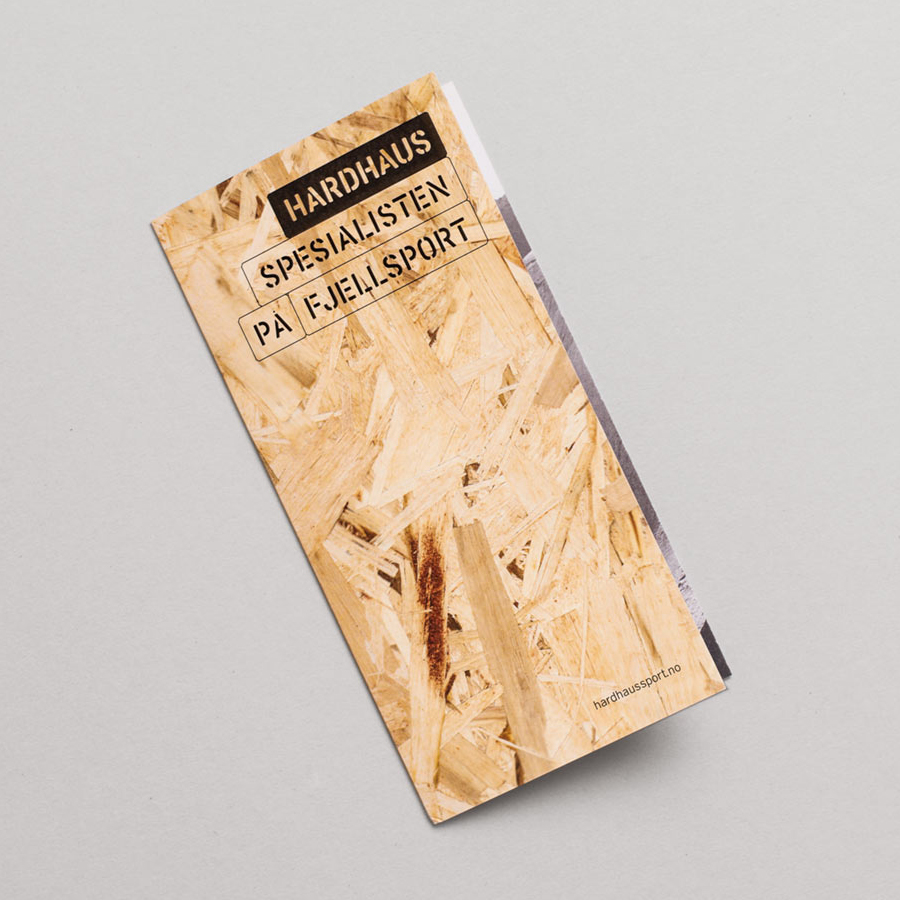
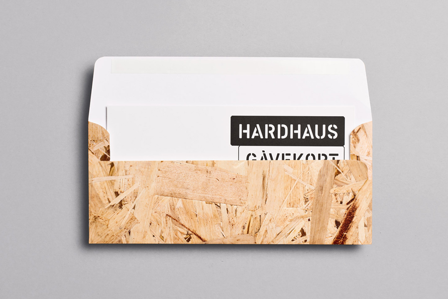
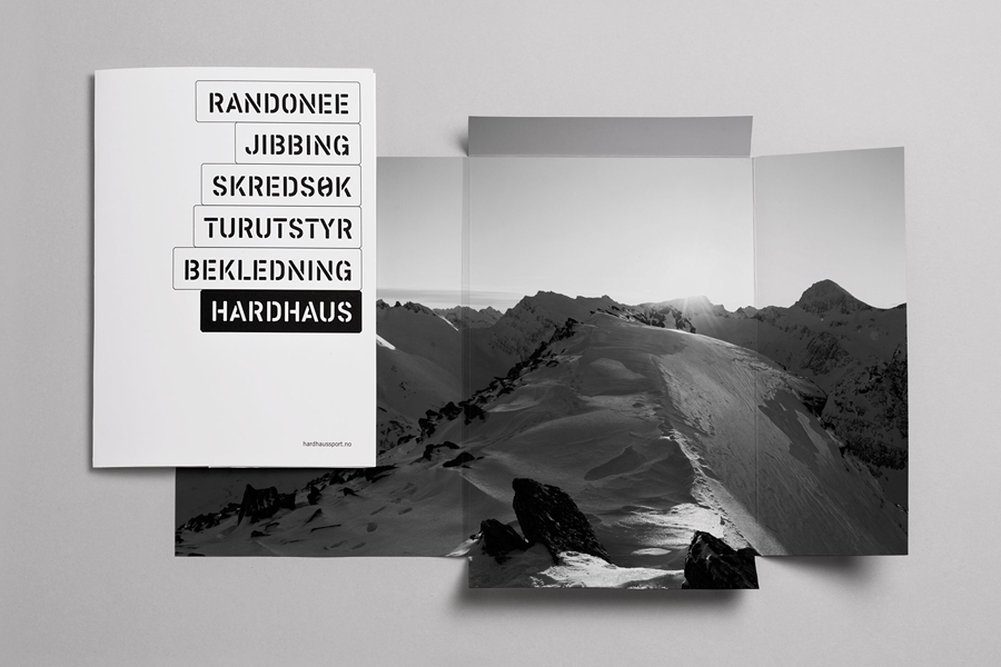
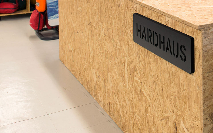
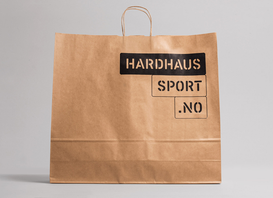
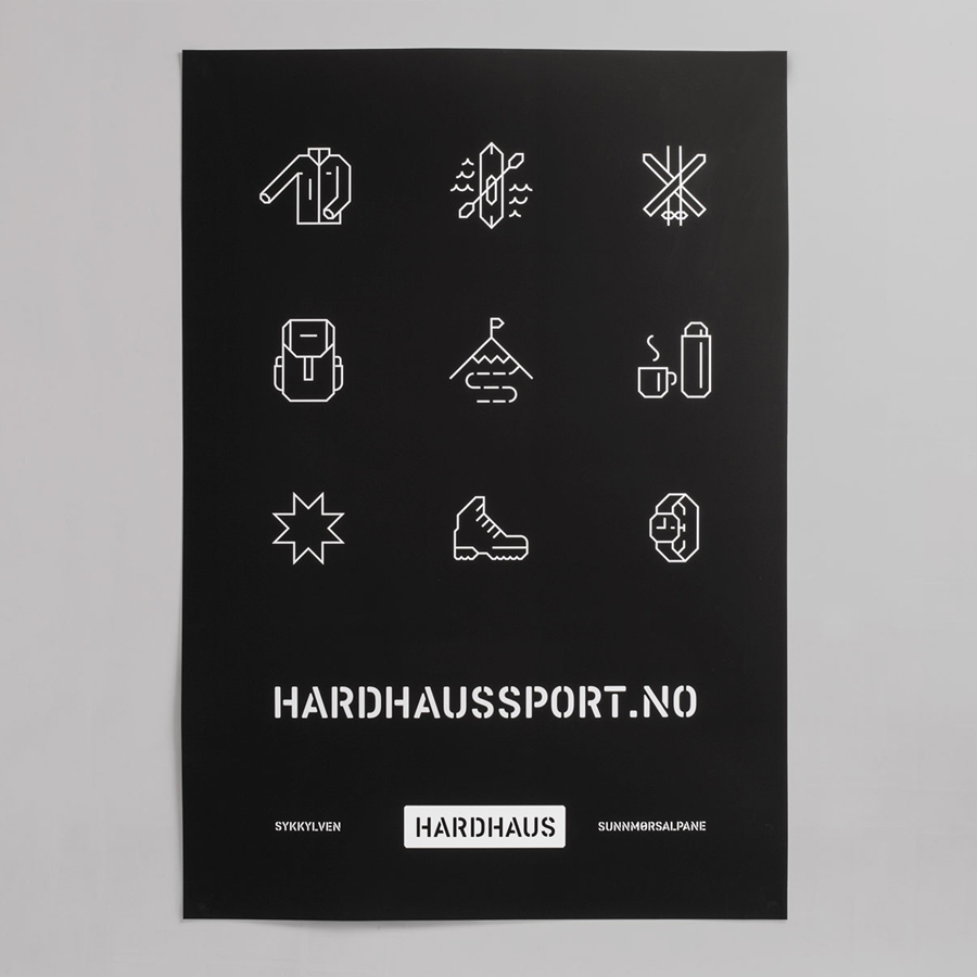
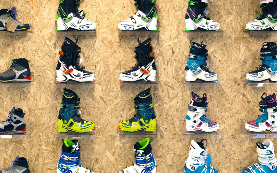
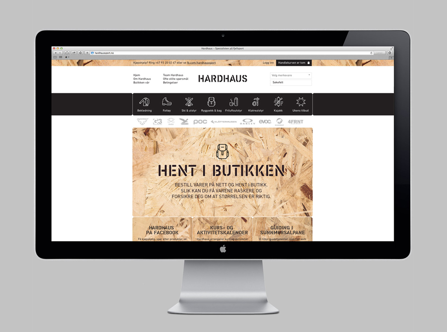
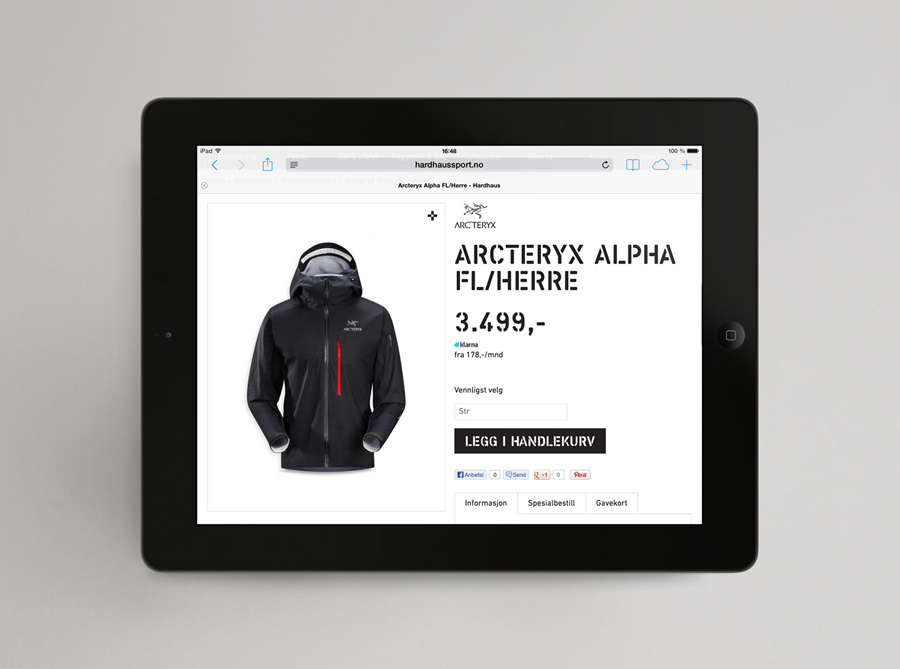
Hardhaus is a Norwegian specialist mountain sports retailer located in the alpine municipality of Sykkylven. Based around the concept of ‘technical durability’, Heydays developed a new brand identity solution for Hardhaus—which included a logo, stationery and website—that juxtaposes the utility of a heavy uppercase and stencil cut sans-serif—bold and ‘oversized’ in its execution in print—and the robust and hardy aesthetic of chipboard imagery, with the finer weight, contemporary on-trend and technological sensibilities of a very well rendered set of geometric and mono-line weight icons.
The result is a confident appropriation of a ubiquitous typographic feature, rooted in mountain wayfinding, and material texture, paired with a current illustrative approach, and resolved in a way that appears proprietary and achieves a clear communicative precision and relevant aesthetic impact.
