Norwegian Academy of Music by Neue
Opinion by Richard Baird Posted 2 January 2014

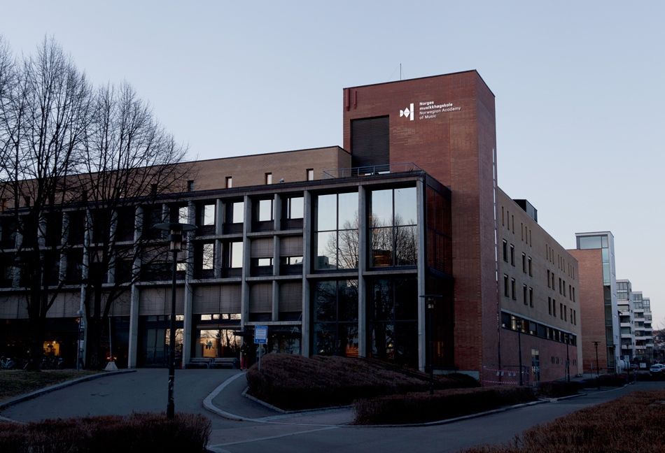
Located in the Majorstuen district of Oslo The Norwegian Academy of Music is Norway’s largest music academy. It offers both undergraduate and post-graduate courses, has educated some of Norway’s most prolific musicians, and, according to Wikipedia, ‘attempts to lay the foundation for research within the various fields of music’.
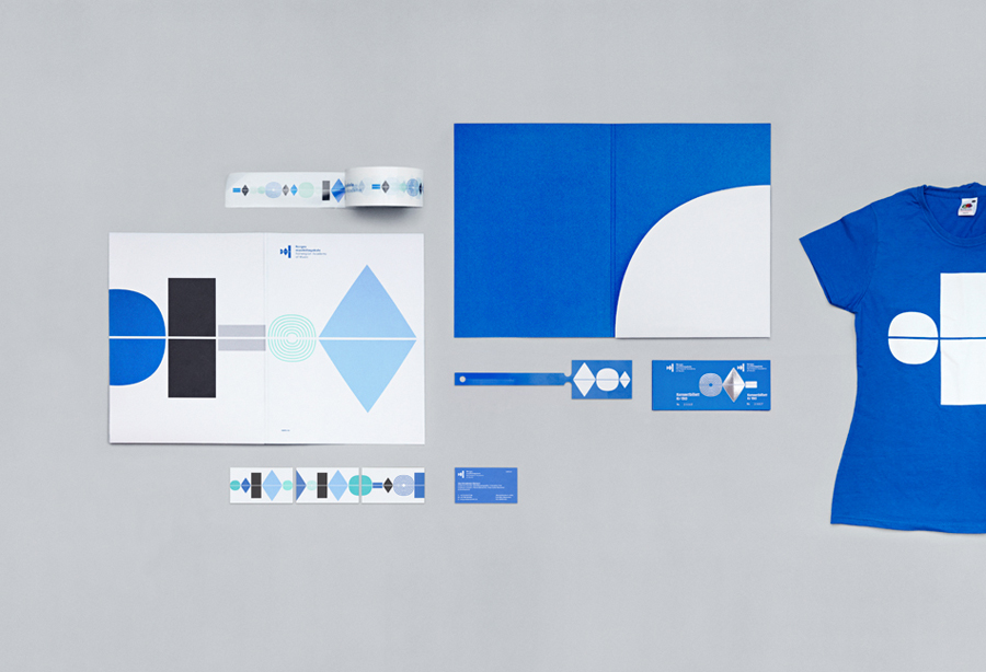
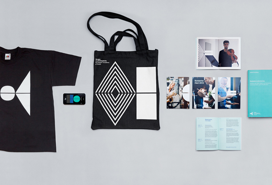
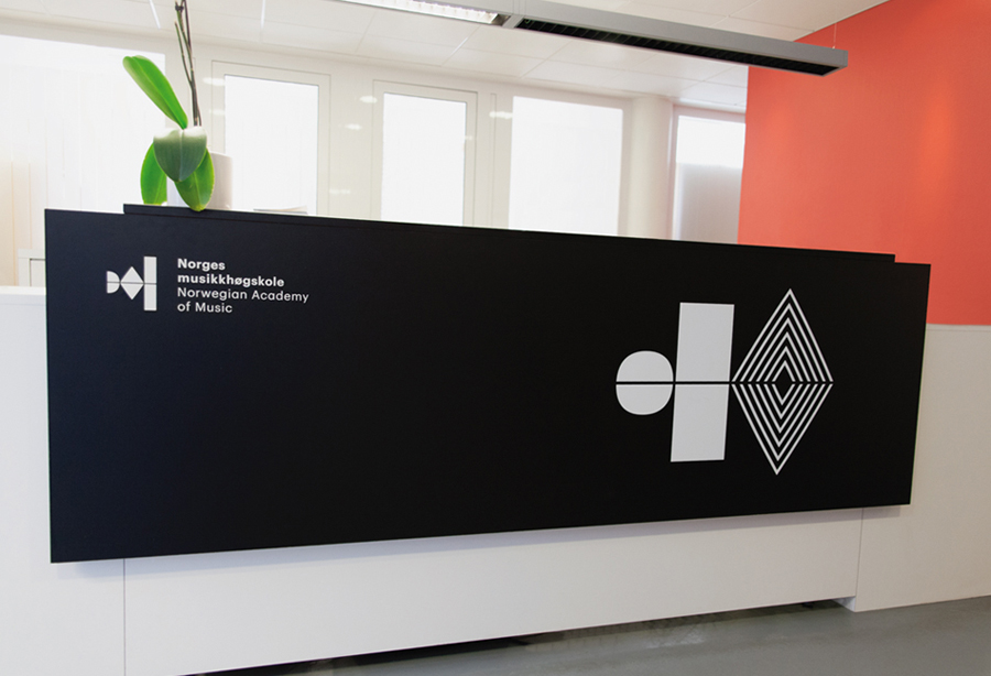
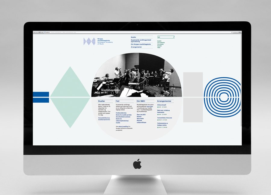
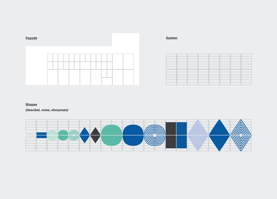
Based around the concept of an ‘endless visual pulse’, design agency Neue developed a new generative logo system for the academy that takes the sounds of students practicing, the conversations of the cafeteria and the applause of the concert halls, and allows these to resonate through a number of graphic elements set above and below a horizontal line to form a responsive and geometric waveform.

Like Demian Conrad’s work for Camerata de Lausanne Neue have pursued a solution that attempts to draw form from sound and avoid the generic through a generative solution. Both have high concept foundations but appear slightly abstract as a result. Outside of the case studies the sounds that generate the forms are not evident and as such fall a little short in capturing the fluctuation, modulating and symbiotic nature of life and music within the academy, existing in largely static instances and contexts.
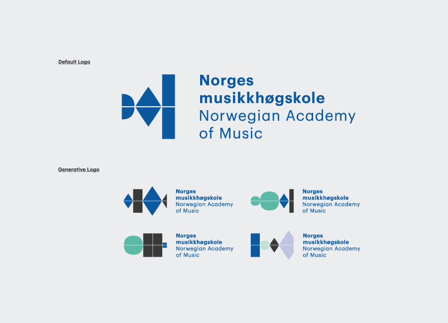
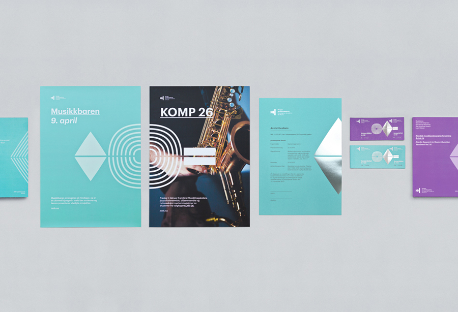
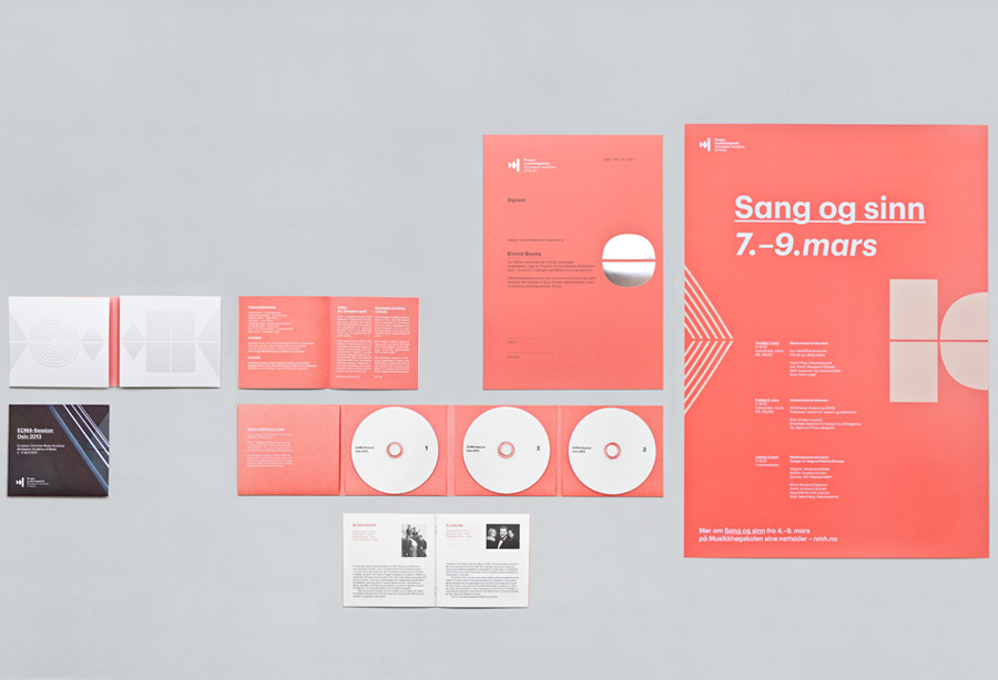
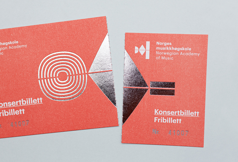
The structural nature of the logo overwhelm the waveform concept in the primary mark—leaving me looking for a monogram in the shapes—but appears stronger in its generative form, the crop to the right indicating a touch of motion as does the use of radiating concentric lines elsewhere. Paired with two typographic weights that work well to resolve a bilingual name and have an institutional sans-serif efficiency, the typography provides a nice contrast and balance to the logomark with finer detail.
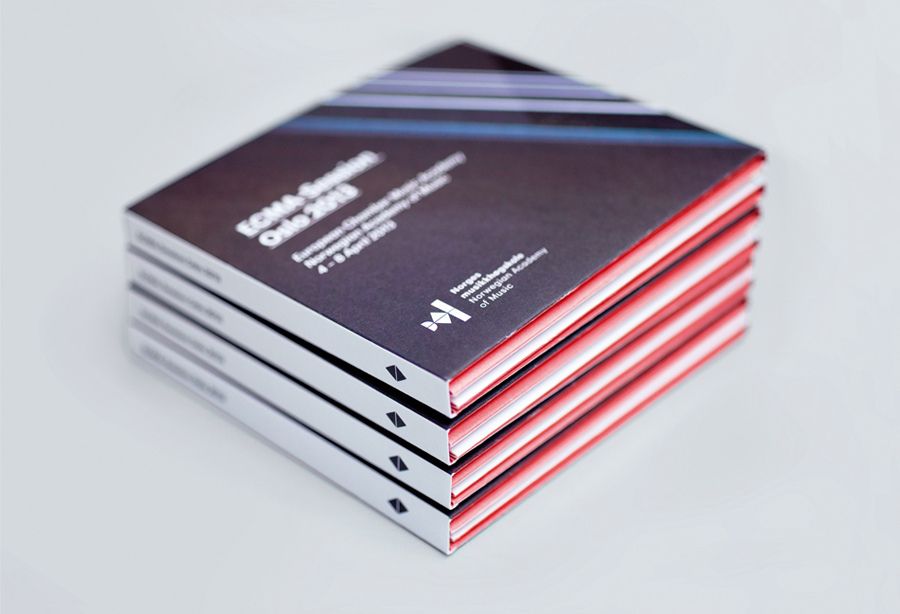
The combination of graphic design, materials and finishes make for a lively and distinctive aesthetic in print where the building blocks of the logo appear as bold and oversized details and as a neat stream along the box tape—perhaps the most successful use of the concept as a static element. These are bound by a bright set of spot colours and a silver block foil finish that appear creative and contemporary.
While it is a shame that the origin of the sounds that underpin the visuals are not at the forefront, be that through animation, video or photography, Neue’s solution is generative for a reason based on a solid and interesting rationale that establishes a compelling visual resolution with a variety that avoids the superfluous or superficial.
