Cuckoo Muesli by B&B Studio
Opinion by Richard Baird Posted 3 January 2014
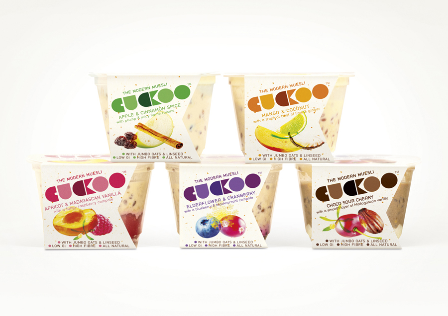
Cuckoo is a ‘modern’ wheat-free bircher muesli range that blends oats, yoghurt and fruit. Individual flavours include ‘Choco Sour Cherry with a smooth layer of Madagascan Vanilla’, Mango & Coconut with a tropical twist of Lime and Ginger’ and ‘Elderflower & Cranberry with a Blueberry & Blackcurrant compote’. London-based design agency B&B Studio, inspired by Swiss graphic posters, developed a new packaging treatment for Cuckoo that contrasts a bold geometric logo-type with the bright organic qualities of photography.
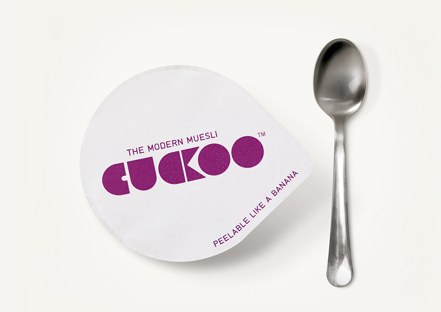
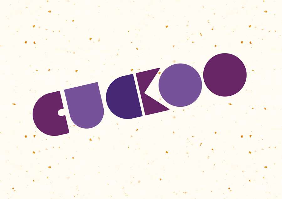
While there is a familiar combination of communicative design cues, B&B’s solution takes these and introduces a couple of distinctive details. The bold, geometric simplicity and heavy fills of the logotype appear robust, wholesome and hearty while the tight spacing of the C and K at the centre—making these appear as a bird eating a berry—is playful without appearing childish.
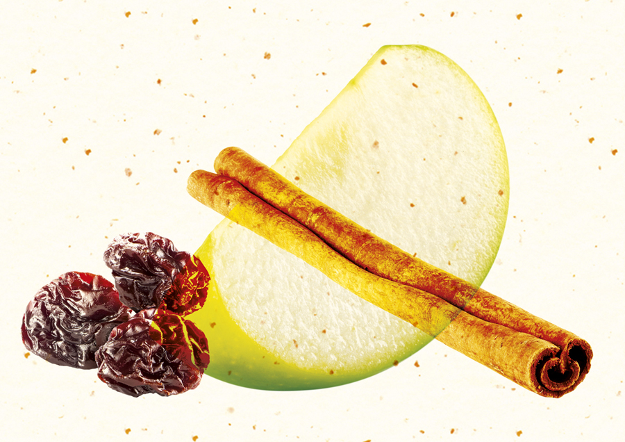
A mix of bright spot colour and brown complement the images of fruit and the consistent cream of the backgrounds, collectively conveying sharp, sweet and earthy flavour profiles and individually reflect the key ingredient of each pot.
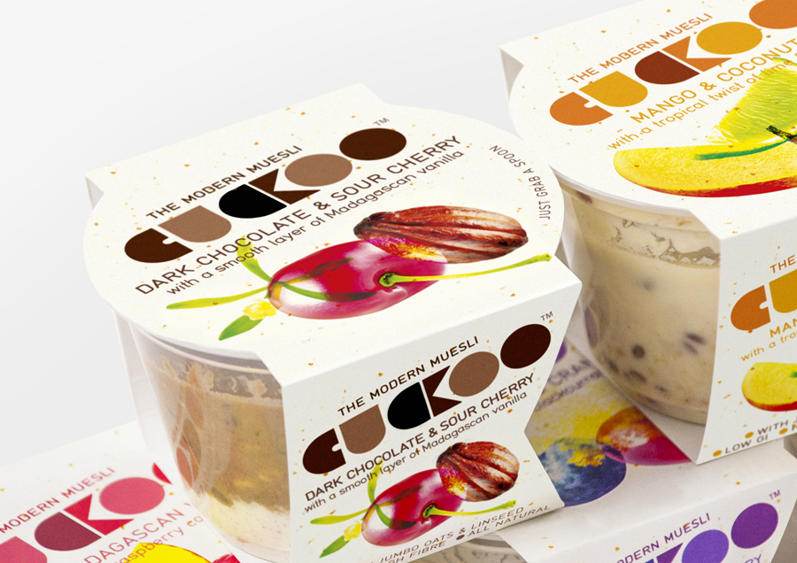
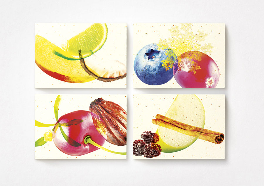
The photography has been given a saturated and over-print-like treatment that combines a communicative necessity with a proprietary quality while the mixed fibre-like flecks of an overlay add a very subtle crafted sensibility, a quality also reflected in the composition of the images and the almost potato stamp-like forms of the logotype.
The result appears bright and contemporary, hearty and healthy and successfully leverages established communicative conventions but with a couple of smart details that keep it looking unique.
