Olive & Sesame Oil by Lo Siento
Opinion by Richard Baird Posted 7 January 2014

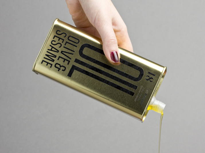
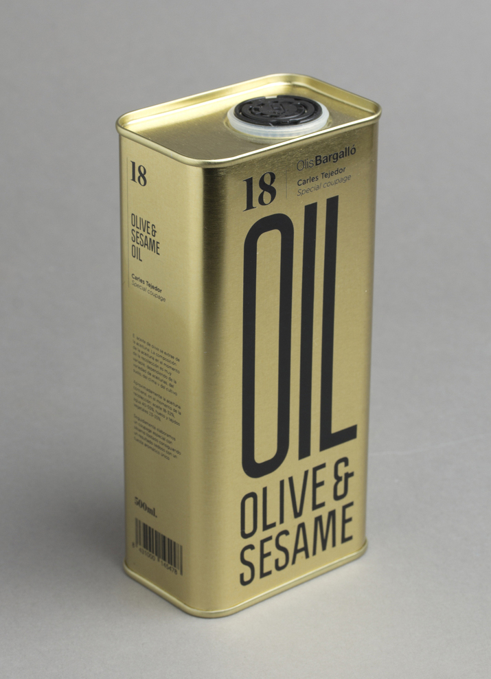
Design agency Lo Siento have recently completed their packaging design work for Spanish olive oil producer Olis Bargalló‘s new Olive & Sesame variety.
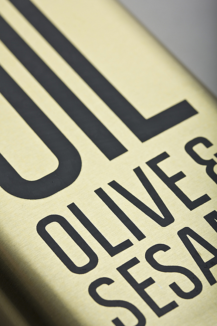
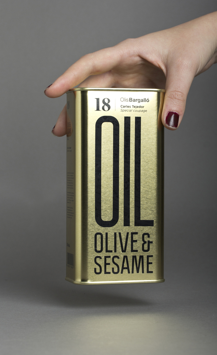
Lo Siento’s use of condensed sans-serif typography, stacked vertically, and printed with a single black ink makes great use of the tall tin and its warm gold colour.
Typography, structural choice and straightforward language share a similar commercial kitchen utility and simplicity that suitably reflects Olis Bargalló’s relationship with professionals in gastronomy and commercial kitchens while the serif of the 18 and lighter sans-serif weights set horizontally offer contrast and temper the bold typography with a little detail. Although made up of few elements the solution effectively combines structure, colour and typography in a way that appears bold and distinctive.


