Brae by Studio Round
Opinion by Richard Baird Posted 14 January 2014

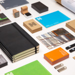
Brae is a restaurant, located in the Australian town of Birregurra, that describes itself as having a menu of unique and contemporary dishes built around a respect for nature and seasonality, and crafted from organic ingredients both locally sourced and grown on its own 30 acre site. Brae’s new brand identity—which included a new logo-type, menu, stationery set and website developed by Melbourne based Studio Round—juxtaposes traditional typography and a seasonal colour palette alongside the contemporary creativity and rich natural detail of a series of still life photographs taken by Scottie Cameron.

On the surface Round’s solution appears as a relatively conventional union of type, image and paper but this simplicity is layered with a level of contrast and nuance—such as the regional weather widget of the website, the combination of sans-serif numerals and serif characters and the influence season has on the colour palette—that makes this a really interesting and communicative piece.


In print the combination of coloured, uncoated papers, a generous amount of unprinted space, a limited white and green ink choice and a blind embossed print finish, establishes a distinctive classic and contemporary contrast and introduces a tactile sense of good quality.
A pale and rich green provide an earthy sensibility alongside a peach that neatly reflects the summer seasonality of the menu below.


The photography provides the strongest communicative yet unconventional asset, lending the restaurant a very distinctive quality. It is a costly detail not often utilised in such an abstract way within the hospitality sector but within the context of Brae—a restaurant led by a chef described as having Jedi-like techniques that amplify flavours and play with textures—really benefits from Scottie Cameron’s playful and structured approach. A combination that neatly conveys, in a very clear, honest and creative way, the fusion of food, fresh from the ground, dirt and all, and their modern preparation and presentation.
These images are made the most of on-line as full screen splashes, changing with the season much like the menus. These appear as celebration of ingredients in their most basic form, a reminder of their connection to the earth, not just a prestine plate of food and their arrangement but also work well to add a richer dimensionality, through organic texture, to the open space and simple layouts of the print work.

Small details online such the live regional weather data, current season and length of the day are intelligent and technological subtleties that build on the themes of efficient farming and locality, that alongside the traditional qualities and values conveyed by the typography, the creativity of the photography and a contemporary restraint of the print, convey the holistic conscientiousness of Brae’s contemporary dining experience.
Design: Studio Round
Photography: Scottie Cameron
Printer: Press Print Digital
Paper: G . F Smith Colorplan
Opinion: Richard Baird
Fonts Used: Stanley