Raiffeisen Rechenzentrum by Moodley
Opinion by Richard Baird Posted 23 January 2014
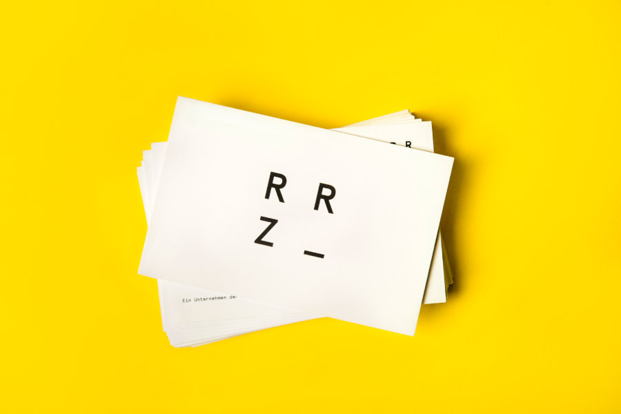
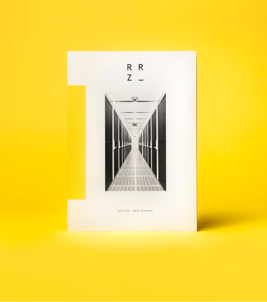
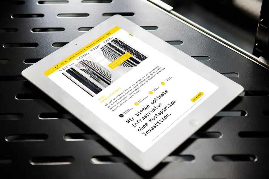
The Raiffeisen Rechenzentrum is a customised IT infrastructure service provider and subsidiary of Raiffeisen Landesbank with a modern, ‘high availability’ and maximum security data centre located in Austria. Design agency Moodley recently developed RRZ’s brand identity—which included a logo, business cards, brochure and website—based around a single sans-serif, a contrast of humanistic and technological imagery and a white, black and bright yellow colour palette.
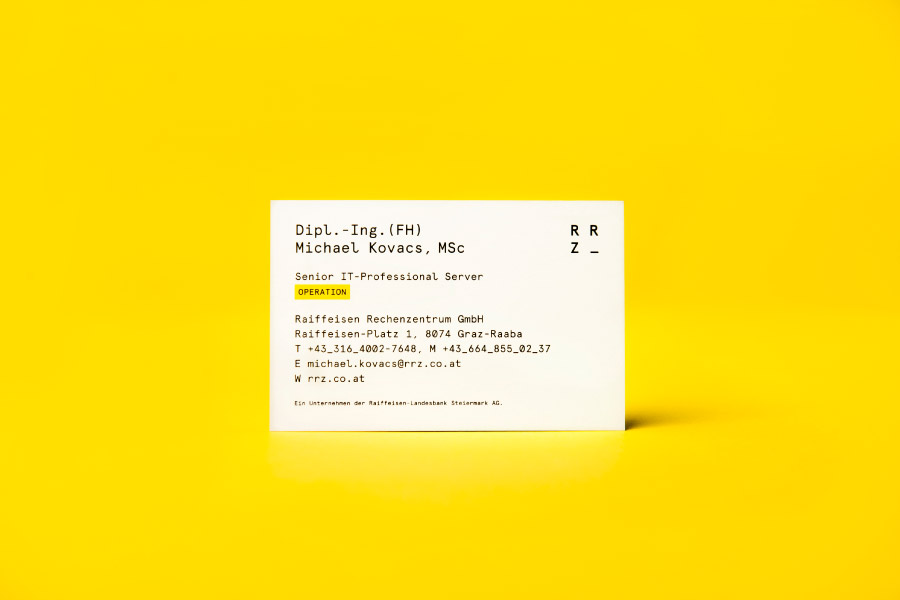
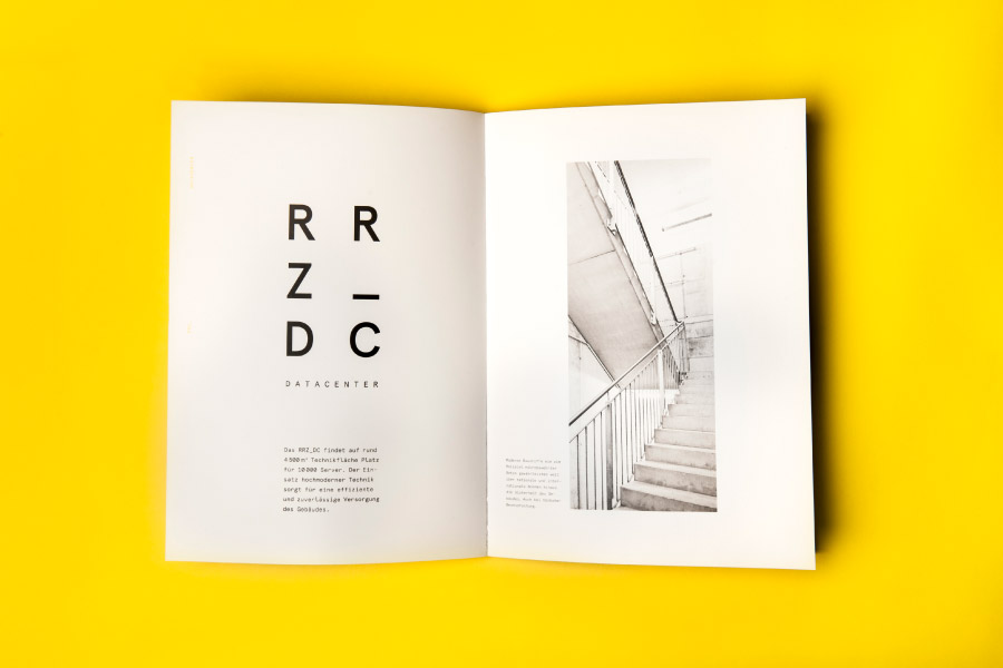
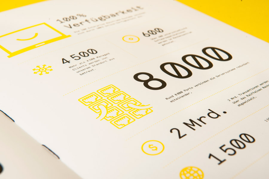
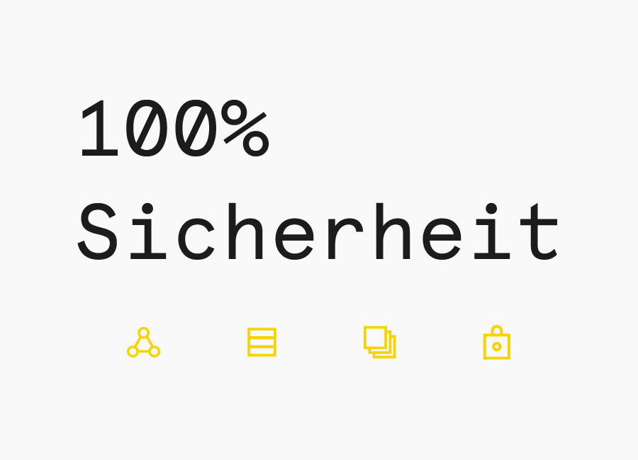
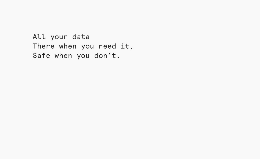
Set in Apercu Mono Regular, the logotype, its stacked resolution and the typography of the brochure and website are quick to establish a technological foundation. Consistent line weights, mono spacing and black ink across white paper convey a consistency, reliability and utility with very little fuss or superfluous detail.
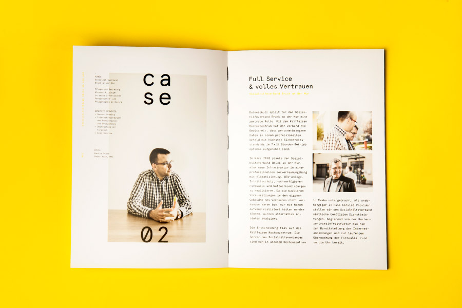
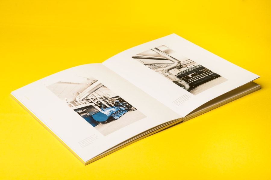
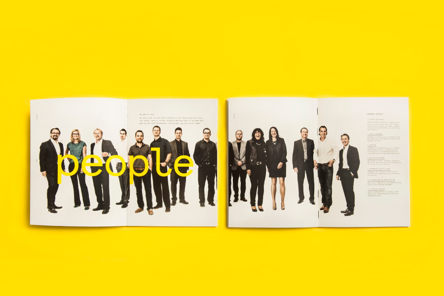
In contrast, the photography introduces a well shot and almost a sci-fi sensibility, blending images of the high tech and industrial areas that house the servers with those of people that maintain these and service customers. It is an approach that provides a humanistic layer to a lab-like cleanliness and efficiency that tempers the mechanical and one dimensional and straightforward communicative nature of the type.
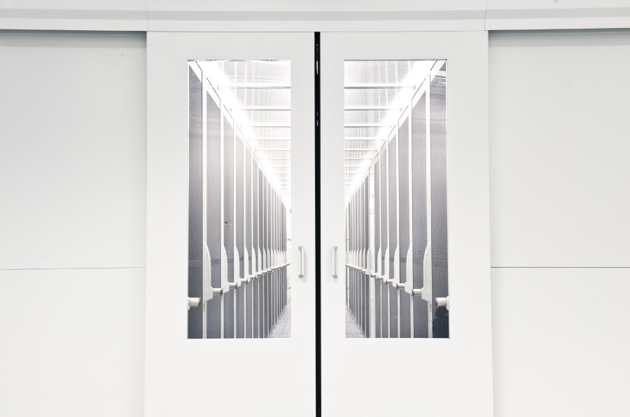
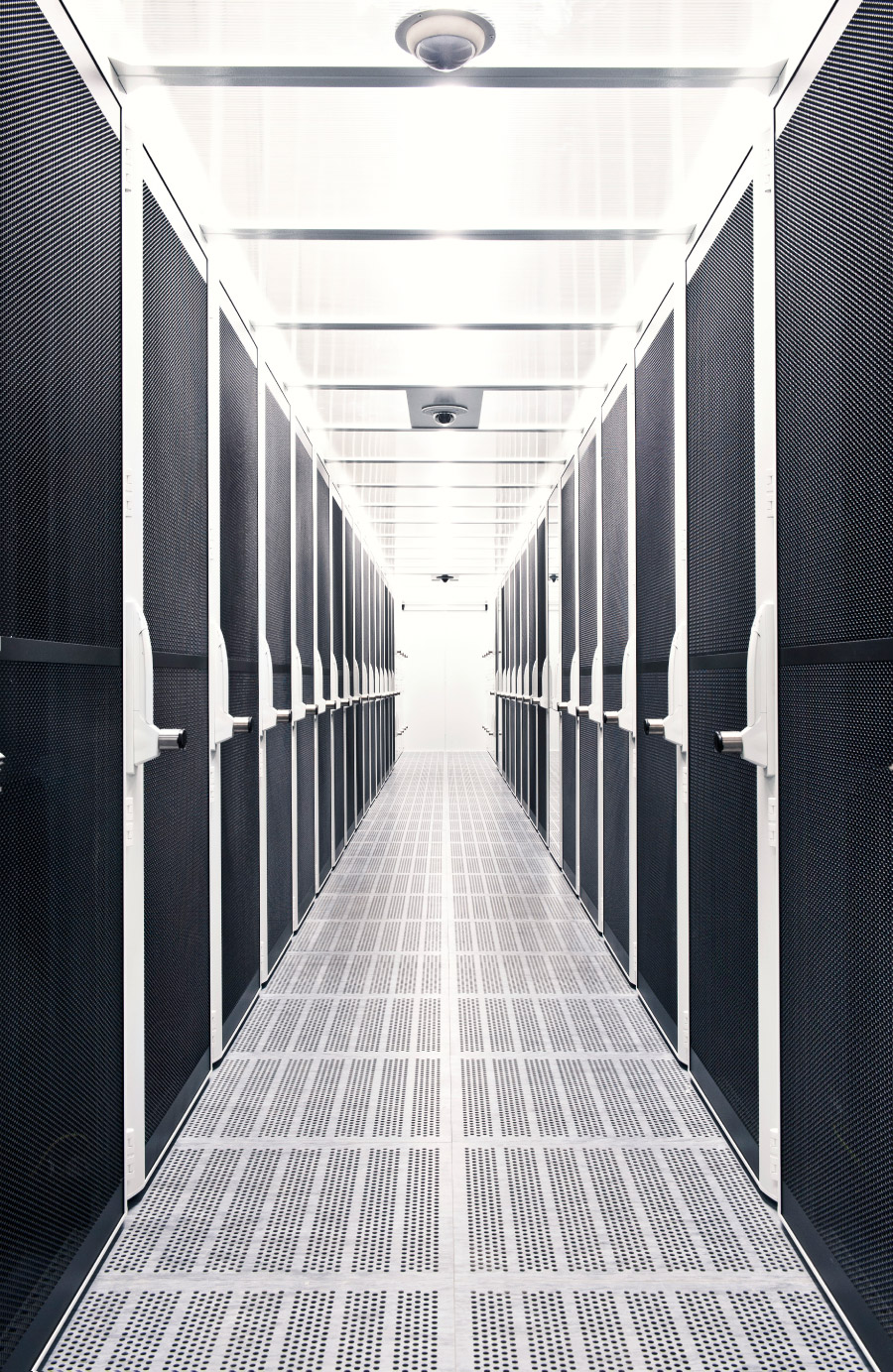
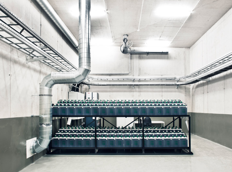
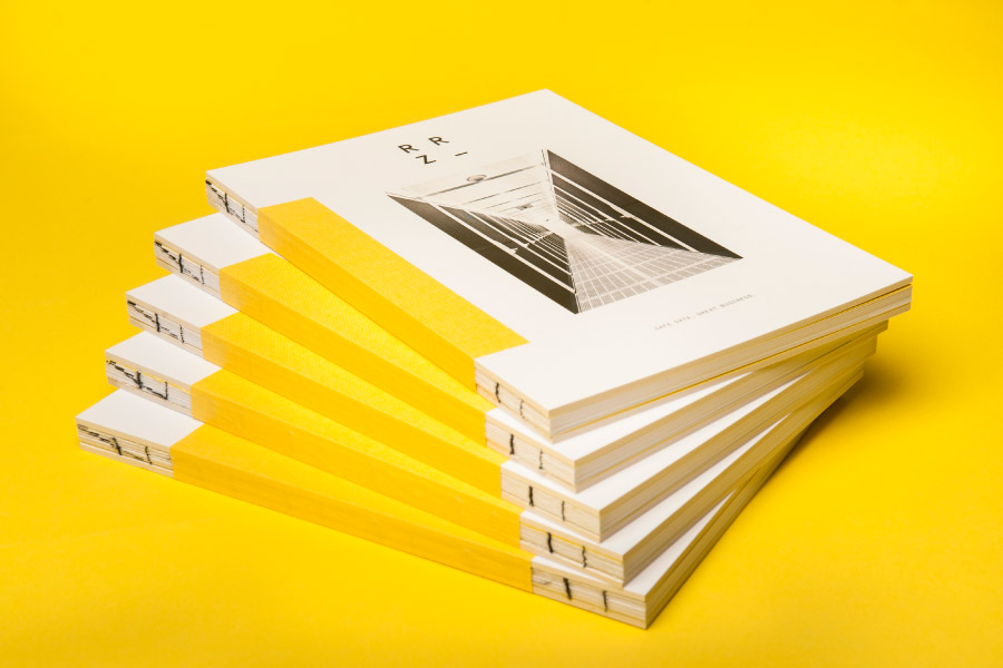
A basic white and black colour palette is juxtaposed alongside a bright yellow band appearing, much like the photography, as both industrious yet accessible—enhanced by the iconography—while small details in print such the open stitching of the brochure introduce a layer of crafted detail and a level of care unusual for the industry.
