Collective Gallery by Graphical House
Opinion by Richard Baird Posted 10 April 2014

Collective is a contemporary visual arts organisation founded in 1984 to help new and emerging artists exhibit their work in Scotland’s capital city Edinburgh. The organisation delivers a diverse programme of new exhibitions and commissions, and is described as being “fundamental to the cultural vitality of the country”. Following a move to The City Observatory, Glasgow based design studio Graphical House worked with Collective to develop a new brand identity that would challenge the ‘white space’ gallery convention and give them a contemporary voice within Edinburgh.
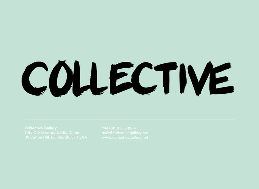
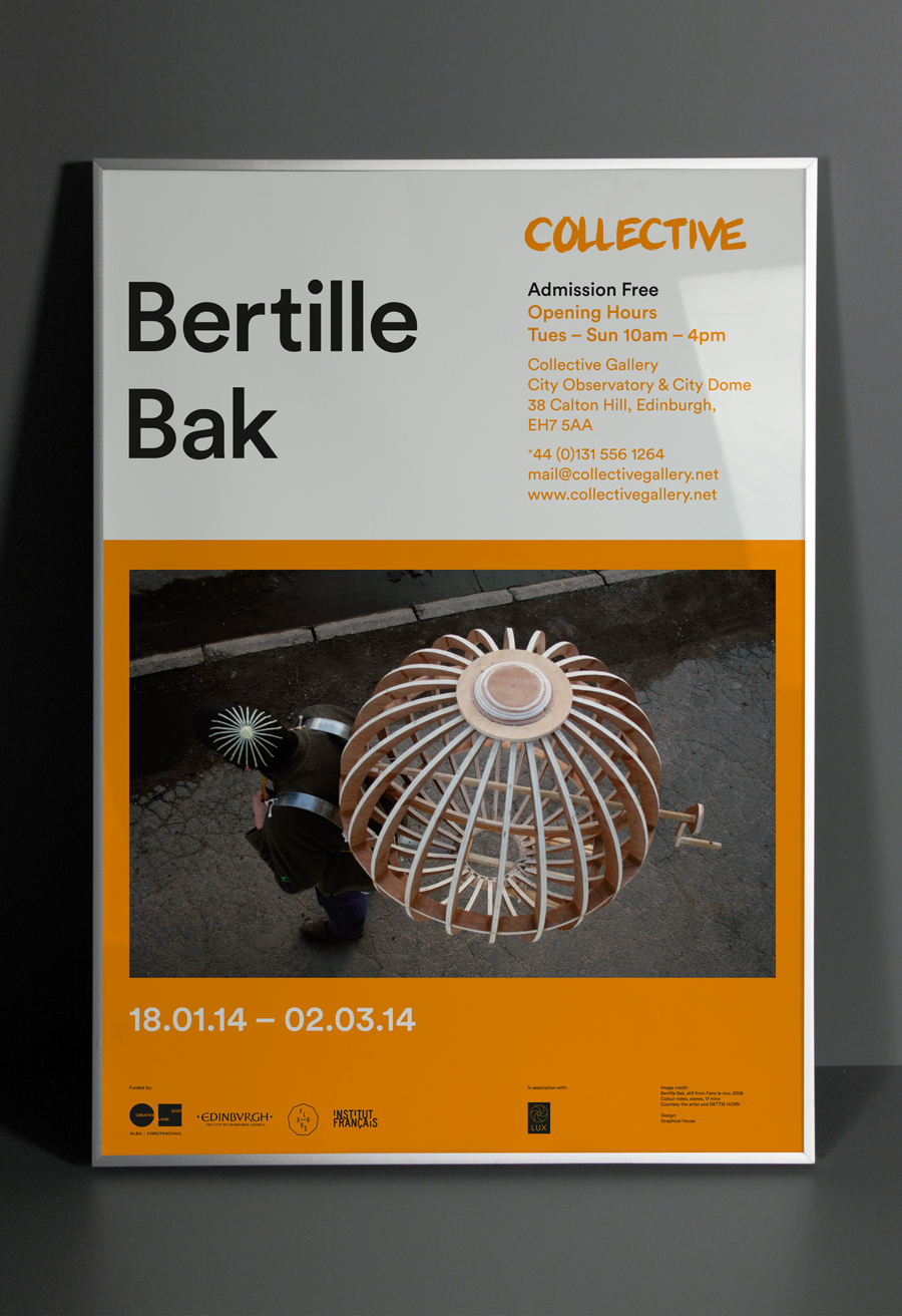
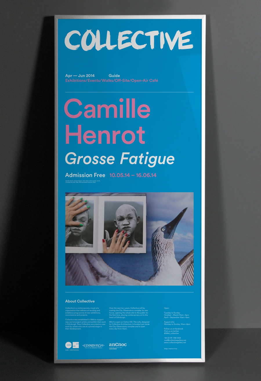
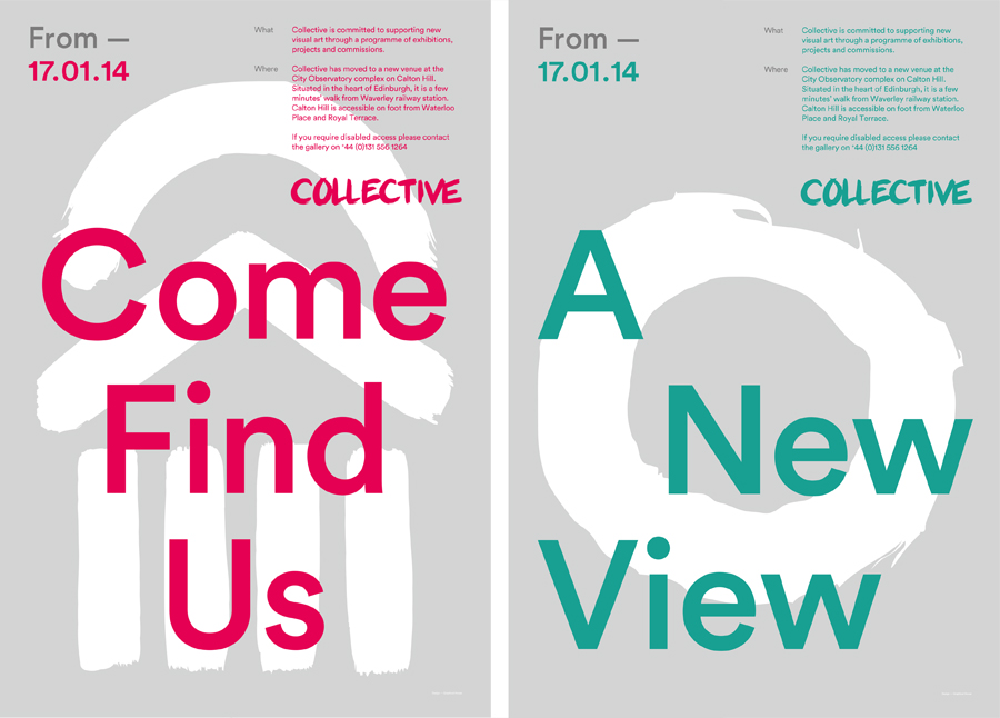
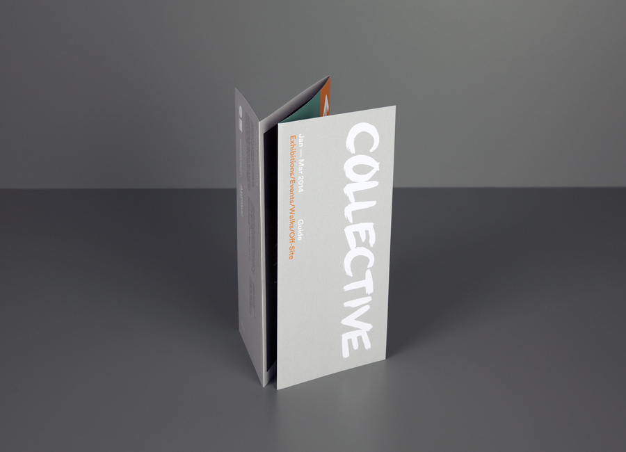
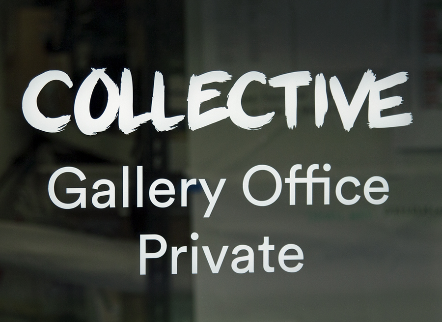
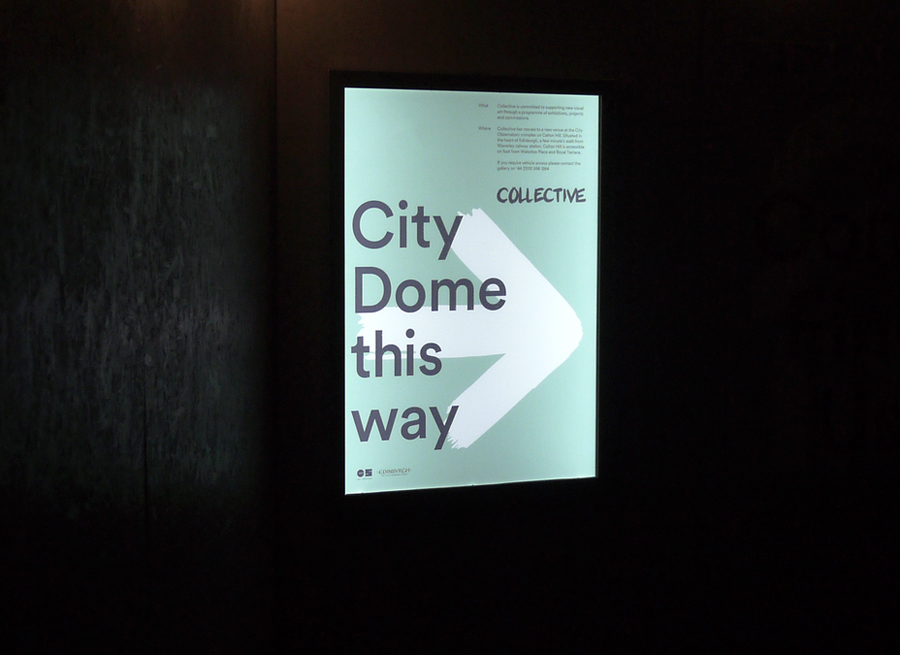
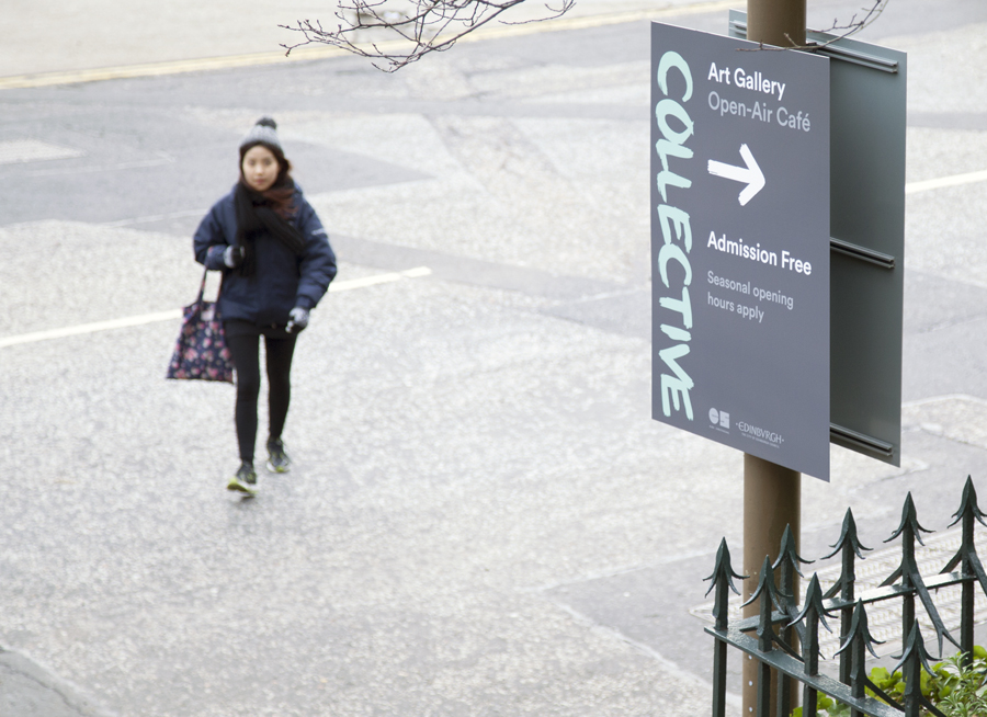
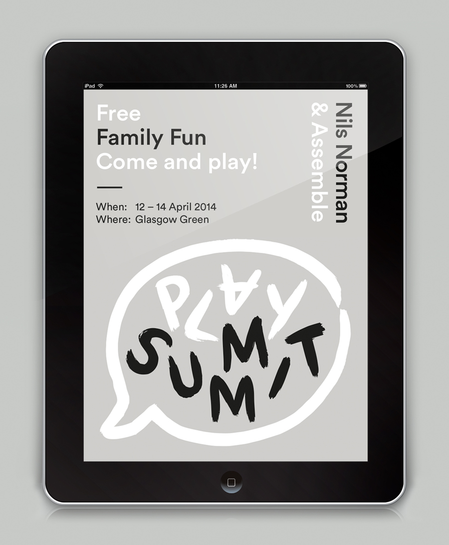
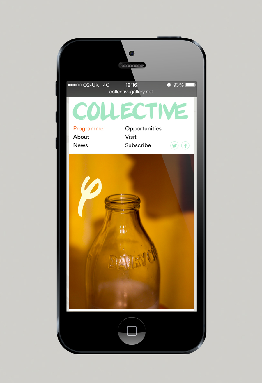
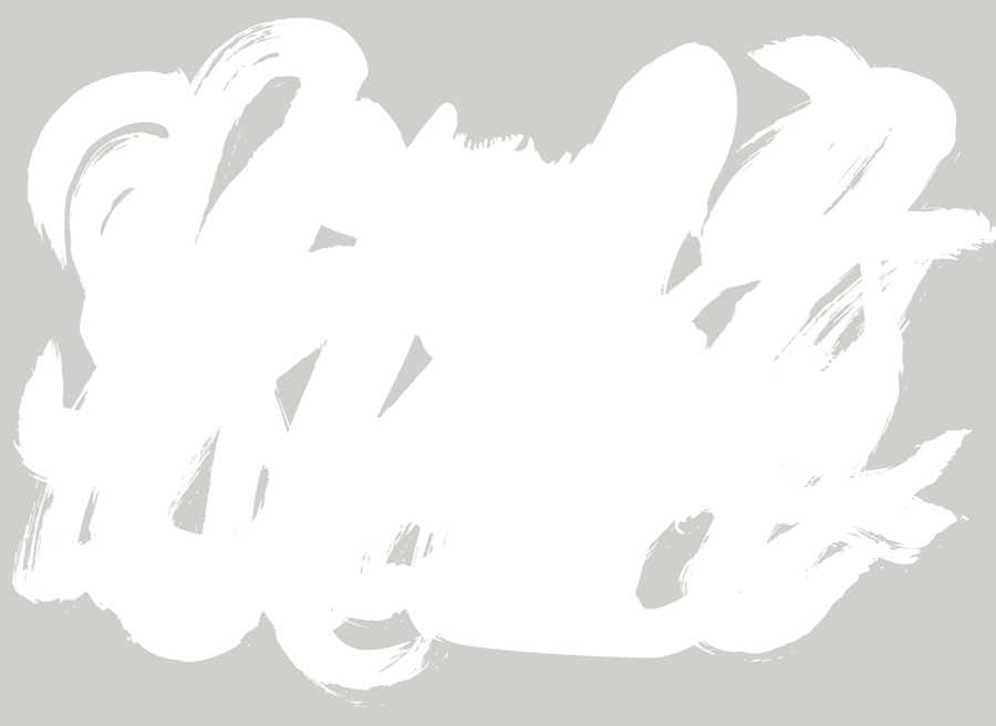
Based around the broad brush strokes of a proprietary cursive font, Graphical House’s solution introduces significant motion and contemporary contrast to the heritage and unmoving Greek style architecture of the gallery’s new premises at the observatory. Its uppercase characters, weight and bristle detail deliver a familiar urban energy, a subtle anti-establishment sensibility in its graffiti-like application across the doors, and is expressive in the way that it borrows a little from the aesthetic of protest, influences ideal for a gallery that rejects the ‘white space’ convention.
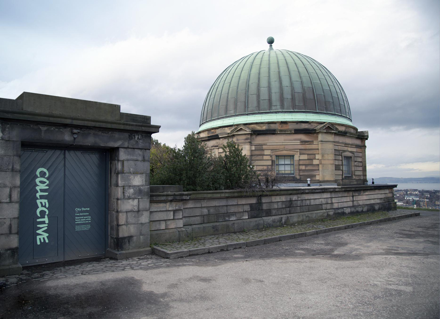
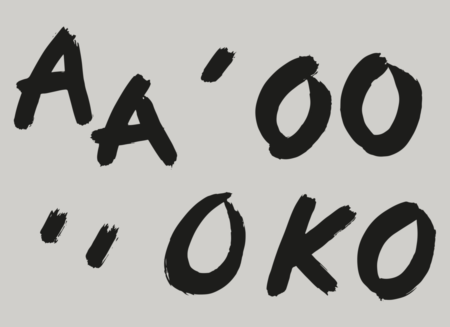
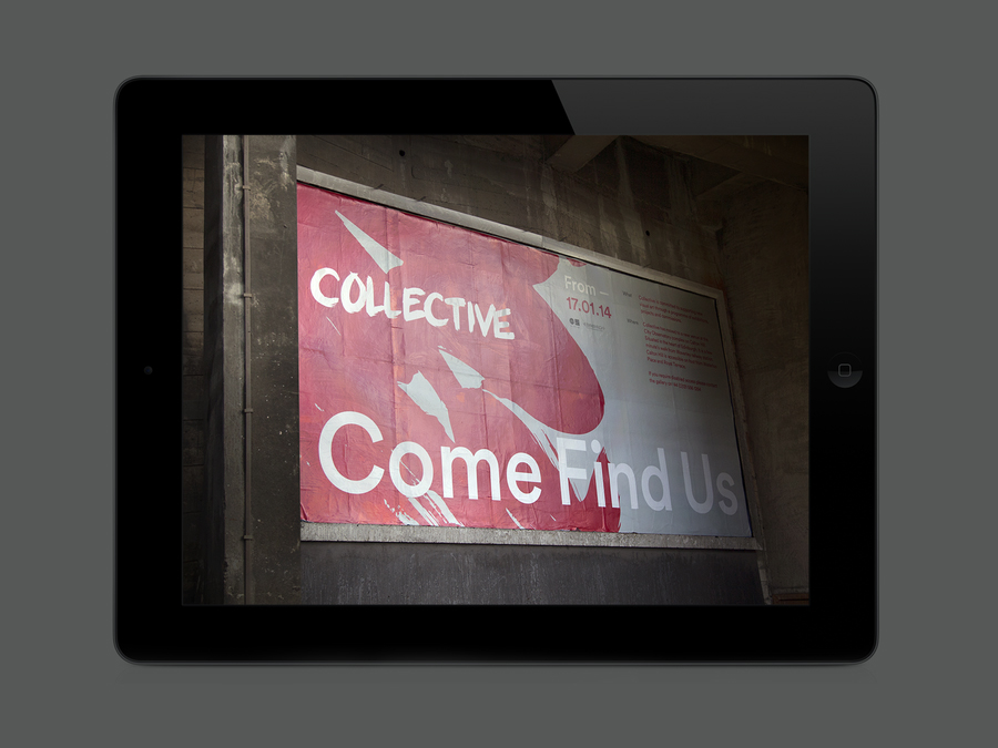
The strokes of the logotype are grounded by an accompanying sans-serif typeface utilised in print and online with a couple of neat details and good character shapes that avoid neutrality or ubiquity. This contrast of type and environment is translated effectively into a colour palette of what could be described as stone alongside a brighter combination of red, blue, pink and orange. The result successfully leverages disparity to derive communicative impact and breathes new life into a familiar aesthetic through a simple change in context.
Design: Graphical House
Opinion: Richard Baird
Fonts Used: Circular
