Vitenparken by Bielke&Yang
Opinion by Richard Baird Posted 14 April 2014
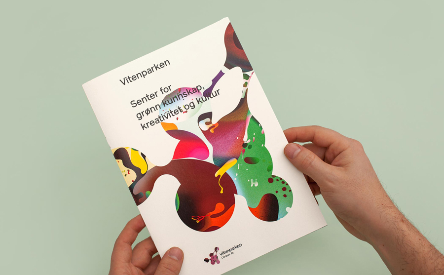
Vitenparken is a science centre committed to facilitating and improving the dialogue between the bioscience research community and the general public. The centre contains an exhibit hall, cafe, dairy museum and meeting facilities set within the Campus Ås grounds of the Norwegian University of Life Sciences. As well as the science centre these grounds are home to over a 1000 scientists, a university with eight departments and 4500 students, and a number of parks.
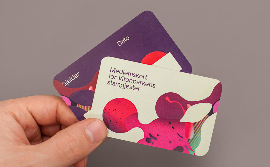
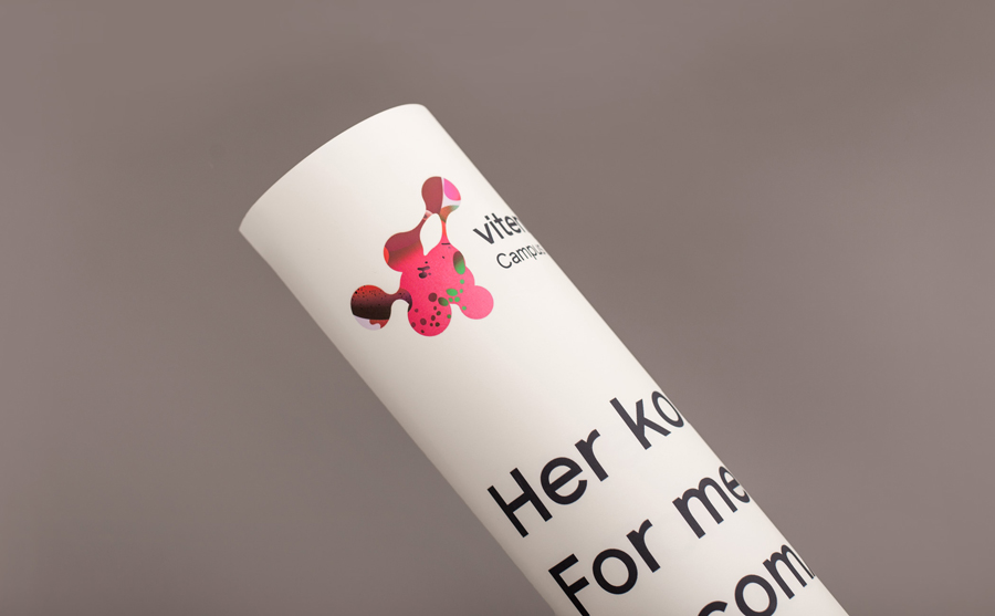
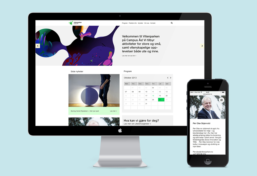
Formerly the Norwegian Agriculture Museum, Vitenparken commissioned design studio Bielke&Yang to help them transition from museum to science centre through the creation of a new brand identity that included naming, logo, print and website design. By appropriating the practical aesthetic of science (sans-serif typography, black ink and white paper), and juxtaposing this alongside the bright contemporary energy of MVM‘s illustrative work, Bielke&Yang’s solution establishes a common yet compelling scientific accessibility.
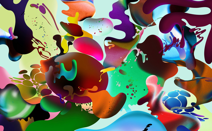
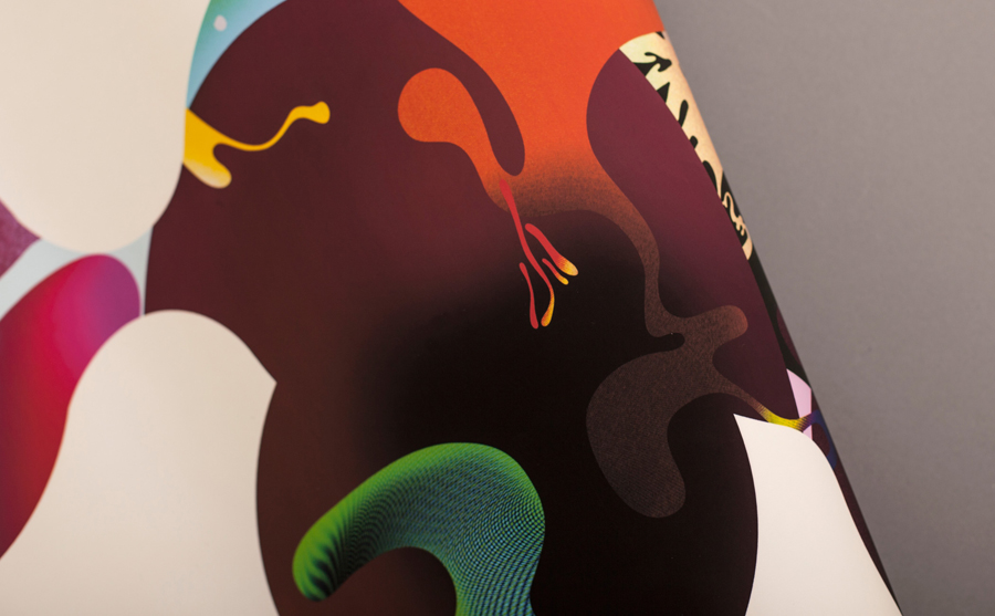
The contrast of typographic restraint and illustrative embellishment is a well-established design technique but one that can fall short, its success largely hinging on the quality of the imagery and its ability to blend communicative and aesthetic value. This piece by Bielke&Yang is a strong example. By appropriately leveraging the freelance talent of Magnus Voll Mathiassen, whose detail and texture is similar to that of spray rather than vector art, and executing it in print with consideration, provides the visual identity with a very high quality crafted finish.
Wolff Olins’ packaging work for Windows 8, illustrated by Colors And The Kids, is perhaps one of the few similar examples to have an equally high polish but with a little more diversity.
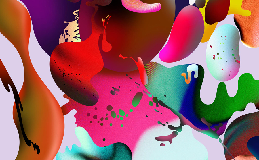
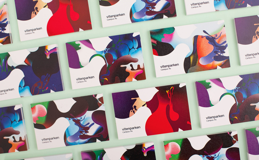
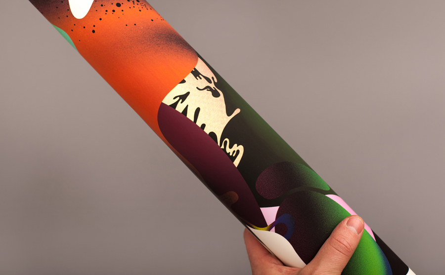
The illustrations effectively mix bright contemporary colour, soft and grainy visual textures, light and shade, gradation and achieves a good sense of depth and motion through the organic coalescing shapes. Although these may appear abstract to some, others will see these as being informed by themes such as liquid dynamics, creative thought, bioscience and the alien world of microscopic organisms, a combination of subtle communicative reference and clear aesthetic value.
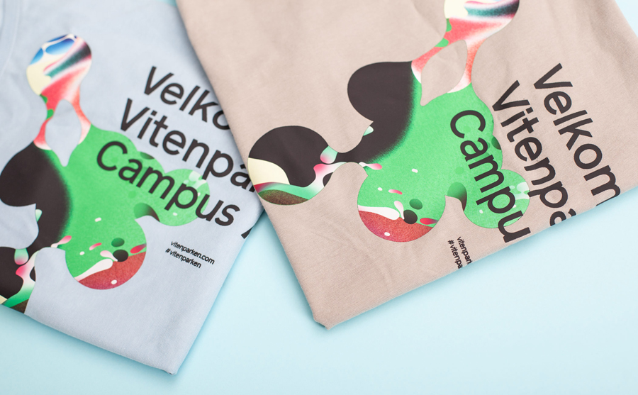
The use of two just two panels provides Vitenparken with a very strong sense of consistency and identifiable brand character that while appearing largely logo-centric utilises different crops to extract as much visual equity and variety from these as possible.
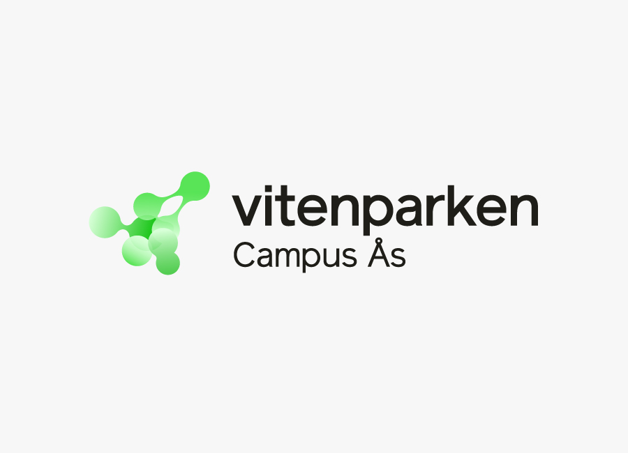
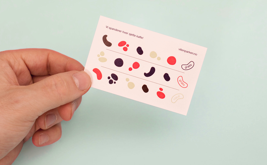
Removal of the illustrative element reveals a familiar combination of near-neutral sans-serif typography and abstract protean form. Together these deliver a corporate formality, perhaps hint loosely at the concepts of dialogue and connections, and although conventional, work well to ground the motion and bright aesthetic of the images with a clinical austerity.
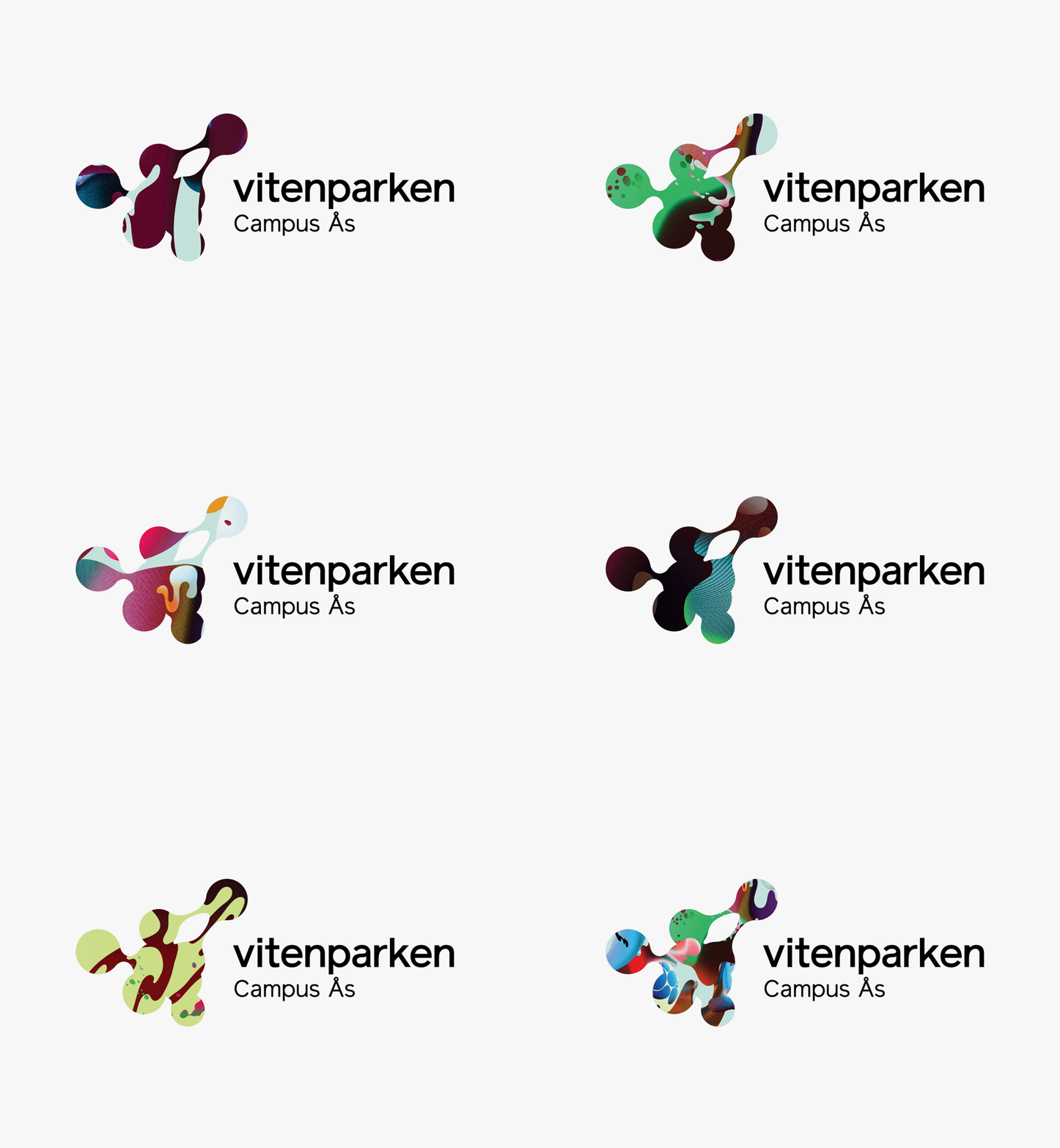
In print the illustrations are contained by the logo, appearing as a window to say a microscopic world or as a suspended gel much like a lava lamp. These are enhanced by flat colour that moves between a contemporary and complementary deep purple, bright red and the clinical sensibilities of plenty of white space.
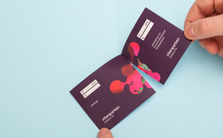
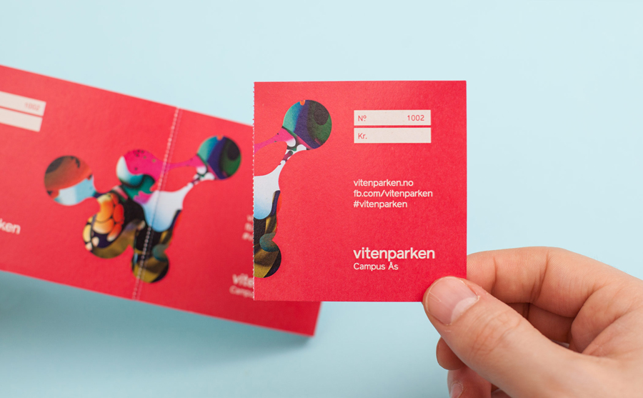
The result is a well established but appropriate juxtaposition that is both communicative and impactful. It benefits from strong outsourced illustrative work and the ability to maximise these through flat surrounding colour or plenty of white space, different crops and large print coverage across a variety of collaterals. It neatly balances simple visual stimulus with a communicative agenda without undermining either.
Thank you to Christian Bielke for giving BP&O the exclusive. To see further projects published today by Bielke&Yang be sure to check out their new website.
Design: Bielke+Yang
Illustration: MVM
Opinion: Richard Baird
Fonts Used: Reader
