Propercorn 2014 by B&B Studio
Opinion by Richard Baird Posted 29 April 2014
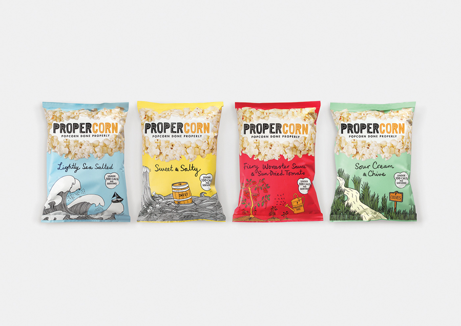
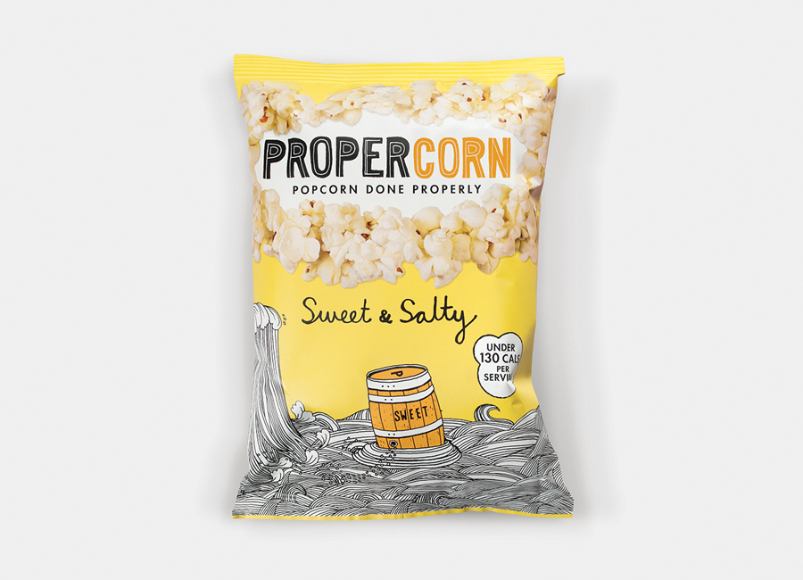
Propercorn is a ‘hand-popped’ gourmet butterfly popcorn range, launched in 2011, made using British rapeseed oil and seasoned with a secret blend of ingredients. Flavors include Sweet & Salty, Sour Cream & Chive and Fiery Worcester Sauce & Sun-Dried Tomato. London based design agency B&B Studio were recently commissioned to refresh Propercorn’s packaging and visual identity which included the development of an “ownable logotype, evocative imagery, appetising product shot and clear communication.”
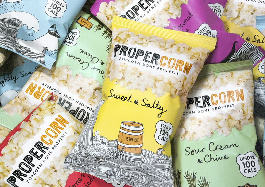
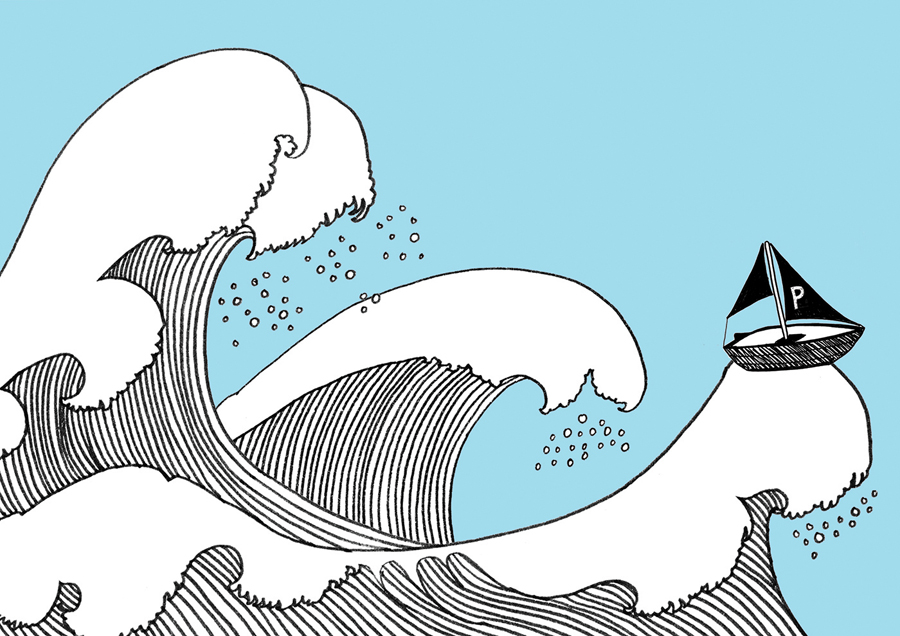
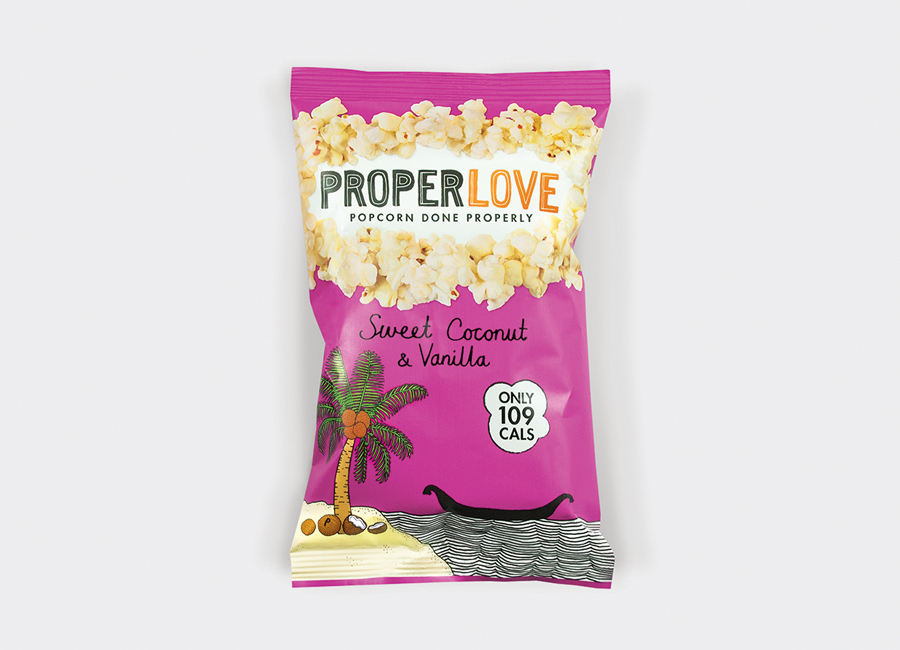
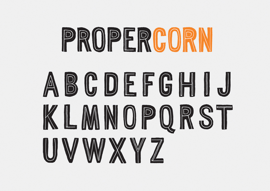
B&B Studio’s solution honours the familiar and effective communicative combination of crafted design cues and playful brand personality of the original whilst improving impact and consistency. This was achieved through revised hand drawn illustrations from designer Zoe More O’Ferrall, a new logotype and extended typeface with inline scribble and hand stamped treatment, a similar flat contemporary pastel colour palette and the continued use of a loosely rendered script.
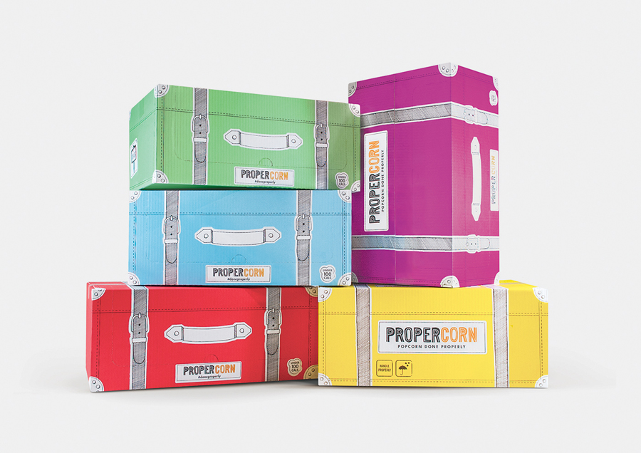
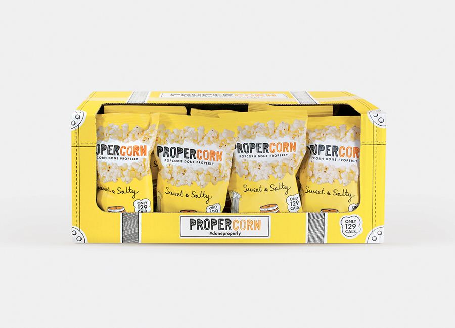
The card box, often a utilitarian corrugated board, has been given a full colour treatment and illustrative finish, creating a high quality consistency with the bags that reflect the shipping of the popcorn in a more playful manner and provides a larger branded canvas within a retail space.
It is difficult to make popcorn look good in print but the flat colour of each pack helps to draw out their lighter shades and detail keeping them from appearing anaemic. As the studio explain, their approach effectively retains and heightens the charm of the original packaging.
Design: B&B Studio
Illustration: Zoe More O’Ferrall
Opinion: Richard Baird
