The Confidante by RE:
Opinion by Richard Baird Posted 15 July 2014
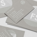
The Confidante is a group of CEOs who draw on their extensive networks to provide business leaders with tailored executive coaching and mentoring services. Designed by Re: Sydney, The Confidante’s new brand identity effectively visualises the confidential and discretionary nature of their work and the executive level of their service through a simple negative space keyhole logo that has been given visual and communicative breadth alongside ornate door handle photography, a contrast of bold sans-serif and fine serif typography, and the perceived high quality of dark paper and a copper foil print finish.

While the lock may well be a saturated shorthand for security its communicative value is well established, clear and effectively utilised here, not just as a clever negative space logo, but intelligently drawn out through edge to edge photography in print. The ornate cast detail of the door handles and sturdy wooden panels are a far more compelling assets, delivering an old school club sensibility and a behind closed doors visual narrative that may play well to executives. The value of these is distilled down well into a logo through a simple rotation of a C to form a lock. It is a shame, however, that the opportunity to play with the orientation of the business cards through type layout to really draw out its duality has been missed.


The traditional tone of the imagery is reinforced through material detail and print finish. Dark, dyed, uncoated and laid paper, die cut detail, a copper foil emboss, a lighter blue board and serif typography confidently mixes both classic corporate and executive mainstays while the negative space details – the pawn silhouette neatly hinting at strategy – and large sans-serif characters of what looks like Brandon Grotesque offer a more recent dimensionality.
Design: Re
Opinion: Richard Baird
More from RE: Ridley & Bang PR
Fonts Used: Brandon Grotesque