Echo Capital by Trüf
Opinion by Richard Baird Posted 19 August 2014
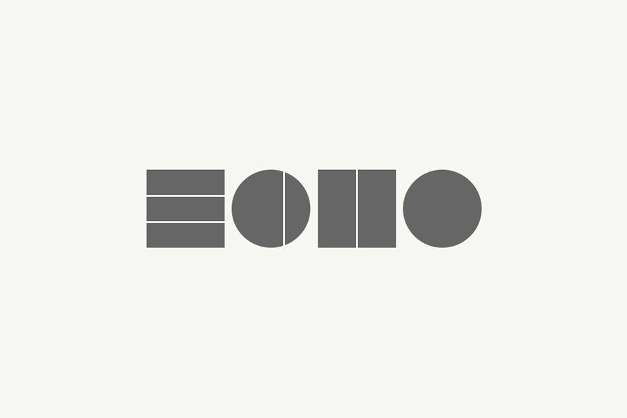
Echo is an American investment firm founded by, and working for, ‘Millennial’ entrepreneurs in the consumer packaged goods sector. The firm emerged from the Denver based Consolidated Investment Group with a mission to support and collaborate with young trend-setting companies with revenue streams between $1m and $10m, and products that are innovative, first-to-market, have positive social impact and good ethical standards.
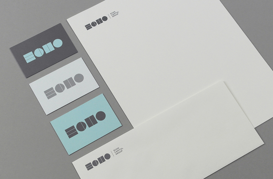
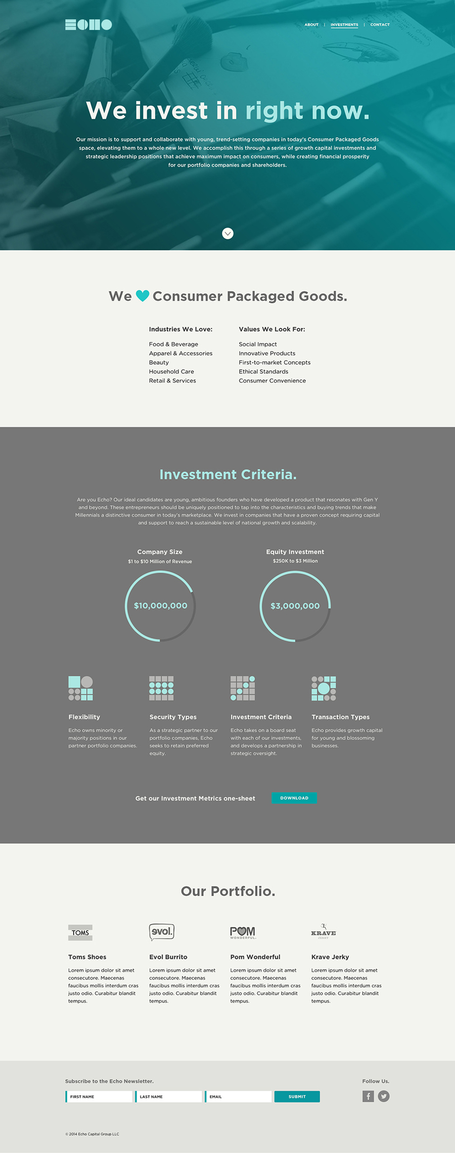
Echo’s brand identity, created by Californian graphic design studio Trüf, mixes a bold geometric logotype, logo animation and patterns with multiple weights of Gotham with the intention of conveying the firm’s forward-thinking and Generation Y nature whilst maintaining a consistent professional image.

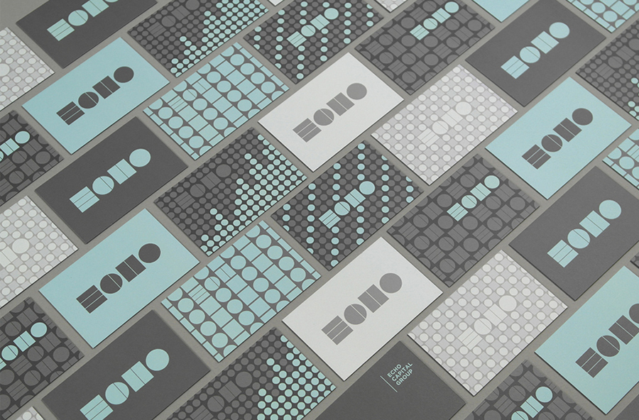
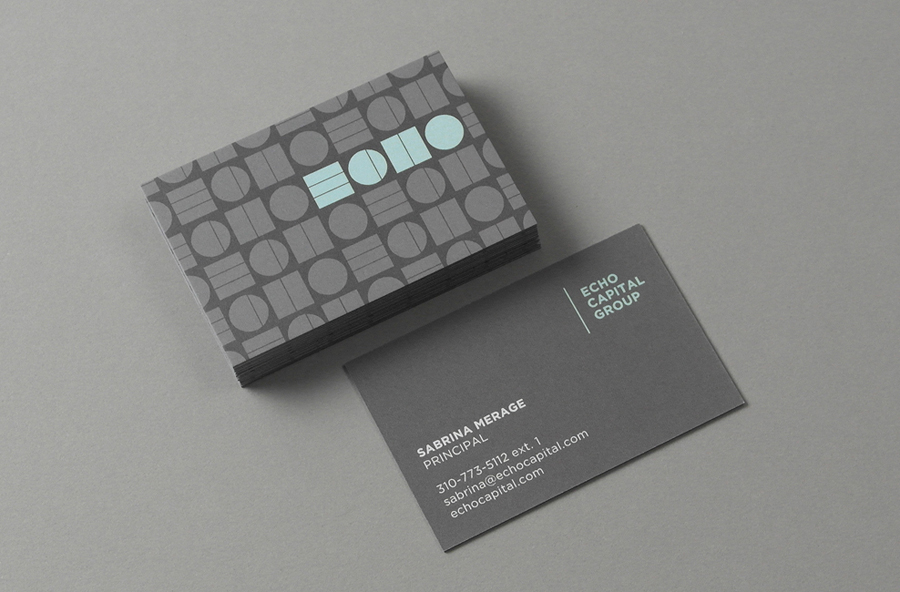
The logotype’s contrast of geometric shapes, fills intersected by fine lines, set alongside the single weight and small size of Gotham, effectively takes a bold and modernistic reductive style—distinctive form bordering on typographical illegibility—and underpins it with a more conventional, ubiquitous but robust corporate directness. This contrast is perhaps most acutely seen across the business card’s two sides. The reverse delivering, without aesthetic obstruction, information, while the front features an edge to edge pattern treatment that expands on the forms of the logotype. Trüf make the most of Moo’s multi-image option to deliver variety and very strong but slightly retro impact.
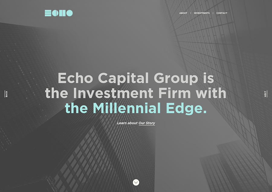
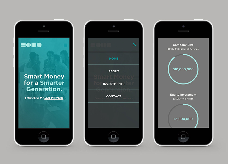
The patterns work well to draw a proprietary quality from elemental form through diversity. The resonating, echo-like nature of these are enhanced by colour, and are used online to help divide some of the content. These assets, as they do across the business cards, predominantly act as an stylistic treatment to achieve uniqueness within the industry but manage to convey a creative yet structured nature reflective of the company’s Millennial foundation, its distribution of capital and strategic leadership. Alongside copy that mixes corporate speak and exuberance, tinted imagery, and set within the context of a responsive website that utilises scroll activated HTML5 animations, the solution borrows a little from digital lifestyle brands and balances a youthful enthusiasm and subtle corporate authority to establish a unique presence within the financial industry.
Design: Trüf
Opinion: Richard Baird
Fonts Used: Gotham
