Mauritshuis by Studio Dumbar
Opinion by Richard Baird Posted 20 August 2014
Mauritshuis is an art museum and state-owned building constructed in the 17th century and located in The Hague. The building is described as being a fine example of Dutch Classicist architecture. It was formerly the residence of count John Maurice of Nassau and has been home to the Royal Picture Gallery since 1822. Today, it houses a plethora of Golden Age masterpieces, including works by Rembrandt, Jan Steen and Vermeer.
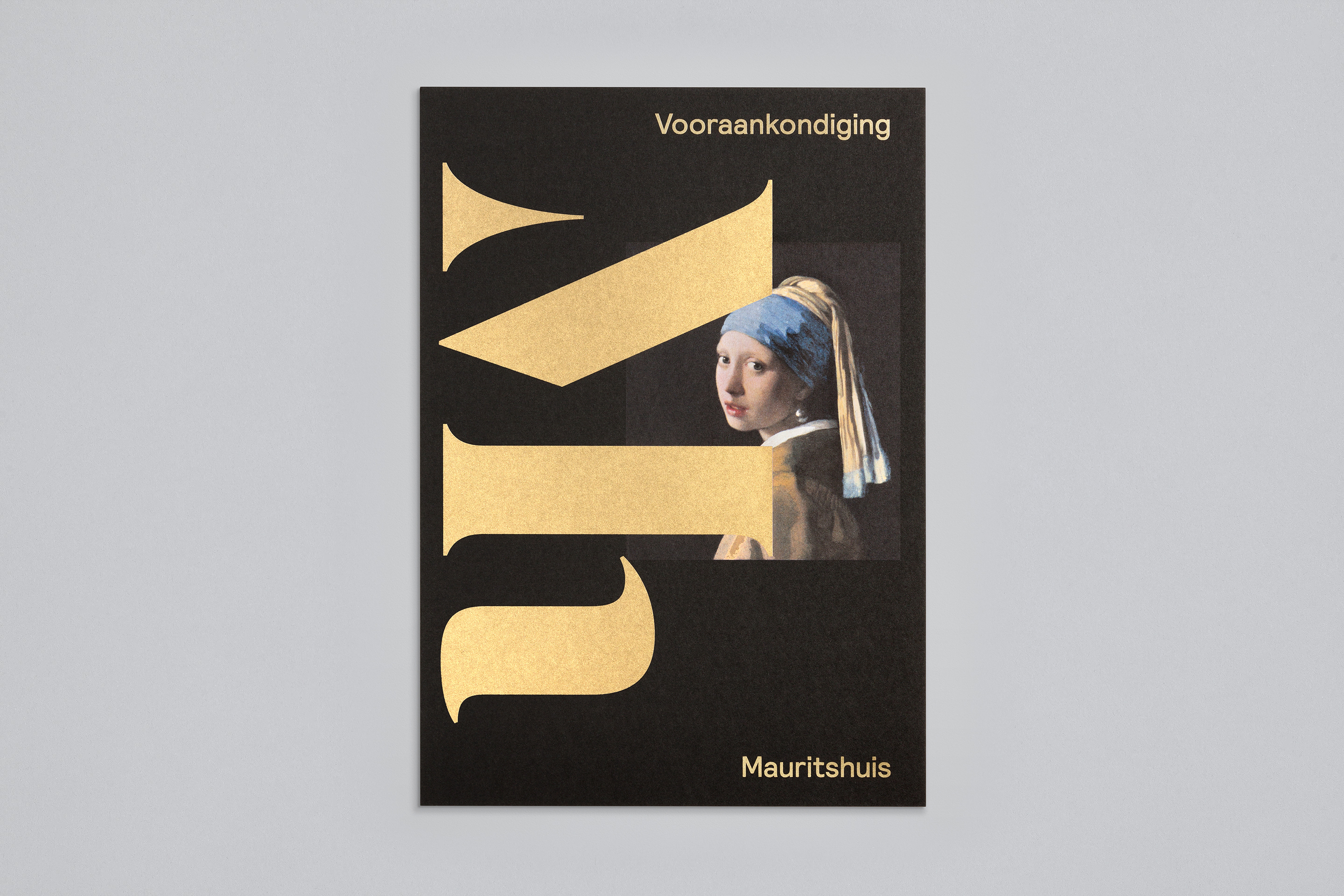
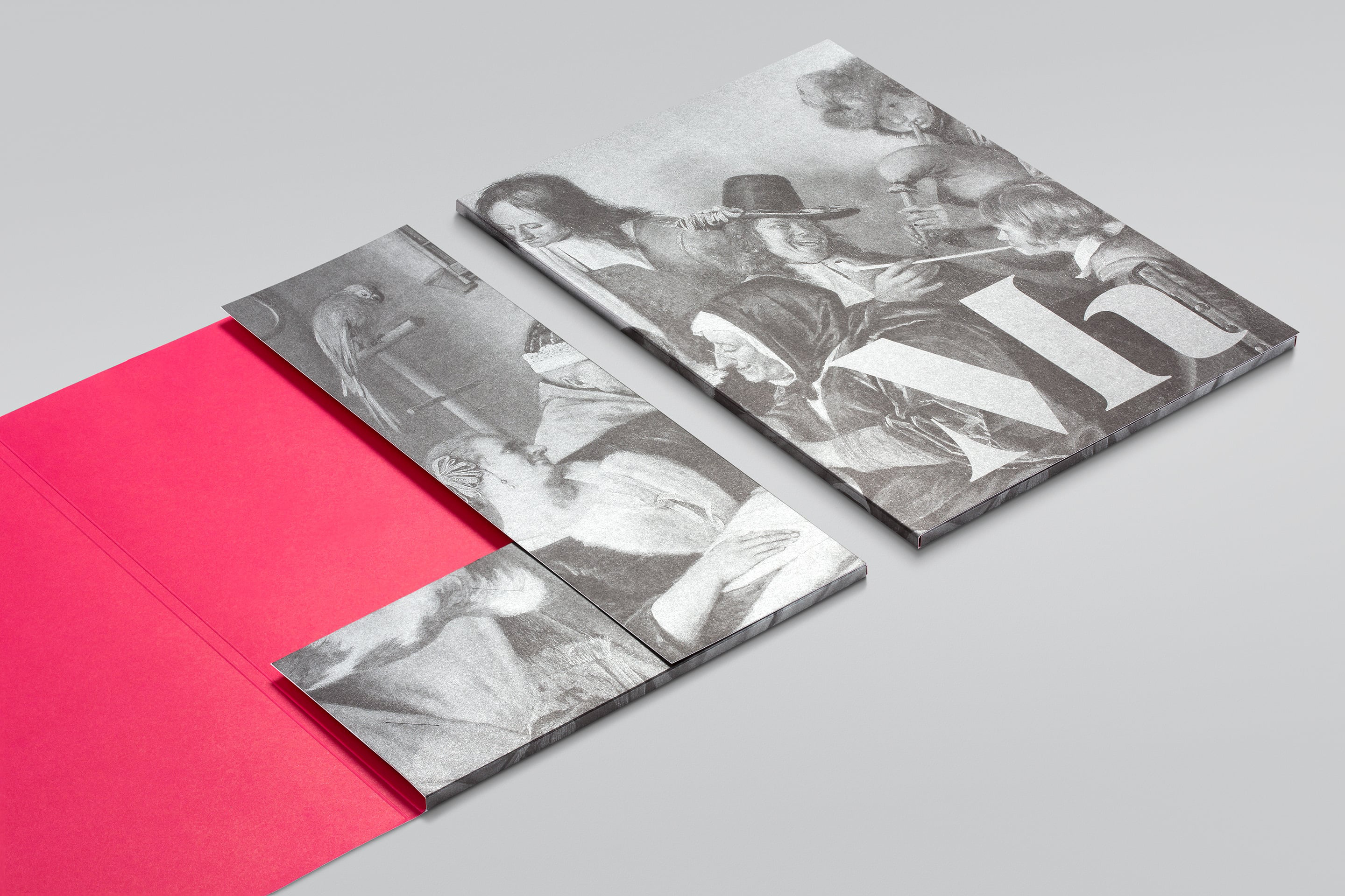
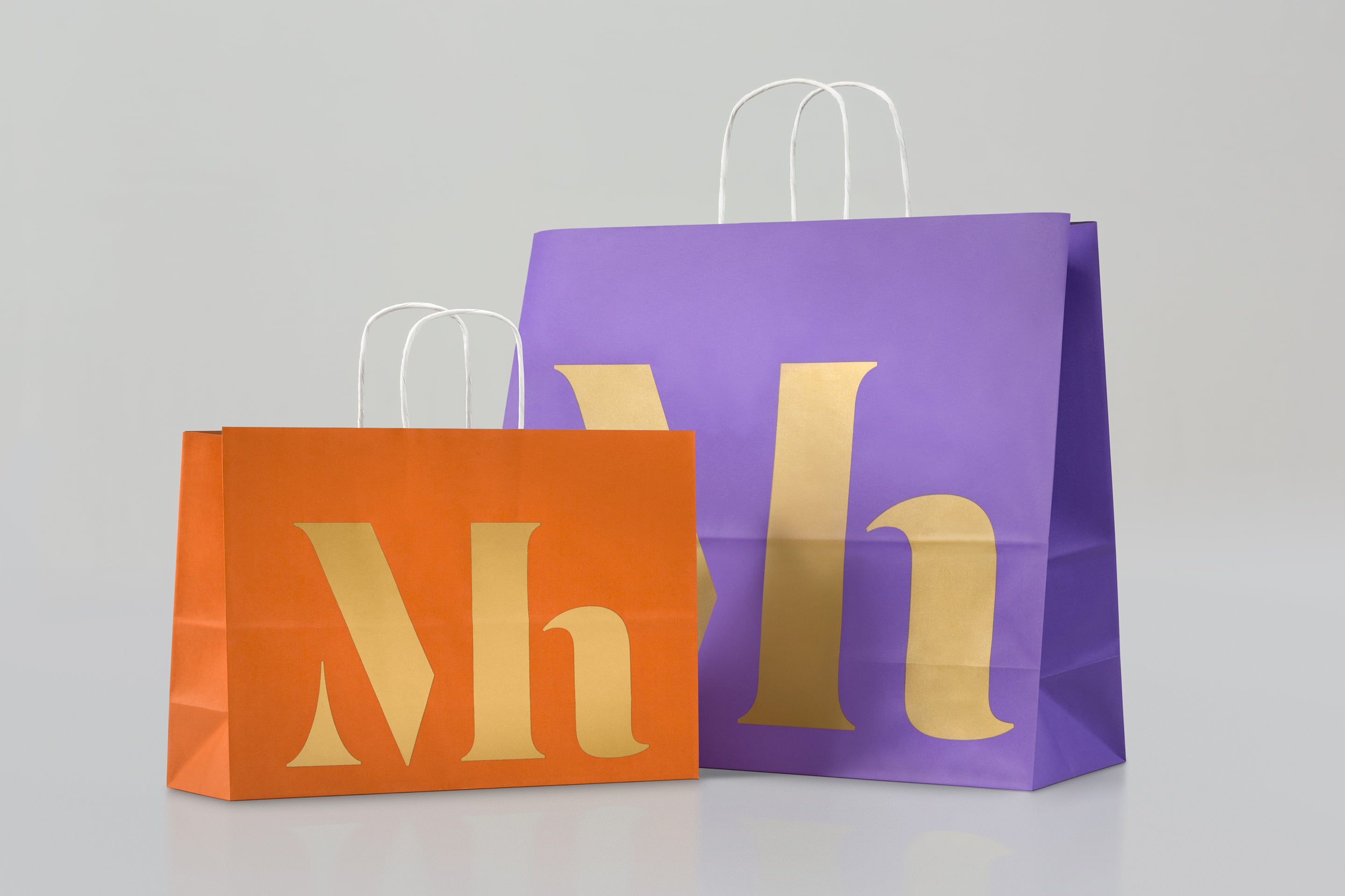
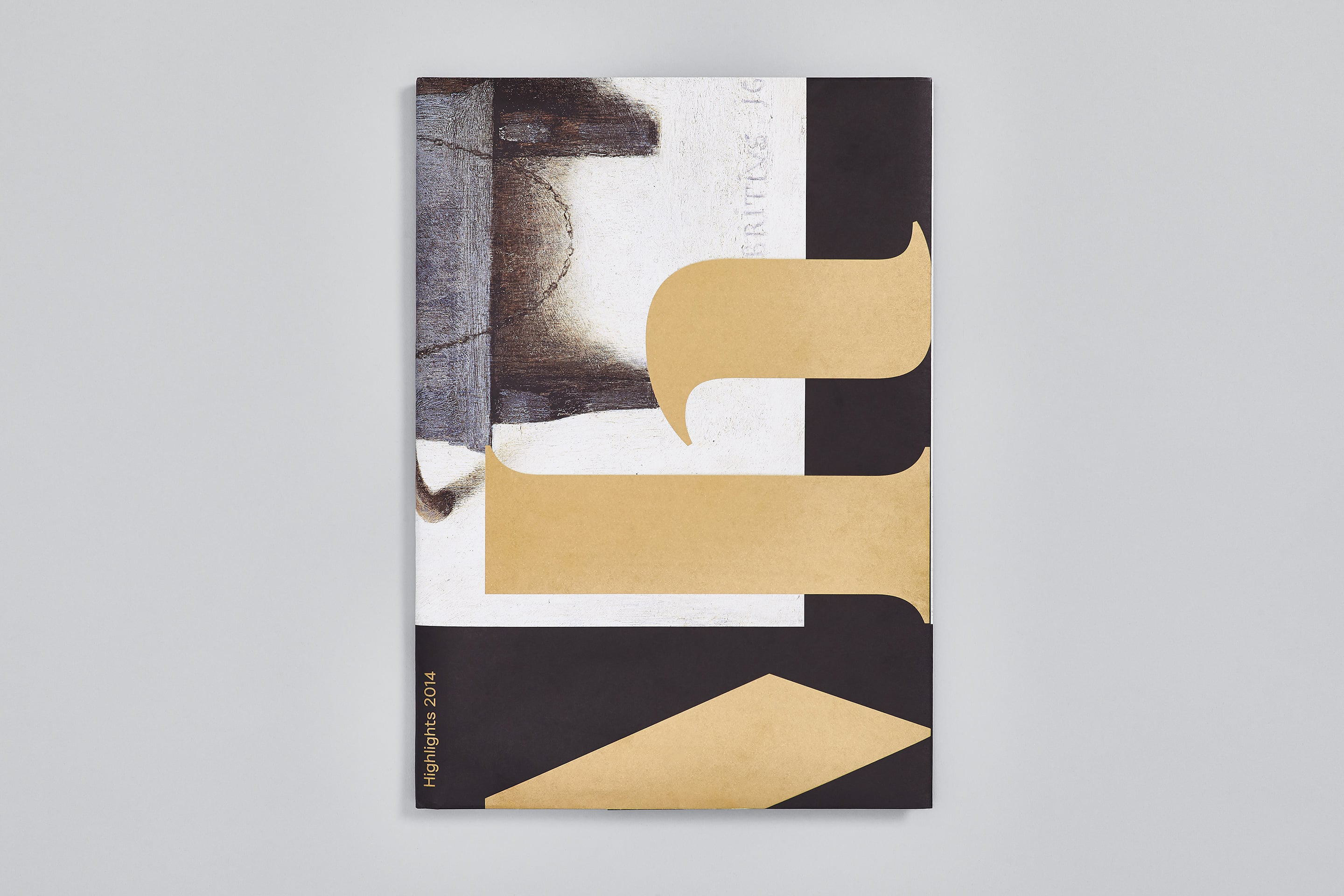
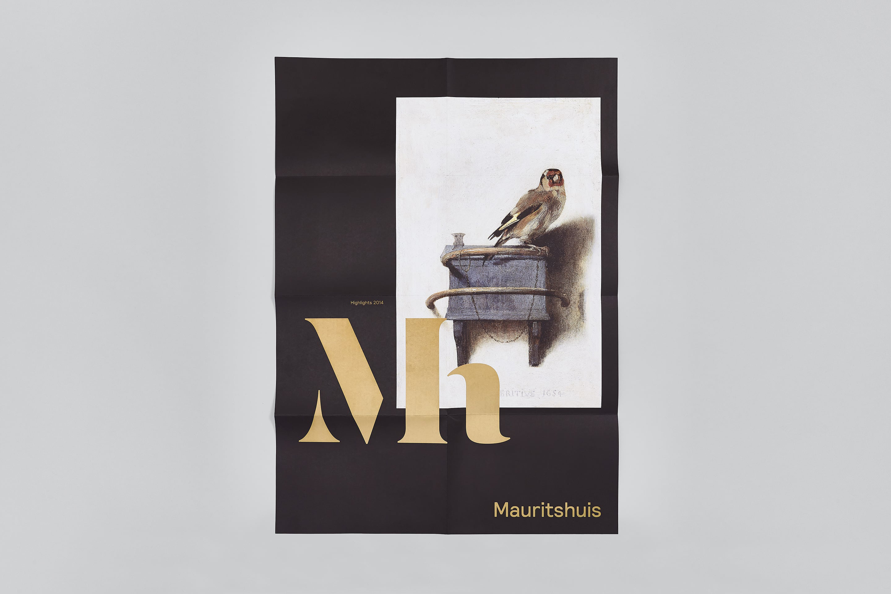
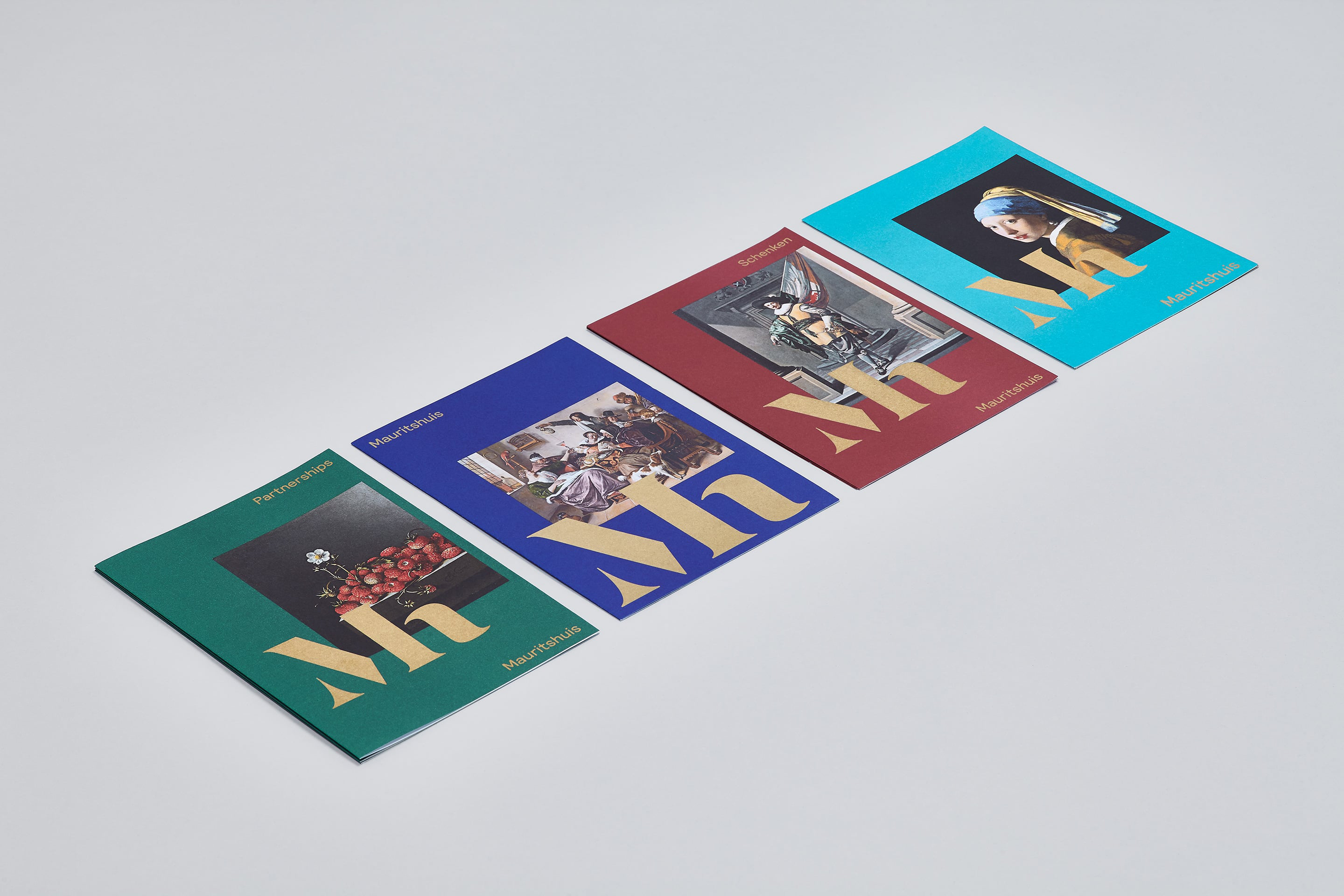
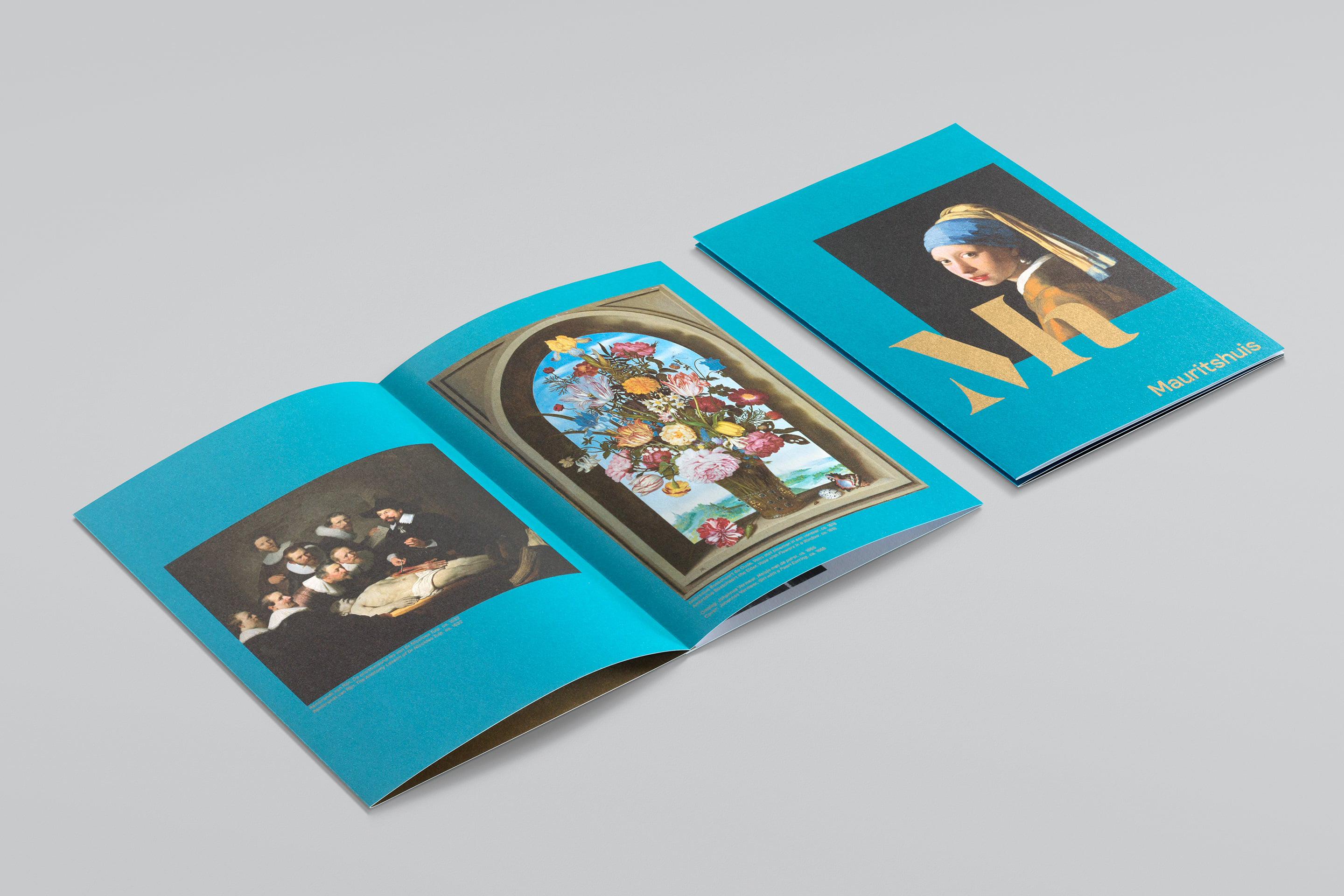
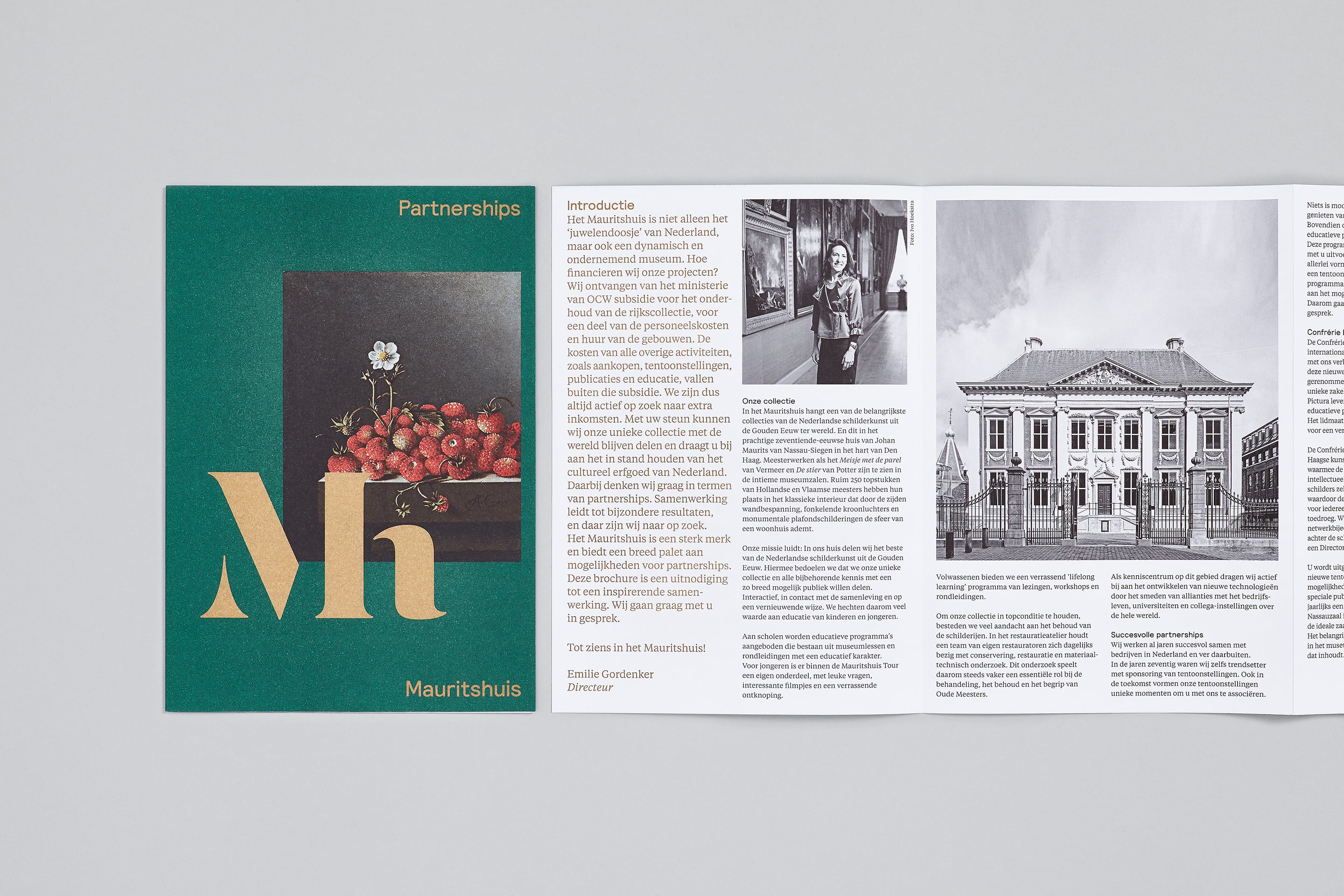
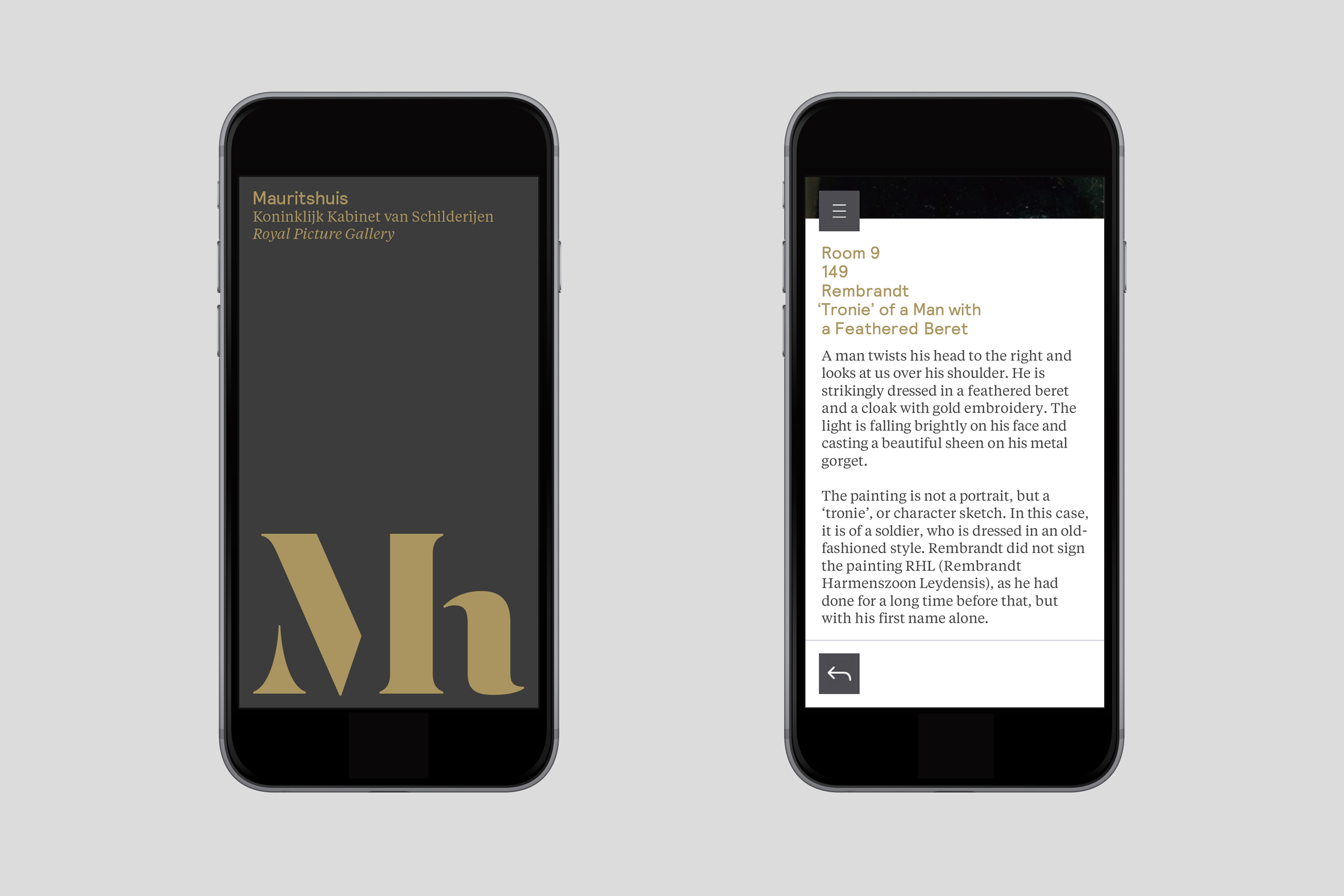
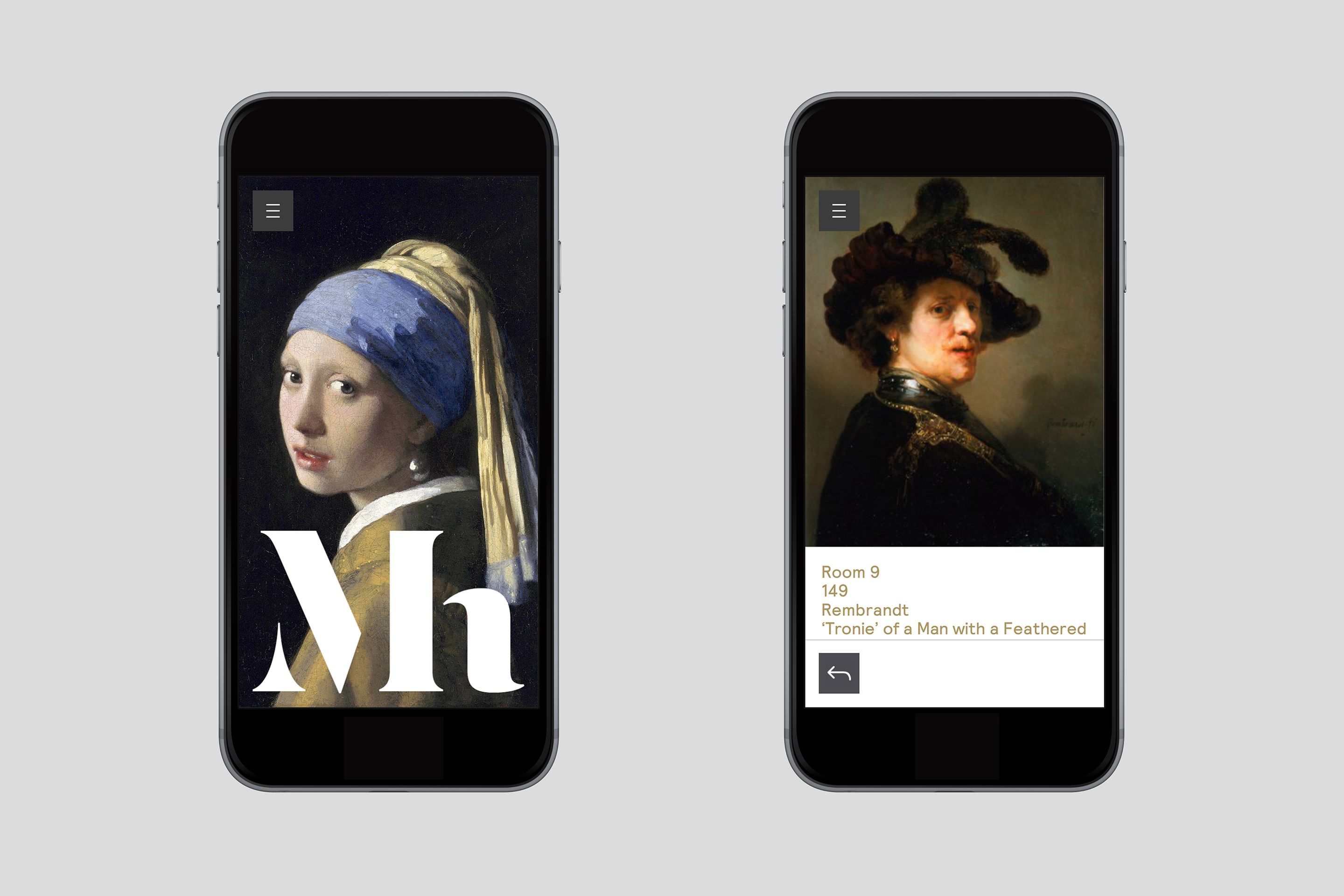
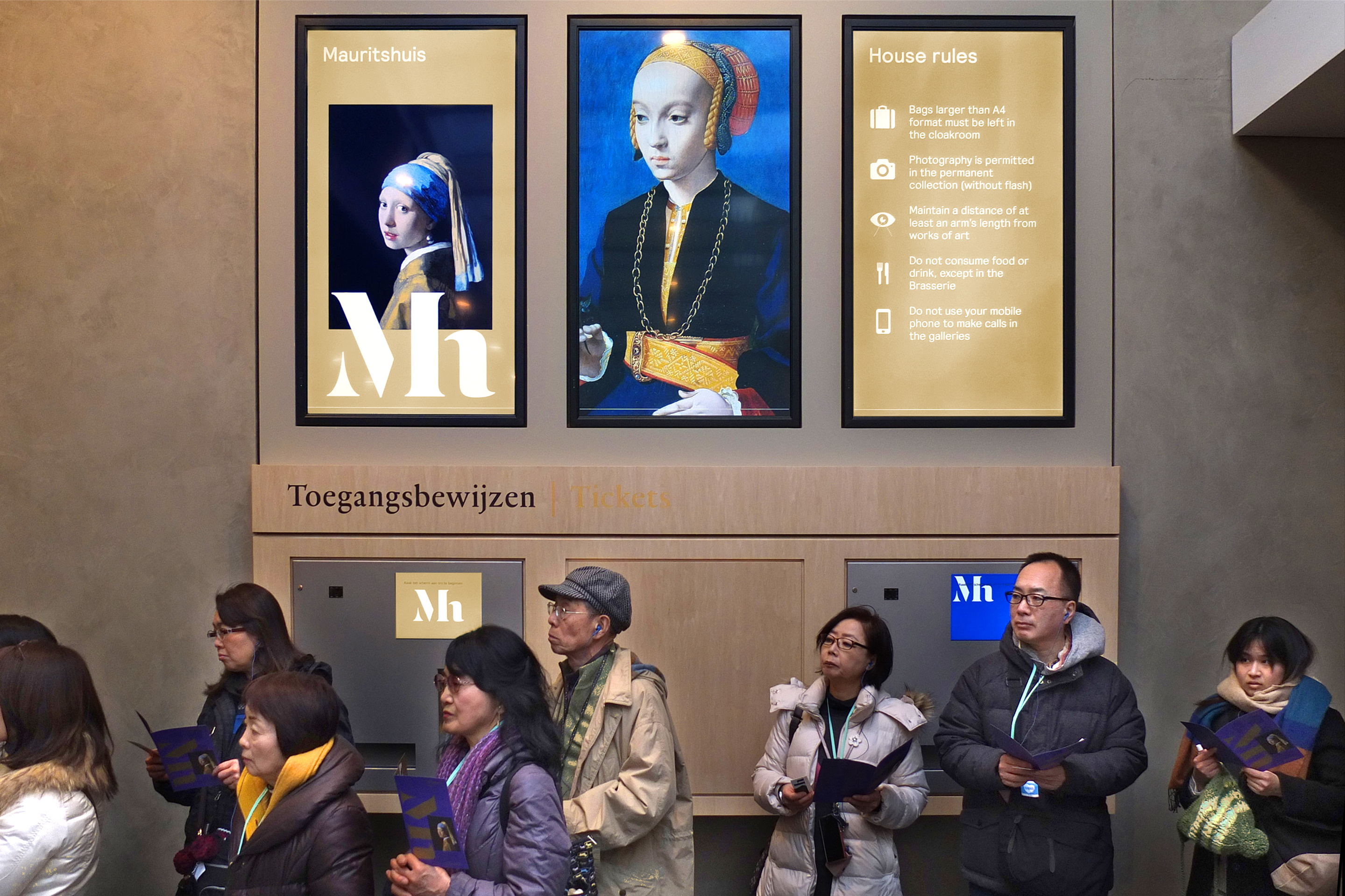
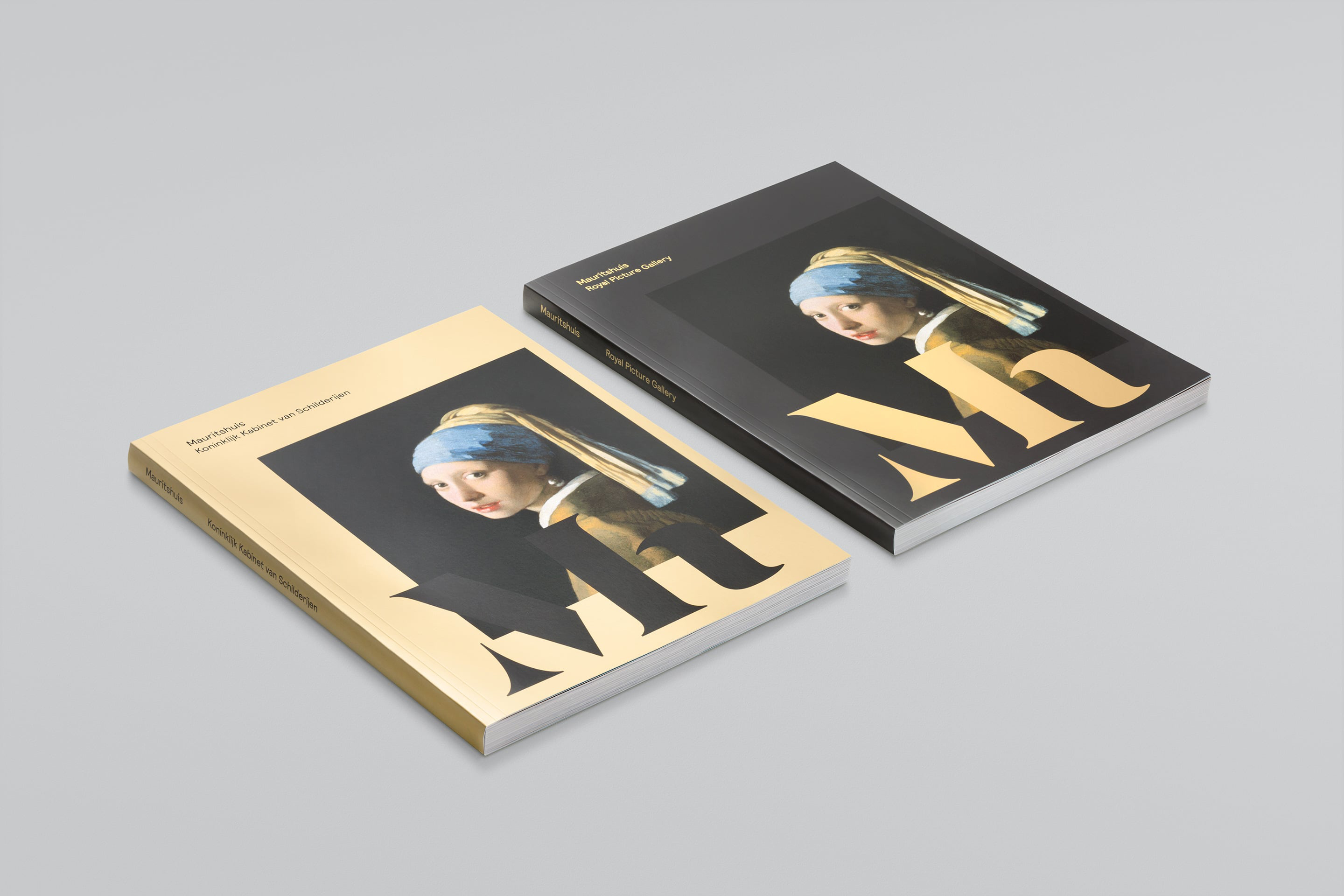
Following a two-year period of refurbishment the building was reopened in the summer of 2014. To coincide with this occasion a new brand identity was commissioned. Designed by Studio Dumbar this new brand identity, a serif monogram and contrasting sans-serif type, a mix of metallic inks and dyed papers, full bleed and cropped images, over-print detail and bright contemporary spot colour, neatly reflect the contemporary revitalisation of a classic building and gallery.
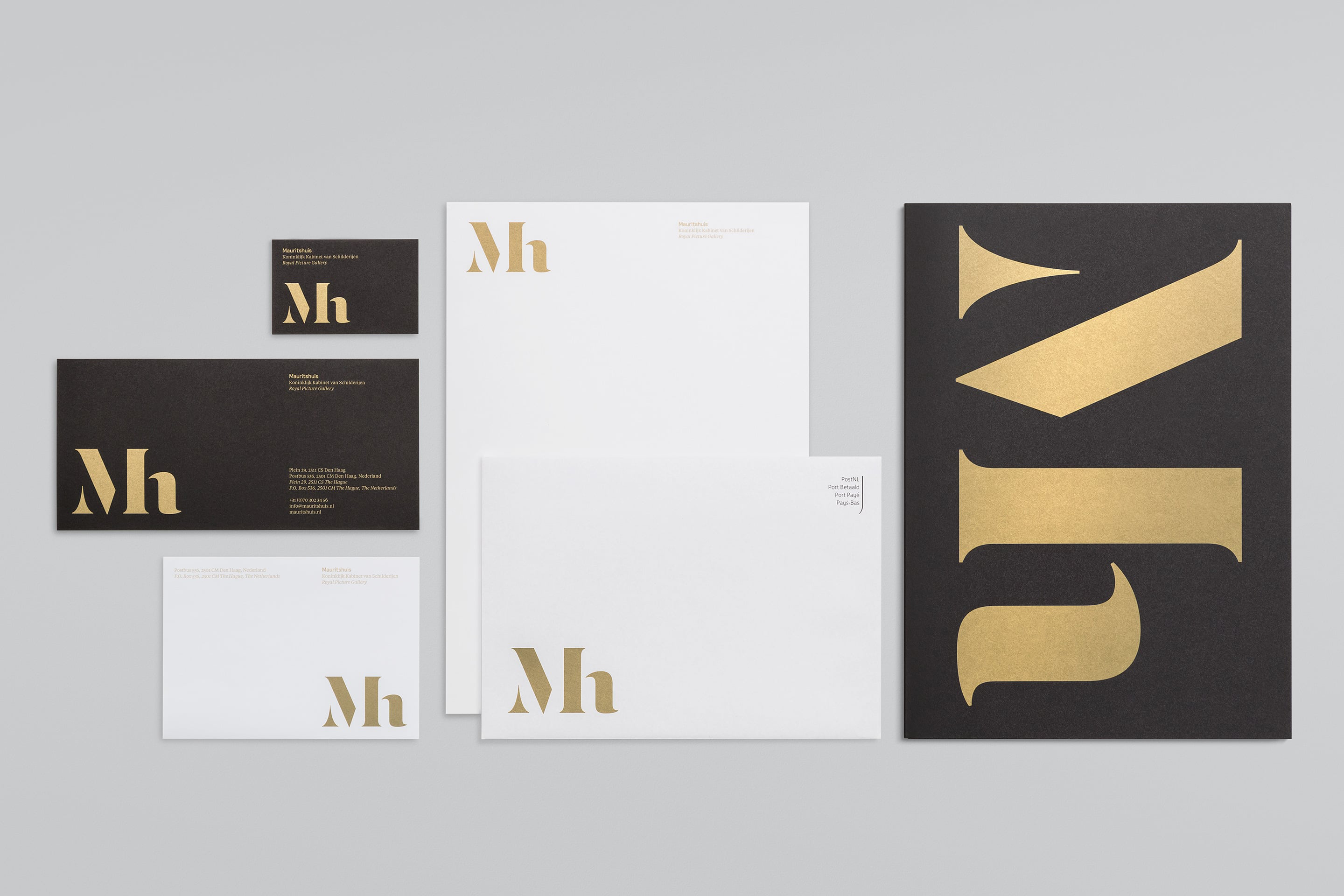
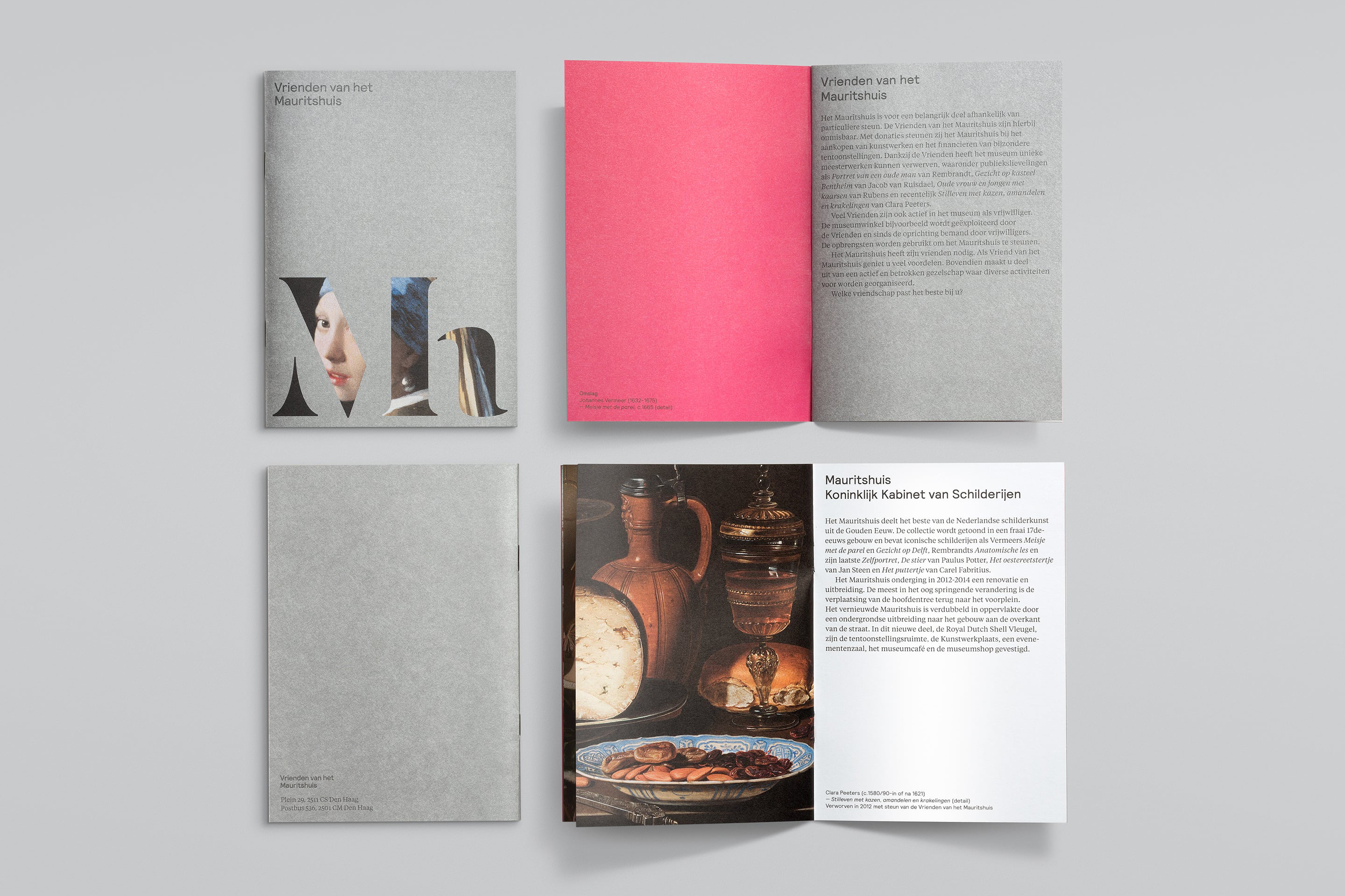
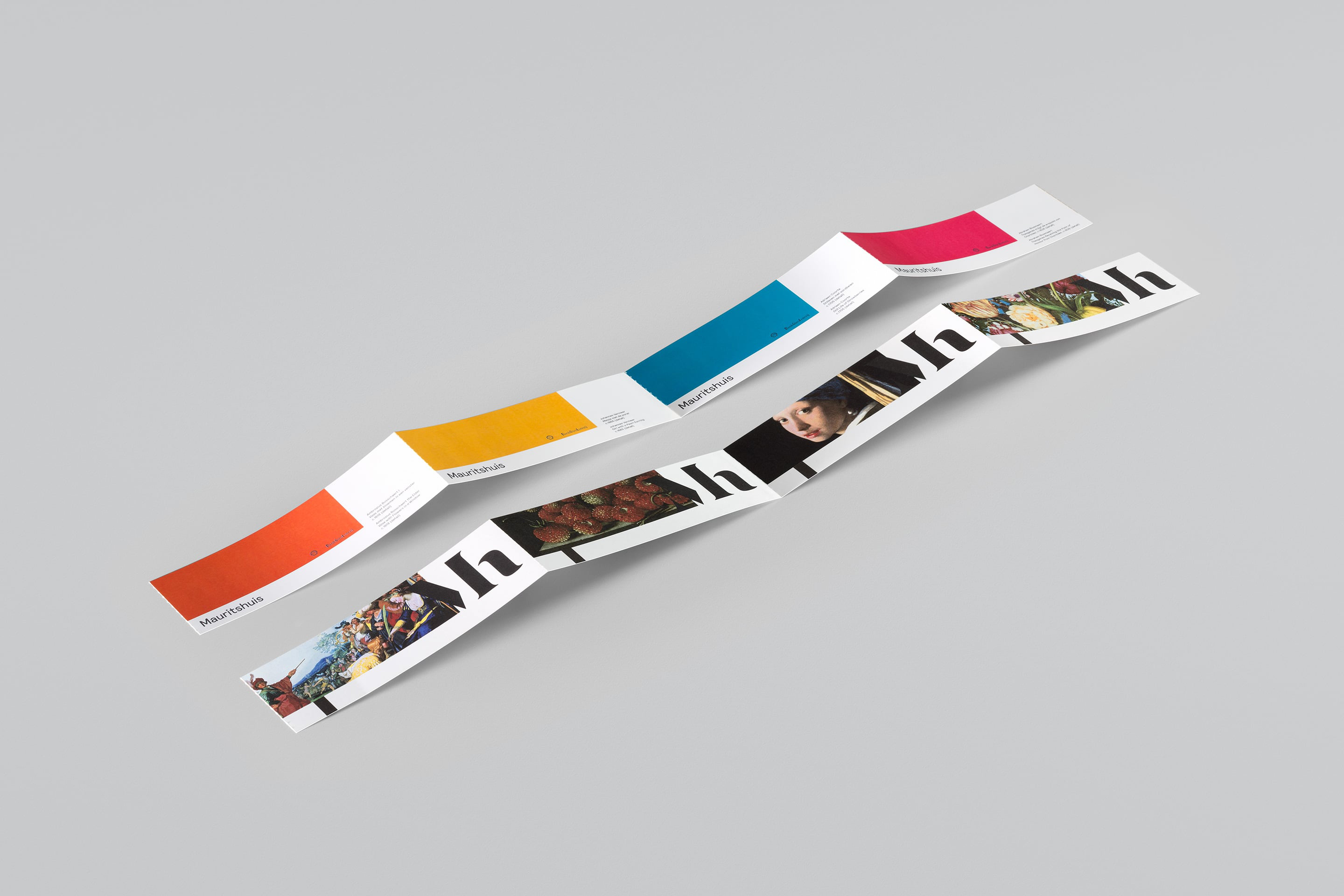
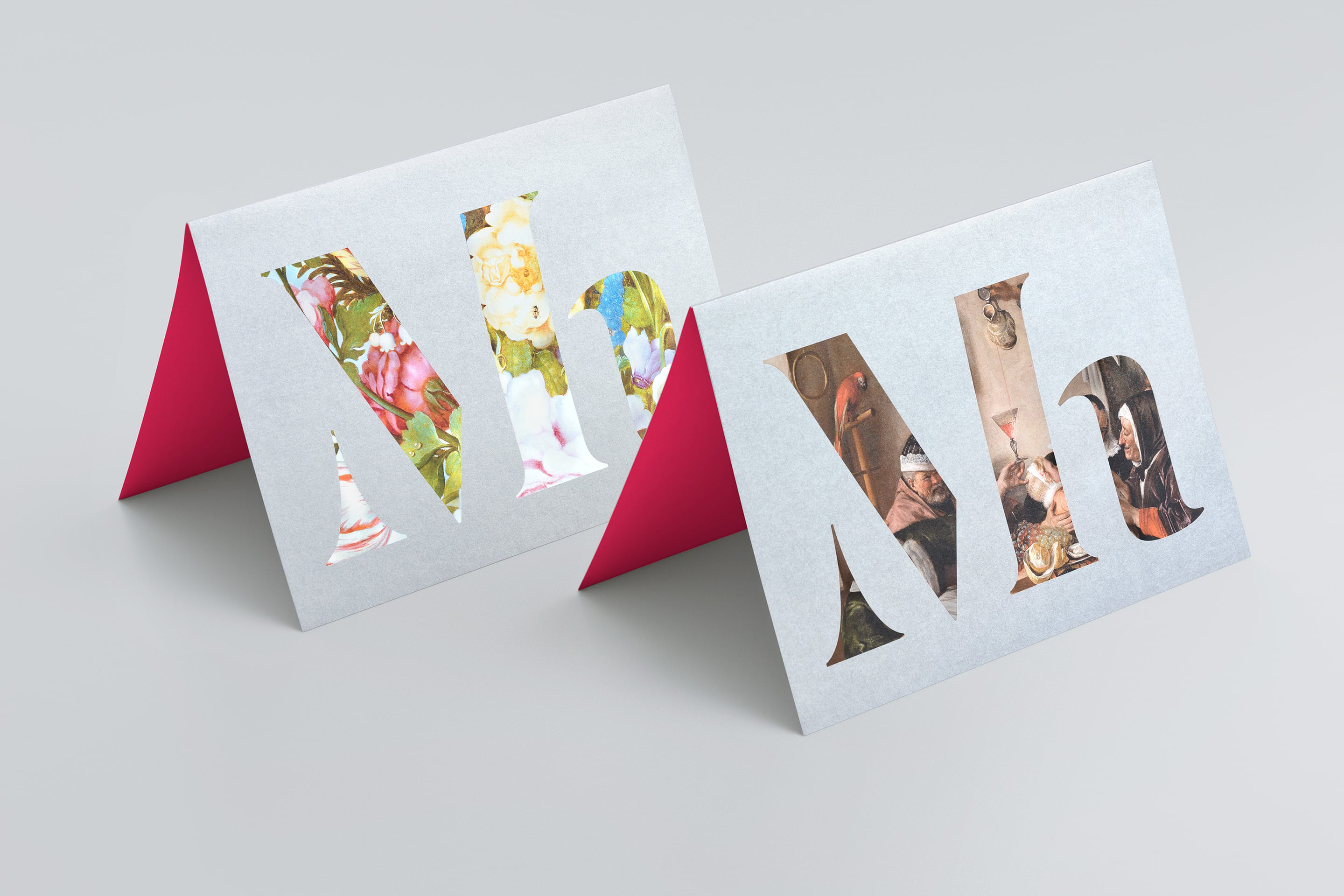
“Inspired by artists’ monograms, the new logo overlaps reproductions of key paintings to communicate a clear link between the Mauritshuis and its collection. Supported by a contemporary wordmark, the logo hints at the museum’s heritage while placing it in the 21st century. Golden Age paintings are known for their details: look closer and you’ll see more. We expressed this idea in the logo and a new photographic style: paintings are shown in context, through doorways. The core colour evokes royalty, the Golden Age and the house’s baroque interiors, while a brighter secondary palette echoes its famous damask wall coverings.”
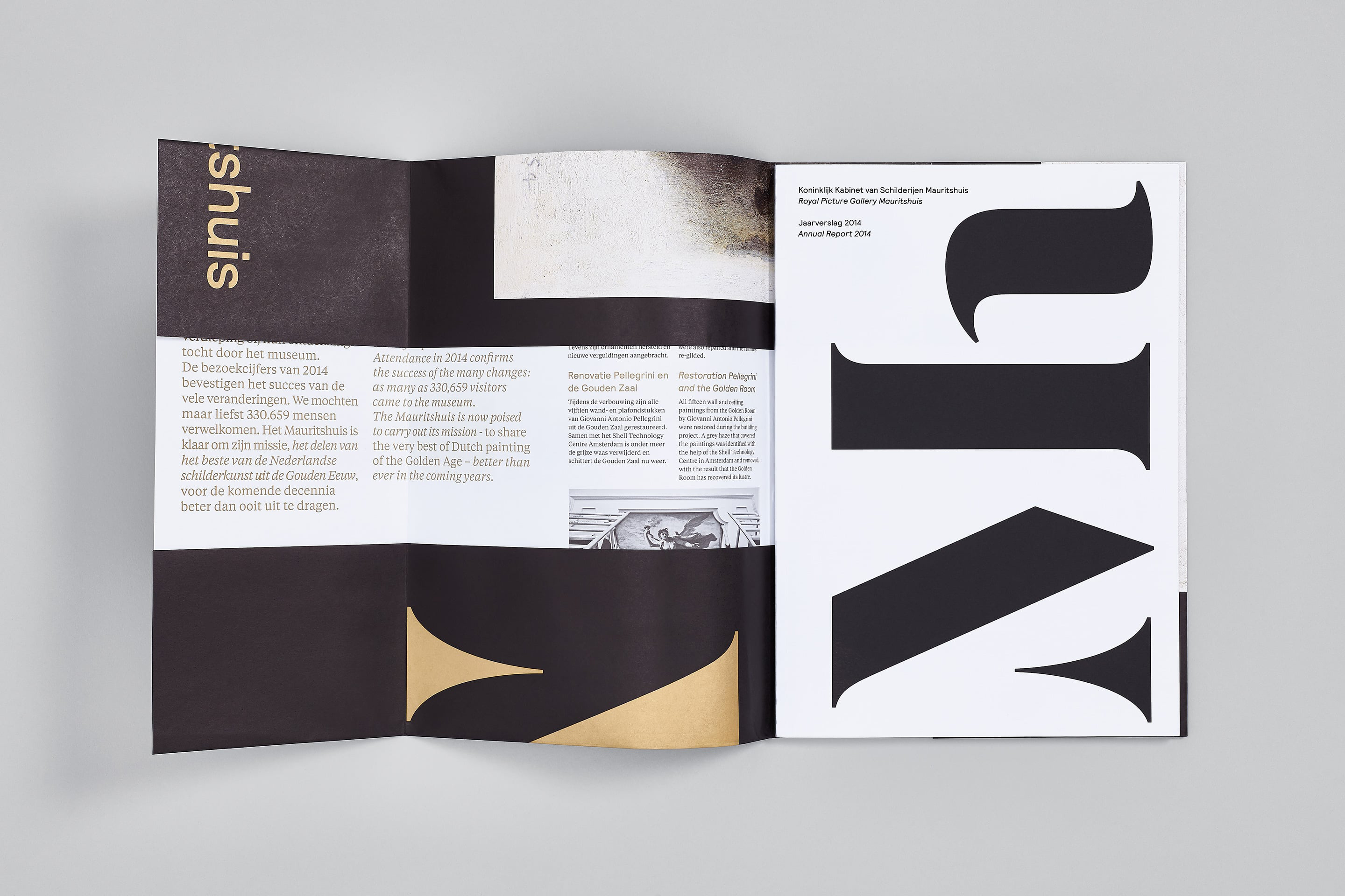
“We applied the identity to a range of collateral including entrance tickets, invitations, ground plans, trams and flyers, as well as a new and comprehensive collection catalogue. We also created a new identity for The Friends of the Mauritshuis – a foundation that supports the museum with funding for new acquisitions and exhibitions.” – Studio Dumbar
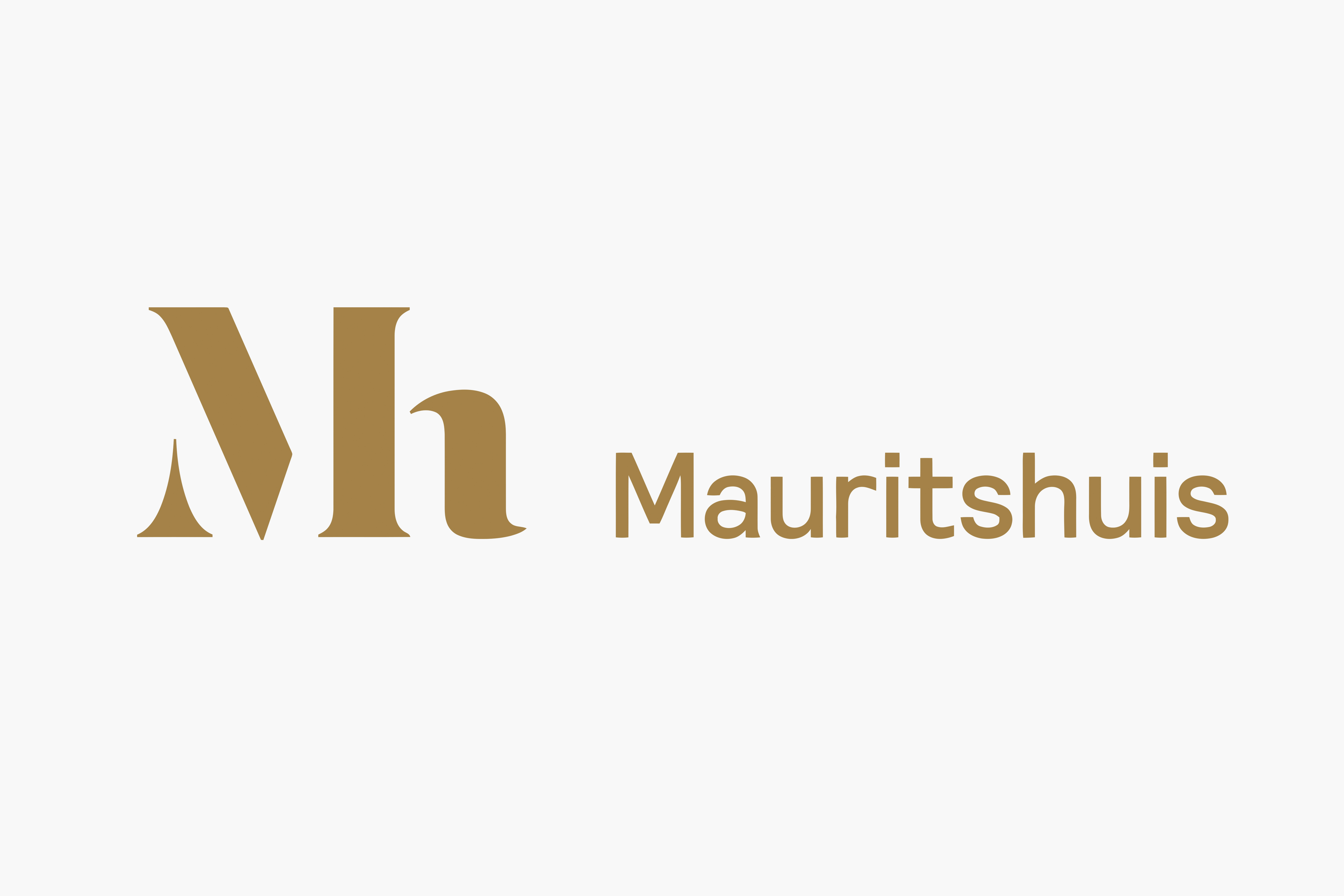
Studio Dumbar’s project background and process insight makes explicit what is successfully communicated implicitly through moments of clear typographic contrast and duality, material and ink combinations that move between tradition (bronze and black) and modernity (bright spots and silver). The work has a sense of individual craft (monogram) and gallery consistency (sans-serif), and areas of reduction alongside rich artistic detail. Brand identity frames and unifies diverse and disparate gallery content and has a little character of its own without being distracting or overbearing.
Design: Studio Dumbar. Opinion: Richard Baird. Fonts Used: Relative
