Oyya by Skinn
Opinion by Richard Baird Posted 2 September 2014

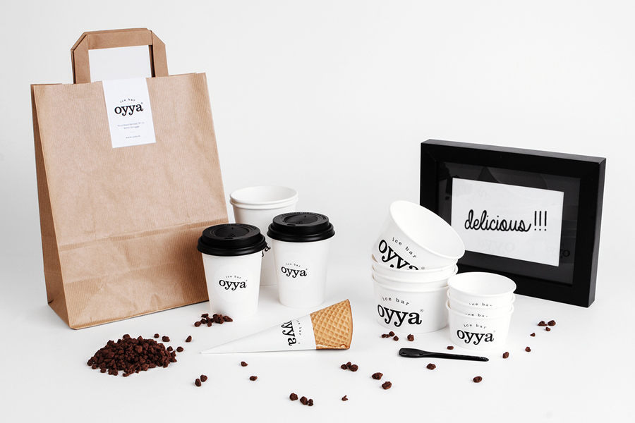
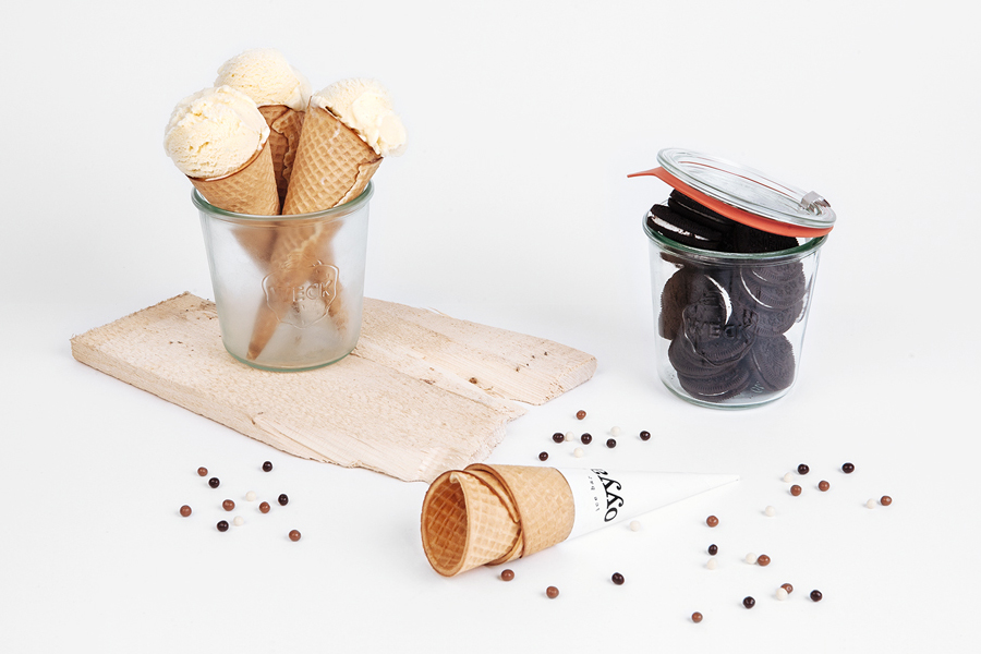
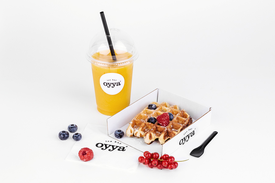
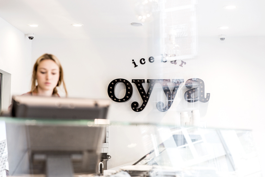
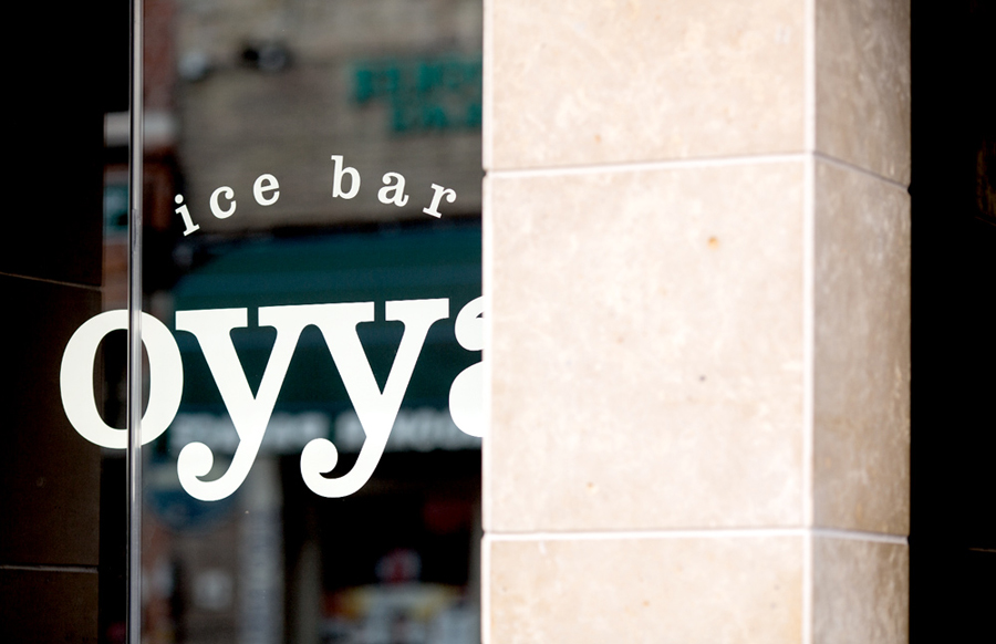
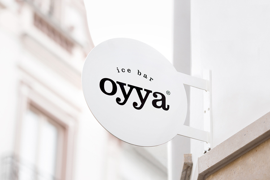
Oyya is an ice bar located in the Belgium city of Bruges that retails a variety of frozen yoghurts, yoghurt drinks, waffles and 28 ice creams — the most in the city. Its brand identity, which included logotype, print, signage, uniforms and interior design created by local studio Skinn, while largely logo-centric and having a strict consistency across stickers, tubs, cone sleeves and boxes, manages to establish distinction through reduction without looking cheap and is sensitive to the historic nature of its location.
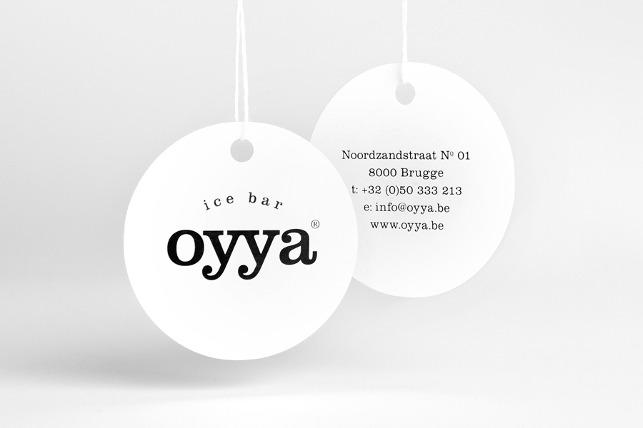
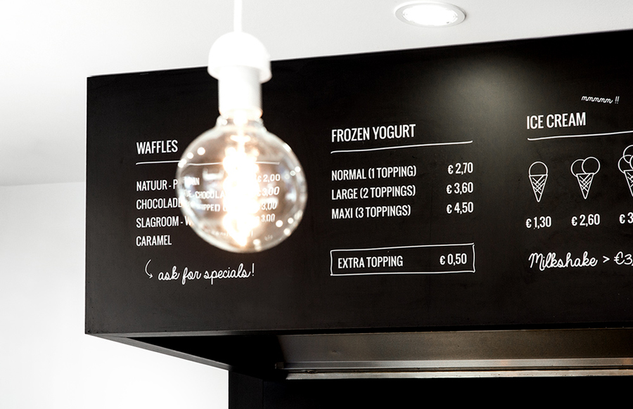
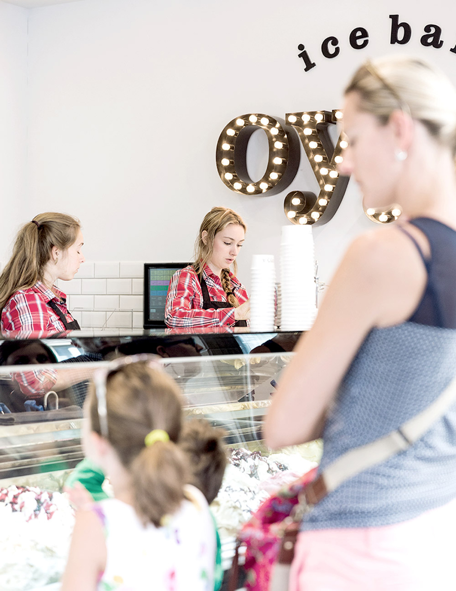
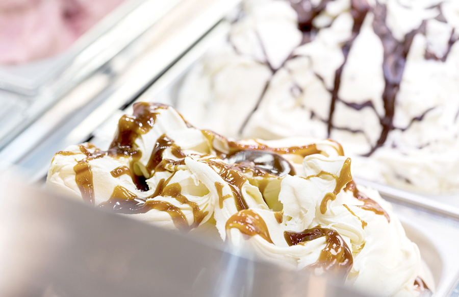
BP&O looks to publish a variety of approaches, concepts and aesthetics, this is perhaps the most limited of these. Based around and predominately made up of an all lowercase sans-serif logotype, consistently applied as a black ink across white surfaces, the identity appears unflinchingly economical in its approach. This is further emphasised by an interior of white walls and tiles. However, these are punctuated by the ubiquitous but understandable craft-tone of a blackboard, script and simple but conversational language, the colours of the ice-cream, and benefit from the individual character of red checked uniforms and the flourish of an illuminated sign. While strict in its use of paper, print and graphical assets, and absent a pervasive concept, it stands up pretty well largely due to the choice and contrast of type, and the consideration given to the uniforms within an all white interior and its location.
Design: Skinn
Opinion: Richard Baird
Fonts Used: Clarendon
