Bec Brittain by Lotta Nieminen
Opinion by Richard Baird Posted 16 September 2014

Bec Brittain is a New York based lighting and product designer who is driven by a “love for luxurious materials, intuitive forms and forward-thinking technology.” Working with her small team from a studio in Brooklyn, Bec Brittain creates products that explore and experiment with new production techniques and materials that push the boundaries of American-made centrepiece lighting design. Each piece is created and inspected by Bec and produced using a local network of fabricators and artisans.
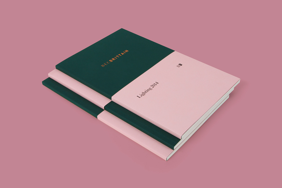
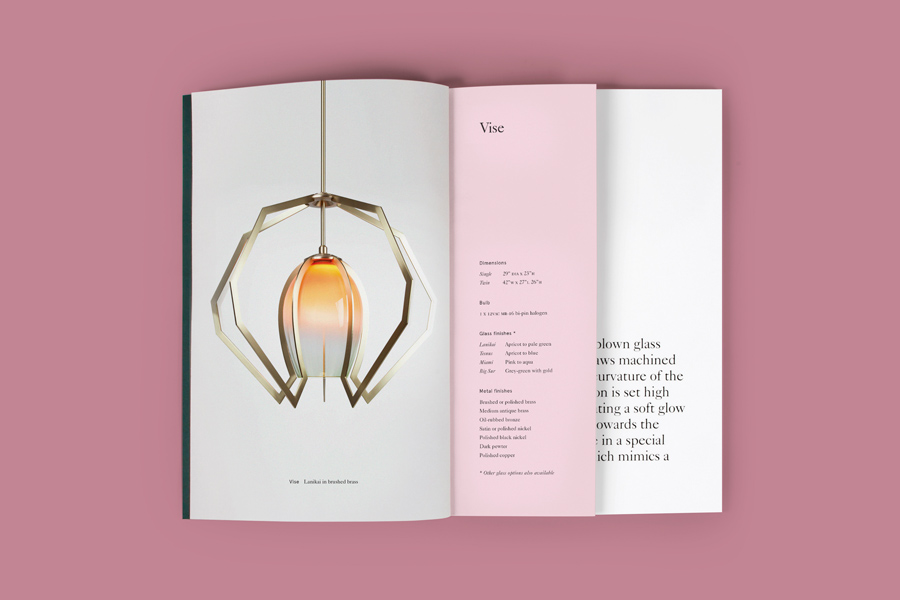
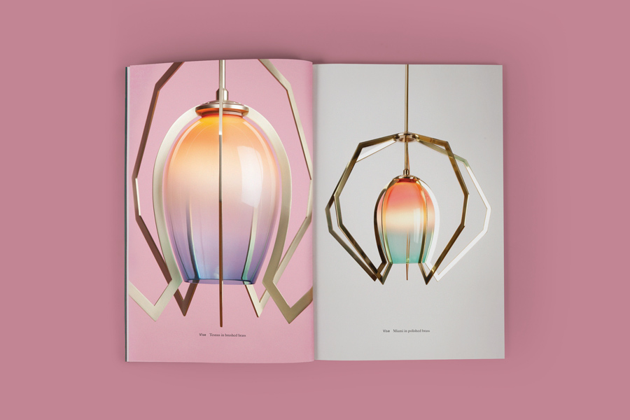
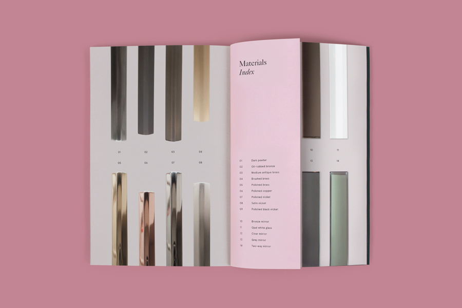
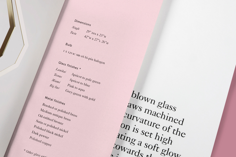
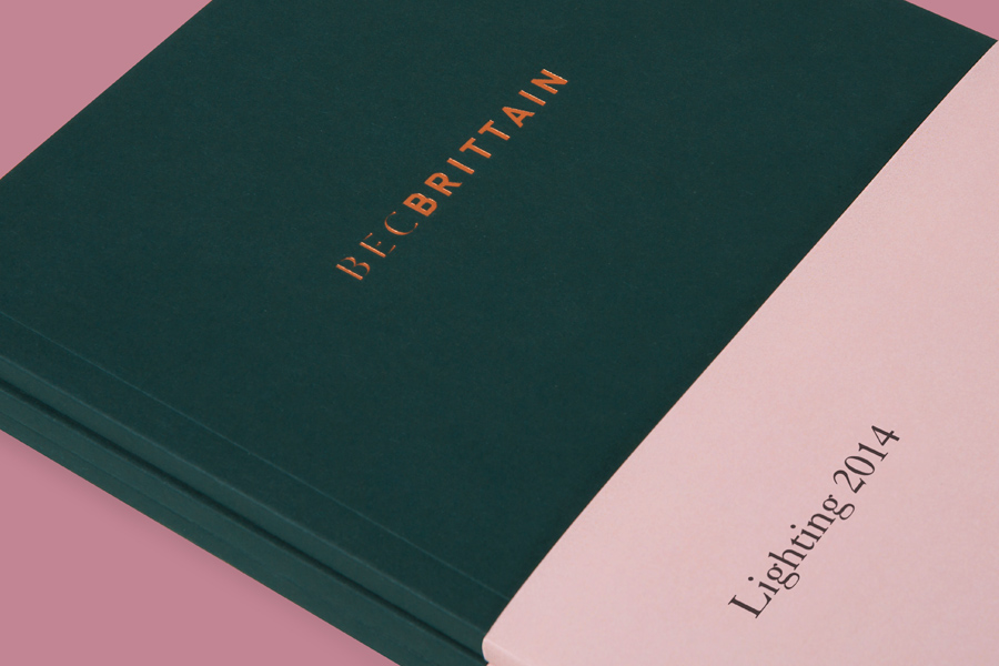
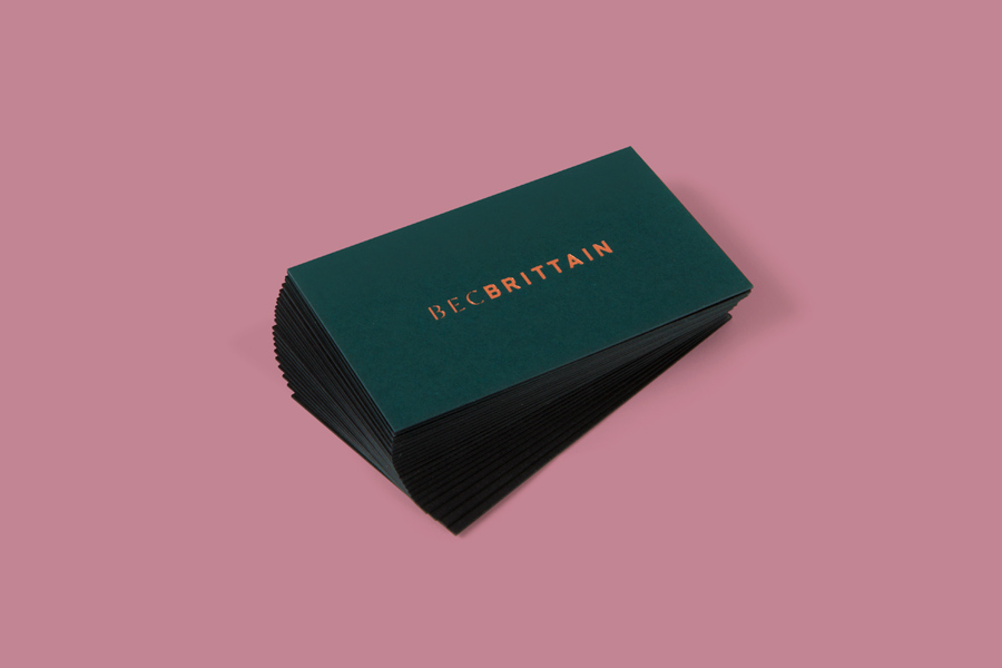
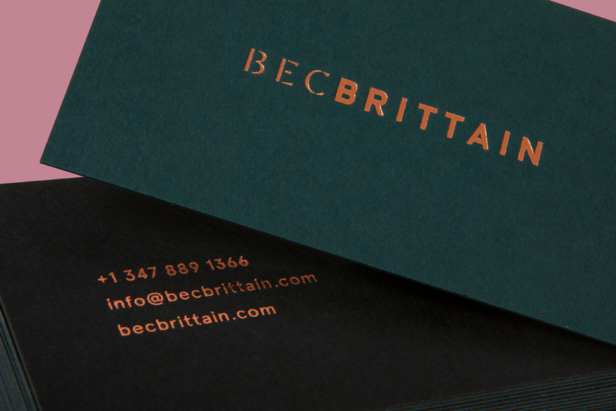
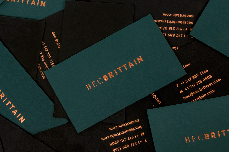
Bec Brittain’s brand identity, designed by Lotta Nieminen, is sensitive to the incredibly unique nature of the products and the idiosyncratic way these have been captured by photographer Lauren Coleman, yet still manage to reflect a sense of material and process appreciation. This is achieved through a foil print finish, duplex boards, dyed papers, and the contrast of colour and type, from the fine lines and stencil cut detail of Dala Moa Thin to the bold geometric characters that sit alongside it.
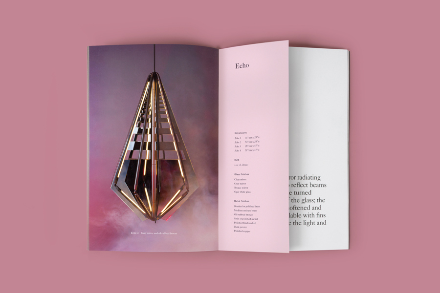
The smoke and background colour, full view and tight crops, and material quality and form of each piece, have a distinctive retro-futuristic sensibility, that is to say a vision of the future as seen from the past, which has been well used across the catalogue. These very much set the tone in print, but are sorely under-utilised online, while the logotype and business cards appear more of an appropriate echo rather than a communicatively literal or dense aesthetic reflection of the many philosophies that underpin Bec Brittain’s products.
Design: Lotta Nieminen
Photography: Lauren Coleman
Opinion: Richard Baird
Fonts Used: Dala Moa
