SSU by Snask
Opinion by Richard Baird Posted 17 September 2014

The Swedish Social Democratic Youth League, abbreviated to SSU, is a branch of the Swedish Social Democratic Party, associated with the Swedish Trade Union Confederation, and one of the largest youth leagues in the country with a membership of over 10,000. In response to an upcoming general election, which took place on September 14th, the SSU looked to readdress its visual identity which had remained untouched for ten years.
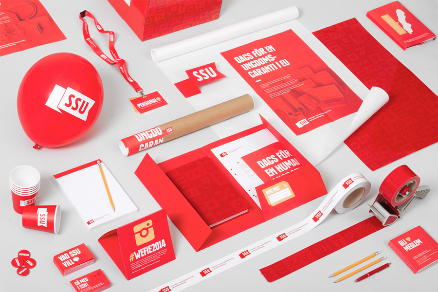
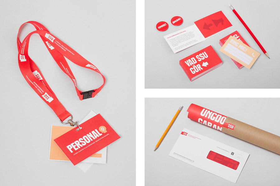
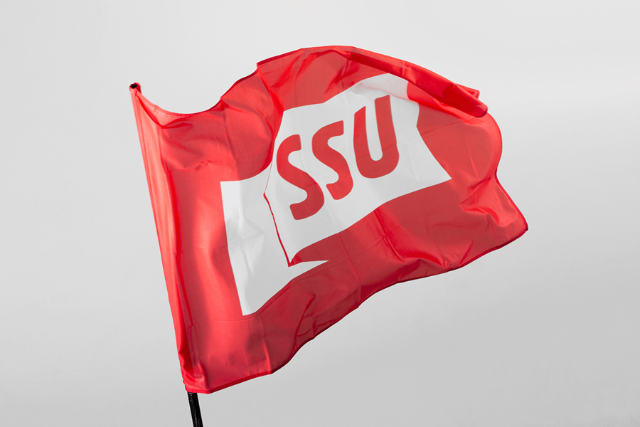
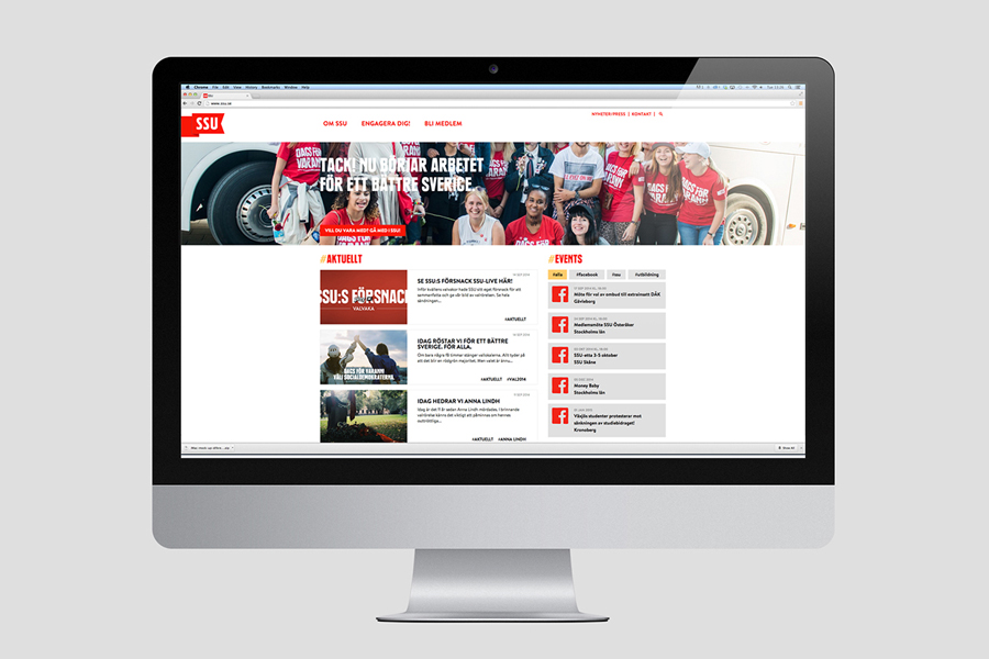
Designed by Snask and launched a few months prior to the election, the SSU’s new visual identity, drawing colour from its relationship with the Trade Union Confederation and Social Democrats, using bold typography, and introducing a variety of more accessible details, broadens its communicative value and aesthetic impact, and unifies its members under one cohesive system.
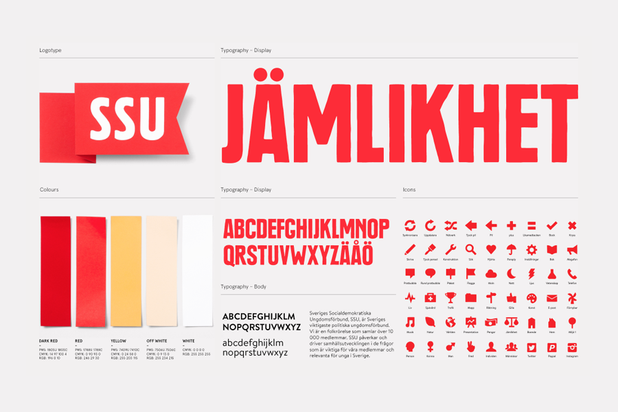
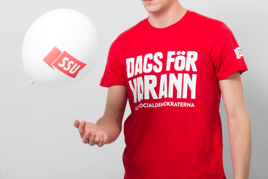
Snask’s identity treatment is founded on the convention of colour that permeates many of the world’s political parties and their campaigns. Its overwhelming use of red, occasionally punctuated by white and yellow, is undoubtably unifying in its intension and works well to do so, only appearing intense due to the necessity of shooting it together as a portfolio piece.
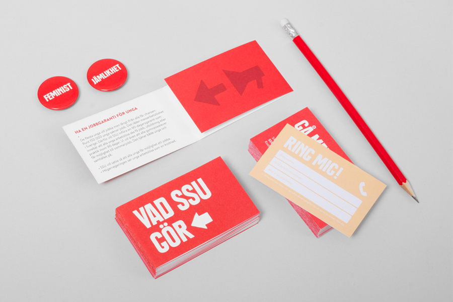
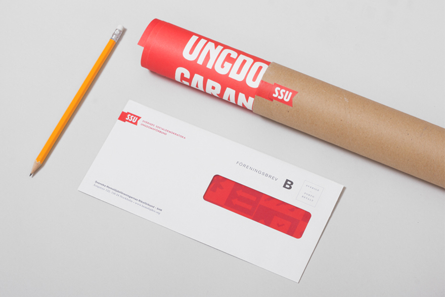
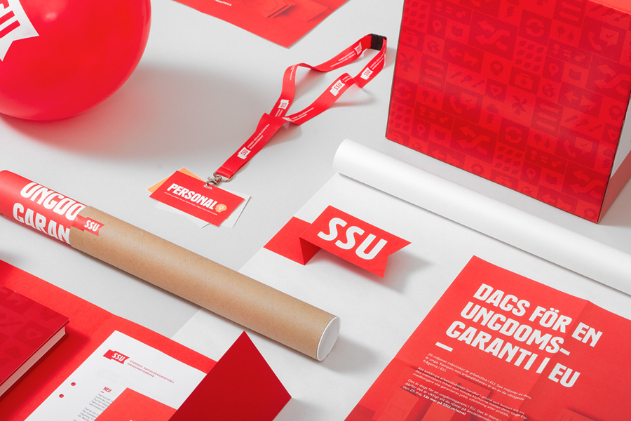
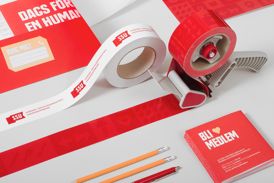
Red is typically perceived as a warm and welcoming colour but can be undermined by its political associations. However, the type choice, a bold condensed uppercase serif with a loose and almost hand stamped edges, iconography with a clear and familiar technological influence, and the use of paper sculpture, all work incredibly well to keep political convention and talk from being dictatorial. As such, the solution appears more accessible and compelling, and although the type is loud both in its height, caps and application, its custom rendering gives it an subtle informal quality without undermining message. This is emphasised by a standard business card personalised by handwritten contact information.
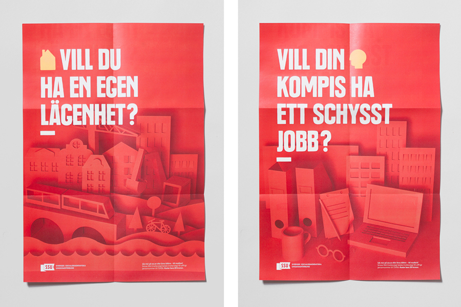
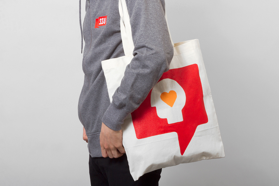
The paper sculptures look great, are contemporary and on-trend. Their build and photography, which holds the red well, adds depth, light and shade to campaign print work with plenty of flat panels of colour, and effectively mixes the themes of urban development and rural living, commuting, technology, sense of place and eduction. These are reinforced by a simple icon set with similar communicative intentions but also broaden this out with social media, gender, health, art, justice and science elements. Their rounded corners and loose edges tie in with the type, soften aesthetic and have a proprietary quality that, set alongside and in conjunction with the sculptures, offer a youthful characteristic that avoids appearing childish.
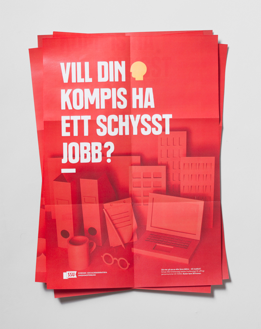
While political accessibility is not a new endeavour, it is certainly a noble pursuit and very well executed here. It is a shame that the logotype and its half ribbon gets lost, appear odd on a flag and are perhaps not as conceptually clear or aesthetically impactful isolated, but the amalgamation of type, colour, iconography and sculpture, placing far less communicative weight on the logotype, is distinctive and founded on clear understandable themes and is not heavy-handed in its agenda.
Design: Snask
Opinion: Richard Baird
