Rendez-vous des Créateurs by Marks
Opinion by Richard Baird Posted 23 October 2014

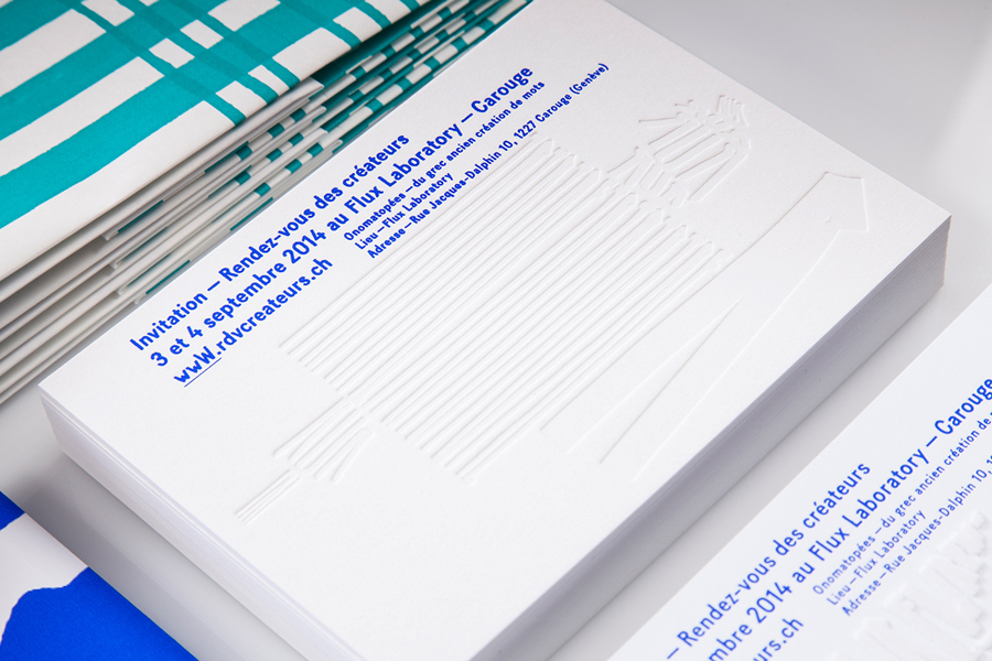
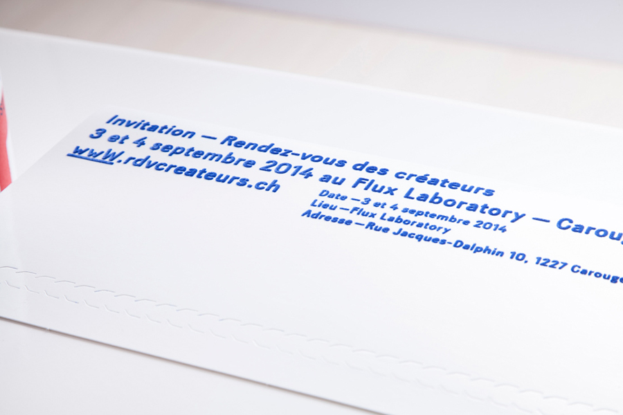
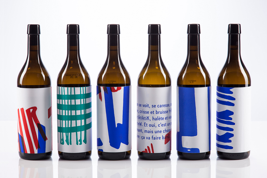
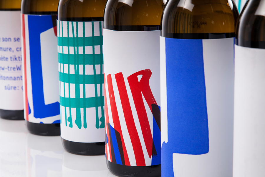
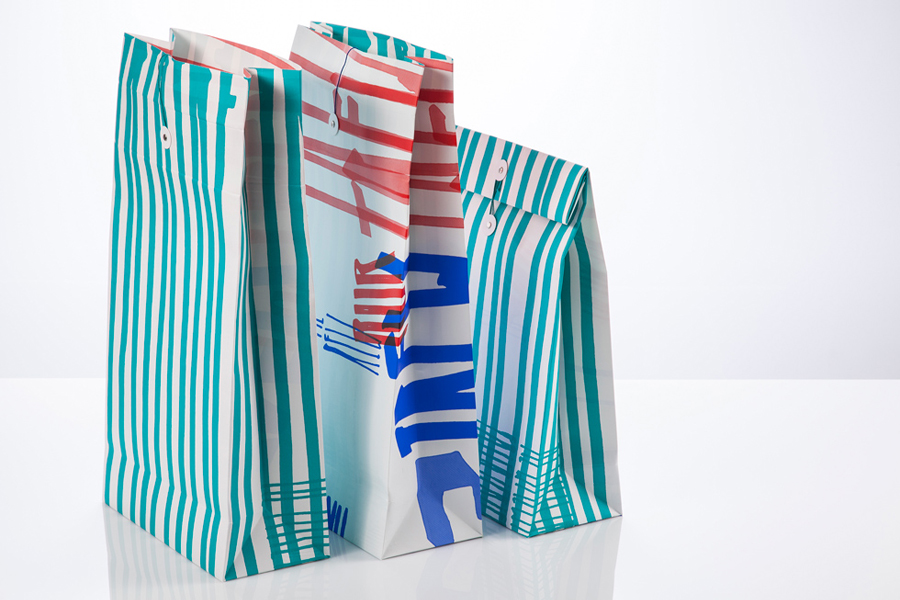
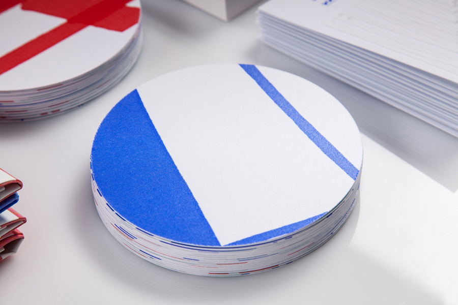
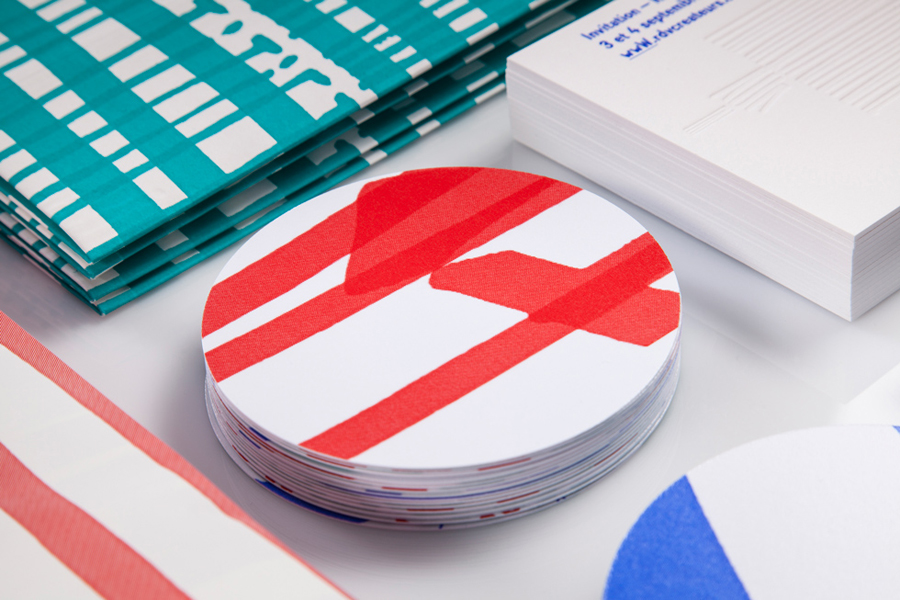
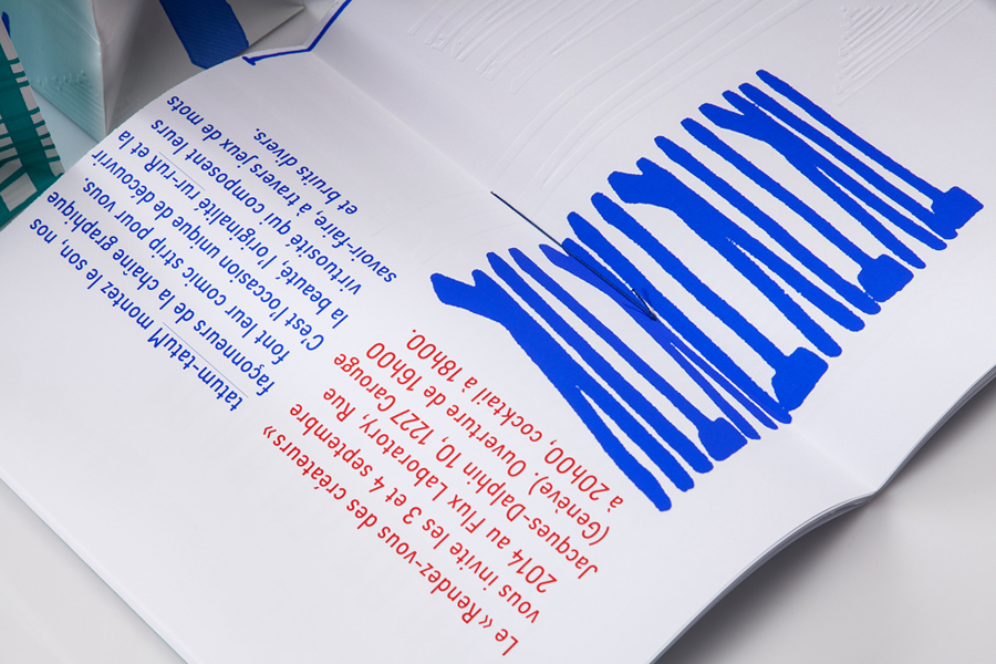
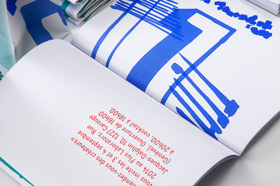
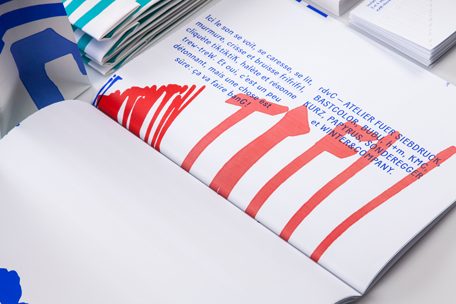
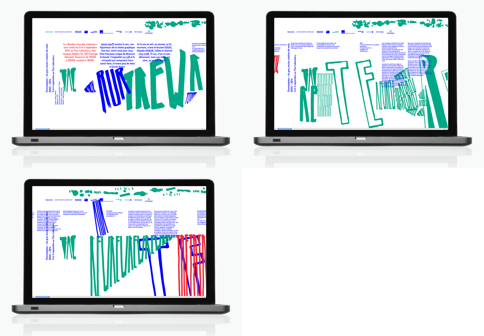
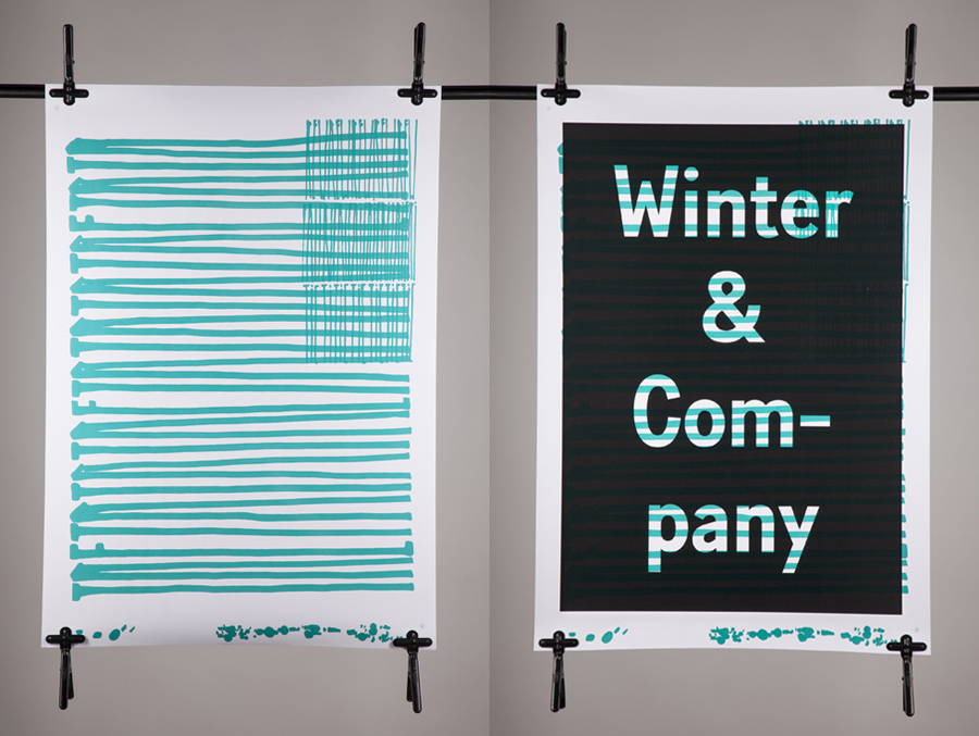
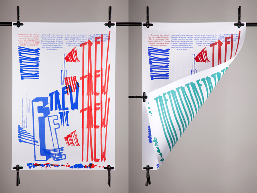
Rendez-vous des créateurs 2014 was an event that took place in September at experimental meeting, performance and exhibit space Flux Laboratory in the Swiss town of Carouge. The exhibition was an opportunity for those servicing the graphic design chain to show off finishes, materials and techniques under the title “onomatopoeia of printing”. Participants included silk screen printer Atelier Fuerm, binder Bubu, hot stamper H+M, material manufacturer Winter & Company and electro-static flocking specialist Bastcolor amongst others. The exhibition’s brand identity, which extended across invitations, flyers, posters, brochures, coasters, wine labels, shopping bags, signage and website, was developed by graphic design studio Marks.
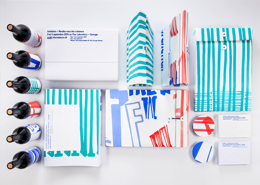
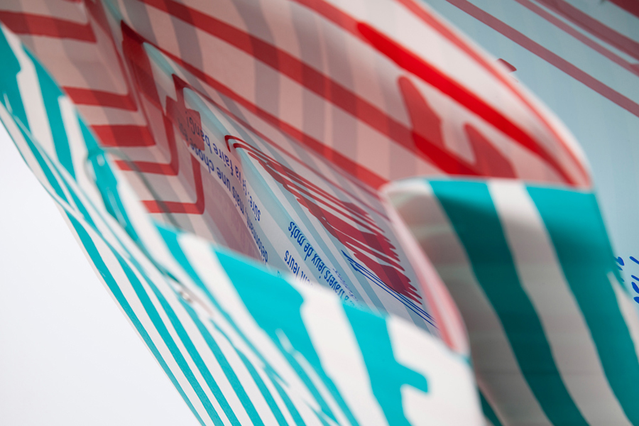
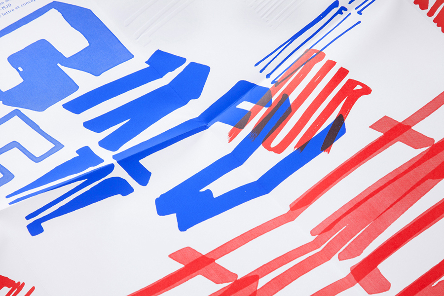
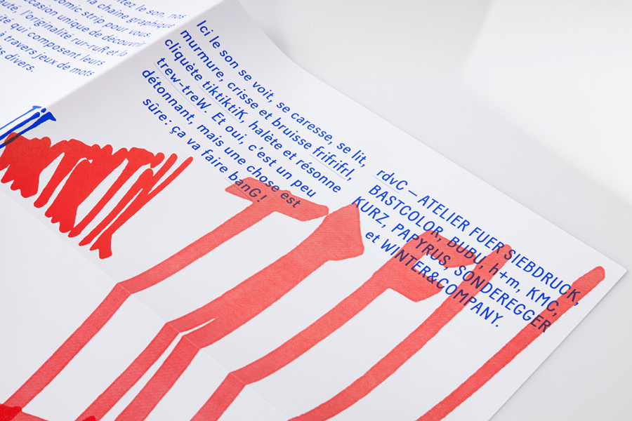
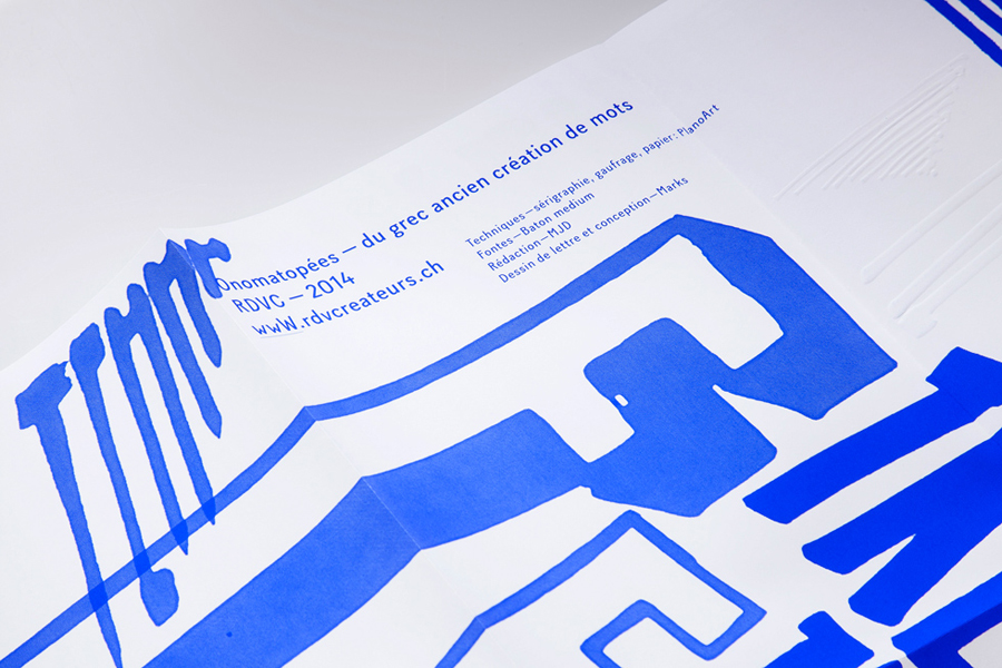
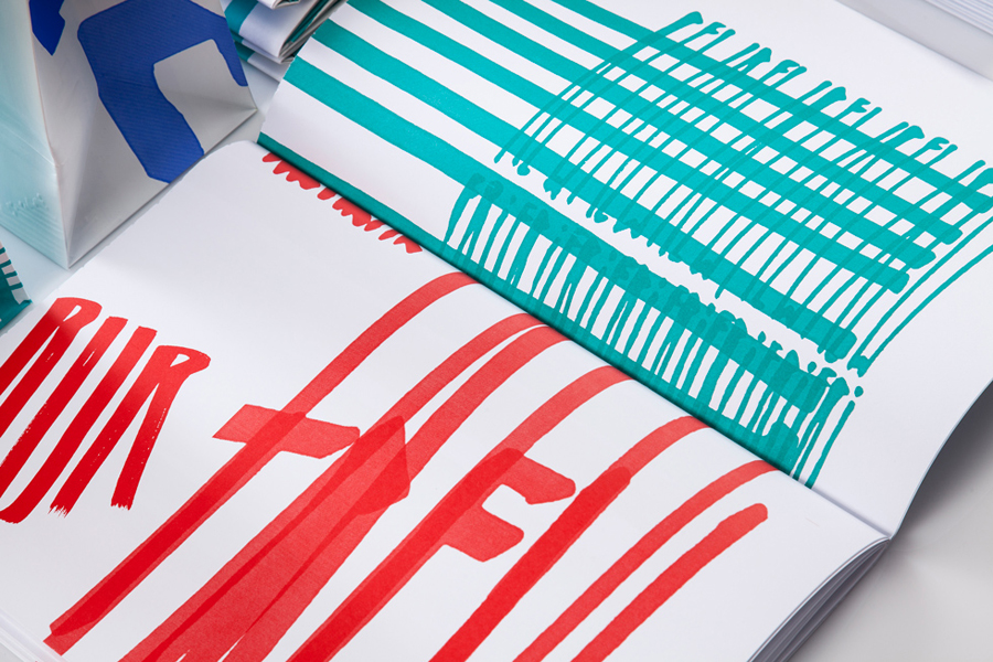
Through a bold marker pen aesthetic that visualises what is typically only the verbal, oversized, condensed and cropped type and a contrast of bright colour and white surfaces, Marks’ approach effectively captures the expressive nature of the event’s theme both in its aesthetic and in the process of its realisation. Sounds included, as written, rur-ruR, frifrifrl, trew-treW, and the more familiar, banG and tiktiktiK.
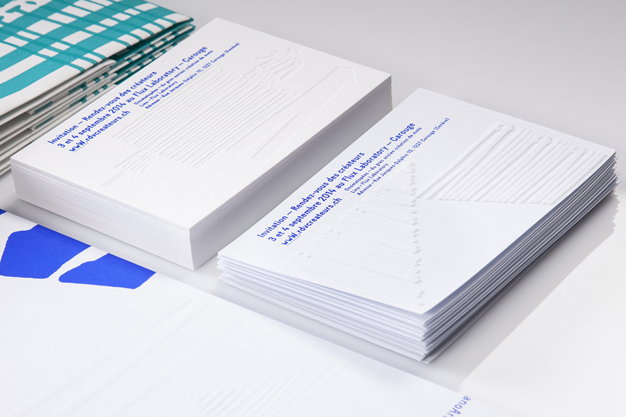
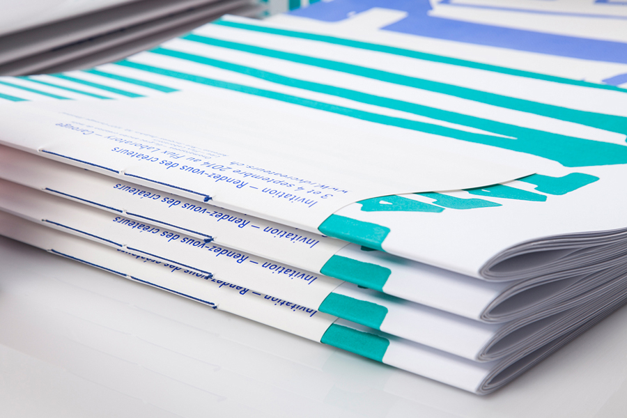
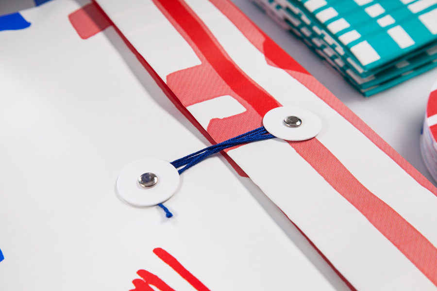
The use of blind embosses, perforations, folds, flocked type, open stitches and string ties mixes the bold and flat nature of the pen work with the physical, tactile finishes provided by event’s exhibitors. It takes what can often be perceived as mechanical processes and helps to draw out their crafted nature, highlight the creative opportunities these can offer and the subtle ways in which these can complement, contrast and add detail too strong graphic design.
Design: Marks
Opinion: Richard Baird
