Reachin’ by Karoshi
Opinion by Richard Baird Posted 25 October 2014

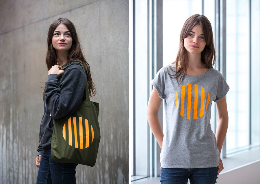
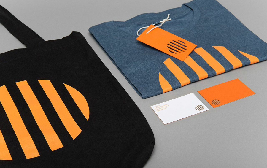
Reachin’ is a regular charity event established in 2012 to engage with a younger demographic and raise awareness and funds for Myeloma UK, an organisation dedicated to finding a cure for Myeloma, a rare cancer of the bone marrow. Money made from each event is complemented by the online sale of branded t-shirts, vests and tote bags.
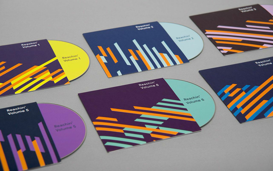
Designed by Karoshi, Reachin’s brand identity draws its inspiration from the architecture of the Turner Contemporary art gallery, the venue of its first and forthcoming events. The building’s clerestory windows, mono pitched roofs and glass facades informed the creation of a grid-based system and the use of dynamic geometric shapes to cohesively bind a simple logo design, poster layouts, patterns, business cards, stationery, merchandise and a changing event-based colour palette.


Taking a look at the image treatments above — the only communicatively literal element of the identity — it is clear that these events are in the form of a rave rather than anything resembling an exclusive formal dinner or the inclusive family fun run you might expect from a charity.
The identity is quick to establish a connection with a young and presumably untapped group between diners and fun-runners through the appropriation of a medium and graphic language already familiar to it, what could be described as a being influenced by a contemporary EDM aesthetic, be that light installations, album artwork or flyers. This is perhaps most acutely evident in the way that posters play an integral role within the identity and the recognition of their strategic value; the ability to exist in a variety of demographically appropriate locations, legal and illegal, with flyposting delivering an edgy quality, at least for a charity.
Within the contemporary club context the tinted photography and bold treatment of the posters does little to break new-ground but effectively leverages some of the expectations of a high-profile club night and avoids anything that may be considered conservative or parental.
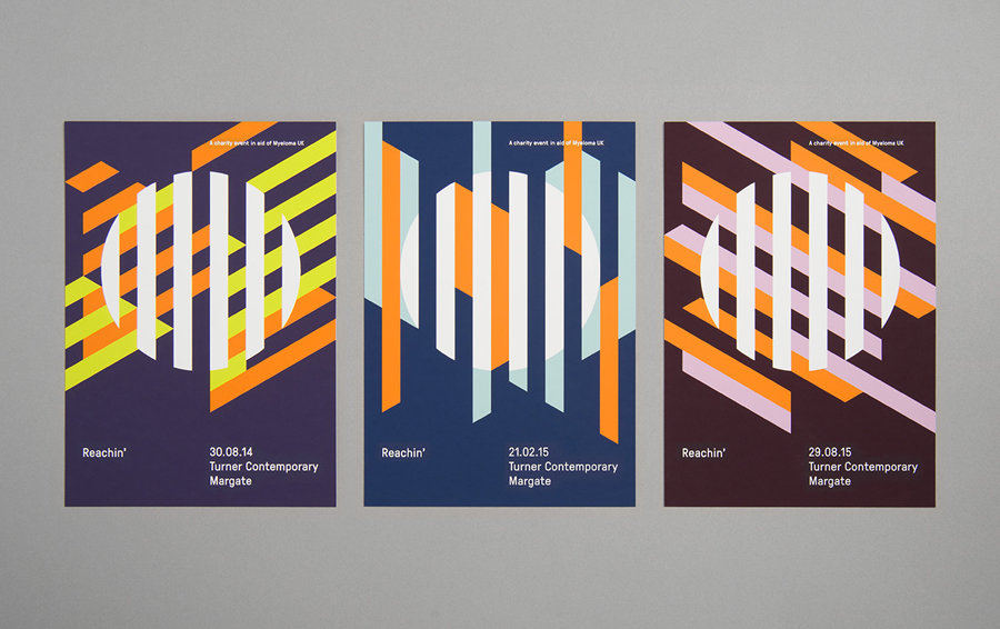
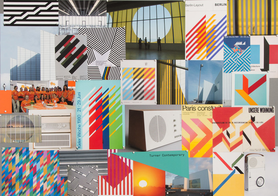
While the club poster aesthetic is familiar and often dips into geometric abstraction, Reachin’s benefit from the unique reference point of the Turner Contemporary, what appears to be an appreciation for the graphic design of the 1960’s and 70’s, as seen in Karoshi’s moodboard below, and a current favour for emerging boutique type foundries.
This comes through in the poster’s exploration of geometric form, contrast of colour, shape, motion, grid-based layout and the use of GT Pressura. Each of these gives the solution a sense of consideration and quality, and takes something that is frequently over-designed and inconsistent and gives it a restrained and systematic quality, one you might see designed for a modern cultural institution which feels rather fitting for the venue.
The retrospective appreciation of form and contrast is given a more recent spin through the use of colour. It loses some of its designer appeal, but is energetic and youthful well suited to its demographic, and alongside layout, establishes a very clear and unwavering resonance between events.

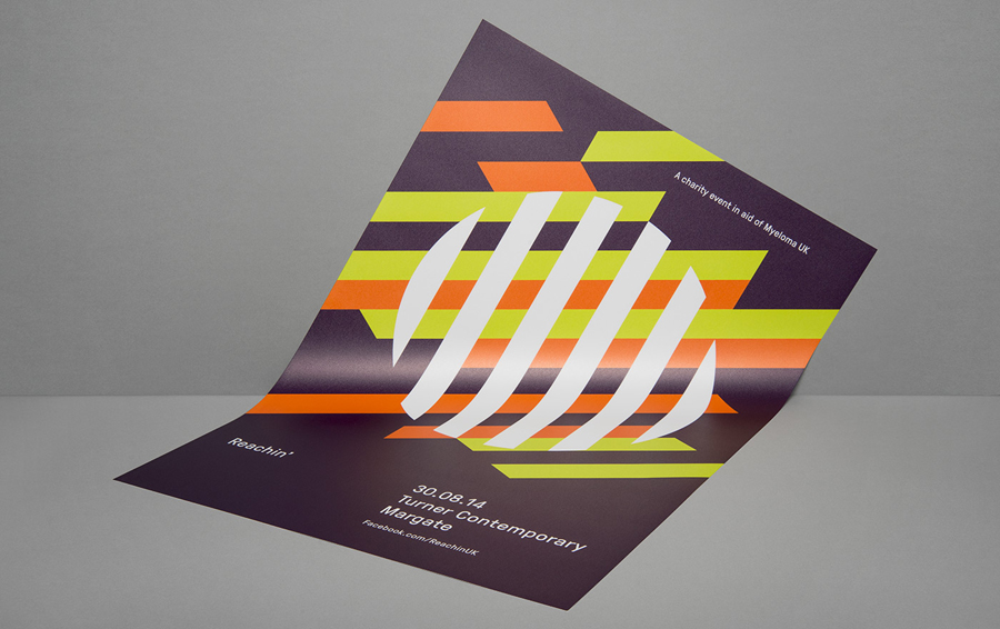
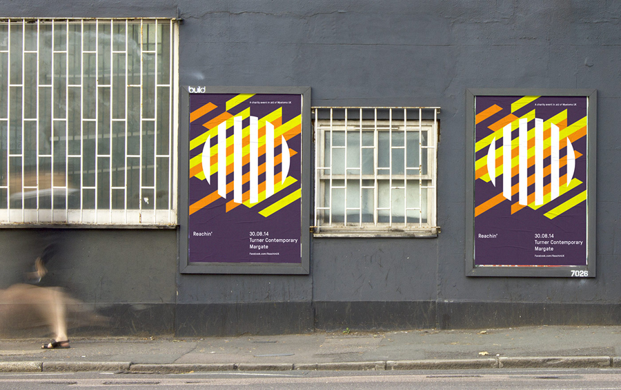
Where the posters are reductive, the logo and its application across merchandise go on to reduce the identity down further. The circle and orange are warm and assuring but as a reflection of venue, something that may not at all be recognised, it is not particularly communicative in a way that is often expected of logos. Like the posters the logo could be considered more of an informed aesthetic in service of distinction rather than a concept-driven solution, which is fine. In today’s climate of design criticism it is likely to draw comparisons with something or other but its charity, location and event-based context is key.
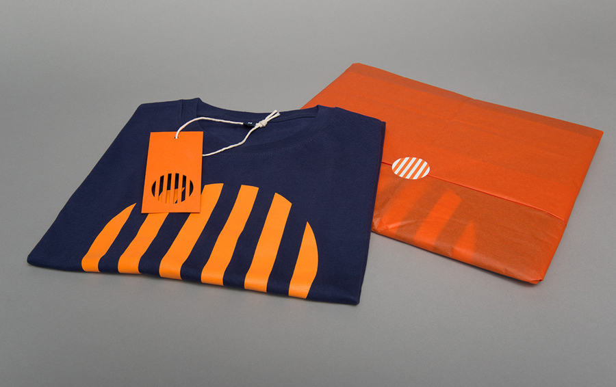
The logo functions well as a consistent visual marker through proportion and the absence of ink over the detail of the posters and its bold and isolated use across branded products. It really only works as an ownable asset because of the ways it has been executed, and I do not think that anyone with a similar mark should be concerned.

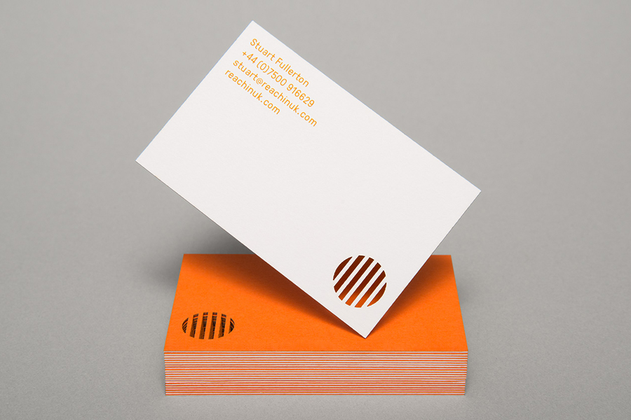
The flourish of G . F Smith coloured board, duplex business cards with die cut detail (a reference to the windows and decals of the gallery), plenty of unprinted space, and an oversized screen printed treatment across clothing and tote bags, provide a layer of tactile detail and quality to the identity. It draws a little more distinction from the simple form of the logo and has a modesty more in line with a charity.
To derive an identity solution from a particular venue, one so unique in its structure and cultural recognition, could have perhaps been a vulnerability, with any change in location potentially undermining its relevance, however, as an abstraction, bold enough in its application and appropriately expanded upon in print it appears appropriate and well-founded.
Design: Karoshi
Opinion: Richard Baird
Fonts Used: GT Pressura
