Huckle & Goose by Cast Iron
Opinion by Richard Baird Posted 30 October 2014
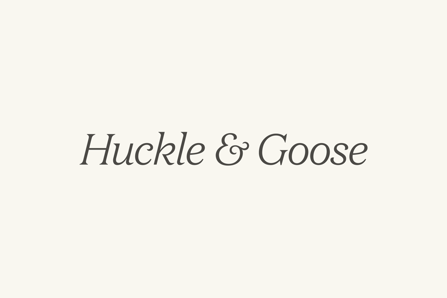
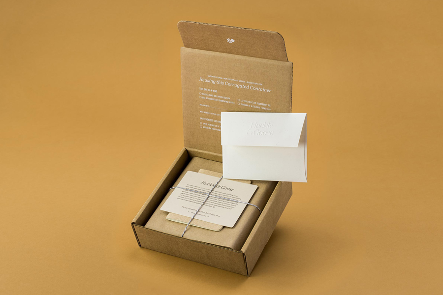
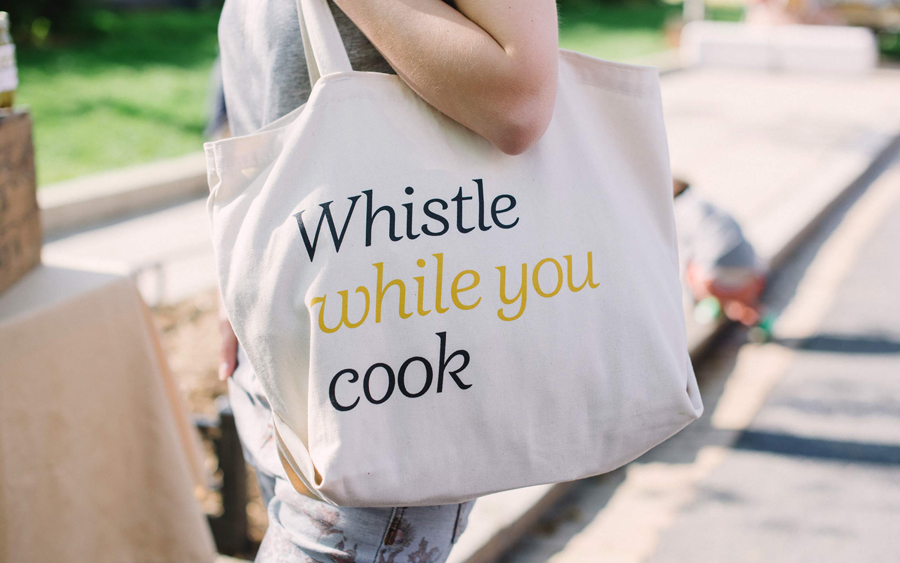
Huckle & Goose is an online food service that delivers weekly seasonal recipes to subscribers with the intention of making it simple and easy for the conscientious home cook to plan meals according to what’s in season at the local farmers’ market. Colorado-based Cast Iron Design were appointed to bring Huckle & Goose to life, developing a brand identity which included a press pack, journal and stationery design, an online experience and interactive web app.
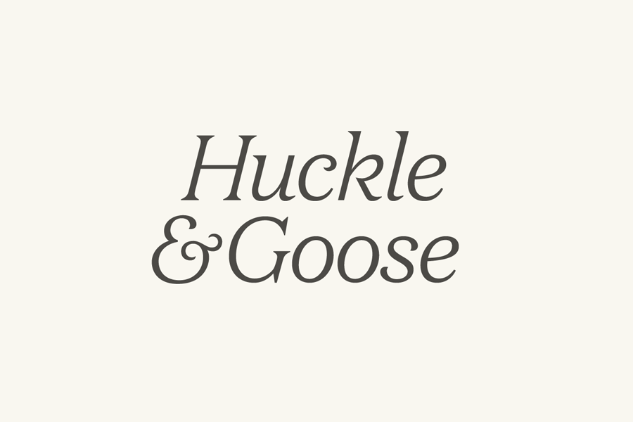
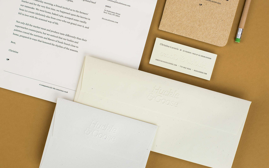
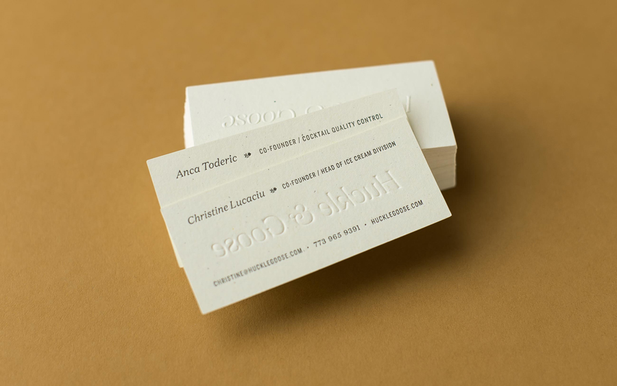
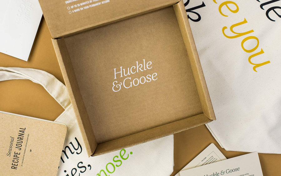
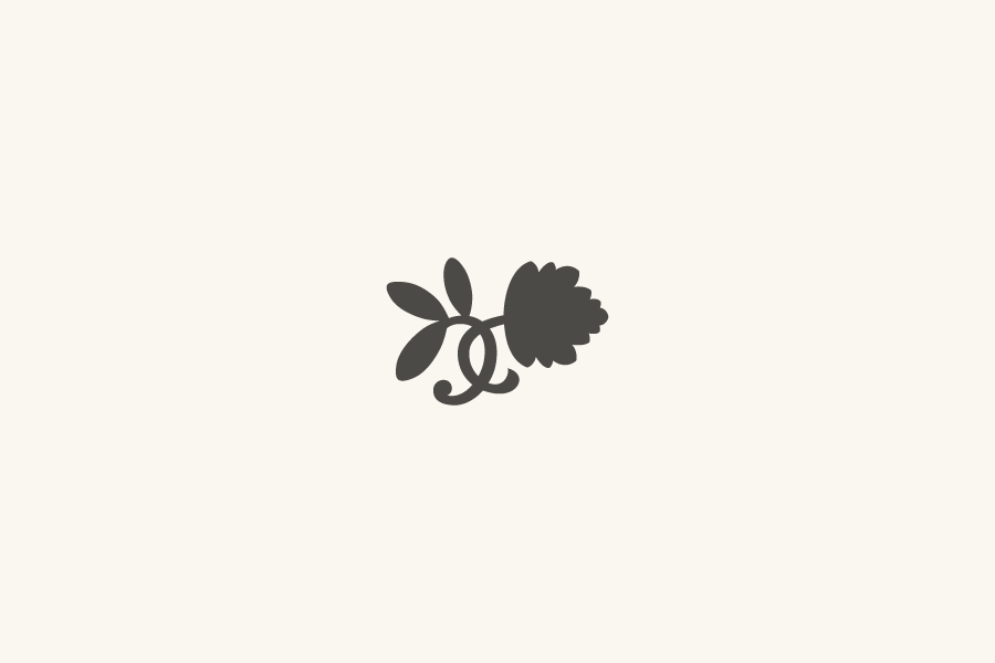
The name Huckle & Goose was created by combining the first parts from huckleberries and gooseberries, only in season a few weeks a year, to suitably capture and communicate the company’s philosophy of seasonal living and eating. The visual identity feels modern and fresh, and avoids worn-out aesthetic cliches of the organic food community. This is achieved by mixing traditional typographic details with a current preference for boutique type foundries and a considerate use of materials. The refined organic letterforms and small details of Klim’s Domaine form the basis of the word mark and are complemented by the flourish of a bespoke ampersand, and a fleuron based on the leaves of the namesake berries, which is sparingly used throughout as an accompanying symbol.
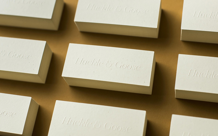
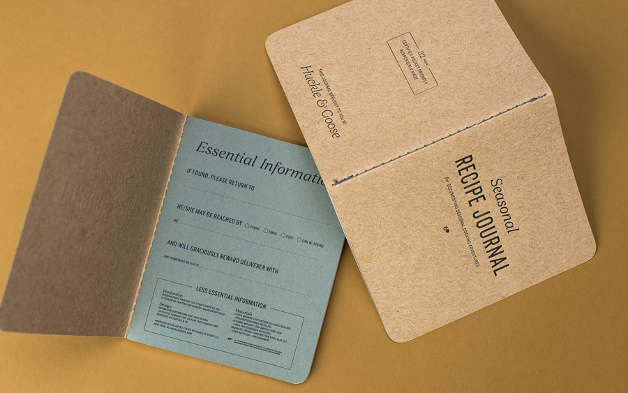
The promotional materials, stationery and journal are packed with subtle physical detail, earthy textures, uncoated, unbleached and dyed papers. The flourish and contemporary detail of the printing techniques, white ink on unbleaching corrugated board, and the blind emboss on natural stock, makes the identity feel current and crafted. There’s been consideration and wit put into the identity’s digital presence as well, having the colours change according to season on the webapp is a particularly nice touch.
Design: Cast Iron Design
Opinion: Robert Holmkvist
Fonts Used: Domaine, Mercury Text & Knockout
